5 Easy Ways to Make Your Trailer Logos Stand Out
Posted on July 18, 2017 by Logo Design Tips and Tricks

Is your trailer logo lacking a certain something? It’s easy to feel overwhelmed when first creating a logo. Knowing which tips make a better logo will make this process much easier.
A logo is often the first visual someone has of your company. First impressions are important.
Creating the right logo is the first step for providing an amazing first impression. Knowing the right tips will make creating your logo a breeze.
You don’t want to make logo creation mistakes that end up costing you business. In this article, you will learn five easy ways to make your trailer logos stand out.
1. Appeal to Your Audience
Most trailer companies want a logo to reflect their products. People using trailers will need them for work situations. Teardrop camping trailers are powerful devices.
Your trailer logos should not have a cutesy appearance. People using trailers want a machine that will help them get the job done.
Make sure your logo reflects a serious and realistic tone to match the wants of your audience.
2. Colors Make or Break Trailer Logos
Consumers tie color with emotions. You’ll want to think about what your customers value.
Many trailer companies utilize the color black for its masculine feel. Blue is a color associated with trust that you’ll see in many company logos.
It’s generally recommended you avoid feminine colors including pink and purple.
3. Choose the Right Font
A font is important for having an effective logo.
Your trailer company will likely want a logo with sharp and bold lettering. Rounded letters sometimes provide a font that lacks seriousness. Rounded letters look great for toy stores but you’ll need something more rugged.
Always choose fonts that are easy to read without a second of hesitation. White Mountain Footwear noticed a 20% sales increase by changing their logo font.
4. Avoid a Busy Logo
You’ve chosen the right color and font but you don’t want to go overboard. It might seem nice to include many elements to have your logo stand out.
Having a logo with too much going on only creates distractions. A logo should be simple, to the point, and memorable.
Iconic companies create logos to stick in the minds of consumers. Including too many words, colors, and images makes a logo clash, steering away potential customers.
5. Consider Multiple Platforms for Logo Placement
Your trailer logo might look great on a business card but how about on a billboard? It’s important that you choose a logo that works in any situation.
The best way to have an adaptable logo is to create designs on different platforms.
Adjust the size of your mock logo to see how it looks on small and large surfaces. In some cases, a logo that looks great on a billboard looks smudged on a business card.
Don’t forget about online logo creation programs. These programs give you the ability to create, edit, and complete your trailer company logo. Following these tips will help to ensure you have a great looking logo for your trailer company.
Need a New Logo? 5 Tips for Your Small Business
Posted on July 18, 2017 by Logo Design Tips and Tricks

Are you starting a new business, or working on rebranding an existing one?
If so, then you’re going to need a new logo.
Your company’s logo has a big impact on its brand identity and recognition. When customers easily recognize your brand, they are more likely to remember it. This helps encourage brand loyalty and repeat business.
That said, just like a great logo can help your business, an unappealing or ineffective logo can hurt it. Let’s look at some best practices for creating logos to guide your business.
Choosing the Color for Your New Logo
Coca-Cola has one of the most recognizable brands in the world. A major factor in that recognition is iconic red and white color combination.
Studies show that color can increase brand recognition by up to 80%. This means that the color you choose for your company’s logo will have a big impact on how customers perceive you.
For this reason, it’s important to understand the different connotations certain colors have. The color green tend to make people think of nature. By contrast, blue is seen as consistent, and professional.
Make It Relevant
The purpose of a logo is to improve your company’s brand recognition. For this reason, it’s important that your logo design connects to your company’s mission and purpose.
If it’s unclear how your logo relates to your company, it won’t help customers remember you. That defeats the purpose of having a logo in the first place.
At the same time, you don’t necessarily logo to be too obvious, or “one the nose.” This can make it look cliche. Instead, shoot for something that communicates the message of your business while still looking original.
Keep It Simple
When people see your company logo, they should be able to immediately recognize it. This is why simplicity is important.
Logos that are overly busy or complicated take too long to read and can be hard to understand. As a general rule of thumb, a person looking at your logo for the first time should be able to comprehend it in less than five seconds.
Using a Combination of Text and Images
Some company logos are completely image based. Apple Computers and Twitter come to mind. Other logos, however, like Dell and Coca-Cola, use mostly text.
For small businesses, logos that combine text and images tend to work best. Using text helps promote your company’s name. Pairing the text with an image helps make the logo more memorable.
Know What Resources Are Available to You
There’s no need for small businesses to reinvent the wheel. There are plenty of resources available to help you keep your business running smoothly.
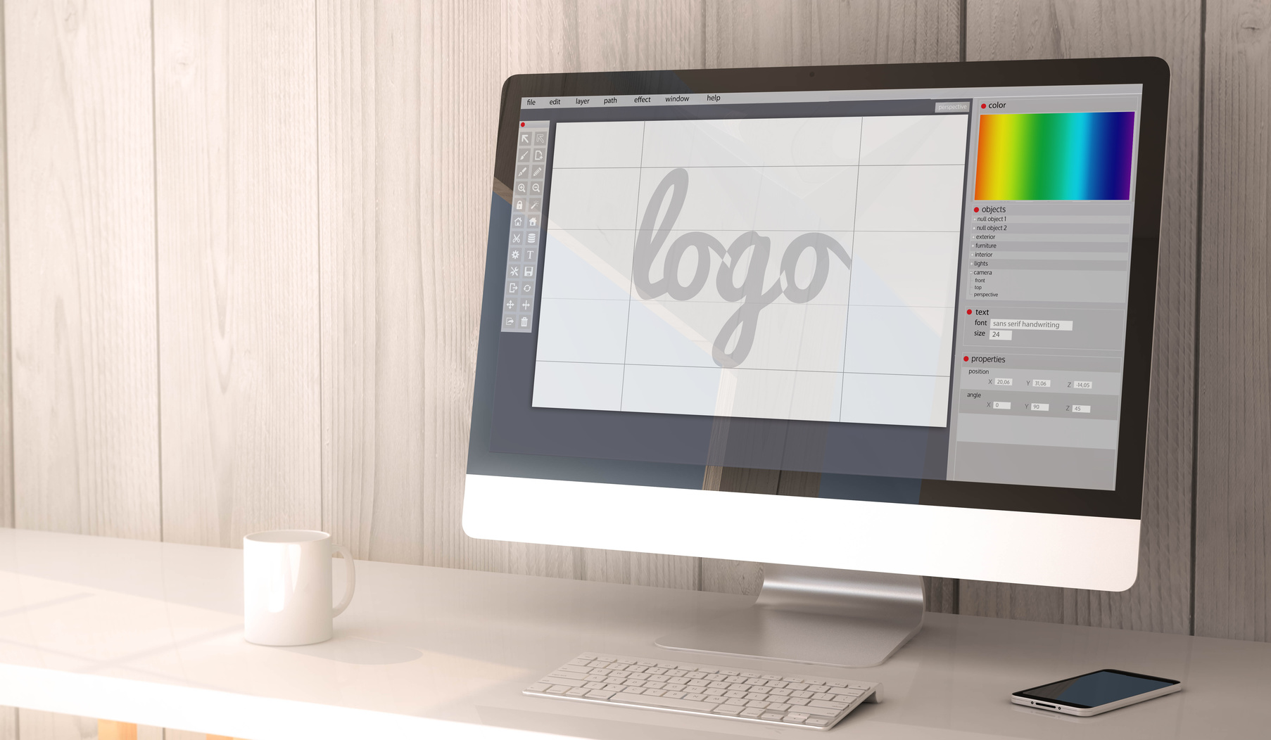
For instance, this short guide has mostly focused on basic design principles for making a new logo. If you need help with the technical aspects, you can refer to our logo-making tutorial.
There are also several websites and consulting agencies exclusively dedicated to helping small businesses. You could look to these small business growth partners for specialized resources for your businesses.
Getting Started on Your Logo
If you’re ready to start making your company’s new logo, check out our free logo maker. This tool will help you combine text and images to make the perfect logo for your company.
Why a Retro Housing Logo Might Work for You
Posted on July 18, 2017 by Logo Design Tips and Tricks
Have you noticed that retro logo design is making a comeback? Even the most modern, hi-tech companies are making the switch – and there’s a good reason why.
Your logo is one of the most important aspects of your branding, yet so many organizations get it wrong. Often, it’s a case of trying to be too clever – or treating the logo as an afterthought.
Your logo is the first impression of your business. It identifies you and should be representative of your product. Look at Coca-Cola or McDonald’s. They are so well known, people know at once what they mean.
What Does Your Logo Say?
Your logo needs to say ‘trust‘, ‘quality’ and ‘reliability’ – the principles needed to grow a strong brand. And it seems ‘trust’ and ‘nostalgia’ can go hand-in-hand.
People talk about the ‘good old days, and how products ‘used to be better made’. There seems to be an inbuilt trust factor. So it only makes sense to buy into that when designing your logo.
The big players already know that. Take Kodak. Last year the company brought back a modified version of its 1971 logo. They said it was about reinforcing the brand’s integrity.
Retro Logo Design Making A Comeback
Another example is Tesla Motors. The company was only formed in 2003, yet the logo is like the Bauhaus designs of the 20s.
If you thought retro logo design only worked for old-fashioned products, you’d be wrong. It will work for most products and services, including new housing.
Remember how your logo should say ‘trust’? You can add to that safety, protection, security – everything a home can give you. So using retro logo design for housing is a great fit.
Flashback To The Past
Not only that, but you can use a symbolic building to great effect in your logo. Something Ronald McDonald House Charities realized when they revamped their logo.
The thought of a roof over their head is comforting to most people. Let’s say a couple was looking for new homes Gold Coast. A retro logo design might remind them of childhood holidays in this seaside paradise. It’s all about nostalgia. It takes us back to simpler times – like ice-creams on the beach and backyard cricket.
Many new housing providers have emerged over recent times, some good, some bad. For those established many years ago, it’s important to have a point of difference.
Buyers Want Quality, Value
If you were looking at a new home, you would want to be sure you were dealing with a reputable company. You want to know that you’re getting quality craftsmanship and value.
Buying a home is a major investment – one of the biggest you’ll ever make. It’s also about putting a secure roof over your family’s head.
The builder or developer wants to send that message through their branding. They need a logo that is recognizable, simple yet effective. And often the solution is ‘less is more’.
Do they appear to put their time and energy into flash logos? Or do they concentrate on the business at hand – designing your perfect home?
Send the wrong message and it could be a deal-breaker!
Unique Real Estate Logos Are for Closers
Posted on July 18, 2017 by Logo Design Tips and Tricks
A great logo can help any business stand out in their customer’s eyes. Real estate is no different.
As a realtor, you’ll want a unique logo that communicates your brand’s identity. What message are you trying to send your clients?
Whatever it may be, your logo is the perfect outlet for conveying that message.
Read on to learn how to make real estate logos that will impress your customers.
Don’t Follow The Trends
There are so, so, so many real estate logos that feature homes and building structures. Our advice? Ditch these cliches.
Yes, you want your customers to recognize your brand through your logo. However, that doesn’t mean you have to pick the most overused icons.
There are plenty of other ways to represent your identity. Are you a realtor in sunny Florida? Incorporate something sunny and welcoming into your logo. (Read more on this below). Do you focus on upscale real estate? Go for sleek and simple.
Expand On Your Name
Many of our favorite real estate logos are some kind of clever play on the company’s name.
For instance, Compass now uses the ‘O’ in their logo to depict an actual compass needle. You can read more about their processes and reasons for changing their logo.
Or, look at Two Trees Management. They are able to incorporate their forestry, friendly name into their logo.
Use Natural Themes
As I mentioned above, using natural themes in your real estate logo is a unique way to brand yourself.
The best way to do this is to consider the environment of the market you sell to.
Like in the Florida example, you’d want to go for something that feels sunny or beachy.
If you live in the Western part of the country with lots of mountains, use that to your advantage. There are plenty of mountain-esque icons that can help you stand out from the crowd.
Play Up Your Personality
A logo has the job of communicating your brand to the world. By that logic, your real estate logo absolutely has to be unique.
You should consider your business’ personality and how you brand yourself to the world. You need to go beyond just saying “We buy houses” and show a little more personality.
What’s your tone? Are you light-hearted and young? Family oriented? Or, perhaps urban and chic?
If you’re having trouble capturing your personality, study your audience. What is their personality?
Tie this in by finding icons, images, and typography that complement your personality.
Cut The Icons (Maybe)
Somewhere in logo history, it became pretty universal to have some kind of icon or image. Thankfully, there isn’t any logo police- none that we know about anyway.
So, we say- ditch the icons if it’s not working for you. Using strong typography can capture your audience’s attention in a good way.
If you do this, it’s best to keep your logo fairly professional (professional, not dry). Removing the images can make your logo look non-businesslike, which we want to avoid.
We’ve Got You Covered On Real Estate Logos
You’ve got the knowledge on how to create a unique realtor logo. Now, let’s put you to the test.
Create a stunning logo that will really “Wow!” your customers with our online logo maker!


