Does Your Health Services Company Need a New Logo?
Posted on July 12, 2017 by Logo Design Tips and Tricks
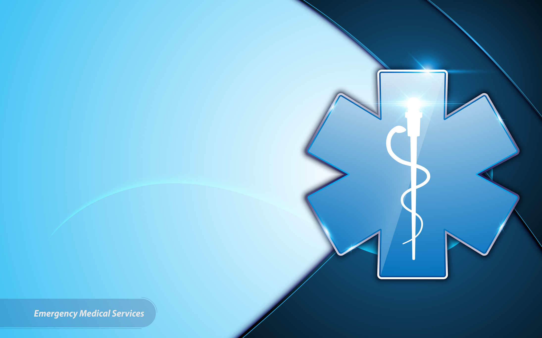
Logos are a great way to increase brand loyalty, reflect your organization’s goals, and create an overall representation of your organization’s values.
And when it comes to health services, a logo can be a great way to create a relationship with potential patients.
Here are some questions to ask yourself if you are thinking about getting a new logo for your health services company.
How long have you had your current logo?
While well-designed logos can last a long time and come to represent your organization, an out-dated and unchanged logo can reflect exactly that: something that is stagnant, inflexible, and non-evolving.
In an industry like biological health services that is constantly gaining new information, growing and changing, having a logo that stays the same over a long period will not reflect well.
If you’ve had the same logo for more than 10 years, it is definitely time for a new logo or at least a redesign.
Does your current logo contain outdated designs or images?
This question goes along with the previous one.
Older logos tend to have design elements that match the time period in which they were created.
While 3D effects, clipart images, and shadows might have been trendy designs 15 years ago, they are no longer modern and they can cheapen your logo.
Modernizing your logo to make it look relevant and interesting while still retaining the feel of your past logo will allow people to recognize your organization while simultaneously getting a much-needed upgrade.
You should keep in mind your target demographic, current trends, healthcare policies, and other health services marketing ideas as you look to redesign your logo.
Older and outdated design elements can also pose a problem with modern technology.
Oftentimes, older logos will not be compatible with new technology like mobile apps and social media, which are essential for marketing and advertising.
Modernizing your logo so it is suited for newer social media platforms like Facebook and Twitter will give your health services organization a broader reach and easier accessibility to today’s patients and customers.
Have other competing organizations gotten a new logo recently?
If there are certain organizations in direct competition with you, it’s a good idea to check out their logo.
If they have recently changed or updated their logo, this can add to their appeal, thus taking away potential patients and customers. A newer, better-designed logo can often be viewed as more appealing, which will give your competition an edge.
Upgrading your own logo will at least keep you on the same level as your competition, and it can perhaps give you the edge if your design is modern and trendy.
Did you make your current logo yourself?
Oftentimes organizations will begin with low funds for marketing and logo design, which forces them to create their own logo.
But if you want to keep up in a popular and influential industry like health services, then your logo should look professional and well-designed.
So unless you happen to be a graphic designer, it’s better to leave the designing to professionals.
Bottom Line
With the health services industry evolving constantly, it is important to have your health services company growing and changing as well.
A new logo can keep your organization modern and appealing. Ask yourself the questions we posed here to see if it is time for you to upgrade your logo.
If you have any other ideas or comments, feel free to leave them in a comment below!
The Importance Of A High-Quality Real Estate Logo
Posted on July 11, 2017 by Logo Design Tips and Tricks

So, you’ve got your real estate license and you’re ready and excited to launch a successful career.
Not so fast. A real estate license is only the first step. There are already hundreds of thousands of licensed realtors in the U.S.
A license doesn’t do much to make you stand out from the competition.
In order to find success in your real estate career, you need to start marketing yourself as a business.
There are a lot of aspects to marketing yourself as a business, but one of the most critical ones is having a logo.
A well-designed logo tells your audience what you’re about and gives them a visual representation to remember you by.
Just think of some of the big name companies you know- Starbucks, Nike, Coca-Cola. Do you recognize these companies by their current CEO’s?
No. You recognize them by their logos. A well-designed logo can really make a difference for your real estate business. If you’re not quite convinced, keep reading to learn the importance of a real estate logo.
Creates Your Image
Realtors know better than anyone that image is everything in the world of business.
Think about when you’re showing a house to prospective buyers. How do they react when you show them a house with a beautiful front landscape versus a house that has weeds growing in the front yard? Even if the inside of the house with weeds is pristine, some people will still have trouble getting over that first impression from the outside.
The same analogy can be applied to your Realtor logo. If you don’t have a logo or if your logo is poorly designed, many people are going to have trouble getting past that, no matter how good your skills are as a realtor.
The right logo sets the tone for who you are as a realtor.
Brand Awareness
A logo is a crucial element for building brand awareness.
Simply put, brand awareness is the familiarity your desired consumers have about your brand. This familiarity is established through language, images, and various forms of advertising. Brand awareness also helps set you apart from other Beverly Hills real estate agents.
A well-designed realtor logo will create a perception of quality service. The more people see this logo on your site, billboards, social media, and other platforms the more they will recognize you as a provider of quality service.
And guess what? Once people recognize you, they will start to trust you more and more. And obviously, trust is essential in the real estate business. No one will let you sell their home if they don’t trust you.
Establish Ownership
A logo is equivalent to a signature.
It proves your ownership and also acts as a safeguard against forgeries and fakes. Once you have a logo, no one else can reproduce it and use it.
A logo that is truly yours establishes your credibility in the business and lets your potential consumers know that you take your business seriously.
Realtor Logo: Wrap Up
As you can see, a realtor logo can really help take your business to the next level.
If you have any questions about designing a logo, please don’t hesitate to drop a comment below.
Insurance Logos: Designs to Inspire Customer Trust
Posted on July 11, 2017 by Logo Design Tips and Tricks

Are you looking for a better logo design?
In every industry, you want to make sure your logo inspires customer trust. However, insurance is one industry where customer trust truly means everything.
People are definitely more willing to take a gamble on a food product purchase or clothing purchase than they are on an insurance purchase.
Therefore, insurance logos need to think beyond being catchy or flashy. They need to convey professionalism and integrity in order to win over the customer’s trust.
But how do you create a logo design that inspires trust?
Read on to find out.
Clutter-Free
Crazy font styles, bold colors, detailed images. It can be easy to get carried away with your logo design without even realizing it.
Cluttered logos are not only difficult for customers to decipher, they’re difficult for customers to trust.
That’s because people perceive cluttered logos as unprofessional. Even worse, many perceive cluttered logos as desperate. Why is this business trying so hard to get my attention? Is it because their business is struggling?
On the other hand, insurance logos that are clean, crisp, and minimalist convey professionalism. They let people know that while your logo represents your company, it’s your services that speak the real truth.
So, if you want to inspire customer trust, try to simplify your logo as best as possible. Stick to only using one font and maybe just one or two colors.
Design in Black and White First
Speaking of crisp and clean, one of the best ways to ensure you achieve a clutter-free is to design a logo in black and white first.
This will help you get the design right before you worry about adding in a lot of color. It’s always easier to start simple and on more later than it is to scale back.
Plus, there are times when your logo may need to be black and white due to printing restrictions. Making sure it looks good in black and white helps you lie the foundation for detailing later on and helps prevent you from going overboard.
Choose the Right Colors
While black and white designs are great, there’s nothing wrong with adding a splash of color to your logo to help it stand out from the crowd.
However, you should be very selective about the exact colors you choose. Color psychology- the idea that certain colors convey certain meanings- should be taken into consideration.
While there is no “wrong” color, it’s important to pick colors that will resonate well with your target audience. The more a logo resonates with an audience, the likelier the audience is to trust your business.
For example, if you want to evoke feelings of cheerfulness and warmth, go with yellow. If you want to evoke feelings of calm and serenity, go for blue. Red, the color Amistad Insurance Services uses, evokes intensity and passion.
You can check out this color chart to learn more about what emotions are associated with each color.
Insurance Logos: Wrap Up
Hopefully, this article has inspired some ideas for creating an insurance logo that inspires trust.
If you have any questions about developing your logo design, please do not hesitate to drop a comment below.
5 Reasons Why Your Roofing Company Logo Failed
Posted on July 11, 2017 by Logo Design Tips and Tricks
Your logo is one of the quickest ways to introduce your roofing company to the world. If it doesn’t get the message across about who you are and what you do, it’s not going to work for your business.
Keep on reading to learn the top 5 reasons your logo failed to reach your customers.
Why Your Roofing Company Logo Isn’t Working
1. You chose the wrong font
Choosing a font can seem like the most boring part of your roofing company logo design. However, typography is actually one of the most important steps in logo creation. The font you choose sends a message about your roofing company.
If you choose a font that’s too casual, like Comic Sans, it can make you look unprofessional or sloppy.
On the other hand, an ornate calligraphy-style font might convey the elegant look you’re going for. However, the details and flourishes can be hard to read.
Remember, a business card is only 3.5 x 2 inches. Your font needs to be readable even at a small size.
2. There is not enough going on
A generic logo doesn’t say much about the company it represents. Using a drab color or a lackluster font won’t get anyone’s attention or bring in new business.
Try punching up your roofing company logo with a bright accent color. If your main image looks like cliche clipart, switch it out with something more stylized. You need at least one element that stands out.
3. There is too much going on
If your logo is a rainbow of harsh colors coupled with a crazy font and distracting image, your message will probably get lost.
Too many clashing elements will actually compete with each other for attention. The end result is that nothing gets through to the viewer.
To pare things down, go back to your core business goals. If you had to choose one defining thing about your company, what would it be? Throw out anything that doesn’t fit with that message.
4. It’s not in the right file format
When it comes to your logo, your files need to be in vector format. A vector file is infinitely scalable. That means no matter how much you blow them up or shrink them down, they won’t look pixelated or blurry.
Some common types of vector file formats are .eps, .ai, and .svg.
Raster file formats—including .jpeg and .png—are not scalable. That means if your original file is small and you need to feature your logo on a poster or banner, you will see major pixelation with a raster file.
5. It doesn’t really reflect your brand
If there’s a disconnect between the look of your logo and the way you run your business, customers will pick up on it.
They might not know why they don’t like it, but something about your company will just seem “off.”
For instance, imagine a logo that uses clean lines, a serif font, and a blue color scheme to convey a sense of professionalism and credibility. If they pair that logo with an ad about how cheap and fast their services are, customers will sense that something isn’t right.
Make sure your logo says the right thing about your roofing company.
Create a New Roofing Company Logo Today
Get started on your redesign using Online Logomaker.
Use our free tool to create several design options that fit perfectly with the message of your brand. Remember to always check back with our blog for the latest updates in logo design.


