3 Visually Stunning Art Logo Trends for Craft Supply Stores
Posted on June 27, 2017 by Logo Design Tips and Tricks
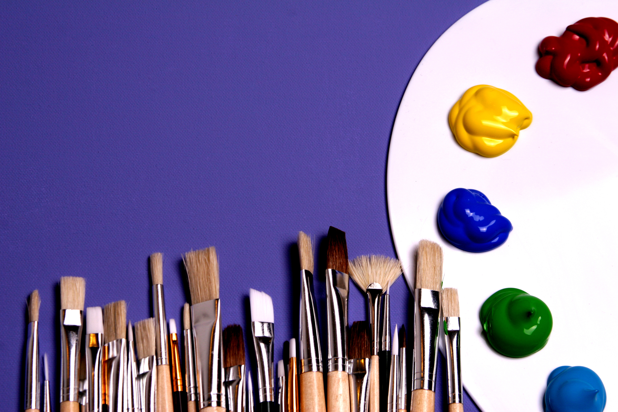
Are you a craft supply store looking for a visually stunning new art logo to attract shoppers and give your brands some personality?
If so, you’ve come to the right spot.
Today, we’re breaking down three trends dominating the art logo design field today. We’ll show you how they can add the pizazz you need to stand out from the crowd.
Ready to get started? Let’s dive in!
1. Letter Cropping
The late modernist designer Paul Rand introduced the concept that you can still convey a message without showing the entirety of each letter.
Drawing inspiration from this methodology, one hot art logo trend for 2017 is to strategically crop the letters in a logo, showing only the bare necessity to get the point across.
The look is minimalist and simplistic while still adding a creative and thoughtful touch.
A few examples?
Take a look at the cover of this book on the history of Punk magazine. See where the “P” disappears off the bottom of the page?
In addition, the London Design Festival 2016 to its advertising to the next level with promotional materials that hardly fit any of the event’s title on the page but got the message across perfectly.
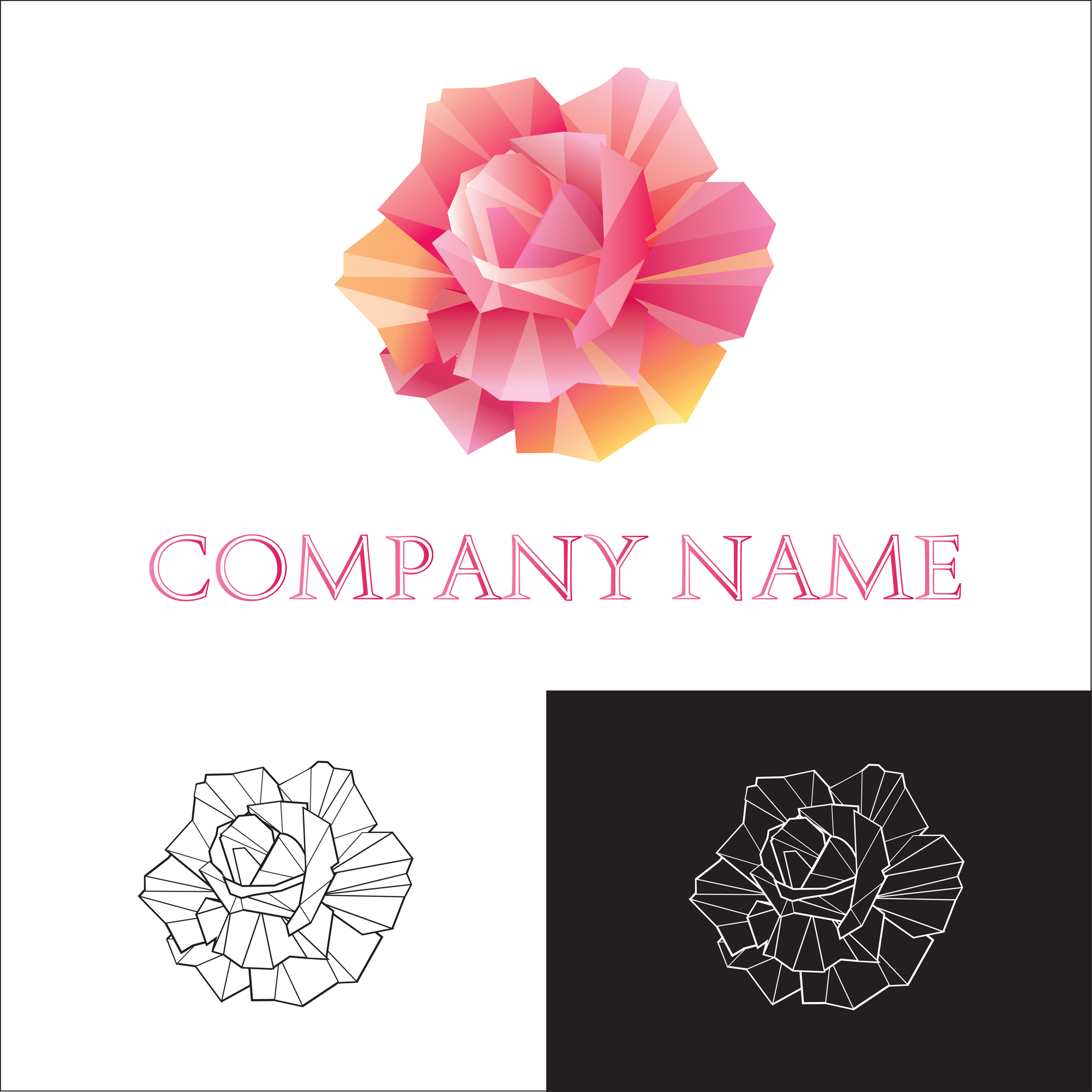
2. Simplified Forms
This year, logos are taking a step back, scaling their textures, colors, and shadows back in favor of more flat designs.
Art supply stores are especially poised to benefit from this emphasis on simplicity.
Now, even the most intricate and elaborate offerings, such as origami instructions or knitting kits, can be advertised as straightforwardly as possible.
A few trademarks of this art logo design trend?
It tends to focus on just one or two colors, rather than utilizing the whole rainbow. In addition, it stresses neat, straight lines over messy or complicated designs.
In lieu of a more complicated design, these logos are also making use of negative space.
In a nutshell, this design element incorporates the blank space around an object into the overall image itself, turning a simplified logo into anything but.
3. Gradient Overlapping
Want an art logo that’s colorful and simple yet still packs a punch? Overlapping gradients is a subtle yet effective way to achieve that balance.
In short, these logos are ones that incorporate multiple, complementary colors that correspond with each other.
As one color fades, the other picks up in an overlap, creating a visually dynamic, blended image that leaves an impression.
Perhaps the most well-known and iconic example of a logo that utilizes gradient overlapping? MasterCard, with its simple interlocking circle design.
Here, there’s one red circle and one yellow circle that overlap in the middle, creating a sliver of orange. The result? An unfussy, clear approach to branding.
Create Your New Art Logo Now
From art to software and every industry in between, a dynamic logo is an essential part of any brand.
If you’re in need of a new logo design for your company, we’d love to help. Our online logo maker tool is free and simple to use.
Reach out if you have any questions, then register today to get started!
Branding With Style: The Key to a Beauty Logo Design
Posted on June 27, 2017 by Logo Design Tips and Tricks
Many businesses underestimate how important a logo is to their brand identity.
The clothing retail giant GAP learned this lesson the hard way after changing its logo in 2010. The change lasted only a week before consumer outrage forced GAP to revert back to its old one.
But what does it take to create a stylish logo in the beauty industry?
In this article, we’ll look at a few of the most important aspects of beauty logo design. Keep reading to find out how to create the best logo for your business!
Starting Your Design
You want to begin the beauty logo design process by looking at some of the most successful brands in your industry. This step helps you decide how you can distinguish your brand from others. It also allows you to see what elements of successful logos are worth keeping.
Next, consider what message you want to send to your potential customers. This is an important step in determining the personality of your brand.
When starting your design, focus on simplicity. While a complex logo seems like a good idea, a simple yet original logo is easy to recognize and replicate. Furthermore, it’s clean and versatile, so you can use it anywhere.
Think about some of the most iconic logos in the world. McDonald’s, Apple, Nike, and Disney all have simplistic logos that have stood the test of time.
Choosing the Right Colors
Believe it or not, every color evokes certain emotions in people. Selecting the right colors can make a huge difference in your beauty logo design.
For example, a business that offers cosmetic treatments such as SculpSure benefits from using blue and black in its logo. Many people associate blue with trustworthiness and black with seriousness. Both of these are great characteristics for any cosmetic treatment brand.
Hair and beauty salons might choose to include either purple, pink, or orange in their logos. People often associate purple with glamor. Pink triggers feelings of femininity and warmth, while orange signals creativity and happiness.
Green is great for anyone trying to associate relaxation with their brand, whereas yellow evokes feelings of joy and high energy. Although red can be aggressive, it also signals trust, so don’t be afraid to try it.
Using multiple colors will help you create your ideal brand image. That said, try not to use more than three colors in your design. Otherwise, you may end up with a confusing and messy logo.
Additional Beauty Logo Design Tips
There are a few tips that can put your beauty logo over the top.
For starters, negative space can add a distinct flavor to your logo. Don’t force it, but look for ways to incorporate it after you already laid out a basic design.
Typography is another important aspect to consider. The font you use can have just as much of an effect on emotion as the colors in your logo.
Finally, try to avoid cliches such as letter overlaps, reflections, and the Helvetica font.
Making Your Own Logo
The individual components of your logo all come together to form one brand identity. Your brand identity determines how people perceive your business, as well as what characteristics they attach to it.
Make sure you kick things off by researching successful brands in your industry. Also, remember to use colors to evoke associate specific emotions with your brand.
At this point, you’re ready to put your newfound knowledge to the test. Use our free logo creator to design a stylish logo for your brand today!
A Simple Guide to Creating Flashlight Logos
Posted on June 27, 2017 by Logo Design Tips and Tricks

You’ve probably heard the age-old question, “If a tree falls in the woods and no one hears it, does it make a sound?”
You could ask a similar question about marketing: “If you produce or sell tactical flashlights, but no one knows about it, will you stay in business?”
In most cases, the answer is no. Marketing is essential to the health of any business.
There are a lot of approaches to marketing. Perhaps you think of buying ad space on television or online to spread the word about your business. Or, maybe you think of running special promotions to entice potential customers.
That said, sometimes business owners only think of big initiatives and campaigns when it comes to marketing. This could lead them to overlook some basic, yet essential marketing practices.
A prime example of this is your company’s logo.
A great logo is foundational to any good marketing strategy. Your logo should be clear, and easy to understand. It should give customers an indication of what your company’s purpose is.
So, for instance, if your company sells tactical flashlights, then you should brand your company with flashlight logos. This will help customers to immediately recognize and remember your business.
Let’s take a look at how you can learn to make a logo for your business.
How your business will benefit from flashlight logos
Let’s a take a closer look at why logos are so important to your business’s success. This will give us more context as we get into the specifics of how to make a flashlight logo.
Logos make your company look credible
Small businesses often struggle to gain customer trust. This is partly because they lack the name recognition that national chains have.
A logo can help your business look more “official” and “established.” It shows that you and your staff take your work seriously, and you conduct yourselves as professionals.
Logos can promote brand loyalty
Logos help small businesses create a brand identity. When you put your logo on your website, your advertisements, and your product packaging, customers begin to recognize that logo and associate it with you.
Additionally, a good logo will help customers remember your company. A company name can be easy to forget. If, however, that name is paired with a sharp-looking flashlight logo, it will be more memorable.
Best practices for creating logos
In order for your logo to look awesome, it’s important to follow some basic design principles. These principles will ensure that your design is engaging and visually appealing.
Keep it simple
Simple logos are the easiest for customers to read and understand. Make sure that your company name is clearly legible, and that the logo communicates the purpose of your business.
Additionally, your logo should only use around 1-3 colors. More than that, and it begins to look crowded.
Make it versatile
Think of the places where you plan to use your logo.
Will it look good on a polo shirt? On a mug, or a pen? How about your Twitter profile picture?
What is most important is that the logo works for your purposes.
Make it yours
In order for your logo to be memorable, it must be sufficiently unique.
Take a look at logos for businesses that you consider to be competition. What is similar about them? How can you make your logo different?
Are you ready to start working on some high-quality flashlight logos for your business? Then check out our free Logo Maker tool to get started!
5 Qualities of a Great Orthodontist Logo
Posted on June 27, 2017 by Logo Design Tips and Tricks
Are you interested in creating a new logo for your orthodontics office? Do you know how to make it stand out and appeal to potential patients?
Keep these five tips in mind when designing your orthodontist logo to make it as effective and eye-catching as possible!
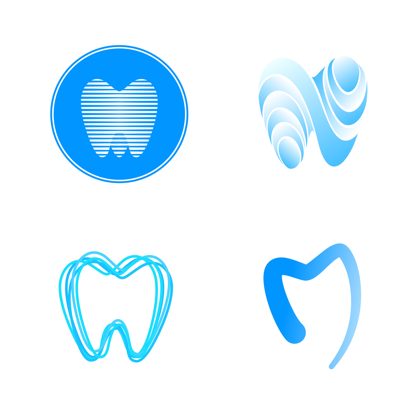
Keep It Simple
A simple, streamlined design is going to have a much stronger impact on potential clients compared to an overcomplicated one.
Keeping your orthodontist logo simple and straightforward will ensure that it is easily recognizable.
You might think your logo is simple enough, but it’s important to know what other people think of it as well.
If you’re unsure about how your logo is coming across, ask a friend or coworker — preferably someone who hasn’t been seen the design before — if it is easy to describe. Does it take too long (more than a couple seconds) to explain what it looks like or what it involves? If so, you should probably scale it back a bit.
Make It Versatile
A simple logo design will also benefit your orthodontics office because it will be easier to recreate.
When your logo is simple, it can be used on the sign for your office, embroidered on your coats and uniforms, and printed at the top of all your important documents. When you’re designing your logo, make sure that it will be easy to recreate across all kinds of surfaces.
Use The Right Colors
A logo’s color is one of the first things that people notice, so choosing the right color will be one of the most important design decisions that you make.
Many orthodontics offices, including Davis Orthodontics, utilize colors like blue and green in their logos. The reason for this is that these colors are associated with trust, care, calmness, and health.
Make It Different
It’s true that the majority of orthodontics office use the same colors in their logos, but it’s important to make sure that your logo still stands out from the competition.
Think about your competition and ask yourself what you can do to separate yourself from them. Whether it’s using a lighter or darker color or utilizing a rounded shape instead of straight lines, there are lots of simple things you can do to distinguish your practice from others in the area.
Make It Timeless
A good logo will never go out of style. Think about how long the McDonalds logo has been around.
While you should make your logo unique, you also should focus on longevity rather than simply trying to make it as trendy as possible.
Ask yourself if your design will still be relevant in five years. What about 10 or 15 years?
Although popular logos can be redesigned from time to time, the basic structure remains the same, and they’re always recognizable. Can the same be said about your logo?
Create Your Orthodontist Logo Today
Now that you understand a bit more about what goes into a great orthodontist logo, it’s time to create your own. Give our online logo maker a try today and create the perfect logo for your practice!


