How to Revamp an Outdated Food Product Logo
Posted on June 27, 2017 by Logo Design Tips and Tricks
How often do you think people see a logo redesign and run to Twitter or Facebook to hate it?
Throughout the history of many brands, a logo redesign has been tough to execute well. Sometimes the new logo can take the brand in a completely different direction and garner a lot of hate. Other times, a revamped logo can refresh the brand’s image and give it a new sense of identity.
That’s why it’s important to be careful with your food product logo.
People are often very loyal to the brands they buy, regardless of price point or healthiness. This means that the logo becomes an important part of the food for them — they confer meaning to that logo.
Fortunately, this guide is aimed at giving you some tips on how to properly revamp an outdated food product logo (without your brand crashing and burning).
Ready? Let’s dive in.
“Undo” your food product logo
Our brains might tell us that more complicated = more interesting, right? Well, many companies today don’t think so. They’re beginning to “undo” their logos.
So what exactly does that mean?
Essentially, brands have begun to pare down their designs, making them simpler and simpler. This is obvious in Nike’s rebranding to remove the uppercase “Nike” lettering and in Starbucks’ move to remove their text as well.
The message? Less is more. Brands want their logo to speak for itself.
With a food product logo, one thing to try is taking the logo down to a simpler style. This gives it a trendy, stylish look while still being an essential part of your brand.
Make sure your logo is cartoonish and full of character
No, not the goofy Saturday morning cartoons you watched as a kid.
This doesn’t mean you need actual illustrations or anything. Usually, this style appears in typefaces. To create a cartoon logo, a brand can use a font that looks as though it were handwritten or even just a font that has a little more playfulness in it.
This makes your logo look a bit “younger,” but it can reinvigorate an otherwise dated and boring font.
Color in the lines
It’s time to break out the big box of crayons because color can really take your logo to the next level.
Microsoft, for example, went from having a sort of boring typeface to the much fresher and eye-catching four-colored window design. This draws the eye directly to the logo while matching their new “Metro” aesthetic.
For a food product logo, using the colors of your product can work well. For example, Diamond Dales World Famous Spice and Rub uses the color red often to show the spice and flavor of the rub.
Keep it creative
The last thing modern companies do quite often is create a logo that has multiple dimensions to it.
IHOP’s logo, for instance, revamped from a boring sign into a logo that now includes a not-so-hidden smiling face under the O and P.
Getting creative with your brand’s identity can speak volumes about what kind of company you are.
Conclusion
To modernize your logo, keep it simple, stripped down, and get creative with color and style.
What are you waiting for? Revamp your logo today.
How Logos for Bloggers Create a Brand
Posted on June 27, 2017 by Logo Design Tips and Tricks
The right logo can do wonders for your brand.
Take Apple, for instance. Their logo isn’t particularly complex. In fact, they took an extremely minimalist approach. And yet as soon as someone sees that white apple with a bit missing, they know exactly what it means.
As a blogger, it’s important that you do everything within your power to get your name out there. There’s a lot of competition in the blogosphere, and your content should stand out.
Logos for bloggers should bring the brand to mind as soon as the audience sees it.
Here are some of the biggest ways that using a logo can create a brand for your blogging business.
Logos for Bloggers Establish Identity
When push comes to shove, your logo is all about brand recognition and creating an identity. Whether you’re outsourcing or using a WordPress frontend plugin, create something recognizable.
Take a moment to think about all the branding your audience is exposed to on a daily basis. Everything from billboards to t-shirts features brand names and logos.
If you’re not making an effort to stand out, you’re going to get lost in the shuffle.
An effective logo should be eye-catching, but it should also evoke feelings. Depending on your location, certain colors can portray different things, so it’s important to know what you want your colors to say.
Take the color red for instance. It’s a simple, common color, but it’s able to convey:
- Anger
- Passion
- Forcefulness
In contrast, something softer, such as a pastel yellow can evoke feelings such as:
It may sound silly, but if you neglect the psychological impact of color, your logo will suffer.
Typeface Matters
Think of typeface as the icing on your logo’s cake. It’s decorative but adds a distinct flavor at the same time.
In fact, the typeface you choose is every bit as important as color. Accordingly, there’s an awful lot to consider.
For instance, should your logo be in print or cursive? What about the age-old serif vs. sans serif debate?
When it comes to logos for bloggers, these simple questions have a tremendous impact on their brand.
Spend a few minutes looking over this list, and note just how many types of font there are.
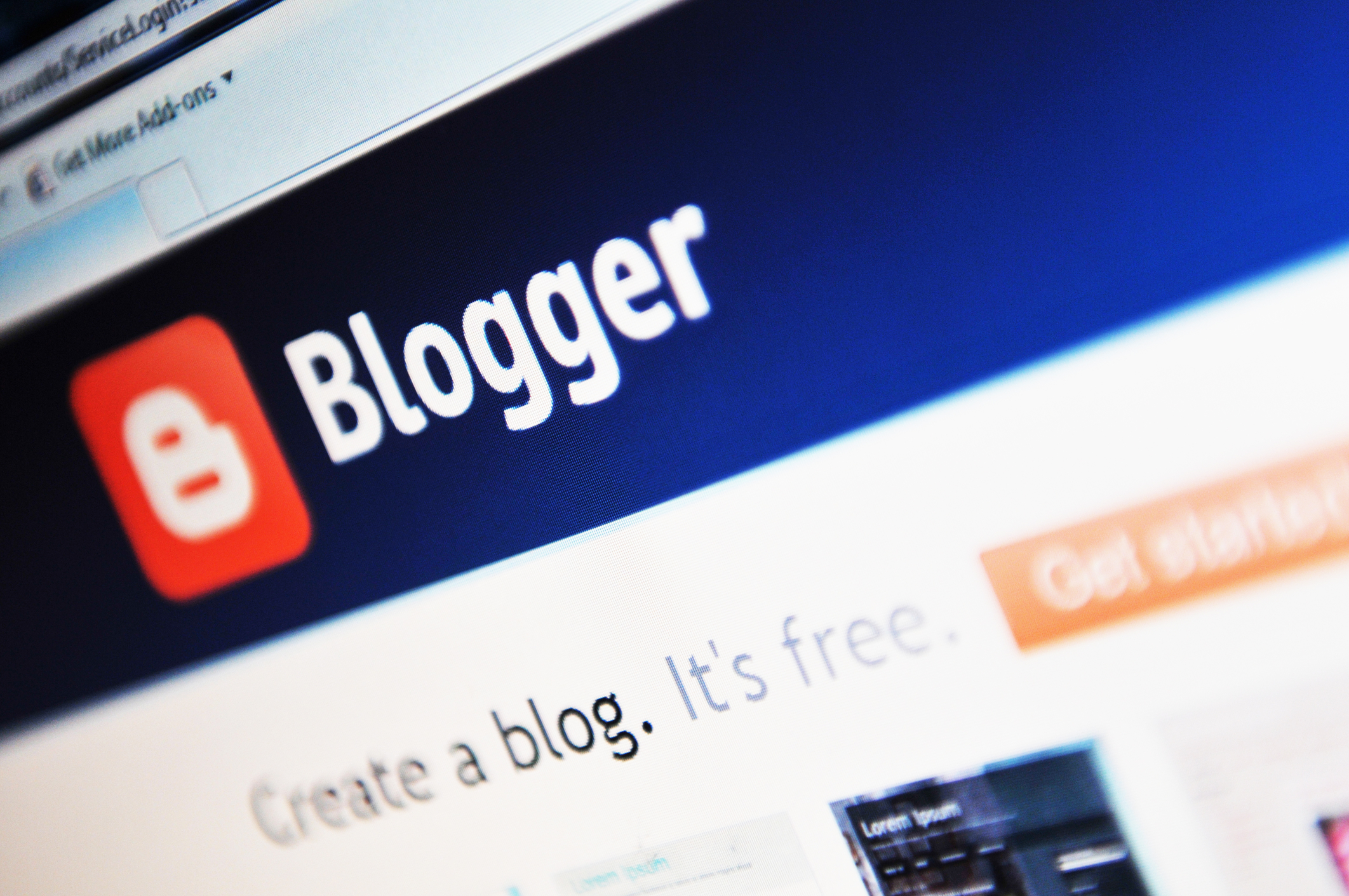
These things do matter. Take a moment to consider one of the most famous blogging logos out there, the WordPress logo. You can likely conjure up the image of the curvy W without even seeing the logo.
The Best Logos for Bloggers are Simple
Let’s stick to the WordPress example for a minute. Their logo is about as simplified as it gets, it’s just a white W in a baby blue circle.
And yet most bloggers would be able to spot the logo anywhere. What makes it so effective? It isn’t busy or distracting at all, yet it’s instantly recognizable.
Ultimately, that’s your goal as a blogger. Your logo needs to be simple, clean, and to the point. There’s just something elegant about a simple design.
When it Comes to Logos for Bloggers, the Logo Makes the Brand
As you can see, it’s important that you use your logo to establish an identity for your brand. Through the use of color and font, your logo can capture the imagination of your audience.
Whether it’s Disney, Folgers, or even Subway, there’s one thing to take away from this article. Logos make the brand, not the other way around.
Create an identity like no other through the use of your logo.
What Message Does Your Chiropractic Logo Send?
Posted on June 27, 2017 by Logo Design Tips and Tricks

Think about the logo for a huge company like Starbucks.
Now think about all of the possible meanings people assign to that logo. Some may think that logo provides the comfort of a warm cup of coffee. Others might see it as an invigorating start to their day. People might even just associate it with a comfy place to sit and read a book!
The important thing? The logo speaks for itself. It has a visual identity.
Your chiropractic logo also tells patients something about your practice.
However, that logo should stand for something greater: the health of your patients. Health is a big deal — it pays to be careful with what you’re saying to your patients. There’s a reason companies like Apple spend millions on their logo designs.
Come on in — let’s talk about what message your chiropractic logo sends.
Shape matters
Surprisingly enough, the shape of your logo actually matters.
In fact, studies have found that even simple things like the roundness or squareness of a logo can conjure feelings in consumers. They might associate a round logo with a caring, warm company. A rectangle, on the other hand, portrays a trustworthy, familiar company.
With this in mind, you should keep the shape of your chiropractic logo in mind. What kind of practice do you want your patients to believe in? Choosing the right shape might just be the best first step towards creating a practice that upholds those values.
Chiropractic logo fonts
Everyone knows how Google’s font looks, or the characteristic broken lines of IBM’s logo.
Your typographic choices can have an impact on your logo’s perception as well. In fact, there’s even a psychology behind the use of fonts in branding.
For example, if your company is a straight-laced, traditional practice, would you use a very decorative, curly font? Probably not. That’s because that font doesn’t send the type of message you want.
It works the same way in business. If you’re sending a formal email, you wouldn’t use a comic kind of font. You would use a font that portrays exactly the type of person you are — your practice is no different.
Creative imagery
How many times have you seen happy looking families on images for medical services?
Probably too many. These images are cliche and do nothing for your brand or your practice. In fact, they may be actively hurting you.
It’s important to use images that pertain to your practice. For example, if you’re a chiropractor in Bradenton Florida, perhaps your logo can portray the beach or some palm trees. A chiropractic logo for a practice specializing in a certain type of patient should use an image relating to those patients.
When you’re designing a logo, that image becomes a window into your practice and your values as a chiropractor.
Conclusion
Ultimately, your practice’s logo should portray meaning in its image, shape, and font. You want your consumers to trust in both you and your brand image.
Don’t know where to go next? Start with our easy logo maker.
7 Clever Components to Include in Your Hypnosis Logo
Posted on June 27, 2017 by Logo Design Tips and Tricks

Wouldn’t it be great to help others make the mental shifts they need to live the life of their dreams? That is the art of hypnosis.
Wouldn’t it be even better to make your hypnosis business stand out to potential consumers? That is the art of a beautiful logo design.
Anything is possible when designing your own logo from scratch. You can be the artist behind the message your logo sends, telling people exactly what a hypnosis service can do for them. Things like losing weight, quitting smoking or making career moves.
Big accomplishments that all stem from a glance at your logo.
Your hypnosis logo is waiting to be created. Here are some tips to get started.
7 Components to Include in Your Hypnosis Logo Design
1. Start With the Grid
Using a grid keeps you on scale. It makes you think about the way dimensions relate to each other.
The lines create a strong foundation, meaning angles are consistent and the logo is versatile. There is nothing like having a beautiful design idea just to have the angles not match up.
It would be like hypnotizing someone and somehow they get the wrong message.
Grids can also draw inspiration from existing geometric shapes. This makes a hypnosis logo bold and new, yet recognizable. Unique concepts with a hint of familiarity can go a long way.
The process can even be double-checked further with a ratio or two. Take the golden ratio, for example. Believed to be used for over thousands of years, it is a mathematical explanation for design in architecture, painting, and much more.
2. Shape, Shade, Space
Putting a new company out on the market is a big deal. Branding it with the right hypnosis logo is even bigger.
The details matter. The shapes and shade of color you use matter. Even white space matters.
What are you trying to say to potential customers? What feeling can your hypnosis service give?
The use of shape psychology can give your logo the upper hand.
Circles express community and unity, a feeling of being complete. Squares offer a sense of balance and professionalism for the consumers looking to feel secure. Triangles are traditionally masculine and stable.
What color supports your message? Some options to consider are blue for integrity and success, or maybe yellow for optimism and cheer. Black is always classic, feeling formal and sophisticated, and purple can add a hint of creativity.
Tie everything together with the right amount of white space. Give your hypnosis logo room to breathe and the ability to come together without being too busy.
Also, don’t forget to let the design process happen.
Take a step back and give your logo-in-the-making a fresh look at every stage.
3. Be Original
This step might seem obvious. but it is worth mentioning.
Classic logos are easily recognizable because they are either the first or only of their kind. Think companies like Nike, Spotify, Tinder, and McDonald’s.
Nike took one symbol and made it theirs. McDonald’s created their own standout lettering with the famous golden arches.
To add an extra dash of originality to your hypnosis logo, take a close look at your typography. Are you using lettering that is already popular? Is there a way to tweak your letters to make them unique?
Bold letters will say what you need to say and make it stick. It will also make it unique to your brand. Avoid using trendy or flashy styles, but rather choose styles that last.
4. Simplicity is Key
Another necessary design element is simplicity. When considering a hypnosis logo, remember an essential part of hypnosis is deep relaxation. This means the simpler, the better.
People don’t want a logo that has too much going on.
Keep the audience in mind and don’t make them work to understand it. The quicker they “get it”, the better your logo’s chance of establishing a good relationship.
This step is like falling into hypnosis – the quicker it happens the sooner you can get to the real work. Create your hypnosis logo to look a consumer in the eye and get straight to the point.
A great way to check for simplicity is to make your logo black and white and see if it still makes sense, says Huffington Post.
Other ways to keep it simple is to think from the viewpoint of a potential consumer. Would the logo be understood by someone new to the brand? Would it catch their attention or be too busy to focus on?
5. Think About the User
The user is everything. Even more important is where your user is.
Is the final logo going to be found online, promoting self hypnosis downloads? Or act as the front page of an online newsletter or email?
Will it be printed on business cards or company shirts? Can it easily be recognized against many other apps available on a smartphone screen?
Think about the user’s lifestyle.
Are they searching for you on a mobile phone or in a magazine? Do they drive on the highway or take the subway? Would you rather slap your logo on a billboard or have it appear on a social media ad?
The whole point of a hypnosis logo is to help people reach new limits in their minds. To get there, think like the user. Make it work for them visually so they can commit to the buy-in.
Existing consumers already love your brand (and logo). Potential consumers have to learn to love it and fast. As in, faster than your competitor can get to them.
6. Anticipate Growth (and Change)
A good logo is designed beyond current trends. A strong company with a good logo lasts through market shifts and changing consumer preferences.
To stand the test of time, companies have to tweak and redesign their logos through the years. This makes it important to stay on the right edge of innovation.
Logos have to be timeless, yet open to improvement.
The best time to improve the logo is when improving the whole company. Take a moment to think about the next step your organization is looking to go in.
Are you rebranding? Expanding to a different market? Offering new services?
These are all prime times to link in a new logo. It can shift consumer confusion to excitement. This creates new kinds of engagement with your brand.
When done well, tweaking an old logo into a slightly newer design makes a world of difference. It doesn’t need to be a dramatic shift to get the kind of attention a rebrand calls for.
That’s the sweet spot – a bridge between the old and new that keeps old customers coming back and new ones rolling in.
7. Keep it Clean and Enjoy the Ride
A good hypnosis logo design takes time. Keeping it clean is a combination of the components listed above.
Building a logo is not a free-for-all of sketches and random ideas. It might start out a little messy, as big ideas sometimes can. Yet, it has to be broken down into thoughtful bits and pieces that come together perfectly.
A logo idea is a spark of inspiration. A finished logo has a blueprint.
Your logo likely won’t be born overnight, but once it is ready to go to market, you want it to go out swinging.
Final Thoughts
Yet, at the end of the day, design is design.
There is no step-by-step manual or singular process. True design is very personal and often full of surprises.
In a way, it is its own form of hypnosis. You have to plant a desire in someone’s mind for something they might not be sure they need.
When mixed with careful, thought-out steps, logos have almost no limit. So, start big. Really big.
How do you want consumers to feel when they look at your hypnosis logo? What big companies’ logos out there already inspire you?
Define the big picture first to make it easier to understand when the process gets tough. The rest is narrowing things down along the way.
This also helps make the fine-tuning feel natural. Do the shapes used to build the hypnosis logo make sense? Is it symmetrical? What colors work better than others?
The more you know the direction you are headed in, the more questions you can ask along the way to best get you there.
Don’t forget about a second opinion, either.
Conclusion
Throughout the design process, keep in mind your hypnosis logo is more than a representation of your company and services. It is the first impression.
Think of your logo like shaking a potential customer’s hand. What the logo says is the first thing that comes out of your company’s mouth, so make it matter.
On any platform – online, on business cards, spotted on a billboard – it is meant to make a statement. These seven components will ensure you are getting the message across loud and clear.
If you are new to logo design, our tutorial is here to help you get on your way to saying the right thing to your audience.


