5 Characteristics of a Memorable Business Logo
Posted on June 07, 2017 by Logo Design Tips and Tricks
Think of the most memorable company logo designs.
We’re willing to bet that most of you will name the same iconic brands. We know you want to create a business logo that stands the best of time — and stands out from the competition.
But if you want your logo to be as impactful as the biggest brands out there, you can’t do what everyone else is doing.
You have to be willing to be a little bit of a black sheep.
You also have to be willing to listen to professional advice.
To get started, let’s go over 5 of the most important things you need to do if you want to create a logo your customers — and your target market in general — will never forget.
1. Typography Is King
Your logo gives you a limited amount of space to explain as much about your brand as possible.
You need to take advantage of every avenue you have. That starts with the font you use. For example, if you’re a natural foods company, it wouldn’t really make sense for you to use a bold, capitalized, and aggressive font.
It also wouldn’t make sense for a law firm to use a loopy pink script.
Make sure the font you use is consistent with the overall message of your brand.
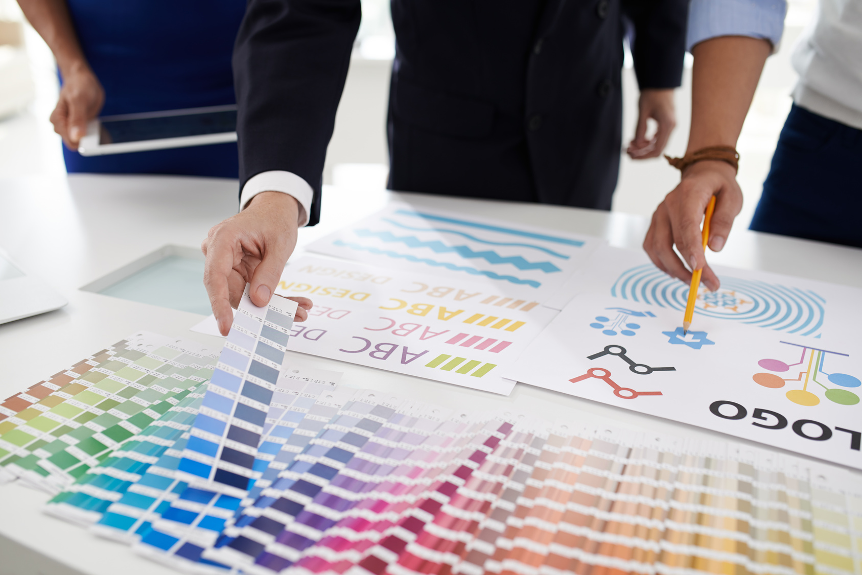
2. Be Deliberate In Color Choice
Color can be a huge help in making your logo pop — it can also make your logo difficult to read and muddle your brand message.
While not every business has to go for minimalist black-and-white, you do need to make sure that your color choices are in line with your brand.
To that end, don’t be afraid of including negative white space. It keeps your design from looking too jumbled, and it makes the bold colors you do include stand out even more.
3. Try Word Association
Sometimes, it can be tough to identify the cliches you should avoid. To figure out which ideas are actually unique and which ones have been done to death, try word association.
For example, if you’re a salon, things like a hair dryer, shampoo bottles, and scissors take you about 2 seconds to come up with. Chances are, they’ve already been over-used.
4. Don’t Fear Simplicity
Whether you’re an established brand or just starting out, there’s nothing wrong with keeping your design simple.
Remember that a simple design stands behind the integrity of a brand. Sometimes, you don’t need all the bells and whistles — your reputation speaks for itself.
5. Keep It Actionable
When making your business logo, you want to create a design that shows action. For example, Twitter’s logo shows a bird in flight.
If you’re a clothing boutique, show a customer trying on clothes and looking in the mirror. Avoid images like clothes folded in stacks or hanging on racks.
You’re Ready To Create A Memorable Business Logo
There are lots of things that go into making your business run smoothly. Integrated CRM, sales pitches, expense reports, marketing strategies….the list goes on.
But without an eye-catching, memorable, and unique business logo, you won’t be able to get customers in the door.
Now that you know what it takes to create an iconic logo, it’s time to get started on bringing your design to life. Use our free online logo maker tool to test out your ideas.
For more advice on logo marketing and creation, make an account with us today.
5 Tips for Creating a Memorable E-Cig Logo Design
Posted on June 06, 2017 by Logo Design Tips and Tricks
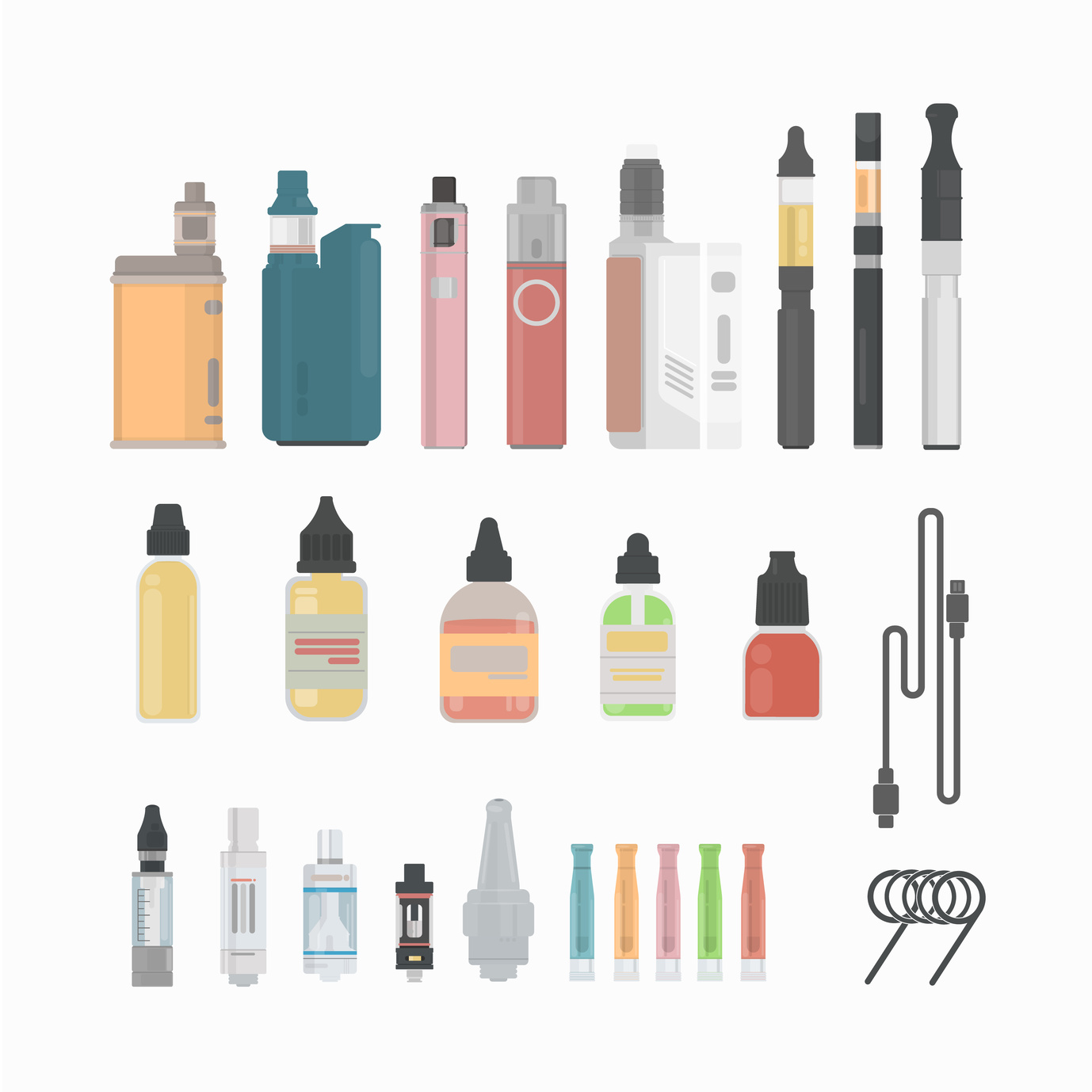
They’ve been around since the 1960’s but E-Cigarettes have only recently taken the world by storm.
With over 500 brands out there and more than $7 billion in global sales, it seems like everyone is vaping. Most are using E-Cigarettes as an alternative to tobacco, while others simply enjoy the scent and taste.
How can you make sure your E-Cigarette brand stands out among the 500 others out there?
A well-crafted E-Cig logo design can help persuade a customer to pick your product over another.
But how do you craft a memorable E-Cig logo design? One that people will recognize and patronize each time they make a purchase.
Here are 5 tips for creating the best logo design possible for your E-Cigarette products.
1. Represent the Brand
When choosing your E-Cig logo design, it’s important to remember that your logo is a representation of your brand.
When people see it, you want them to instantly think of your company and the experience they’ve had with it – exceptional service, high-quality and reasonably priced, or whatever personal connection they’ve made.
Take Coca-Cola for example. The infamous red and white label is simple, yet memorable. The font is unique and appealing. No picture needed.
We can all imagine the adorable polar bears sliding down the snowy hill in one of Coca Cola’s Christmas commercials. Or the iconic glass soda bottle, dripping with ice while being lifted out of a cooler. Reminds you of summer and satisfaction.
So many feelings and memories can be incited by a simple logo. When designing yours, be like Coca-Cola and keep it classic.
2. Use the Right Colors
Colors do more than just bring your logo to life visually. Each color does a special job. Some express trustworthiness, others elicit thoughts of nature and some represent dependability.
Once you decide the type of message you want to convey with your E-Cigarette logo, you can begin the logo design process. This will start with choosing the colors that best suit your needs.
3. Less is More
Your E-Cig logo doesn’t need to be lavish to be memorable or effective. Sometimes, less in more in terms of appeal.
One thing to consider when making your logo is whether it will be typographic (text only), illustrative (a logo that represents what your brand sells – for instance, an enlarged E-Cigarette or THC e-liquid) or abstract graphic (a symbolic picture).
You can even use empty space to your advantage. Take the FedEx logo for example. The empty space between the letter ‘E’ and the letter ‘X’ creates the shape of an arrow.
This symbolizes speed and efficiency. And it was achieved using empty space.
4. Size Up the Competition
To create an E-Cig logo design that gets noticed it needs to stand out from the competition. The best way to size-up your competitor is to evaluate them.
What’s working for your competitor? What features would you like to mirror in your brand logo? What don’t you like about it?
Ask these questions and use the answers to help motivate your design. Just don’t steal your competitor’s ideas! No one likes a copy cat and your audience will notice.
5. Be Flexible
“If at first, you don’t succeed, try, try again!” “Practice makes perfect.”
All those catchy phrases that make you want to gag? Well, they’re true when discussing logo design.
Try not to become so fixated on one idea, that you rule out alternative options. Sometimes slightly changing things around, as far as letter size and font choice, the position of things, or colors (see above), can make or break the success of your logo.
Try not to have tunnel vision and “roll with the punches” (there’s another one of those darn phrases!).
Designing your own logo is now easier than ever before! With free logo makers that you can use right from your home computer, you can draft and edit your logos before showcasing them for the world to see.
So, what are you waiting for? Let’s get designing!
Top 5 Creative Ideas for Veterinary Logos
Posted on June 06, 2017 by Logo Design Tips and Tricks
With over 100,000 veterinarians currently practicing in the United States, you need to do everything you can to set yours apart.
One of the best ways to make that happen? By either creating or redesigning veterinary logos for your practice.
Logos will help to build your brand recognition, connect you with new customers, and let pet owners know the kinds of services you can provide for their four-legged friends.
Still, we know it can be a challenge to come up with unique ideas for veterinary logos.
We’re here to help!
In this post, we’re sharing our top 5 favorite logo ideas for your veterinary practice.
1. Consider the Prints
Sure, lots of logos have paw prints in their design. But usually, those prints are only of a dog’s or a cat’s paw.
What if you combined a variety of paw prints from different animals in your logo design? Think rabbits, birds (more like “claw prints”) and even horse hooves! It’s a great way to stand out and to let people know the kinds of animals you treat.
2. Go Bold
Lots of veterinary clinics have logos that are in darker, somber colors. While it’s true that often, a trip to the vet isn’t tons of fun for animals, bright colors are more optimistic.
“Happy colors” will also help to cheer owners who may be concerned about the health of their pets.
Plus, bright colors are eye-catching, and tell potential clients that your practice is different.
3. Include the Owners
Lots of veterinary and pet store logos focus on the animals themselves. Few give credit to their owners!
Your logo could feature an owner walking their pet on a leash, carrying it in their arms, or even asking it to perform a trick!
4. Feature Different Animals
Lots of veterinary clinics have cats and dogs in their logos. Yours should indicate that you cater to lots of different pets!
For each letter in your clinic’s name, feature a different animal clinging onto a letter. We think a “U” could make a perfect parrot perch!
5. Create a Mascot
If you have a pet of your own, why not include them on your logo? You can create a lifelike pencil drawing or simply use a photograph of your pet.
This design is a great idea for smaller or family practices, as it shows that the focus is on individual care. As an added bonus, bring your pet to your practice when you can.
An in-person (or in-paw!) appearance will help to build your brand recognition even further.
Create Veterinary Logos That Make Your Practice Stand Out
Whether your provide laser therapy for dogs, spay/neuter services for cats, or even take care of more exotic animals, your logo should help you to let potential pet parents know what you do.
Now that you’ve got your creative juices flowing, it’s time to create your logo.
That’s where we come in.
Spend some time on our website and contact us with any questions. Also, be sure to try out our awesome online logo maker tool to see your ideas come to life before your eyes!
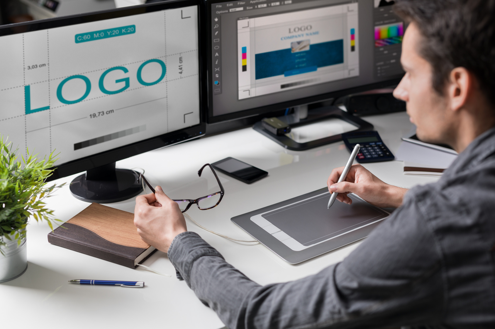
Make Your Own Logo with These Design Tips
Posted on June 02, 2017 by Logo Design Tips and Tricks
Starting a business?
Need an amazing logo to build your brand?
If you’re in the early stages of your business and don’t have the money to hire a professional graphic designer to create your logo, don’t worry. It is possible to make your own logo by following a few basic logo design principles.
Below we’ll go over the best design tips for building an excellent logo that will speak volumes about your business.
Avoid Cliche
When it comes time to make your own logo, it can be easy to start using unoriginal design styles and cliches.
Many designers rely too heavily on trendy and overused aesthetics and styles. Although some of these look great, it is best to go for a logo design that is unique and perfectly fits you and your brand.
Be careful of using cliche design choices. If you’ve seen many other businesses do something before, it may be a good idea to go in a different direction.
Color is Crucial
One of the most important things to consider when you decide to make your own logo are your color choices.
Picking the perfect color scheme can really make or break your logo design. You want a logo that stands out, and colors are one of the most important ways of achieving this.
The right colors can bring life into your logo design, pull people in, and make it much more memorable.
Choose the Right Font
Don’t underestimate the value that the right typography can provide your logo. When it comes to crafting an excellent logo, using the right font or even getting a custom type is one way to make a design that really shines.
Many great logo designs have even been made with text alone, and remain intensely memorable with unique lettering alone. Coca-Cola is a great example of a logo that stands out from the letters alone.
A product doesn’t have to have a particular image or illustration to stand out and be memorable. In some cases, a great type is enough.
Make Use of Double Meanings
A visual logo with a double meaning, or a double entendre, can be a great way to create a striking concept that can be perfect for your business.
The doubling of two images which function as two sides of the same coin can be a great way to show the meaning and purpose of your business while also sticking out in your customer’s minds.
Memorability is one of the prime goals of creating a logo and if the design deeply connects with your business’ purpose in some way, then that’s even better.
Don’t Forget the Overall Brand
While it can be easy to get caught up in trying to create clever images when you make your own logo, it can also be easy to go too far. You need to keep yourself in check. While a logo of a cute puppy may work fine for a pet grooming business, it may or may not be the best choice for a soda brand or a car manufacturer.
Even if you are being really creative and making great images, it is best to always check to see if your logo aligns well enough with the mission of your brand.
Active vs. Passive
Consider whether the images in your logo are active or passive. If your logo features an animal or another object, consider whether it is best shown in motion or in a passive state.
Twitter for example launched with the image of a perched bird. Later, the logo evolved into an image of the little blue bird in flight instead.
An active image may be the perfect choice to grab that extra bit of interest from viewers and create a captivating logo design.
Utilize Negative Space
When you make your own logo it is important to pay attention to the design that you’re crafting and each image that you are using. One often overlooked area of a logo design, however, is negative space.
Negative space can be an excellent way to create a unique logo and add more interest to a design.
You can form an extra shape or image in the midst of your logo’s letters, for example. Negative space can also be a great way to add a double entendre to your logo, as mentioned above.
Keep it Simple
All of this talk of creating a unique logo design may be a lot to take in, but just because it’s important that your logo is unique, it doesn’t mean that it needs to be overly complicated. If your logo has too much going on it can become cluttered and busy. It is best to have just one or two strong images that a viewer can grab on to.
Usually, just one or two main focal points is enough to create a striking and memorable image in a viewer’s mind.
Get A Second Opinion
After you complete your design, you may be a bit too close to it after those hours of blood, sweat, and tears. At this point, it can be useful to get a second opinion.
Ask your friends or family members what they think of the logo. Do any images or aspects of the logo stand out over others?
A fresh pair of eyes may be exactly what you need at this stage in your creation. It’s important to find out what people will glean from a look at your logo after only a momentary glance.
Stay Flexible When You Make Your Own Logo
Continuing from the last point, it is important to remain flexible during the design process. While you may have a great idea in your mind as soon as you sit down to make your own logo, it can be a mistake to become too attached to any one aspect of your design.
If a family member or friend views your logo, be sure to stay open minded and take their concerns into consideration.
Stay flexible and be ready to “kill your darlings.” Sometimes great ideas have to be removed to make room for the overall plan.
Use Online Tools
Don’t think that you have to be completely old school when you make your own logo.
An Online Logo Maker will come with amazing fonts and symbols that you can use to make an amazing logo. These tools are easy to learn and allow you to easily visualize what you are working on.
Although the end plan is to make a unique and memorable, templates and tools can be an excellent way to get started and form new ideas.
Don’t Be Too Literal
Depending on the name of your business, it can be tempting to literally express the name of your business in your logo design.
In some cases, it may be appropriate to add an animal or another object into your logo that isn’t explicitly related to the title of your business. In other cases, your title may already provide an imaginative description.
If you have a pet store called “Birds on a Log”, your logo doesn’t necessarily have to feature an image of birds on a log.
Shapes and Symmetry
Consider the use of shapes, geometry, and proportions when you make your own logo. Squares, triangles, ovals, and circles could all become a crucial part of an interesting logo.
Consider the amount of symmetry you use in your design. While in some cases it may be important to have a symmetrical design, it can also be useful to create an asymmetrical design as well.
Take the Apple logo for example. A bite taken out of one side of the apple adds interest and makes a seemingly normal object more unique.
Consider Grayscale
While color is an important element to consider in your design, it is also important that you make a logo that can translate well to a variety of different mediums. Will your logo be printed in black and white when on your company’s letterhead? Are there any instances where you will be using the logo in grayscale?
If so, be sure to create a logo that stands on its own even if the color is drained from it in some instances.
Size Matters
Similar to the last point, you also want to make sure that your logo can be just as powerful if used in different sizes.
You may design a logo that looks great while enlarged on the front page of your website, but can it stand the test of becoming a small icon in the URL bar? How does the logo look in your email signature?
If your logo can’t work well in a variety of sizes you may need to simplify or improve your design.
Final Thoughts
A logo can be one of the most important aspects of your business. It is critically important for helping people recognize who you are and what you stand for. Take your time. Work hard to make sure that the logo is right for you and is sending the right message about your business.
By keeping the above tips in mind when you make your own logo, you’ll be well on your way to creating the perfect design in no time.


