Make a Splash: 5 Elements to Consider for a Fluid Pool Logo
Posted on December 04, 2017 by Logo Design Tips and Tricks
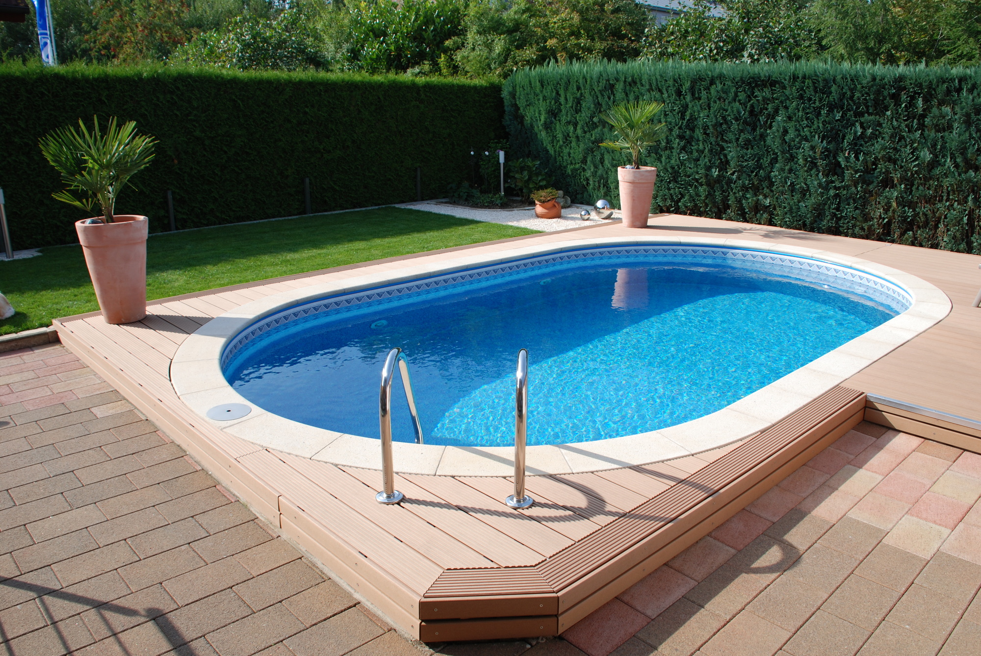
Want to design a pool logo that will catch every homeowner’s eye?
As a business owner, you’re always on the hunt for ways to attract more customers and to establish your brand image.
But before you get caught up in online marketing or promotions, it’s important to spend some time developing a professional logo. The right logo can send a clear and snappy message to consumers and establish your reputation–all in the blink of an eye!
When it comes to crafting the best pool logo, you’ll want to keep several elements in mind. Read on to learn more about what your logo should incorporate to make a splash in the pool market.
1. Choose the Right Message
Every logo is founded on a clear message, one that will stay with customers well past that first glance they give your logo.
The best message is one that reiterates what your company is all about and, as a result, will lead to a new customer relationship.
Before you plunge into crafting the ideal pool logo for your company, start by brainstorming what message you want to communicate to your existing and future customers. A great place to start is your company motto or even a statement of your vision as an organization.
If you install pools for a retiree community, you may want to emphasize an element of freedom and new horizons, for example. If you are a pool remodeling company like Ross Services for U, you’ll want to communicate ideas of renewal or change.
Sometimes it can be helpful to write down a list of keywords and to go from there. For example, your brainstorm list may have the words “facelift,” “comfort,” “sunny afternoons,” and “leisure” on it.
If you’re stumped, browse online for blogs about designing your ideal logo. There is a lot of advice out there when it comes to branding, and sometimes a quick Google search can help you ease that design block.
2. Don’t Forget the Water
Every pool logo has something to do with water. Don’t forget to integrate this element when you are designing your logo, and to match it with the message you want to share with your customers.
When coming up with ways to bring in the water element, try to think outside the box. You may want to do a Google image search of “water” to see what appears. Think also about the variety of forms that water can take, and what emotions we associate with forms of water.
For example, you’ve got water droplets, rain, waves, the ocean, pools and rivers, lakes, and puddles. Of course, each of these images is likely to communicate a different message and emotion to a viewer.
If you bring in an image of the ocean into your logo, you may invite in a sense of expansion and distance. The image of rain will naturally evoke a feeling of being drenched.
Play the matching game to choose which form of water matches the message you want to get across to viewers.
3. Assess Your Competition and Take It Up a Notch
A lot of companies deal with water, so you’ll want to pay attention to the logos of your competitors to make sure you aren’t taking their ideas. Beyond that, checking out the playing field will enable you to take it up a notch when designing your pool logo.
Analyze each logo and ask yourself what message it communicates. How effective is the image in communicating that message? Most importantly, how could you do it better?
In order to take it up a notch, you may want to go more abstract. Let’s say that your competitor has an image of a water droplet in their logo with a distinct color pattern.
This sounds great, but you could take that same water droplet and cut it in half. Or you could change it into a perfect sphere. Or you could transform that droplet into four quarters of a circle, recalling a window. See where we’re going with this?
Often times the most competitive logos are artful and unexpected. They aren’t obvious. Try to go this path when creating your clever pool logo.
4. The Simpler, The Better
No one has time to read a logo or sign that is crowded with information or isn’t straightforward. Keep your customer in mind when designing your logo and keep it simple.
Aim for a minimalist design that still has a clear message and an image. Make sure that this streamlined design can be easily replicated on business cards and outdoor signage.
Choose images that aren’t overly complicated or detailed–less really is more!
5. Bring in the Perfect Colors
If you are designing a pool logo, you’ll likely want to bring in some colors that remind the viewer of water–i.e., blue and white.
When choosing the perfect colors, however, try to avoid the standard blue and white your competitors might have in their logos. Explore different hues and variations of these colors, or bring out a striking contrast with a dark navy and a pale cerulean.
Go to a paint store and take samples of paint swatches if you have to. Choose colors that resonate with your message and image but also set you apart.
Things to Consider When Designing Your Pool Logo
You can make or break your brand image depending on which logo you choose to represent your company. Before you go about designing your pool logo, it’s important to think about some key elements.
Begin by choosing the right message you want to convey to customers with your logo. This could be a message about change if you are a pool remodeling company. It could be one of freedom or inspiration if you cater to new or retired homeowners looking to make a splash with a patio or pool addition.
Once you have your message, match the colors and the theme of your logo to this message. You’ll want to bring in the element of water no matter what, but in a way that carries your company’s message across.
Have experience designing your successful pool logo? Share your thoughts in the comments below!
10 Tips for Designing Healthy Food Logos
Posted on November 16, 2017 by Logo Design Tips and Tricks

Creating a brand is all about representing who you are and what you do. It is your products as well as your purpose.
Particularly for a healthy recipe blog, it means more than having a passion for good food. Your brand is a commitment to offering quality advice on many healthy food topics.
As such, building your brand is no easy task.
Thankfully, there is one part of branding that is more fun than others – logo design.
A logo is like a ribbon wrapped around your brand. It makes the first impression and is the most recognizable part of your business.
There are many healthy food logos out there, but making a design stand out is not as hard as it seems.
Here are ten tips to making a beautiful logo for your healthy food blog.
1. Check Out the Competition
The best place to start your creative process is to get the inspiration flowing.
Check out leading recipe blogs that influence you. Better yet, look at the ones you are trying to compete with. See how they’ve branded their wording, typeface, and, of course, their logo.
The logo should be easy to identify on their page. It may stand alone or have a company phrase attached to it. Popular healthy food logos will likely have some sort of common trend.
Maybe they all have a certain shape or hint at cooking in the logo. Or, they might be simple and straightforward to the brand name.
2. Brainstorm, Brainstorm, Brainstorm
Once you have an idea of what is already working in the market, it’s time to make a logo that can handle the competition.
The first thing to do is to get all your ideas out. Make quick sketches of what comes to mind when you think of your brand. Don’t worry about making it look great yet, just get what’s in your head on paper.
From here, start to weed out the good design ideas from the bad.
Try to narrow them down to one or two healthy food logos to work on. It’s better to focus on a few quality sketches than to try to take many of them through the design funnel.
3. Think About Your Brand
If you’re having trouble picking a few logo ideas to work on, go back to your brand.
Ask yourself what will best represent your values and your writing style. Are you quirky and cool, or more calm and collected? Align your brand’s personality with the logo making process and you can’t go wrong.
For more help making a decision, put your ideas on sticky notes. Place them on a wall and start taking down the ones that you don’t think will work with your brand.
After a few minutes, you should have a much better idea of where to take your design direction.
4. Play with Shapes
The next step is to take your thoughts from paper to program. This will help your ideas for healthy food logos come to life.
As you’re getting the basic ideas on to your logo maker, start to play with shapes. Shapes carry big weight when it comes to logo design.
A circle represents strong emotional influences, like fostering community or appealing to a feminine market. The straight edges of squares and triangles hint to stability and practicality. Triangles are also associated with power and masculinity.
5. Consider Using Letters
Lines and curves don’t just affect shape psychology. They influence how typography stirs emotions in your audience.
Cursive is a cute tactic to use for women interested in health food. Men, on the other hand, appreciate bold lettering. If you want to stay gender neutral, try an angular typeface with subtle curves.
Think of the emotions you want your readers to associate with your blog.
Create a persona for them beyond the fact they want to eat healthily. This will help you picture the people you want to reach.
6. Plan for Scale
The shapes and letters you use should start to bring your logo together. These create a foundation for something meant to stand out.
Remember, your logo will be on everything you write, no matter if it’s on your blog or in an email campaign. As you use it across different mediums, you will be playing with different sizes.
Make sure your logo looks good in the corner of a social media picture and at the top of your landing page.
Plan for a logo that lasts beyond your blog. What if it ends up on a billboard one day or among other healthy food logos in a magazine?
7. Choose Your Colors
As you think about the different uses for your logo, consider how your brand colors will work with what you’ve created.
The best logos begin in black and white.
Working without color allows you to focus on the structure and feel of the logo. It also gives you an idea of how iconic a logo can be. The more recognizable and unique a logo is without color, the stronger your design is.
When you have the structure down, then play with a little bit of color to tie it all together.
8. Ask if it Can Adapt
Before you click “save” on your new healthy food logo, ask if it translates well across different mediums.
Remember, you want it to last as your business grows. Say your blog takes off and becomes a health food store or restaurant. What if you decide to write a book of recipes?
Don’t make your logo specific to just one part of what could eventually be a big business. Your logo should be timeless and adaptable.
Aim for something you can use to talk about complex culinary creations as well as simple ice cream dishes – like the one available when you click here.
9. Know the Difference Between a Logo and a Header
Don’t expect your logo to do everything. A healthy food blog has a stand-out, stylish header and a powerful logo.
A header gives you more room to play with colors, textures, and typography. There should be some similarities between these design features and those in your logo. But, you can’t just slap your logo at the top of a page and call it a day.
Take on the logo first, then design the header based off what you create. This ensures you have strong brand consistency, yet unique elements to excite readers on your blog.
10. Don’t Try Too Hard
The most important thing to do in the design process is to have fun!
Don’t pin the success of your blog on your logo. Although it is an important element of your brand, it is not worth stressing over.
Try your hand at making your own logo and see how it feels. Is this something you can commit to and move forward with? If so, you’re on the right path.
Trust your design instincts and have some close friends provide feedback. Then, write about your re-branding and get users excited to see your new healthy food logo.
Be Among the Best Healthy Food Logos
Designing a strong logo is a creative adventure.
It is not the intimidating, stressful process some think it is. All you need is a bit of inspiration, some time to design, and the right tutorials to get started.
From there, the rest is up to you and the program you use to create something beautiful.
What are you waiting for? Your logo design idea is waiting to make its debut.
Get to work and create the logo your healthy food brand needs.
How to Design a Creative Logo That Attracts Creative Customers
Posted on November 13, 2017 by Logo Design Tips and Tricks
Ninety percent of data transmitted to the human brain is visual content.
This is why designing a top-notch logo could very well be the most important thing you do for your brand.
A well-crafted logo should be memorable without hitting you over the head with its message.
This is simple in concept, but much less easy to execute than one might think.
Creating an effective logo requires a combination of artistic instincts and marketing know-how, plus a whole lot of hard work.
Here, we’ll provide you with a step-by-step guide on how you can design a creative logo to make your brand stand out from the competition.
First, let’s look at some of the basics about choosing a logo.
What a Creative Logo Should Be
Simple
Simple is always better when it comes to logo design. An intricate logo can be confusing and runs the risk of conveying a different message than intended. Give your customers something easy to recall.
Goodman Creatives has a great example of this.
Timeless
Avoid using trendy fonts and pop culture images in your logo design. It’s perfectly fine to touch up your logo every few years, but the main image should remain consistent and relevant.
Unique
Among the sea of designs out there, your creative logo needs to stand out from the crowd. Don’t stress about choosing a logo that directly relates to your product or services.
Instead, go with something your customers are likely to remember.
How To Design One
The details will vary based on your individual needs, but the process for designing a logo remains pretty streamlined. Here’s what to do.
Research
Gather info about what your logo needs to set itself apart in your industry. This is the time to check out the competition and figure out what is and isn’t working elsewhere.
If you’re creating a logo for a client, get some background info on what they’re looking for. Know ahead of time if there are any must-haves for the design. That’ll save you potential headaches down the road.
If the design is for you, do some soul-searching. Figure out what you want to convey.
Your logo is the first opportunity you’ll have to make an impression on potential customers. Knowing what you want that impression to be will help make sure your message hits home.
Ask as many questions as possible before sitting down to conceptualize your design. You’ll create a clearer picture of what your end result should look like.
Brainstorm
In this stage of planning, there are no bad ideas. Get every word, image, or concept related to your logo out of your brain and onto a sheet of paper.
Some basic keyword research can point you down the right path if you hit a creative wall. Enter any word you can think of that’s related to your company or niche, and see what comes up.
Try doing a brain dump.
Write down absolutely everything you can think of that’s relevant to your logo. Get keywords, phrases, and ideas on paper and out of your head. You can lead yourself to the perfect creative logo without even realizing it.
Writing down words and ideas can organically lead to images. Feel free to sketch any visuals that stand out, but don’t stress over it.
This stage is about getting an accurate feel for the nuances of your brand’s mood.
Your logo needs to convey it.
Draft
This is the part where your ideas will begin to take shape.
There are four different styles of design you can choose from:
- Lettermark logos are based on the company’s initials, like a monogram (examples include HP, CNN, and McDonald’s)
- Wordmark logos incorporate an entire word into their logo (Google, Subway, or Disney)
- Mascot logos heavily include the brand’s mascot in its design (Frosted Flakes, Pillsbury, or Wendys)
- Pictorial marks are icons or images used as logos (Target, Apple, and Starbucks)
Try creating drafts in multiple styles to see what works. Even if you intended to start with one type of design, you’ll never know what will be the most impactful.
Start sketching in whatever medium feels most natural. If you’re more productive using a pen and paper instead of a whiteboard or graphic design software, pick up that pen. There’s no wrong way to start.
Create several different designs. Feel free to mix and match components that you particularly like about each one. Figure out what you like about each one, and assess what feels right for your brand.
When you’ve found a design you love, make sure to give a lot of consideration to the colors you’ll be using.
Psychology tells us that colors are directly linked to emotion, which is the strongest component of brand loyalty.
If you want to convey optimism or friendliness, go with yellow or orange. If trust or peace is your goal, blue or green should be featured.
Choosing the right colors can be an easy way to hack into the science behind brand perceptions.
Hold on to your drafts, even after you think you’ve settled on a logo. You might be able to use them in a future design or for another project entirely.
Take a Break
Put some space between yourself and your new design. We tend to miss details when we’ve been staring at them for too long. Give your eyes a break from your work.
When you come back to it with a fresh perspective, you’ll be able to better identify any potential issues.
Create Your Final Draft
The hard part of your creative logo design is done!
Add any finishing touches you came up with after taking a break from your work. Play with aspects like shadow, perspective, and depth until your design feels right.
Conclusion
Even without a background in professional graphic design, knowing what a great logo looks like can be enough to help you meet your goals. When you take the proper steps, you can create a face for your company that your customers will remember.
Don’t want to do it all yourself? Check out our website to see how we can help.
How Staffing Agencies Can Benefit From A Free Custom Logo
Posted on October 11, 2017 by Logo Design Tips and Tricks

When starting a new company or re-branding an existing one, your logo can mean the difference between catching someone’s attention or watching them pass you by. Staffing agencies have the added challenge of appealing to both job-seekers and employers, making an eye-catching logo a must.
But how do companies come up with an enticing logo? There are a few things to keep in mind as you brainstorm design options.
What Staffing Agencies Need to Know About Logo Design
A logo is often the first thing people notice about a brand. Take a look around and note of all of the items around you with prominent logos and labels.
From your laptop to your bottle of water, to your sneakers; all of these product brands can be easily identified according to their logo.
As a staffing agency, you want to be seen as approachable, reliable, and effective in finding the right candidate for a job. When designing a logo, think of these traits and how you can get them across visually.
If your agency’s name is evocative of an item, consider how you can incorporate that in your design. For example, think of Apple and their easily recognized logo.
Also, think about which colors best represent your company. If you want to highlight professionalism and trustworthiness, blue is your color. If you want to signify growth and learning, green will work well.
It all boils down to what you want people to think of when they see your logo.
Having a focus group to come up with words or phrases may help in determining what type of style, color, and imagery will help you accomplish your goals.
Need more inspiration? Take a look at the logo for Scope Recruiting, which incorporates geometric shapes in different shades of blue. The color blue makes them feel professional, while the different shades and shapes have a modern appeal to them.
How to Get Started with Logo Design
Thanks to free online web tools, custom logo design has become very user-friendly.
You can upload an image you’d like to incorporate, you can add text and adjust the size and fonts, add shapes, symbols, and more.
Again, you’ll want to do some basic brainstorming before getting started so you’ll have an idea of how you want the logo to look. Once you have that in mind, you can get started adding these features and see how they all come together.
And with free custom logos available, you won’t have to break the budget. No need to hire a professional designer or agency – you’re in control of the process from start to finish.
Reaping the Benefits of Your Logo
All businesses benefit from building a consistent brand image. Staffing agencies in particular need to work extra hard since individuals and companies are looking to them as experts in the field.
Having a well-thought-out logo will instill a greater sense of confidence that you have the skills and resources to get the job done.
In addition, as your agency builds a strong online presence and reputation, people will start to recognize your logo on its own. It also builds a foundation for a unified online presence, not only through your website but also through blogging and social media. Your logo can be used as a profile image across all networks.
To get started, check out this tutorial on how to build a free custom logo.


