Create a Logo and Avoid These Mistakes
Posted on June 08, 2017 by Logo Design Tips and Tricks

Want to have a stunning logo for your brand? Contrary to what you may have heard, there’s no need to spend a fortune on this service.
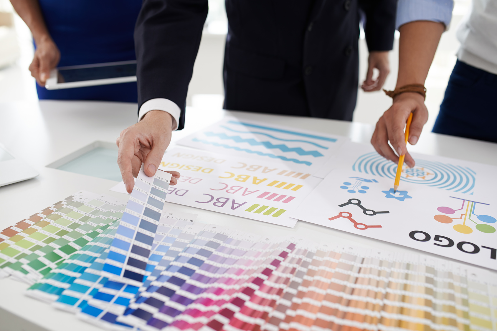
Actually, you can create a logo with just a few clicks. There are plenty of online tools that make it easy to design beautiful business logos. All you need is some creativity.
Logo design services can exceed $2,500. Most freelancers charge at least $800. If you hire a web design agency, expect to pay more.
Additionally, no one can guarantee that you’ll be happy with the final result. Some designers have huge potential, but limited experience. Others may not be familiar with your type of business and the message you’re trying to convey.
Web design agencies may refuse to make the changes required, or charge extra for these adjustments.
The best thing you can do is create a logo yourself. Online logo makers feature professional templates for any niche.
Eager to learn more? Let’s get into it!
Why Create a Logo Yourself?
The art of creating logos requires creativity and technical skills. After all, you want a logo that’s relevant, memorable, and scalable.
It should also convey the brand’s personality and gain immediate recognition. A good logo should give your clients a feeling of familiarity and trust. It needs to look professional and stand the test of time.
What if you lack the skills needed to create a logo?
You can always hire a web design agency, but the costs are high. This is where free logo makers come in handy. These tools enable users to create logos without the need for design skills.
All you need to do is choose a template, drag and drop items, and pick the right colors. It’s that simple!
With free logo software, you’ll save money and get things done in less time.
It’s no need to give phone calls or send dozens of emails to a design agency. Your new logo could be ready in minutes.
These online tools are perfect for business owners, bloggers, and online marketers. When used right, they can help increase brand awareness and visibility.
Before getting started, check out these common logo mistakes and how to avoid them:
No Research
Just because you have a certain logo in mind, it doesn’t mean it will work. The colors might not be right. Or the image might not reflect your brand.
The world’s most popular logos share a couple of similarities, so use them for inspiration. Take a quick look at Coca-Cola, Toyota, Dell, Samsung, and other well-known brands. What do they have in common?
- About 90 percent of these logos lack a by-line tag.
- 74 percent of them only use one color.
- Just 31 percent include the company’s initials in their design.
Most of these logos use the colors red and blue. According to experts, blue conveys trust. Red expresses strength and passion. Additionally, they use no more than three fonts. Using too many fonts can make a logo hard to remember.
Take the time to do some research before creating your logo. This way, you’ll avoid common mistakes and produce something that’s truly memorable.
Low Resolution
If you need a magnifying glass to read your logo, you’re doing it all wrong.
With a few exceptions, resolution-dependent raster graphics are a recipe for failure.
A good logo should include quality images, with no pixelation issues. Not to mention that it’s easier to edit vector graphics than raster graphics. Fortunately, most logo makers use simple images that are easy to read and understand.
When using vector graphics, it’s easier to edit and scale the logo at any size. The image will look better on mobile devices.
Relying on Color
Using too many colors for logo design may distract attention from the core message. That’s why the most popular logos use three colors or less.
Every color elicits a different emotional response.
Restaurants often use the color red in their logos because it stimulates appetite. Car manufacturers rely on this color to showcase their signature products.
Red also highlights images and text. In marketing, it drives customers to make buying decisions. For this reason, it’s widely used for Click Here and Buy Now buttons.
Yellow draws attention and evokes cheerful feelings. This color is also associated with food.
Health companies use the color green because it symbolizes hope and fertility.
Dark blue is a sign of professionalism and expertise. It’s a favorite choice for most corporations. Since it suppresses appetite, you should not use it for promoting foods and cookware.
Black is associated with prestige, authority, and elegance. This makes it a perfect choice for business and fashion logos.
White is typically used for promoting dairy foods, low-fat foods, and health products.
Toy manufacturers add the color orange to their logos because it’s playful and energetic.
Now that you know these things, pick one or two colors that best fit your brand. Create a logo that can be easily associated with your business.
Before adding color, design it in black and white. People should be able to recognize your logo even in grayscale.
Following Trends
Trends come and go, but your logo remains the same for years.
Don’t rely on the latest fads if you want to create a logo that lasts. Following trends is like printing the term of expiration on your work.
The best logos are timeless. They’re just as popular now as they were decades ago.
For example, extreme minimalism was the latest craze back in 2014. Now, it lost some of its appeal.
In 2017, designers used broken letters and cropping to make logos. The question is: are these trends going to last?
Think about big names like Sony, UPS, and IKEA. Their logos haven’t changed at all over the years. Yet, they still look fresh.
Another example is the BBC logo, which has remained the same since 1997.
Focus on your brand’s core values instead of slavishly following trends. Create a logo that clients will remember for years.
Poor Font Choice
World-famous brands use Times New Romans, Arial, and Helvetica for their logos. Just think about Microsoft and Honda.
Complex fonts are hard to remember and may overshadow your message. Choose one that’s legible, clear, and easy to the eye.
When you create a logo, consider your audience’s age and demographics. Use fonts that match the purpose and message of your brand.
Decide whether you want a traditional font, a bold font, or an elegant font. Select one that resonates with your business and targeted customers.
Copying Current Logos
Drawing inspiration from the most iconic brand logos can increase your success. But it’s an excuse to copy them.
First of all, you run the risk of violating copyright and trademark laws. Secondly, it can hurt your credibility.
You must create a logo that’s unique and original. It should not look too much like your competitors.
Select fonts, shapes, and colors that set your brand apart. This will help your clients easily identify your business and its values.
A logo that lacks originality will confuse your customers.
Get creative and play with colors. Experiment with different icons and create your own fonts.
Using an Overly-Complex Design
You probably have lots of different ideas for a new logo, which is great. However, you don’t have to use all of them!
An overly-complicated logo will be difficult to remember and lose its meaning. Additionally, it may increase printing costs.
Embossing looks good on the page, but it’s difficult to reproduce on different materials. Complex graphic elements can turn a work of art into a visual nightmare.
One of the best ways to make your logo memorable is to keep things simple.
For instance, big brands like GAP, Apple, and Nike have a simple logo that anyone can recognize. The font style is clean, and the background is solid.
Choose a simple picture and upload it to the logo maker. Remember that more is less.
Typographic Issues
Surprisingly, even the best designers make typography mistakes. For example, Curlz and Vijaya fonts have no place in a professional logo.
Predictable typefaces, excessive spacing, and super-heavy fonts are not the best choice. Also, it’s not unusual to see misspelled words in a logo.
These silly mistakes can hurt your business and make you look like an amateur. To avoid them, run the text spellchecker before finalizing your logo.
Using Acronyms to Create a Logo
Unless you have a popular brand, refrain from using acronyms. Customers might not be able to remember them and understand their meaning.
Also, there might be other brands that use the same acronymic as you do.
Eventually, you can shorten your business name. Just make sure it’s recognizable and easy to memorize.
Another strategy you can use is incorporating the company’s name with an acronym logo. This will make it stand out from the competition and strengthen your brand.
As you see, it’s not that hard to create a logo. Avoid the most common mistakes and keep things simple.
For a quick boost of inspiration, check out these expert logo design tips!
5 Ways to Find Vape Logo Design Inspiration
Posted on June 08, 2017 by Logo Design Tips and Tricks
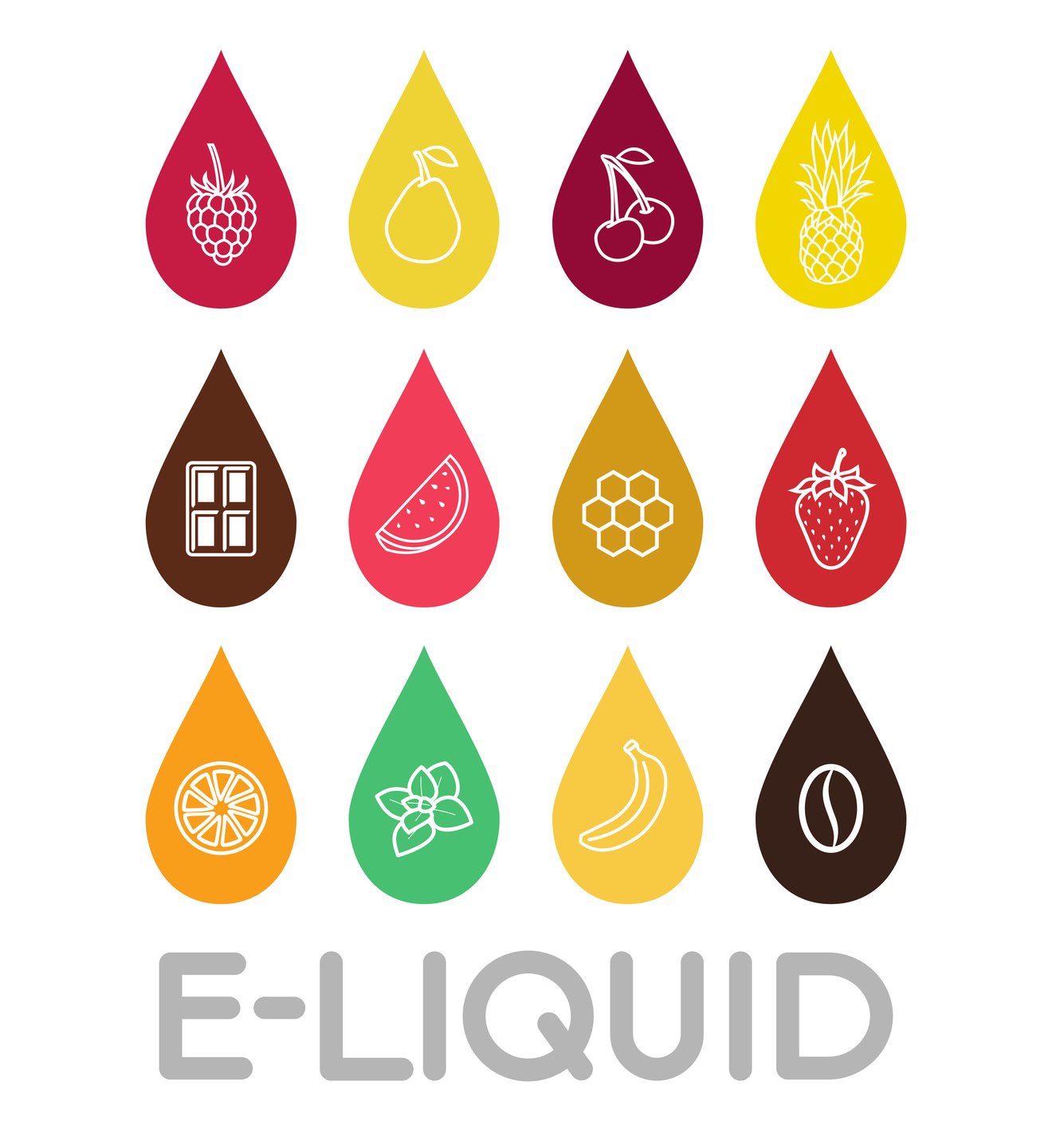
Today, vaping is quickly becoming more popular than cigarettes.
From sampling smooth new vape juice flavors to blowing huge smoke rings, there’s lots to love about vaping.
However, if you own a vape or smoke shop, you know that you have more competition now than ever before. You need to create a unique and eye-catching vape logo design for your business.
Need some help?
Check out the 5 best inspirational ideas to get your creative juices flowing for your vape logo design!
1. Use The Pen
The vape pen is the start of all e-cig experiences. Why not incorporate that into your logo?
We love the idea of creating a play on words by having your vape “pen” write your logo’s text. To make sure you stand out, consider creating your own font.
2. Keep Your Design Active
When you’re creating a logo, it’s especially important that any images you use show an “action.” For example, consider how Twitter’s iconic bird is shown in-flight, not sitting on a branch.
So, when creating your design, it’s a great idea to use an image that shows someone blowing clouds of smoke, buying vape juice flavors, or even enjoying vaping with friends.
Just showing some products on a shelf or a vape pen on its own isn’t enough to get potential customers to see themselves using your products.
There’s so much to do in the vaping world. Your design should help your market want to get in on the action!
3. Create A World
We love the idea of using the vape pen and the clouds of smoke to create an entire cityscape!
The pens can be skyscrapers, the smoke rings can serve as clouds, and you can “populate” your logo city with drawings of people vaping and walking through the streets.
4. Use Multiple Colors
We know that minimalist and black-and-white logos are all the rage now (more on why breaking from the mold is a good thing in a minute.)
But using bright colors that are relevant to vaping, like oranges, silvers, and blues aren’t just eye-catching.
They’re also a play on the colors those that vapers see every day! Silver vape pens, blue tips of e-cigs, and orange to replace the flames of cigarettes!
5. Don’t Get Trapped By Trends
Of course, you also need to know what you should avoid when it comes to creating your logo. Your e-cigs and juices are better, and your shop is a special place.
But if your logo looks like everyone else’s, potential customers will never know it. Plus, going the cliche route means that you’ll really only be marketing to a small portion of the population.
Avoid standard “hipster” images like arrows, mustaches, anchors, flags, and typewriter fonts.
Use These Awesome Vape Logo Design Ideas
Thanks to this post, you’re ready to create an incredible vape logo design for your vape shop that will build brand recognition, get you more customers, and set you apart from the competition.
Need more inspiration? Want help making your designs a reality? Be sure to use our epic online logo maker tool to see your ideas come to life before your eyes!
5 Characteristics of a Memorable Business Logo
Posted on June 07, 2017 by Logo Design Tips and Tricks
Think of the most memorable company logo designs.
We’re willing to bet that most of you will name the same iconic brands. We know you want to create a business logo that stands the best of time — and stands out from the competition.
But if you want your logo to be as impactful as the biggest brands out there, you can’t do what everyone else is doing.
You have to be willing to be a little bit of a black sheep.
You also have to be willing to listen to professional advice.
To get started, let’s go over 5 of the most important things you need to do if you want to create a logo your customers — and your target market in general — will never forget.
1. Typography Is King
Your logo gives you a limited amount of space to explain as much about your brand as possible.
You need to take advantage of every avenue you have. That starts with the font you use. For example, if you’re a natural foods company, it wouldn’t really make sense for you to use a bold, capitalized, and aggressive font.
It also wouldn’t make sense for a law firm to use a loopy pink script.
Make sure the font you use is consistent with the overall message of your brand.
2. Be Deliberate In Color Choice
Color can be a huge help in making your logo pop — it can also make your logo difficult to read and muddle your brand message.
While not every business has to go for minimalist black-and-white, you do need to make sure that your color choices are in line with your brand.
To that end, don’t be afraid of including negative white space. It keeps your design from looking too jumbled, and it makes the bold colors you do include stand out even more.
3. Try Word Association
Sometimes, it can be tough to identify the cliches you should avoid. To figure out which ideas are actually unique and which ones have been done to death, try word association.
For example, if you’re a salon, things like a hair dryer, shampoo bottles, and scissors take you about 2 seconds to come up with. Chances are, they’ve already been over-used.
4. Don’t Fear Simplicity
Whether you’re an established brand or just starting out, there’s nothing wrong with keeping your design simple.
Remember that a simple design stands behind the integrity of a brand. Sometimes, you don’t need all the bells and whistles — your reputation speaks for itself.
5. Keep It Actionable
When making your business logo, you want to create a design that shows action. For example, Twitter’s logo shows a bird in flight.
If you’re a clothing boutique, show a customer trying on clothes and looking in the mirror. Avoid images like clothes folded in stacks or hanging on racks.
You’re Ready To Create A Memorable Business Logo
There are lots of things that go into making your business run smoothly. Integrated CRM, sales pitches, expense reports, marketing strategies….the list goes on.
But without an eye-catching, memorable, and unique business logo, you won’t be able to get customers in the door.
Now that you know what it takes to create an iconic logo, it’s time to get started on bringing your design to life. Use our free online logo maker tool to test out your ideas.
For more advice on logo marketing and creation, make an account with us today.
5 Tips for Creating a Memorable E-Cig Logo Design
Posted on June 06, 2017 by Logo Design Tips and Tricks
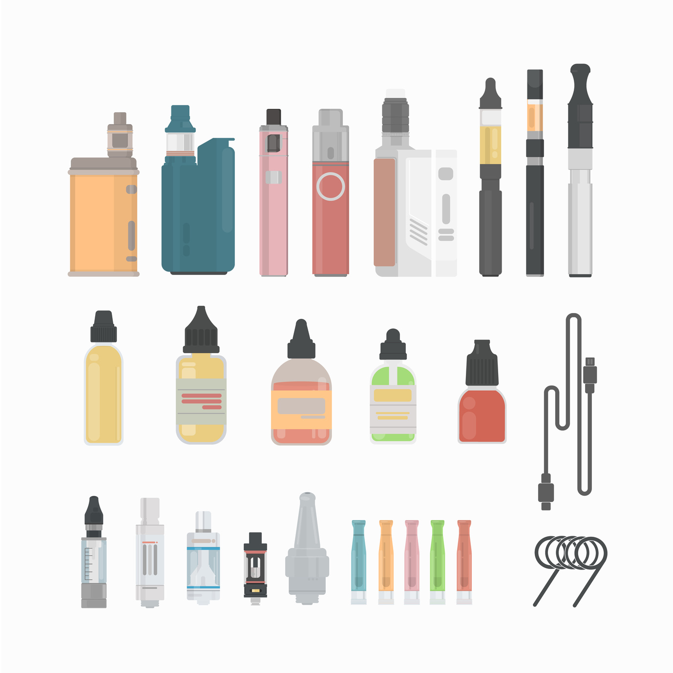
They’ve been around since the 1960’s but E-Cigarettes have only recently taken the world by storm.
With over 500 brands out there and more than $7 billion in global sales, it seems like everyone is vaping. Most are using E-Cigarettes as an alternative to tobacco, while others simply enjoy the scent and taste.
How can you make sure your E-Cigarette brand stands out among the 500 others out there?
A well-crafted E-Cig logo design can help persuade a customer to pick your product over another.
But how do you craft a memorable E-Cig logo design? One that people will recognize and patronize each time they make a purchase.
Here are 5 tips for creating the best logo design possible for your E-Cigarette products.
1. Represent the Brand
When choosing your E-Cig logo design, it’s important to remember that your logo is a representation of your brand.
When people see it, you want them to instantly think of your company and the experience they’ve had with it – exceptional service, high-quality and reasonably priced, or whatever personal connection they’ve made.
Take Coca-Cola for example. The infamous red and white label is simple, yet memorable. The font is unique and appealing. No picture needed.
We can all imagine the adorable polar bears sliding down the snowy hill in one of Coca Cola’s Christmas commercials. Or the iconic glass soda bottle, dripping with ice while being lifted out of a cooler. Reminds you of summer and satisfaction.
So many feelings and memories can be incited by a simple logo. When designing yours, be like Coca-Cola and keep it classic.
2. Use the Right Colors
Colors do more than just bring your logo to life visually. Each color does a special job. Some express trustworthiness, others elicit thoughts of nature and some represent dependability.
Once you decide the type of message you want to convey with your E-Cigarette logo, you can begin the logo design process. This will start with choosing the colors that best suit your needs.
3. Less is More
Your E-Cig logo doesn’t need to be lavish to be memorable or effective. Sometimes, less in more in terms of appeal.
One thing to consider when making your logo is whether it will be typographic (text only), illustrative (a logo that represents what your brand sells – for instance, an enlarged E-Cigarette or THC e-liquid) or abstract graphic (a symbolic picture).
You can even use empty space to your advantage. Take the FedEx logo for example. The empty space between the letter ‘E’ and the letter ‘X’ creates the shape of an arrow.
This symbolizes speed and efficiency. And it was achieved using empty space.
4. Size Up the Competition
To create an E-Cig logo design that gets noticed it needs to stand out from the competition. The best way to size-up your competitor is to evaluate them.
What’s working for your competitor? What features would you like to mirror in your brand logo? What don’t you like about it?
Ask these questions and use the answers to help motivate your design. Just don’t steal your competitor’s ideas! No one likes a copy cat and your audience will notice.
5. Be Flexible
“If at first, you don’t succeed, try, try again!” “Practice makes perfect.”
All those catchy phrases that make you want to gag? Well, they’re true when discussing logo design.
Try not to become so fixated on one idea, that you rule out alternative options. Sometimes slightly changing things around, as far as letter size and font choice, the position of things, or colors (see above), can make or break the success of your logo.
Try not to have tunnel vision and “roll with the punches” (there’s another one of those darn phrases!).
Designing your own logo is now easier than ever before! With free logo makers that you can use right from your home computer, you can draft and edit your logos before showcasing them for the world to see.
So, what are you waiting for? Let’s get designing!


