Brand New: Your Guide to Starting a Brand from Scratch
Posted on January 25, 2019 by Logo Design Tips and Tricks

Are you setting up a new business?
Every new business begins with creating a brand.
This brand acts as the overall personality of your business and allows you to stand out in the market. The brand in which your company creates is the way that your audience will perceive you.
Are you a modern and cutting-edge business that relates to millennials? Or do you opt for a classic, straightforward design that identifies with a more senior audience?
Without establishing a solid, consistent brand for your business, your target audience is far less likely to identify and interact with your brand.
If you’re starting a new business, you’re going to want to ensure that you read this. We’re outlining a guide fit with five essential tips for starting a brand from scratch.
1. Identify Your Target Market
First things first, you’re going to want to target exactly who you are looking to market your product toward.
Ask yourself who you want to sell your product, idea or service to. In asking yourself this, be sure to consider age, gender, socioeconomic status and even the location of this audience.
Without a thorough understanding of who exactly your audience is, your brand will fail to connect with them. And, without a solid connection, your audience is less likely to interact with your business.
This audience is the basic platform for who you will build your brand upon.
2. Create a Logo
Next, you’re going to want to create a logo to represent your brand.
Whether you’re a small business or a large, multi-faceted business, creating an effective logo is one of the most important steps in establishing your brand.
Think of your logo as the face of your brand. After all, your logo is often the first taste of the brand that your clientele is able to see.
Taking this into consideration, you will want to ensure that your logo is attractive and appealing to your target audience.
If you have identified your target market as millennials, opt for a brand that is unique and cutting edge. This automatically sends a message to your audience that your brand is not only current, but also unique in comparison to the other established brands.
Fortunately, there are online services that allow you to create a logo in a way that is simple yet still professional.
3. Understand Your Competitors
In creating your brand, it’s essential to understand who your competitors are and what their brand is.
Evaluate your competitors brand and determine ways in which you’d like your brand to differ. Ask yourself how your competitor’s brand is falling short and how you can prevent that in your own brand.
It’s also important to note that you will likely share a target audience. That being said, study how they interact with their audience and establish the areas that need work. If you’re going to interact with the same audience, you need to ensure that your brand is offering them someone that no other brand is.
In order to best stand out from the competition, you first need to understand exactly how your competition operates.
4. Choose Your Brand Personality
When it comes to the personality of your brand, it’s helpful to humanize your brand. In doing so, think of your brand as a human and what you’d like their personality to be like.
You can begin by asking yourself what sort of human characteristics you would like your brand to possess. So, what is the overall character and nature of your brand?
For example, a comedic brand that is looking to sell online merchandise may look to have a brand personality that is pessimistic and sarcastic. On the other hand, a financial brand that provides online financial services may look to have a brand that is friendly and honest.
Remember, in order to resonate with your target audience, you must possess similar values and characteristics. In fact, 64 percent of consumers report that having a shared set of values with their brand is what allows them to have a trusted relationship with that brand.
It’s also important to determine how you expect your brand to identify with your audience. Ask yourself these questions:
- How do you want your brand to make your audience feel?
- Do you want your brand to make your audience laugh?
- Do you want your brand to resonate emotionally with your audience?
Determining the personality of your brand will determine which sort of people choose to interact with your business.
5. Hire Professionals
Sure, hiring professionals may appear to be a costly investment at first.
However, it’s important to think of this as a serious and worthwhile investment in your business.
In creating a successful brand, there are multiple hats that need to be worn. And, for entrepreneurs, it’s important to acknowledge the limitations of your expertise. While you may excel in establishing creative solutions, you may need help in the graphic design or marketing departments.
You may consider hiring multiple in-house departments or, instead, choose to outsource these projects. Today, there are countless freelancers that are searching for work in multiple departments.
The Essential Guide to Starting a Brand
If you’re considering starting a business, it’s important to begin by creating a brand.
Your brand is the face of your business and sets a precedent for what your audience can expect from your business.
But, starting a brand that is effective and resonates with your audience is not always easy. In fact, only six out of ten marketers believe that their brand aligns well with their overall business plan.
Fortunately, there are steps any business can take to create an effective brand from the start. From identifying your target market and creating a logo to fabricating a brand personality and enlisting the help of professionals, these tips are sure to keep your business on the right path.
For more tips on brands, logos, and design, be sure to visit our blog!
Smart Signage Design Ideas to Get Customers in Your Front Door
Posted on January 10, 2019 by Logo Design Tips and Tricks
If you want to boost business for your company or shop, you’ll have to get creative. Thankfully, it’s not as difficult as it sounds.
All you need to do is brainstorm some stellar sign design ideas with your team. Signage is an easy way to attract customers and get your brand out there.
Are you curious to learn more? Keep reading for some awesome tips about signage design that will get customers in your front door and skyrocket your sales. Let’s get started!
Solidify Your Logo First
Small business signs will get your business noticed, even if you’re just starting out. But to create effective signage, you’ll need a stellar logo first. After all, your logo is the most recognizable part of your branding.
If your company already has a logo, make sure you’re happy with it before you create new signage. If you’re starting from scratch, check out our blog for info about creating the perfect logo for any business.
Choose an Attractive Color
Color is an important part of marketing psychology. So, when your team is coming up with business sign ideas, consider which colors best reflect what you’re trying to communicate.
Whether you’re creating the main sign for your business, or a sign to advertise a sale or promotion with both words and images, the colors you choose will affect how effective it is.
Use Signs to Increase Visibility
Is your business hard to find? Use signs to increase your visibility and decrease customer frustration. Placing clear signs around your area that point people in the right direction will help.
Focus on Contrast in Your Signage Design
If your indoor or outdoor signage design is too busy and complicated, it won’t attract anyone’s eye as they walk or drive by. Make sure the colors you use contrast each other in a clear and simple way. Sticking to two or three colors is a great way to achieve this.
Contrasting with clarity will communicate the message you want, whether you’re directing customers toward your business’ parking machines or foot traffic into your shop.
Put a Fun Sign in Your Window
Are you afraid your business is looking a little stale? If that’s the case, then it’s time to have some fun.
Signs are a great way to communicate your sense of humor to potential customers. Use your whole team to brainstorm out-of-the-box storefront sign ideas. You might just surprise yourself!
Take This as a Sign
Why wait to start boosting your business? Set yourself up for success today by using effective signage design to improve traffic flow.
For the best results, focus on using colors that match your company’s vibe and message. Be sure to contrast these colors appropriately and to keep your signage simple. Use these signs to show off your sense of humor and to boost your visibility.
Need help coming up with a recognizable logo to put on your signage? We’re here to help. Check out our online logo maker for great results!
How to Create the Perfect Logo for Your Gun Shop That Customers Will Remember
Posted on January 04, 2019 by Logo Design Tips and Tricks
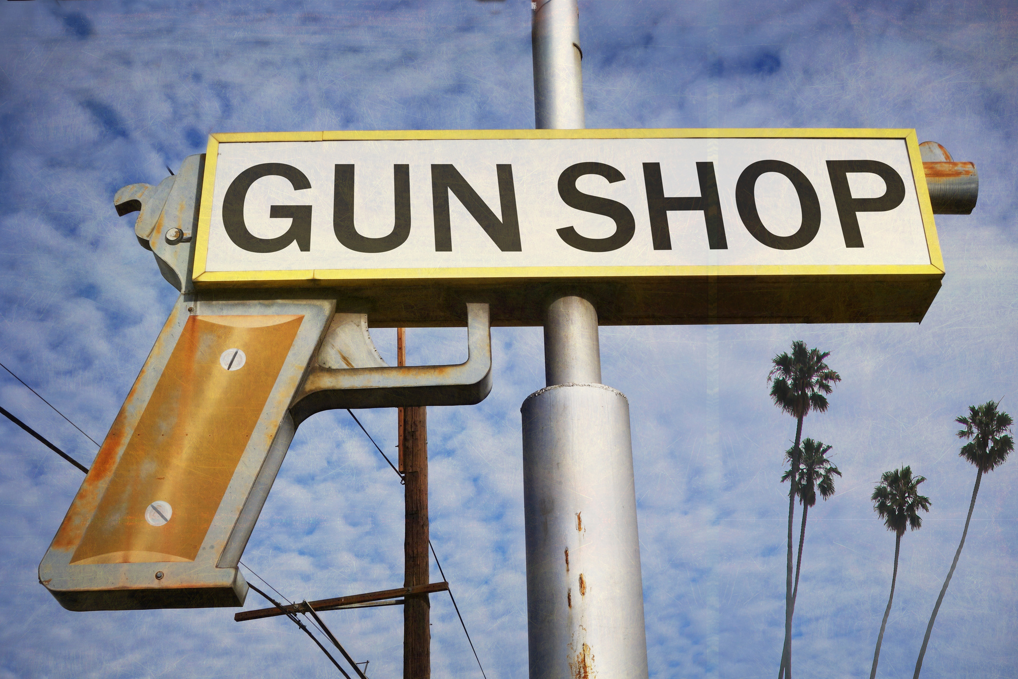
As of last year, there were 64,417 firearm dealers nationwide. That directly translates into a lot of competition.
If you’re looking to stand out from the other guys, then you need one thing: the perfect logo. Creating one yourself can seem daunting at first, but we’re here to help you through the process and show you that you can do it yourself.
In this article, we’ll dive into everything you need to know about creating a logo for your gun shop. We’ll cover why it’s important, the aspects of creating the perfect logo, and how to design your own.
Are you ready? Let’s get started.
The Importance of a Logo
The combination of imagery and text in a logo creates a visual symbol that represents your business. It’s how you build brand recognition and how your customers will recognize you.
For a person who hasn’t seen your logo before, it often informs them of the name of your business and what kind of business it is.
A logo is the chance to show off your business’s personality. Design the right logo for your gun shop and come off as relatable and trusting.
What Makes the Perfect Logo?
The perfect logo is easy to recognize with or without additional text. However, it’s more than just an icon; there’s more than you think when it comes to creating a logo.
It needs to be attention-grabbing, distinct, and unique. Let’s break down what makes the perfect logo.
Clear and Concise
The most important rule in creating a logo is simplification. All great logos are clear, concise, and low in details–with the exception of Starbucks.
Imagine your gun shop’s logo on t-shirts, billboards, magazines, posters, and stickers. It should be clear to read and identify at any size if you decide to scale it large or small.
Consider the Font
To reiterate the point above, you want the text to be bold, clear, and easy to read from any distance.
When choosing a font, the bolder, the better. Avoid script fonts as much as possible and stick to one or two font families. Less is always better when it comes to designing a logo.
Here are some of the best fonts for a logo:
- Garamond
- Helvetica
- Bodoni
- Proxima Nova
- Futura
- Rockwell
- Univers
- Sassoon
- Modesto
Choose a font family like Sans serif for a look that’s clean and modern or go with Serif for something more tasteful.
Color Matters
Color has an impact on buyers and increases brand recognition by up to 80%. With that in mind, we need to carefully decide on the colors used.
A good rule of thumb is to use less than three colors. When in doubt, see what the pros are doing. Big brands like Amazon, Nike, Apple, Facebook, McDonald’s all use less than three colors–you should too.
For your gun shop, you’ll want to opt for darker earthy colors like brown, black, white, and gray. Brown depicts masculinity, ruggedness, and strength whereas black is usually characterized as modern, sleek, and high-end.
If you’re looking for a pop of color, we suggest you opt for blue, which signifies trust and maturity–perfect for an arms dealer. For an in-depth explanation of colors and how they affect your customer, check out this guide.
Context Matters
A logo encapsulates your business and shows others what you stand for. How do you accomplish this? You do it with context.
Incorporating what your business does is one of the most important aspects of your logo.
Customers who don’t already know your name will be instantly drawn to your business if you add context to your logo. If you’re a gun shop owner, you might want to incorporate bullets or something like AR-15 parts within the logo so it’s instantly recognizable to your audience.
One look at your logo and they know exactly what you’re selling. Avoid mystery at all costs, it’s one of the worst things you can do. Remember why businesses create logo’s in the first place–to be recognizable.
Want some examples of how context works in a logo? Think about FedEx’s logo. The white space the letters make is an arrow showing the forward movement of deliveries. Check out some of the examples we broke down below.
How To Design a Logo
When it comes to making a logo you have two choices: paying a professional to do it or trying yourself. Let’s look into both options and see what’s best for you.
There are a ton of great freelancers and graphic designers on the internet willing to design a logo for you, however, it’s going to cost you. A quality logo may start at $200 and run upwards of $2,500.
If calling on a professional doesn’t fit within your budget, consider designing it yourself. It’s quite easy to do these days thanks to logo making programs like the Online Logo Maker. Let’s find out how.
Sketch It Out First
Start by sketching out primary ideas for your logo. You’ll want to map out the text and basic graphics you want the logo to encompass as well as potential color schemes.
Take your Sketch Online
Once you have a rough draft of the direction you’re going in, it’s time to take it online. It’s much easier to start designing online once you have a sketch to go off of to avoid staring at a blank screen.
Use a quality logo making program to bring your logo to life. With the Online Logo Maker, it’s easy to play around with your colors, fonts, and graphics. This is where the designer in you will start to come out.
Make it a Vector
If you want the best format for your logo, you’ll want to save it as a vector. This is a high-quality format that is easily scalable (both larger and smaller) without skewing the quality. Vector formats can also be easily transferred to any format as needed.
Examples of Great Logos
Need a little inspiration before you get started? We’ve gathered some of the most ingenious logos for you to take a peek at.
Each one combines brilliance context with streamlined text to easily inform customers of who they are and what they do.
Target
Can you think of a more iconic logo than Target’s target? With or without the text you know exactly what it means. Whatever you need, whatever you’re looking for, just head to Target. Bullseye!
Movers Moving Company
You might have never heard of Movers Moving Company as you have with Target but one glimpse of the logo and you get the idea that it’s a moving company, even without the text.
Movers Moving Company logo is a great example of context in a logo. The whitespace the hand makes creates a house as if the hand was picking up and moving it easily. Combine that with the simple word “Movers” and you know exactly what the name of the business is and what it does.
Guitar Studio-School of Excellence
This logo may have more text than the others but the visual graphics are bar none. The “I” in guitar and the “S” in studio make up a contemporary guitar. Not only will this grab people’s attention but allow them to take a second look and read into the business.
American Red Cross
Another classic logo that says exactly what it is. American Red Cross’ logo is in fact, a red cross. Easily recognizable anywhere you associate this logo with medicine and the greater good.
For more logo inspiration, click here.
How to Use Your Logo
Now that you know exactly how to design the perfect logo, you can put it to use. There are some basic rules when it comes to using your logo.
The first rule? Use it consistently and often.
Brand consistency is crucial. Ensure your logo is always used correctly meaning it’s not stretched out of proportion, pixelated, or in the wrong color scheme.
You’ll want to use your logo everywhere. You might be familiar with the Marketer’s ‘rule of seven‘. It states that a customer needs to hear or see your message seven times before taking an action.
A good logo sticks in someone’s head. Plaster your logo everywhere like your staff’s t-shirts, your receipts, your webpage, and your packaging to pack the biggest marketing punch. Never let your customers forget where they shopped and how good of an experience you provided them with.
Need Help? Start Here.
Now that you know exactly what the perfect logo looks like, it’s time to get to work.
We know starting a new task like designing your own logo can be daunting, but it doesn’t have to be this way. Check out this online tutorial to using our online logo maker. It’ll walk you through making your design step by step regardless of your design or technical experience.
Our online logo maker makes it possible for everyone to design their logo, without over-priced professionals and over-complicated software.
Get started today.
These Real Estate Logos Sink the Sale Every Time: What Can You Learn from Them?
Posted on January 04, 2019 by Logo Design Tips and Tricks

Are you starting up a business in real estate?
The real estate market is one of the biggest and most successful markets today. In fact, the market’s expected to generate $534.83 in revenue in 2022.
Yes, the numbers show you can make a regular income in real estate. However, it’s not an easy trade to step into because of the ever-changing market and high competition. If you want to succeed, you have to stand out from the rest. One important step is to look at real estate logos.
Your logo is an important part of your real estate business. It’s normally one of the first things your clients see and it’ll set the tone for your entire business.
Take a look at the realty logo of successful companies and learn a thing or two from them.
1. Stribling
What makes the logo of Stribling successful is its simplicity. The logo is only spelling out the company’s name, nothing more than that. That’s all they needed to imprint themselves in their client’s minds.
Keeping it short and simple is one way for you to become successful like they are. That said, it never hurts to do something to make yours stand out among the rest though.
Take another look at Stribling’s logo. Notice that their elegant font style.
This is a custom font that they had someone create specifically for their logo. It ensures no one else uses that font but them, making it one of a kind.
It’s also worth noting that they used the color red. They made their color choice to show boldness and desire, two things most people looking into the real estate market need to buy a house. This makes them even more relatable and thus, trustworthy.
2. Christie’s International Real Estate
Here’s one of the commercial real estate logos that prove simplicity can go a long way. At first glance, there’s nothing that stands out with the logo of Christie’s International. All it has is the company’s name and what they do below it.
Though it’s simple, there’s a reason Christie’s rose in success despite being younger than most real estate companies.
One crucial reason is their use of an old style logo design. This contrasts many competitors that utilize a sleek and modern visual style.
Back when the company started, they didn’t have the means or necessity to make their logos extravagant like how most logos are today. Using this style of logo design attracts customers because the company looks older and experienced than it is.
This makes people believe that they must be doing something right to last this long.
3. Compass
Compass makes their logo with simplicity and purpose.
They set an example saying that a successful logo doesn’t need to cost much, it only needs to be clever. This philosophy also helps consumers remember it better.
Notice how they fashioned the letter “O” in their name. They added the little slash inside the letter so it symbolizes a compass. Now their company name gets represented in a 2-in-1 logo.
Designs like this also helps raise consumer engagement. People get to talk about their logo. Keeping their name in casual conversations makes it more likely that their clients trust them more since it’s likely they heard about them.
Also, it’s worth noting that their logo is colorless. They did this to makes sure that even during printing errors, their logo comes out looking the way it’s supposed to. This is also useful when you’re on a budget.
4. Equal Housing Opportunity
One way to come up with a great logo is to denote what your company does.
In real estate, Equal Housing Opportunity does this best. At first, it may look boring but upon taking a deeper look at their thought process, it becomes the most ingenious real estate agency logo.
Their logo is simple: a house with an equal sign inside. Most people think that it’s because it’s their name, but it also shows their business services. A glance at their logo and most people will know that they provide quality and equal services for everyone.
Smart, isn’t it?
Once you realize that it also helps people remember what their name is, you’ll go from thinking they’re smart to thinking whoever came up with that logo is a genius. It’s also so you don’t need to speak and understand the same language to know what they offer.
5. Warburg Realty
If you’re an already successful company looking to upgrade your logo design, then you may want to take some inspiration from Warburg Realty’s logo.
There is no reason you shouldn’t boast about your milestones like they do. Being in the business for more than 100 years is something you should let your clients know about.
Doing this makes them one of the most trustworthy companies today. Everyone who sees their logo will feel comfortable being in their care. This also makes it so they’re less likely to barge in thinking they know better.
Try to do the same and incorporate your company’s achievements in your next logo design. More people will approach you while browsing for potential realtors. That is what a marketing logo does best.
That said, try to make its inclusion clever like how Warburg did. Listing it down will make your logo look like a resume instead. Failure will only increase your chances of getting turned down.
6. StreetEasy
StreetEasy’s logo blends simplicity with the use of modern forms of communication. It’s also a perfect representation of the services they provide. StreetEasy provides information on the real estate market for those who are unaware.
Since their primary clients are New York citizens, their service is quite popular. Many people move in and out of New York on a regular basis. If you’re looking for a place there, you need someone who has their ear to the ground.
StreetEasy provides such a service, and people know that in an instant. The logo features a building in a speech bubble. Their design shows they’re proficient in talking about real estate.
It also shows people that they provide a space to discuss real estate. Most people feel lost when it comes to buying a new home, especially in the Big Apple.
StreetEasy’s logo hints at a solution. With their in-depth knowledge on New York real estate, their turnkey rates are at an all-time high in comparison to other real estate service providers. And if you’re wondering ‘what does turnkey mean?’, read up and learn more about it here.
7. Ebby Halliday Realtors
One tactic to come up with an amazing real estate logo is to use your reputation. Ebby Halliday Realtors does that in an effective way.
Ebby Halliday was a successful realtor back in her day. She made this company to carry on her legacy and her name. The logo stands in as a representation of how successful she’s become.
Over the years, people changed how the logo looked. They still retained the essence of the logo, though. This was an important decision because they want people to know it’s the same company as before.
A lot of companies, whether in real estate or not, tend to do this. Some companies, like Coca-Cola, kept a similar design through-out the decades while others only keep one crucial element as they change everything else.
Ebby Halliday’s logo also serves as an inspiration for other female realtors. This results in many female realtors looking to get a spot in their ranks. This is also why they have a lot of manpower at their disposal.
8. Partners Trust
One way to make your logo mean more is to define something you’re good at in it. Take Partners Trust, for example. Their logo is the literal embodiment of cutting edge.
This is a great fit for them because their services are fast with guaranteed success. They set the standard of how real estate markets should handle their sales. It also sets the tone of how their employees handle their clients.
Notice how there’s also no clutter around their logo. This is because most printing companies charge depending on the logo’s design. This allows them to print their logo for less if they need more copies.
Your company should follow suit. Make sure people can recognize your logo at a distance or when you print it small for pamphlets or business cards. Remove the clutter and focus on an easily recognizable shape.
Design Your Real Estate Logos Today
Make a good first impression on your clients by having a well-designed logo. This is important if you want to make it out as a successful real estate company. Use these companies with amazing real estate logos as inspiration for yours.
Their designs should inspire simple, clever, and cost-efficient logos of your own. What are you waiting for? Get to designing now!
Nowadays, even real estate agencies offer their services online in some cases. See how you can choose a logo for marketing your digital services here! This will make it so you can keep up with the leading websites and not lag behind them.


