How to Trademark a Logo for Maximum Brand Power
Posted on July 01, 2018 by Logo Design Tips and Tricks

Would you like to know how to trademark a logo?
A logo that you create is central to your brand’s image. It’s also one of the most valuable assets you have in your business.
Think of it this way, what would Nike be worth if it wasn’t instantly recognizable by the swoosh? Well, that mark is worth about $13 billion.
When you trademark a logo, you’re protecting your most valuable asset and you’re setting your company apart from the competition.
Read on to learn what it takes to trademark a logo.
Why Trademark a Logo?
The main advantage that comes with a trademark is the legal protection.
By having an official, federally registered trademark, your company is the only one that can use it. You’re protected under the law.
PayPal has filed suit against music provider Pandora for trademark infringement because they look too similar, according to PayPal.
TRX, the fitness company known for its suspension trainer, successfully won a multi-million dollar judgment against a company that created a knock-off product. It was an infringement of the brand and the product. It has a great product, a strong brand, and a great fitness logo.
This kind of protection would not have been possible if TRX didn’t have the trademark protections in place.
There are some instances where it doesn’t make sense to have a trademark.
It doesn’t make sense to register your logo if you don’t know how long you’ll be in business. You might also decide to change your logo after a few years.
How to Trademark a Logo
The first thing to know about how to trademark a logo is that it’s a long process. It takes a lot of time and it takes about 10 months to go through the trademark process.
State vs. National Trademarks
Depending on your business, you can register the trademark in your state. If you’re a local business with one location and no intention to expand, this might make sense for you. In this case, you’ll want to register your trademark with your state’s secretary of state’s office.
However, if you’re an online business with a national presence, you’ll want to be sure to register your business nationally. That means you’ll have to file with the United States Patent and Trademark Office.
Do Your Research
As you start thinking about whether or not to trademark a logo, start by doing research. You have to ensure that your logo isn’t used by anyone else or it’s not similar to a trademark already in use by another company.
Just about every trademark lawsuit is avoidable with good research.
To research logos and designs, you’ll need to start by visiting the USPTO’s search database.
You need to look at your logo and note all of the design elements that are there and match them with the right code in the USPTO Design Search Code Manual.
You’ll also want to note any keywords, phrases, goods, and services, that your business falls under. You’ll also need to check the international class to make sure that there are no additional conflicts.
There are a few criteria to use when doing your research. Your logo must not:
- Be similar to another logo that’s already in use
- Cannot be offensive or misleading
- Cannot cause confusion in the marketplace
If your logo meets these criteria, then you can proceed.
Use the Logo
If did your research and found that no one is using a logo that’s similar to yours, start to use your logo. This will give you some protection under the law, but you won’t be fully protected.
File the Application
One thing to remember is that you may have a tagline or business name as part of the logo. These must be filed separately, so you’ll have one application for the logo, and another for the business name.
Your application must be complete and meet the USPTO’s strict guidelines. A large percentage of applications that were declined was due to incomplete applications.
You would have to resubmit your application and pay another filing fee.
After you’ve filed your application and it’s been approved, you can then keep an eye out to make sure that no one else is using it or anything that resembles it.
There are trademark watch companies such as CompuMark that specializes in trademark protection. They take the time to do the research so you don’t have to.
Should You File the Application Yourself?
One question you’ll have to answer early on in the process is whether or not you do it yourself, use an online service, or hire an attorney.
There are advantages and disadvantages to each. The main concern for most people who want to trademark a logo is the cost.
At an absolute minimum, it’s $225 for the filing fee for a single class. It also depends on how many classes you want to trademark in and how complex your filing is. You will be responsible for doing the research yourself and filling out the application properly.
On average, online services like Legal Zoom charge about $500. They’ll give you basic research and if there are issues with your application, you’re either on your own or you’ll have to pay more money to have it completed.
An attorney will cost between $1500 – $2000.
Yes, that can be cost prohibitive, but you can increase the likelihood of your application being accepted. It’s been found that attorneys that submit the application are 50% more likely to have them approved than if you do it yourself.
That’s because they will do incredibly thorough research, ensure that the application is complete, and ensure the scope of the trademark isn’t too narrow or too broad.
Your Logo is the Key to Your Success
Your logo is a gateway to connect with your customers. It’s real value, however, gets more powerful over time.
That’s because your customers have had more good experiences with your company, and those positive feelings become associated with your logo.
And that’s also why you want to protect it.
When you know how to trademark a logo, you’re sure to protect your company’s most valuable asset.
If you’d like more great logo tips, check out our blog today.
Winning at Work: Ways to Make a DIY Trophy With Your Company Logo
Posted on June 27, 2018 by Logo Design Tips and Tricks

Fostering fun competitions at work enlivens the spirit of the workplace. It creates an environment where employees have fun and where production is boosted.
To add to the merriment, employers can easily create a DIY trophy at home that’s uniquely outfitted for their business and the contest.
And, no, it won’t look shoddy in the least. At least, not with our tips.
Here, we’ll show you six methods to create the most unique and fun trophies for the workplace from the comfort of your home.
Why Bother?
Friendly contests can increase productivity and feelings of worth in businesses. Supervisors should aim for team contests to avoid any negative feelings that may ensue from competition among individuals. Doing so promotes cooperation and a team spirit, two factors that are integral to a business’s success.
However, silly contests created to instill humor not only make employers more approachable, but they also diffuse any built-up stress from the real stuff. It puts workers at ease and lets them know that laughter needn’t be reserved for their time at home.
Finally, the very act of creating a trophy says more than you can imagine. You took the time to make something for an employee. This demonstrates how much you value them.
Even if you choose to have a trophy custom made through another business, such as Trophies Plus Medals or other popular manufacturers, employees will still feel appreciated.
A Quick Word About Logos
Having your logo taken out into the world on a trophy is an excellent form of marketing. It’s a definite topic for conversation as soon as someone from beyond the company sees it sitting on a mantel or desk.
For DIY projects, consider having a company print your logo on bumper-sticker paper or other material. Not only will you have a quality look and easy application, but the price per sheet is extremely reasonable.
You can also have your logo engraved if you choose to go all-out; after all, it’s an excellent way to ensure it will remain on the trophy forever.
Otherwise, consider using your personal printer to print the logo on sticky matte paper. You’ll be needing it to create every trophy.
Six Ways to Create a DIY Trophy
These methods are convenient for a number of reasons, but mostly because your time is valuable as a manager. Therefore, we’ve selected some of the easiest and quickest ways to create a trophy–without sacrificing its appearance.
1. Disposable Cups and Plates
Chances are you have some plastic cups and plates in the kitchen cupboard somewhere. Rustle them up to create an easy and inexpensive company trophy.
What you’ll need:
- Disposable cups and plates
- Hot glue gun
- Metallic spray paint
- Various toys or items
Create a pedestal or the body of your trophy by placing the cups and plates together however you like. Use your hot glue gun to keep them firmly in place.
Next, place the item you want to be on top and glue it down. Visit your local dollar store for this or take a stroll down the dollar aisle. You’ll be surprised at how many toys you can use as toppers.
Once your soon-to-be trophy dries, take it outside for some spray painting. Metallic colors and paint/primer combinations are the best and easiest way to give the product a finished, authentic look.
Slap on your logo and consider it a job well done.
2. Kitchenware
If you’d like to be super authentic, you can always purchase real glassware to use as a trophy, but be sure to notify your winners!
Use the same method as above, but be sure to substitute the glue and spray paint for glass-appropriate adhesive and paint.
3. Cans and Candlesticks
Hit up your local Goodwill or thrift store for some likely-looking candlesticks, and save those tin cans.
What you’ll need:
- Candlestick
- Tin can
- Glue gun
- E-6000 glue
- Primer
- Metallic spray paint
Glue the tin can to the candlestick. If you have any other trinkets you would like to add to the trophy, glue them on.
Apply primer to the trophy, then the spray paint. Add on your label and your trophy is finished. Simple and easy.
4. Wooden Objects
Find any wooden objects that could be used for a trophy’s base. Watch them transform.
What you’ll need:
- Wooden object, preferably rectangular
- Stick-on felt
- Wood glue
- Spray lacquer
- Epoxy
- Masking tape
- Any items for the top
- Stickers or adhesive nameplates
Apply spray lacquer to the wood if you would like to give it a glossy finish. Let it dry.
Using the base of the wooden stand, cut a piece of felt to apply to the bottom of the stand.
Saw the top of the wooden stand to bare wood, then mask off the rest of the wood. Spray the lacquer onto the top.
After it dries, add whatever item you desire to the top and set it with epoxy glue. Add your logo and any other nameplates you would like, and you’ll have a beautiful trophy.
5. Plastic Bottles
Do you like recycling? If so, you may be surprised to learn you can turn those old plastic bottles into a killer trophy.
What you’ll need:
- A plastic bottle
- A nail
- Pipe cleaners
- Low-temperature glue gun
- Spray paint
- Scissors
- Matboard
Cut the bottom of the plastic bottle off. Using a nail, insert two holes near the cut portion of the larger piece. Twist your pipe cleaners to look like the handles of the trophy. Have one portion twisted to insert into the hole, which will keep the handles in place.
Add both handles.
Cut out a circular piece of matboard to fit the original bottom of the plastic bottle. Adhere it to the opening of the piece. After it dries, glue the curved end of the original bottom to the mouth to create a base. Apply spray paint and any labels.
Recycling and rewarding; that’s what business is all about.
6. Plaques
When we think of “trophies,” we forget about the fancy plaques that are handed out for many awards. However, these are a type of trophy, too, and they’re a classy way to get your logo out there.
What you’ll need:
- Flat or beveled finished wood
- Sponge brush
- A photo and your logo
- Mod Podge
Print off the image you would like to be on the plaque. Apply Mod Podge to the back of the print-off and center it on the wood.
After it dries, apply the Mod Podge to the top of the entire thing, including your image. It will secure the photo in place.
Create Your Logo and Images
Not only is a DIY trophy fun to make, but these six methods are easy ways to show your employees you care.
If you’re ready to transform your logo or take things up a notch for your trophies, we’re here to help. Use our online logo maker to add some pizazz to your logo or dream up new ideas.
After all, what’s work without a little fun?
9 Fashion Logo Meanings Exposed
Posted on June 27, 2018 by Logo Design Tips and Tricks

Have you ever looked at your favorite clothing store and wondered, ‘what does this fashion logo even mean?’. Well, during this article we’re going to expose the stories behind nine of these fashion house logos.
That way you can know with confidence the background of the logo you’re proudly displaying on your clothes.
They say it only takes customers ten seconds to judge a brand’s logo. However, we can only assume this applies when the consumers aren’t in possession of the full facts. We wonder whether it’ll still take you ten secs to form an opinion after hearing what we have to say.
So, with that in mind, let’s dive on in!
1.) Versace
As some of you may already know, the scary looking woman in Versace’s logo is Medusa. On the face of things, this seems like an odd choice.
However, it’s her transformation from something horrific into the goddess Athena that inspired Gianni Versace’s logo. This was a shrewd move on his part because it evoked a sense of fascination with the brand, as well as an air of authority.
It’s believed that Donatella Versace said that the logo came to be because whoever falls in love with Medusa, can’t go back! Hence, suggesting that the brand would have the same effect on its customers.
This notion’s kinda creepy, but intriguing at the same time. A clever bit of branding if ever there was one!
2.) Chanel
One of the myths behind Chanel’s logo is that it represents the relationship Chanel had with a man called Boy Capel. Rumour has it; he was the love of Chanel’s life, and he funded her first ever boutiques.
However, there was never a formal business contract made between the two of them that bound them together. Likewise, no marriage certificate ever solidified their relationship.
Hence, the double C logo is supposed to reflect the fact that Chanel and Capel spent their lives overlapping but never fully facing one another- which is why the C’s are positioned back to back.
3.) Rolex
We love this one.
Rolex’s logo is an extension of their slogan; “A Crown for Every Achievement.”
What a lovely tribute to self-confidence, self-motivation, and perfectionism. Naturally, these three characteristics are things most of us strive for!
4.) Alexander McQueen
Now, this logo may seem deceptively simple. However, by placing the ‘c’ inside the ‘Q,’ they’re hinting at the potential for the brand to grow. Hence foreshadowing the powerhouse this fashion brand’s become.
5.) Hollister
For those of you who don’t already know, Hollister’s brand’s based on a character called John M. Hollister. However, this guy is entirely fictional!
This boy was said to of spent his days surfing and chilling at the beach. So, as an adult, he opened a store in California and named it after himself.
This was a smart piece of marketing because this fictitious story generated interest and made the brand stand out from its competitors.
6.) Nike
The Nike “Swoosh” is internationally recognized and donned by thousands of Nike fans across the world.
This logo was designed by Carolyn Davidson, a graphic design student studying at Portland State University. It’s rumored that the founder of Nike, Phil Knight didn’t particularly like any of the designs Davidson came up with.
However, as they were running out of time he selected the “Swoosh” and said; “I don’t love it, but it will grow on me.”
Little did he know that this logo would eventually achieve global recognition!
At the time, Caryln earned $35 for her original designs back in the early 70’s. However, she later received considerable stock options in the company once the business took off.
7.) Superdry
Have you ever wondered what the Japanese characters mean on their logo?
Well apparently, they say: “kyokudo kanso (shinasai),” When translated, this says ‘maximum dry,’ followed by the word ‘do’ placed in brackets.
From this, we can assume this is a weak attempt at writing ‘Do Superdry’ in Japanese.
It’s funny to think of corporate geniuses crowding over a Japnese to English dictionary trying to work it out for themselves, without hiring a consultant with real knowledge of the language!
8.) Air Jordan III
Did you know the logo used for these shoes was taken from a still photograph,? Jordan wasn’t even dunking!
He was standing and jumping with his legs apart. There was no running and taking off involved. Instead, it was a glorified ballet move with a basketball!
Needless to say, however, they managed it. The logo looks fantastic! It’s just funny to think of how this logo was staged.
9.) Lacoste
You might know this already, but the Lacoste alligator came to be because of the tennis player, Ren? Lacoste. He was the world’s number one player between 1926 and 1927 and was nicknamed “The Alligator” by the press.
He got this tag because Lacoste had a bet going with the French Davis Cup captain involving an alligator skin suitcase.
However, when he came back to France, the alligator became a crocodile, and the tennis star became famously known as “the Crocodile.”
This triggered a friend of his to draw a crocodile for him, of which he embroidered on a blazer. Then he wore on the tennis court to make a statement!
Has This Article Changed Your Opinion of Your Favorite Fashion Logo?
We hope you enjoyed this article. If any of these backstories inspired you to create your own fashion logo, please feel free to check out our blog, for a few handy hints and tips on the topic.
Over there we discuss everything from creating a logo when you’re on a budget to executing logo redesign. Enjoy!
Top 6 Tips to Create an Awesome Vape Logo
Posted on June 26, 2018 by Logo Design Tips and Tricks
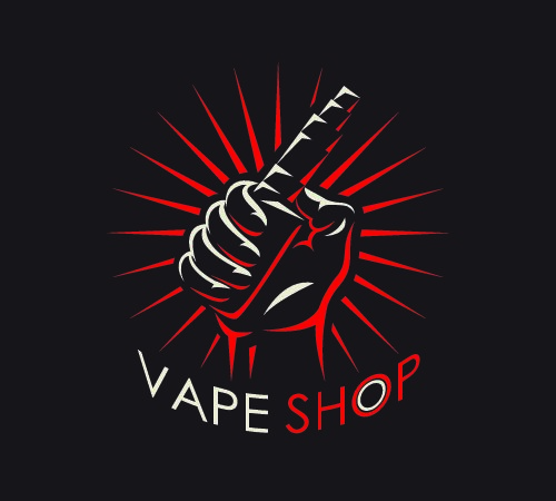
According to Yelp, there are at least 11,000 vape shops all around the US. While not all vape shops are created equal, the one way to tell them apart is their design and their logo. If you’re working on your vape logo, you need to take a few things into consideration.
Here are the 6 most important things to think about when you’re making your vape shop logo.
1. Know Your Niche
The first thing you need to assess when you’re designing a logo is who you’re designing it for. While every company wishes that their products and services appealed to absolutely everyone, it’s just not possible. There’s going to be a target market for your vape shop and you need to know who that is.
Start by doing the market research regarding who is in business near you. If you’ve got a brick and mortar shop, go visit all the shops near you before you announce the opening of your shop. If you’re already known competition, have some friends or colleagues go by and assess how the other stores are doing.
Get to know what kind of design style they’re relying on and get to know how much of the market they reflect. You don’t need to follow their lead but you should consider what they do reflective of the market at large.
Offer something new if you think there’s an untapped section of the market. If the professional vaper is catered to with the casual left behind, that could be your niche.
2. Pick A Texture
Textures reflect a lot about the kind of business you are. When you’re designing a logo, to give your logo some depth, consider what you want to reflect about your business.
Clean, metallic textures are very popular now. Because of the technology involved in vaping, it makes sense. People see vaping as the future and so people choose very metallic and modern looking logos.
However, if your vape shop is more about herbal or natural flavors and styles, you might want to go with an earthier texture. The texture of your logo can give your clients a view of the style of vape shop that you run and the kinds of products that you sell.
The texture of your logo could be a signifier that connects with your audience subconsciously and attracts them to you.
3. Corporate or Casual?
Now that you’ve figured out your target market, you need to think about what end of the spectrum they’re on. While some markets require you to have a more professional and corporate approach, some will be much more casual.
Even if you’re in a relatively relaxed college town, you might have to position yourself relative to what other businesses are around. Your vape logo needs to project the vibe you’re going for.
If a lot of new high-end restaurants have opened up near your vape shop, you’re going to need to take a more corporate or minimal approach. If your area is filled with independent record and bookshops, coffee houses, and pizza shops, you can be a lot more casual.
If you’re a high-end place for customers to refill their eliquid, you need to let customers know what you’re about from the moment they see you.
4. Colors Matter
When you’re projecting your image, the colors that you choose matter. Once you’ve decided on your target market, you need colors that connect with the lifestyle your typical client has.
If you’re trying to capture a more casual demographic, you could use more fun colors. Choose one strong color and a few muted tones to complement it. If you choose a really bright blue, you might want to pair it with grays, pastels, or other softer colors.
If you’re going for a more tech-influenced style, think about the kinds of colors used by companies like Apple. Whites, grays, soft pinks, and black are all possible contenders.
Limit your palette to about 2 colors and work within those strict parameters. Making your logo with too many colors could be distracting.
5. Use a Professional Design Program
When you’re ready to get your design into a digital program, you need to make sure you use a professional level program. While the free design programs that come with your computer might be a good place to start, they won’t give you the options you need.
You’re going to have to start design your logo with a real program, as much as you might enjoy good old MS Paint. With a professional design program, you also get the option to export your logo to a format that can ensure it always looks great.
Few things will make your audience doubt the quality of your company than a pixelated logo on a sign or on a banner. A professional design program gives you the option to export via a scalable vector format. No matter what size you stretch your logo, it will always look great.
6. Get Feedback
Once you’ve come up with an idea for your logo and exported your final version, give it to some friends and colleagues. Let them know that you want to hear some honest feedback about it. Take their feedback into serious consideration.
If it makes sense, average out their feedback. If you see their point, find ways you can accommodate their ideas without losing your original vision. While your friends and colleagues may not be your ideal audience, they can offer general tips from the perspective of consumers.
A Good Vape Logo is Memorable
Even if you don’t remember the name of a certain vape shop, a good vape logo can help you pick it out from the crowd. By sticking in your memory, a strong logo can impact your feelings about a brand. Look into the psychology of branding before you settle on any aspects of your vape shop’s design.
When it’s time to start thinking about fonts, check out our guide to picking the best font for a vape shop.


