How to Design an Attractive Clinic Logo
Posted on March 27, 2018 by Logo Design Tips and Tricks

Do you need a new clinic logo?
Whether you’re giving your current logo a refreshed look or creating a logo for a new clinic, there is a lot to consider.
You’ll want to get your logo design right because your logo can have a tremendous amount of impact on your clinic.
Researchers at MIT found that a good logo design can have a positive impact on your customer’s commitment to your brand, but also on your bottom line.
If you’re not sure how to design a logo for your clinic, you’ve come to the right place.
Here are the top tips to create an attractive clinic logo.
Start with the Brand
When designing a logo, you want to have a deep understanding of what the brand is. After all, a logo is a visual representation of a brand.
In order to understand your clinic’s brand, you’ll want to ask yourself questions to help guide you.
An easy way to go about it is to think about your brand personality. Creating your brand personality is a matter of thinking of your company as a person or character. You’ll then ask yourself a series of questions to uncover the traits of the brand.
- If my brand was a car, what would it drive?
- How would my brand dress?
- Where does my brand live?
- How does the brand speak and behave?
- What are the top adjectives to define my brand?
The last question is important because you’ll need to be able to define the main characteristics of your brand. Here are a few to think about to get yourself started:
Smart, sassy, strong, calm, relaxed, masculine, feminine, approachable, elegant, caring, quirky, energetic, serious.
You’ll then want to match these adjectives up with brand archetypes to discover what your brand’s personality is.
Not only will this exercise help you in designing a clinic logo, but you can use these traits in hiring staff. You can match the qualities of candidates with the qualities of the brand. That will help you determine if they’re a good fit for your organization.
Be Original
You do want to do some research on logos. It will start to get your creativity going as you discover what you like and dislike about logos you come across.
Looking at your competitors’ logos will also help you discover how they’re positioning their brand in the marketplace.
While doing research to get ideas is a good thing, you don’t want to copy elements of other logos. That can backfire on you and damage your brand. It can also raise some serious questions about your ethics.
For example, this clinic for STD & HIV testing took elements of Bernie Sanders’ presidential campaign logo and tagline, right down to “Feel the Bern.”
While that seems creative and humorous at first, it isn’t a good long-term solution for a logo. Most people are only going to remember the campaign logo and slogan for a short period of time.
Not only that, but you can confuse your potential customers. They may think that your brand is somehow related to the campaign.
Use of Color and Fonts
It’s widely known that colors and fonts have an impact on your brand’s perception.
This is where you want to revisit your brand’s personality traits and create a logo that’s congruent with those characteristics.
For example, if you discovered that your brand is conservative, quiet, and strong, you can consider a dark blue color in your clinic logo. Dark blue tends to represent these characteristics, and it’s a more masculine color.
The font should reflect a similar tone. If you were to have a typeface that was a retro style, it won’t convey a conservative, quiet and strong brand.
The Shape of a Logo Impacts Your Brand
If you’re planning to incorporate shapes or symbols in your clinic logo, know that they have a psychological impact, too.
For example, the logo for this drug detox program incorporates triangles.
Studies have shown that hard angles such as these can create the perception of hardness and durability.
A rounded logo can be perceived as soft, warm, and attentive.
Either one can work well for a clinic logo, it comes down to what matches your brand’s personality better and what you want to convey to the public.
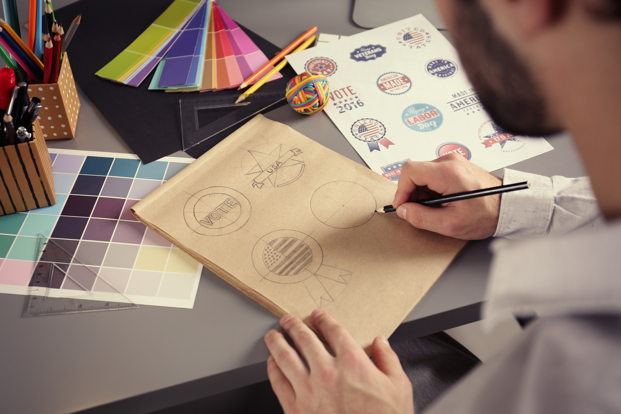
Put Your Ideas Down on Paper
As you’re going through this process, it’s important to keep detailed notes of what you want your brand to stand for and how that should be communicated visually.
These notes about your clinic’s brand personality, as well as what you liked and didn’t like about other logos.
Now, you can start sketching logo ideas. This is where you can let your creativity shine.
Don’t get to hung up on having to be perfect. These are just draft concepts, so feel free to play with colors, typefaces, and symbols.
Once you have your concepts down, go back and see which ones are most aligned with your brand personality.
You’ll want to have three solid logo concepts that you can start testing for feedback and review.
Test Your Ideas
Designing a great clinic logo is a collaborative process. Now that you have ideas down on paper, you can start getting feedback to see what works and what doesn’t.
Take your sketches and start showing them to trusted members of your staff and clients. If there’s one logo that they like more than others, ask them why.
You’ll also want to explain the brand personality to staff and clients. They may offer valuable insight and show you things that you may have missed in the process.
Start Designing Your Clinic Logo
Are you ready to start designing your logo?
As long as you’re true to the spirit of the brand and do your research, you’ll be able to design a logo that makes a great first impression.
You can get started right now with Online Logo Maker. There are images, templates, and fonts to help you draft something in a quickly as 10 minutes.
Check it out here.
4 Amazing Logo Design Tips for Your Online Shop
Posted on March 23, 2018 by Logo Design Tips and Tricks

What if you could make every customer take a second look at your online store?
It may sound impossible. However, an amazing logo design is your key to winning more customers and really selling your brand.
And making a better logo is easy. Just follow these four tips for a better design!
1. Keep It Simple
It may be tempting to jam a bunch of ideas and even words into your logo. After all, you want an image that fully encapsulates you and your brand.
However, this just makes your logo look cluttered. Think about famous logos like those of Apple or Coca-Cola: they are elegant while still being simple.
Try to focus on a single image and the name of your brand. And make sure that image represents your business in some significant way.
Ultimately, this idea is pretty simple: the simple image catches the customer’s eye and your business name associates your brand and that image!
2. Understand the Colors
Ironically, color is something that many logo designers don’t think about until the end of the process. However, the colors you will use should guide the entire design process.
Customers associate certain colors with certain ideas. For example, red is associated with romance and confidence, while blue is associated with professionalism and tranquility.
Try to pick colors that naturally go with your brand while evoking customer emotions. For instance, green is a natural choice for a lawn service due to the business itself. However, customers also have positive associations with green and being environmentally-conscious, making them likelier to choose you!
For a crash course in the importance of color, check out www.ecigwizard.com. Notice how each product makes unique use of color to appeal to different kinds of audiences!
3. Understand Brand and Audience
An amazing logo design has one real purpose. It helps your specific brand to reach a very specific audience.
Despite this, many businesses don’t fully understand either their brand or their audience. And this leads to mixed and muddled logo designs.
Start with your brand. Figure out how you want to be perceived: are you serious or are you funny? Do you want customers to think about your utility or your creativity?
Next, think about what your audience wants. Do you want to be the tool they turn to for specific solutions? Or do you want them to simply have a fun emotional attachment to a recreational product?
Once you know these things, you can create a logo that merges your goals and their needs into one perfect design.
4. The Extra Twist
This is easier said than done, but your logo should have an extra twist. This twist draws attention to what you do best.
Amazon has an arrow that shows how they have products from A to Z. FedEx uses color and font to connote a speedy delivery.
Whatever it is, add an extra twist to show your company’s extra value!
The Bottom Line of Amazing Logo Design
You want a better logo to reflect your company’s value. And you don’t have to design it on your own.
OnlineLogoMaker provides the tools you need to make the perfect logo. To see how we can transform your design, come check out our logo maker today!
5 Gorgeous Label and Logo Fonts
Posted on March 21, 2018 by Logo Design Tips and Tricks

There’s no denying the appeal of a great logo.
Think of some of the most iconic logos for today’s biggest brands. They don’t only benefit from having great design. They also use quality fonts.
Your business font is a vital part of branding and should be consistent in packaging. You need to find a font that will make your brand stand out while also making it easy to read for the consumer.
Are you looking to create your own logo? Check out these gorgeous label and logo fonts that stand out in the crowd. Read on to learn more.
1. Garamond
No list of best logo fonts is complete without a reference to Garamond.
Garamond is a group of serif typefaces since the 16th century. They first gained popularity from texts and hardcover books.
Today, Garamond remains one of the most used typefaces in the world. They add a touch of sophistication and professionalism, which make them a great logo font.
You might recognize Garamond from Apple’s logo. The combination of an elegant typeface and playful design made it an iconic piece of branding.
2. Bodoni
Have you ever seen the logo for Armani? What about Calvin Klein or Vogue?
Bodoni is a popular logo font for upscale brands. This longstanding typeface combines thick and thin letters to create bold and daring logos. It’s a favorite of the fashion industry.
You can use Bodoni to create an eye-catching and visually appealing logo.
3. Futura
There’s no shortage of brands with Futura in their logo.
You’ll see Futura in advertisements for everything from Volkswagen to FedEx. This sans-serif typeface creates a modern yet playful look.
Why go with Futura? For one, it helps create a strong brand identity. The lettering customizes to create modern and easily recognizable brands.
Futura is also widely used in print advertising. You can print out your Futura logo with custom roll labels.
4. Helvetica
You’re probably familiar with the name Helvetica.
Countless brands use this typeface in their logos. You’ll recognize this sans-serif typeface in logos for American Airlines, Ducati, Harley-Davidson, JC Penney, and more.
Helvetica may be a staple in the advertising world, but it’s still relatively new. Swiss designer Max Miedinger created this type family in the 1950s.
Helvetica is widely used thanks to it simple yet creative design. It also creates a sense of comfort and familiarity since it is in the logos of countless brands.
5. Proxima Nova
Proxima Nova may be the newest font on this list. But that doesn’t mean it’s any less impressive.
Proxima Nova had a meteoric rise since its inception in 2005. Over 25,000 websites use this font.
You’ll recognize this font in logos for big brands like Twitter and Spotify. It’s a modern and fun typeface for any brand. This is a great option if you’re looking to go digital or appeal to a younger audience.
More Logo Fonts
The right logo font makes all the difference. Use this guide to create the best logo for your brand.
Are you looking to create your own logo? We can help. Check out our free logo maker today.
4 Tips for Creating Great Medical Center Logos
Posted on March 21, 2018 by Logo Design Tips and Tricks

Unhappy with your practice’s current logo design?
Feel like your logo looks like every other hospital, pharmacy, or medical professional’s office in your neighborhood?
Do you know that you need to make a change to your medical center logos, but aren’t quite sure what that change should look like?
Don’t panic – we’re here to help you.
In this post, we’ll tell you a few of the most important elements you need to consider in your medical center logos. Then, we’ll let you know where you can go to create several potential logo designs.
Read on to learn how to create logos that reinforce your brand message, differentiate you from your competition, and make an emotional connection with your target market.
1. Consider the Central Image
One of the most important things to consider when it comes to creating strong medical center logos?
The central image of your design.
This image will help you build your brand recognition, connect with your target market almost instantly, and, above all, make it clear the specific type of medical services you offer.
This last point is especially crucial.
While, yes, things like a stethoscope, a red cross, or even a drawing of a medication bottle communicate some kind of medical service, these images don’t do a lot to make it clear exactly the kinds of services and specializations you provide.
For example, if you’re a cardiologist, then you might want to make a logo that incorporates a heart rate monitor into your design. If you specialize in pediatric medicine, include children in your logo, and use lots of bright colors in your design.
Above all, your central image should illustrate the kinds of patients you see and should make the specifics of your practice clear.
Not only do stereotypical images fail to set your practice apart from the competition, they also do nothing to give your market any kind of information. Think bigger, and be better.
2. Choose Colors Carefully
Once you’ve decided on your central image, you’ll then need to start thinking about the colors you want to include in your design.
For best results, we recommend sticking to a minimum of two colors and a maximum of about four.
Yes, being bright and bold will help you to stand out – but if your medical center logos look like the page of a child’s coloring book, you’ll stand out for all the wrong reasons.
Plus, keep in mind that color psychology will also play an important role in your design. If you provide natural and holistic services, you may want to go with greens and blues. If you offer emergency services, red and white will make that clear and create an emotional response in your target market.
Above all, the colors you choose to include in your logo design should be consistent with the rest of your branding.
For example, take a look at look at the website for this alcohol rehab center.
They’ve focused their entire website design on the colors blue and white, to help to keep website visitors calm and focused. The text of their website is also white, which is further emphasized by the blue background of the page.
The writing in their logo is consistent, in the same white color, as is their design – a soothing, wound shape like an elongated spiral. This design and the color scheme is consistent with the services they set out to provide.
3. Don’t Neglect the Size
Once you’ve chosen the colors and the central image you’d like to use, it can sometimes feel like your medical center logos are complete.
However, there are still a few more things you need to consider.
One of the most important?
The size not only of the logo as a whole but all of the elements within it.
Think about how many different places that logo is going to be displayed. It may be on physical signage outside of your practice. It might be on your business cards, your social media accounts, printed in a newspaper, or even on the back of the jersey of that local sports team you sponsor.
When you’re creating your design, it’s up to you to ensure that, in any size, your logo images and text are clear, easy-to-read, and don’t end up looking like a Monet painting.
Don’t overcrowd your logo design, include too many words, or create several smaller images. Instead, go for a sleek design that tells your consumers you don’t need all the bells and whistles to get noticed.
4. Typography as a Branding Strategy
We’ve also discussed the importance of choosing the right colors when it comes to your medical center logos.
Now, let’s quickly discuss how the right font can influence buying decisions, build your center’s brand recognition, and help you to connect with your target market faster than ever.
Of course, the most crucial thing to keep in mind is legibility. As with the image you choose, your font choice will still need to be readable in many different forms.
But your font can also reinforce your overall brand and set you apart from the competition. If you’re an eye doctor, use the same font that’s used on eye test charts. If you work with children, you could choose a font that looks like it’s been written by a child (though is still legible, of course).
Your font matters, so don’t be afraid to take a risk.
Ready to Design a Few Medical Center Logos?
One final thing to keep in mind regarding logo design?
You probably won’t get it right the first time.
To come up with several different logo design options that you can let your patients, your employees, and your target market vote on, use our free online logo maker tool.
Still need a little more advice on how to design the most effective logo possible?
Be sure to check out our blog for access to the latest tips and trends when it comes to logo design.
We can’t wait to help you strengthen your brand with a new logo.
