5 Smart Logo Design Tips for a Clinic
Posted on December 11, 2017 by Logo Design Tips and Tricks

Does your clinic have a powerful smart logo design to maximize brand promotion?
A logo can help your clinic stand out in the crowd and appeal to a wider, more diverse audience.
It can aid consumers to remember your clinic, and attach the picture to a physical place and name. Logos can also establish your brand’s values and make you more likable to potential clients.
It serves as the first impression of the clinic and as a reflection of the clinic as a whole.
Therefore, in designing a smart logo, there are many factors to consider in order to best promote your individual brand.
Read on to learn five key tips in forming a smart logo design for your clinic.
1. Keep it Clean
In 2017, there has been a growing trend towards a clean and simple logo design. This is expected to continue well into 2018.
A minimal, simple approach is needed to advertise with a logo in this day and age.
For example, even the 20-year-old logo of MasterCard was revamped in 2017 to be more modern, and minimalist.
2. Make it Versatile
A versatile logo is a good logo because it can be used in a multitude of channels towards many different audiences.
In addition, the last thing you want is a logo that looks good on one medium and not so great on another.
This tip also applies in terms of color. There’s just the right balance between too much color and not enough, and it’s important to consider how the logo will be used when deciding on the color scheme.
3. Design it Uniquely
This tip is almost too obvious, but try not to copy any well-known brand logos, especially if the company is also in your industry.
Living by this will avoid customer confusion, and benefit your clinic in the long run.
In addition, consumers know when a logo looks copied, and this does not usually leave the best impression.
4. Don’t Underestimate Color
While there is a balance between too much or too little color, it’s important not to underestimate color altogether.
There’s beauty in the simplicity of white, black, and empty space. But subtle, targeted color can also work wonders.
5. Don’t be Cliche
This tip goes hand and hand with the importance of being different. It can be tempting to simply follow the trends in your industry blindly while tossing aside originality.
Avoid being cliche, and give your clients a standout design that they will expect from you.
This is especially true when you provide them high-quality services such as safer STD testing. (You can read more on std testing here.)
The Best in Smart Logo Design
In the world of logo design, it can be difficult to find the right person or company for the job.
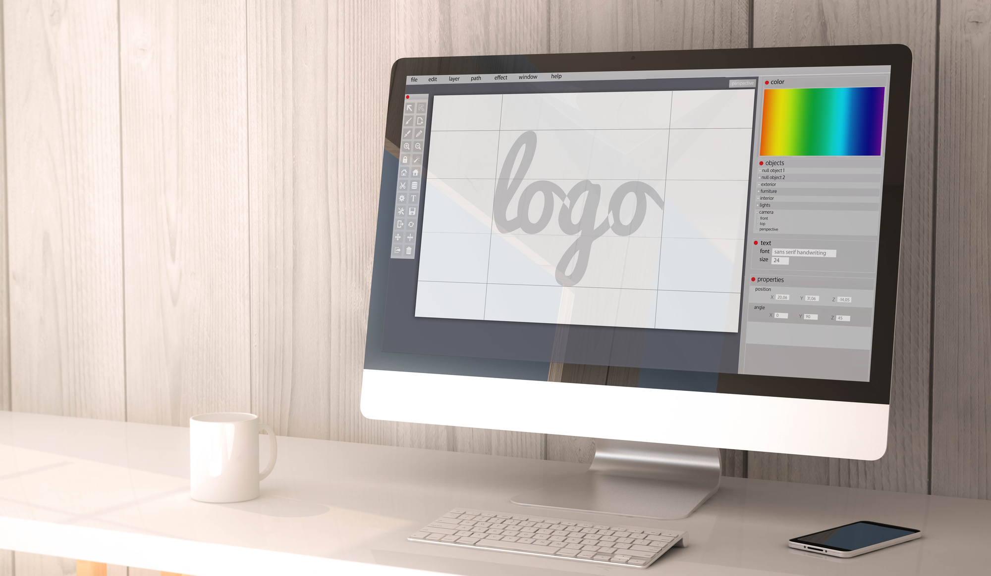
If you love the idea of designing your own logo on a user-friendly platform, look no further than online logo maker.
Our designer is perfectly customizable, and can easily be understood, even by technophobes.
Check it out today, and start making a killer smart logo design for your clinic.
How to Create an Amazing Chimney Services Logo
Posted on December 06, 2017 by Logo Design Tips and Tricks

People become extremely attached to their favorite logos.
This is why so many Uber customers voiced their displeasure when the transportation giant changed its logo. The old logo was a representation of the relationship the customers had with the brand.
You want people to develop the same level of attachment to your chimney services logo. But it’s hard to stand out in an industry where many logos look similar.
Let’s look at how you can make an amazing logo for your chimney services company!
Choose the Color Scheme
The colors you pick for you logo tell people what they can expect from your business. They affect how your target audience perceives your brand personality.
For example, Harley Davidson wouldn’t be as popular with rugged bikers if its logo was raspberry pink and Honolulu blue. But the color combo works very well for a brand like Baskin Robbins.
Thankfully, there are many colors you can use for a chimney services logo.
Blue can help you build an amazing logo. For one, it’s it the world’s favorite color. But people also associate it with reliability and professionalism.
Orange is another excellent choice for this industry. It signals sociability and affordability. Plus, it’s an energetic color that evokes feelings of happiness.
Use the color wheel to find complementary colors for your brand. However, try to avoid including more than three colors in your logo design. While Google, eBay, and NBC can pull it off, using four or more colors tends to give off more of an easy-going, fun vibe.
Select the Graphics
When beginning your design, look for inspiration from other chimney services logos. Take a few elements of successful designs, but avoid copying them outright.
In this industry, many logos feature a chimney, for obvious reasons. But simply placing a picture of a chimney next to a bland text won’t cut it. You need to put your own unique spin on the concept.
For starters, look at this example, which cleverly uses a ladder in place of the letter i. This is an excellent strategy as long as the readability of the logo doesn’t suffer.
If you’re still unsure how to approach your design, Click for More logo inspiration. Chimney Liner Pro does a great job of incorporating the ascender on the letter h into their graphic. It’s a very simple yet elegant design that delivers a clear message to the viewer.
You can choose to mix your graphic with the text, like the examples mentioned above. However, you can also place the graphic to the left or right of the text, or even above or below.
Pick a Font
Most chimney services companies use similar symbols in their logos. So what will really differentiate you from others is the written portion of your logo. You want the name of your business to stand out.
Choose a font that compliments your graphics. But no matter how good a font seems to you, make sure it’s readable.
ADAM.CG Pro is a very professional-looking font that pairs well with most graphics. It’s also easy to read from a distance.
Another great all-around font you can consider is Florencesans. It’s versatile and clean, and it suits the industry.
You can always include more than one font in the same logo. Just make sure that the two fonts aren’t similar, as this can be distracting. Try pairing serifs with sans serifs.
Finally, consider other aspects of your font as well. Switch between lowercase and uppercase to find something that looks eye-catching. Also, feel free to play around with the scaling of your font by condensing it or stretching it out.
Make it Versatile
One of the keys to an amazing logo is adaptability. For example, no matter how much you resize or change the color of the Apple logo, most people can recognize it.
An adaptable logo is simple, not chaotic. The more you have going on in your logo, the harder it will be to adapt it to different formats. You want your logo to look good whether it’s on a billboard, truck, Facebook profile, or t-shirt.
Never make a logo that’s too detailed. When you shrink your design down to use it on a business card, for example, a small bird in the distance can end up looking like a speck.
Also, don’t rely on colors to create a memorable logo either. In some cases, you might need to use a monochrome version of your design. So make sure it looks good in black and white before adding color to it.
Try Using Negative Space
If you look hard enough, you can see an arrow in the negative space between the letters E and X in the FedEx logo. You’ll also find a subtle peacock beak among the feathers in the NBC logo.
These two brands both use negative space to make their logos more distinctive. When done properly, negative space can take your amazing logo design to the next level.
To use negative space, start by placing your graphic on a white background. Think about how you can cut parts of it out to create a second shape that’s relevant to chimney services. You can also overlap new shapes or place white text over your graphic.
If you have a basic wordmark or lettermark logo, you can find shapes in the negative space of your letters. For instance, you can use the triangle found in the negative space of the letter V to add graphics.
Start Building Your Own Amazing Logo
Avoid trends as much as possible, because they come and go. Also, don’t copy the logos of other chimney services companies in your area. Your goal should be a unique, amazing logo that will be the face of your business for a decade or more.
Design the graphic before deciding the font. This way, you can scroll through the entire list of fonts and see which ones fit best with your graphic.
Are you ready to start designing? Use our free online logo maker tool to create an eye-catching logo for your chimney services business!
5 Features of a Streamlined POS Logo
Posted on December 06, 2017 by Logo Design Tips and Tricks

Since the point of sale industry is quickly turning into a nearly $100 billion field, you’ll need to offer the best branding to get your name out there.
As with any industry, this begins with finding a great logo.
If you run a point of sale business and don’t yet have a killer POS logo, you’ll need to follow the tips that will help you find that logo.
With this in mind, let’s explore the five features that guarantee a high-quality, streamlined POS logo.
What Makes A Streamlined POS Logo?
Make Your Logo Stand Out
It’s important that you do everything in your power to stand apart from your competition. Since this industry is cracking the $100 billion range, your competition will only continue growing.
Your logo needs to not only be eye-catching in terms of color and design, it should also possess plenty of personality. Doing this will make you a premier company in your field.
For instance, the Harbor Touch POS system logo is subtle, yet recognizable, which is why this company thrives.
Use A Professional Quality Logo Maker
There are a lot of services you can turn to when you need a great POS logo design. However, if you’re in need of a streamlined logo with little hassle, you can’t go wrong using a logo maker.
Having the help of an online logo maker lets you choose the right colors, dimensions, and design on your own, so you can get up and running ASAP.
Be sure that you find a reputable logo maker that gives professional-grade imaging with each file you create.
Hire A Company To Handle Your Logo Design
When you have a bit of a budget and want attention to detail, leave the logo creation process to a professional.
Hiring a professional logo design shop allows you to find the POS logo that will let your company market successfully.
However, don’t think the most expensive logo is the best. Companies like Nike and Twitter have built billion dollar empires with logos that cost them next to nothing.
Choose quality over price when finding your logo design company.
Think About What You’re Trying To Impart
The message is everything when it comes to selling your brand.
Since your POS system will serve as the foundation for a company that chooses to use it, make sure you’re conveying themes of security and trust.
There are endless ways to convey this with your logo, which is why a little creativity goes a long way. But knowing what you want to convey on the front end is half the battle.
Think About Dimensions And Symmetry
Finally, you need to make sure that you’re following some artistic principles that will bode well for your logo.
You need it to be symmetrical, yet not too plain. You’ll also want to emphasize the rights parts of the logo in order for it to stand out.
Get plenty of logo mockups before deciding on the final version.
Interested in learning more about branding and marketing? Check out more of our posts!
How to Design a Welcoming Dental Office Logo
Posted on December 05, 2017 by Logo Design Tips and Tricks

Did you know that there are 195,722 practicing dentists in the United States?
Quite the number, isn’t it?
If you’re a dentist, it’s important to create a welcoming and inviting environment that attracts both current and potential patients. Creating a welcoming dental office logo can help you achieve that sense of warmth and safety.
Unsure how to create your own? Check out our expert tips!
The Tooth Logo
As a dentist, you work with teeth all day long. Whether you focus on restorative dentistry or specialize in pediatrics, all dentists know their way around the human mouth.
There are many ways to create a beautiful dental office logo that features teeth. Play around with using a singular tooth or an entire smile. You can also experiment with different words and shapes.
The great news about having a tooth logo? People automatically associate it with dentists. After all, who else is going to use a tooth for a logo?
Kid-Friendly Shapes and Symbols
Do you work with lots of kids and families?
If so, you already know how scary visiting the dentist can be for young ones. (Although it can be just as scary for adults, too!)
This is where fun animals or shapes can really make a standout logo. Your design can actually impact someone’s mood when he or she walks through your door.
Consider kid-approved animal cutouts like dinosaurs, fish, or dogs. In terms of symbols, you want to do your best to emulate feelings of happiness. These include popular symbols like flowers, the sun, or plants.
Happiness and calmness are the goals here. The image should make you feel good when you see it!
Abstract Designs
With so many shapes, color, and symbol options, making an abstract logo design is easy and fun.
Abstract logos convey a sense of modern elegance. They also convey a sense of classy minimalism, both of which represent timeless marketing trends.
With abstract designs, the sky’s the limit. Play around with different textures, lines, and symbols. Get feedback from a colleague if you’re not sure what is (or isn’t) working.
Mind the Color
Many people fear the dentist, so the experience can provoke a lot of anxiety in some patients.
This means you need to take color palettes into consideration when designing your dental office logo. The following colors are most closely associated with feelings of happiness, calmness, and serenity:
- Yellow
- Silver
- Light blue
- Light green
- Pink
- Lavender
You may want to avoid colors like black, bright orange, and red. These colors can increase feelings of fear or uneasiness.
While color doesn’t necessarily make or break a logo, it’s important to keep in mind when you start designing.
Final Thoughts on Your Dental Office Logo
Your logo is one of the first images a patient sees when he or she walks through your door.
You want the image to be inviting, captivating, and interesting. You also want it to stand out and be unique from your competition.
Ready to get started on making your perfect logo? Check out our extensive tutorial here and let’s get designing!


