5 Tips for Creating an Amazing E-Cig Logo
Posted on September 25, 2017 by Logo Design Tips and Tricks
E-cigarette sales racked in over $2.5 billion in 2015 alone. Considering that that was a $1 billion hike from 2014, the numbers for 2017 are expected to be sky high.
These numbers show us the competition among e-cigarette companies is growing.
So, what’s an e-cig business to do to gain an edge over the competition and come out on top?
Every successful company has an amazing logo that not only sticks out in people’s minds. These logos influence smokers to start – and continue – using e-cigarettes.
Here are 5 tips on creating e-cigarette logos that will stick in people’s memories!
1. Have a Vision
The logo is not just something that’s stamped on the front of a store, on t-shirts, or on a website.
An amazing logo is what people think about in the hour after they learn of a company. It’s what they see a day, a year, or 5 years after buying that company’s product.
An e-cigarette company should establish what they want to accomplish through their logo. Then, they need to see it through for years to come.
To do so, it’s good to draw from inspiration with the intent to deliver something unique. Because e-cigarettes are still a growing industry, there’s a lot of room for creativity.
2. Convey the Brand Through a Symbol
A symbol can be the most effective way to share and communicate a brand.
With that said, there is no room for ambiguity in a logo symbol. Too little detail can be confusing, and too much detail can distract the consumer.
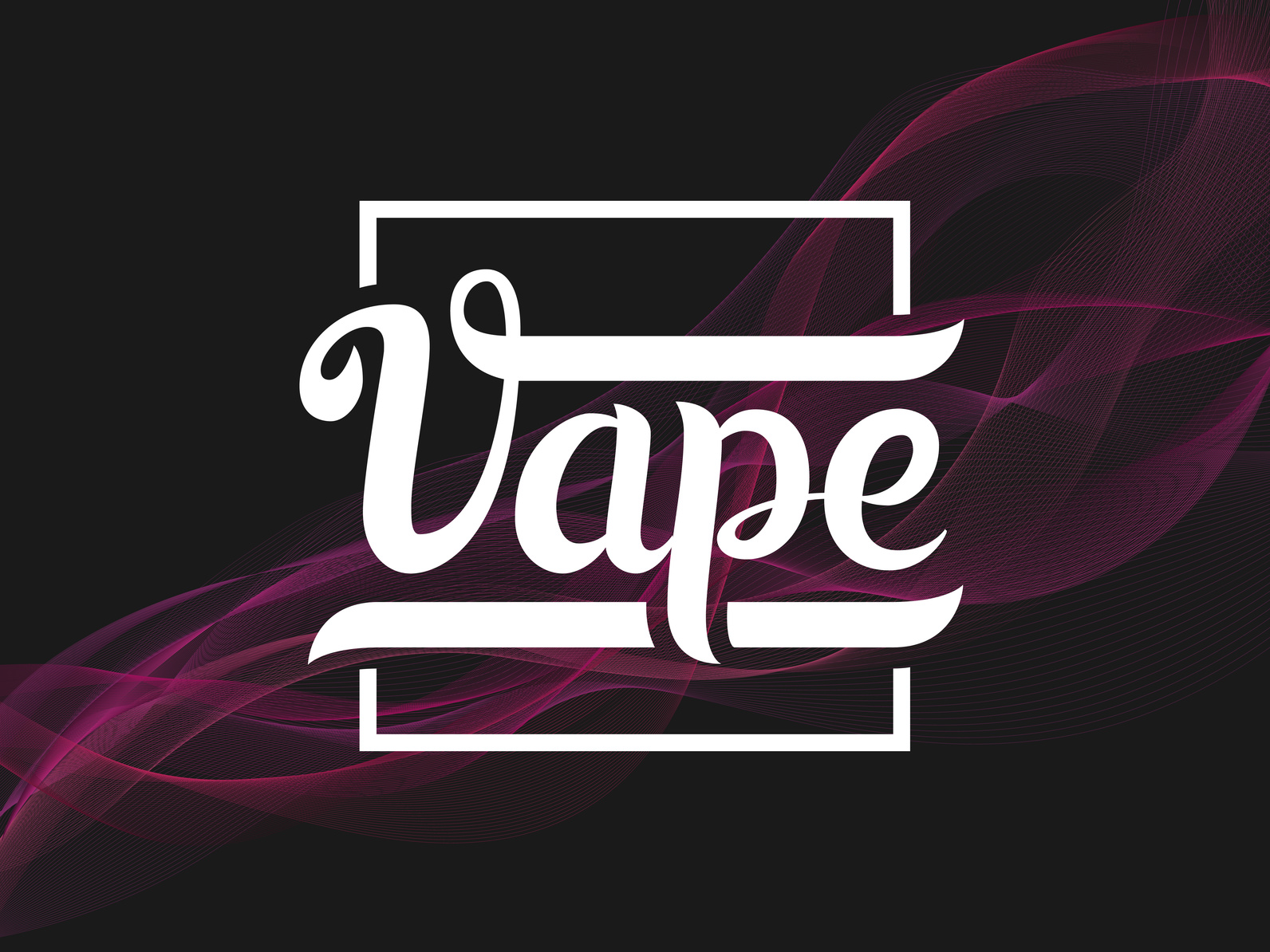
Illustrations of wispy vapor lines or a vape pen itself are common e-cig logos. Though they seem simple, they’re explanatory and to the point.
Of course, the details are also what transforms an ordinary logo into an amazing logo. After all, people are more likely to remember a unique logo than a generic one.
So, finding a balance of creative delivery is key.
3. Work In the Company Name
Every amazing logo incorporates the name in a creative way.
Yet, if it’s not readable, people will have a hard time finding the company in the future.
That’s why a strategic choice of font is so critical. The font needs to hold some relevance to the brand. It also needs to work well with the logo and the logo’s color.
It’s more important to focus on presenting the company’s name in a readable and engaging way. The other aspects of the logo, like the symbol, should communicate the rest.
4. Choose Colors That Reflect the Brand
Colors not only draw in an audience. They reflect and convey the brand.
Colors can help consumers learn more about a brand itself. Since there are different e-cig brands, certain ones benefit from specific colors.
For example, a luxury e-cigarette company can use purple or black in their logo. These colors are often associated with wealth and prestige.
An e-cigarette that’s all about being eco-friendly should incorporate green in its logo. E-cigarettes geared towards femininity can make effective use of shimmery tones, pastels, and pink.
5. Stay in the Game
As more e-cig companies develop, e-cig logos will become a dime a dozen.
So, it’s vital to keep an eye out on the competition. That way, a logo doesn’t get lost among other the other e-cig logos.
And lastly, it never hurts to take the customer’s feedback into account.
Design an Amazing Logo for E-Cigarette Business Success
Part of constructing and maintaining an efficient e-cigarette logo is staying current.
Every growing and successful e-cigarette brand needs a strong logo.
So, stay updated with all the current advancements in digital logo making. And create an e-cig logo that other companies will try to emulate!
5 Tips For Designing A Quality Lawyer Logo
Posted on September 22, 2017 by Logo Design Tips and Tricks

There are more than 1.3 million active lawyers in the US.
While many of them work for established law firms, others are self-employed. As such, if you choose to start your own practice, you’re up against fierce competition.
Unless you’re also an expert in some non-legal field that makes you invaluable, you only have a few ways to stand out. One of those ways is with a quality lawyer logo.
Let’s dig in and look at some tips for creating the perfect logo for you.
Color Choice
If you’re just starting out, give some serious thought to your logo color choices.
There’s an entire area of research on how color influences emotion. A few go-to colors are blue and black.
Cool blues are associated with trustworthiness. Black is associated with authority and intelligence. Both are useful associations for a lawyer.
Keep the Lawyer Logo Consistent with the Brand
The exception to color choice is when your practice has already established a color scheme as part of its brand.
Say you picked colors with local resonance, such as ones similar to the local high school or college colors. If you committed to those colors, the logo design needs to stick with them.
A logo with drastically different colors is not only jarring, but it could confuse people when seen out of context.
If your existing branding includes a specific, memorable font, the logo needs to use that font for any text.
Aim for Simplicity
Memorable logos are easy to remember. In other words, they’re simple.
Think of it this way. How difficult is it to recall the 4-digit PIN for your debit card? How about your bank’s routing number?
You probably remembered your PIN instantly. The routing number, well, most people need to look that up.
The fewer the elements, the easier something is to recall. The stylized quill that Seatons Solicitors uses as a logo is an outstanding example of simplicity. It’s a single image.
Keeping your logo confined to a few essential elements, such as an image and a name, makes your logo memorable.
Local Competitor Research
The odds are that the final version of your logo will resemble at least one other logo somewhere in the world. Unless it looks like a trademarked logo, that isn’t your problem.
What you want to avoid is designing one that resembles the logo of a local competitor. If your logo resembles one of theirs, you may end up giving them free advertising.
Research your competition. Compare your design to their logos before you commit.
Make It Scalable
When you first start out, that logo will probably only go on your website, business cards, and letterhead. Someday, though, you might be successful enough to want to put it on a billboard.
That’ll be difficult if the only version you have is a JPEG image. When you scale that up, it’ll be an unrecognizable mess.
Make sure you have at least one copy of the logo in a scalable file format, such as scalable vector graphics (SVG). Then you can enlarge or decrease as you deem fit.
Parting Thoughts
Designing your lawyer logo takes a little creativity balanced with some practicality.
It should be appealing and consistent with your brand. It should also be original enough to avoid advertising for your competitors. Don’t forget to keep it in a file format that will scale to any need.
If you’re ready to design your logo, give our logo maker a try.
How to Launch Your New Online Marketing Logo
Posted on September 22, 2017 by Logo Design Tips and Tricks

The rebranding of any business is a stressful time and only a few businesses truly do it well. The process can leave business stronger than ever or worse than when they started.
Changing up company logos is typically the first thing people think of when beginning a rebranding campaign. To be successful though much more is required including work on the company’s messaging and culture.
Are you preparing to launch your new online marketing logo and want to be sure you will be successful? Keep reading below for some helpful tips and tricks to ensure a successful rebranding launch.
Ensure Good Communication
When you are gearing up to make changes to your online marketing logo, be sure to broadcast how and why the chances are happening. Explain that careful steps were taken to ensure a successful logo.
Assuring current customers and even staff the change is positive growth is important. Express that the highest quality of service will remain throughout the change.
Engage Employees and Current Customers
One strategy to easy fear over change is to engage both customers and staff. To do this, provide explanation ahead of time where possible and solicit feedback.
If you have an email list for customers, send out previews of your new online marketing logo and ask for their opinion. Maybe provide a coupon or other incentive for your product if they provide feedback.
Build excitement with staff by having launch parties. Play fun games and provide newly branded swag like t-shirts and coffee mugs.
Presenting Your New Online Marketing Logo
People like information when presented as a story. Your customers likely will appreciate knowing the story behind the changes you are making. Explain why the brand changes are necessary and why the new end result will fit your business even better than before.
Consider dedicating a page on your website to explain all of this. Be sure to include high-quality pictures to express the stages of your brand transition. A short narrated clip with the highlights would work great for this.
Updating Your Website
Applying your new brand to your website is very important. This is likely where most of your customers will go for information, coupons, etc.
If you need help making an appealing rebranded website, seek out web designers. They can work with you to make the perfect online experience for your customers.
Avoid a Gradual Rollout
Think like a customer. If you see one identity on a website that doesn’t match with social media accounts, what will you think? You’ll likely be confused and wary of the business.
This confusion can seriously cut into your bottom line and is easily avoidable. Before changing any logos, make a list of everywhere it appears and changes all of them at the same time.
Final Notes
Now you know some tips to have a successful launch of your new online marketing logo and new brand identity. Do you still have questions? Please contact us and we will be happy to help.
How to Create A Church Logo That Converts!
Posted on September 22, 2017 by Logo Design Tips and Tricks

Looking to attract new visitors to your church? That sign out front isn’t your only option.
Creating an inspiring church logo is a great way to build a community around your house of worship.
By affixing a unique design to collateral such as your bulletins, newsletters, outreach materials and more, you help put a face to a name, so to speak.
Doing so makes you recognizable, spurs interest, and draws guests in.
Today, we’re discussing how to create a logo that’s powerful and gets your message across.
Ready to learn more? Let’s go!
Encourage Staff Input
Creating a church logo shouldn’t be a solitary process.
Rather, meet with your executive committees, as well as your full and part-time staff, to listen to their input and ideas.
Key questions to ask include:
- In what areas is our current logo weak?
- What is the message we want to send with our new logo?
- What religious symbols best convey that message?
- Is there a specific demographic we especially need to reach with this new logo?
In addition to your current team members, it’s also helpful to survey a few churchgoers (from within your own congregation and outside of it) to glean their opinions on your current and future logo.
Take a Look Around
The church around the corner might not be the best place to research your next logo design.
Or, could it be?
You might be surprised at what you can learn by simply researching the logos that other churches designed for themselves.
Excellent design knows no bounds. It exists in grand megachurches that attract thousands in attendance to Las Vegas wedding chapels like Little Church of the West. There are churches around the world whose message and marketing can act as examples of great design.
Even if you aren’t intending to imitate them, these designs can still provide you with inspiration on color scheme, symbolism, font, and more. Then, you can pull your favorite elements from each to create a new church logo that’s all your own.
Explore Your Stream of Consciousness
By definition, stream of consciousness thinking occurs when we simply let our thoughts go where they will, without directing them in any specific way.
While this might sound like an exercise best left for a psychology class, it can prove helpful when designing your church logo.
Begin by thinking of your church and its mission. Then, see where your mind takes you.
As you think of specific words, write them down.
Then, try using a visual thesaurus to expand on these ideas. This tool allows you to enter one word, then gives you a map of other, related words.
You may just stumble upon the perfect term that can translate into the perfect idea for a logo!
Draw, Refine, Repeat
Once you have the initial concept in place for your logo, the real fun starts.
Begin by loosely sketching how you envision your design will look.
Don’t focus too much on being precise. Just get the general idea on paper (or onto your logo design software).
Then, meet with mentors and other advisors who can objectively evaluate your design and offer suggestions to strengthen it.
Go back to the drawing board and work on these ideas, refining your logo until it passes your own test of effectiveness, as well as those of others.
Ready to Design Your Own Church Logo? Start Here!
Now that you know a little bit about how to navigate the logo design process, are you ready to create one for your church?
If so, we’d love to help.
Our free logo maker makes it easier than ever to turn your ideas into a powerful reality.
Register today to get started and share your mission with the world!


