How to Create a Spa Logo Design for a Growing Business
Posted on September 07, 2017 by Logo Design Tips and Tricks

The scent of lavender and tea tree oil fill the senses while relaxing music fills the air. While a calming effect immediately begins to take over the body, a clean robe is offered and services begin.
A hallowed place for most anyone on the planet to experience, booking an appointment at a spa can rejuvenate the body and pacify the soul.
The global wellness industry generates over 3.7 trillion U.S. dollars due to the rising popularity of wellness and healthy living. So, it’s no wonder that day spa logos are focused on zen designs.
But what exactly makes a perfect spa logo design to use for a new business focused on health and wellness?
Check out some of these helpful design ideas and tips to plan the perfect logo.
Achieve Zen With These Spa Logo Design Ideas
Sure, to begin a spa business correctly, things such as building location, employees, spa management software, and prices for service must be considered.
However, to really advertise to potential clients, it’s important to create the perfect spa logo design.
People chose to visit a spa because they want to relax and rejuvenate. Designing a logo that is calm, serene, and peaceful is the best way to reinforce these client goals.
Here are some of the key concepts to consider when creating a spa logo:
The Image
First, make sure to consider services rendered.
If the spa is focusing on a total body experience, choose an image that showcases the human body. If the spa experience is focused on facials and other services that revolve around the face (i.e permanent makeup, waxing, botox, etc) – consider a profile image of a body from the neck up.
The Color Palette
Color is key to evoking the perfect spa experience. So, the perfect spa logo design should focus on cool or neutral colors that evoke a feeling of peace.
There are 3 main color choices that have the ability to calm the mind and reduce stress:
Green
With the ability to conjure feelings of peace and tranquility, this is a great color option to choose for a spa logo design.
Blue
Blue hues can create feelings of calmness and well-being. Said to have a sedative effect, the color blue has been shown to lower blood pressure and body temperature.
Purple
Purple has the ability to create an overall mental calming effect. Used as a primary color in helping to soothe mental distress and nervousness, this hue is a perfect addition to any spa logo design.
The Name
Fonts are the finishing touches to a perfect spa logo. Choosing a font to showcase the spa name is integral in finalizing a relaxing, rejuvenating representation of the business and the services.
Choose something light and airy.
Avoiding bold and dynamic fonts can ensure that potential clients are not immediately overwhelmed with a name, but instead focused on relaxing colors and light strokes of a calming font.
Let The Zen Begin
Once the image, the color palette, and the font have been decided for the perfect spa logo design, clients can begin experiencing a mental and physical escape to utter relaxation.
Designing a spa logo that creates feelings of peacefulness and serenity doesn’t have to be a daunting task. Using a logo maker can be the best, easiest, and most effective way to create the perfect design.
Need some inspiration? Try using a template to create the perfect spa logo.
5 Ugly Christmas Sweaters to Inspire Your Holiday Logo
Posted on September 07, 2017 by Logo Design Tips and Tricks
Ugly Christmas sweaters are a hilarious, fun reminder to get into the holiday spirit.
Perhaps unexpectedly, they can also inspire your Christmas logo design.
Most people struggle to get the right gift for others. That’s one reason the sweaters are popular. They are an easy way to bring happiness to others.
To qualify as an ugly Christmas sweater, yours must have various bright colors. It must have a showy element that makes it stand out, such as glitter. Or it could be a striking, over-the-top image.
Lastly, the sweater should have a 3-dimensional feature. For example, some have Christmas tree decorations, bows, or reindeer noses.
So, how can all this inspire your Christmas logo design?
Read on to find out.
Getting Inspiration for a Christmas Logo Design
Every holiday, Google changes its doodle to fit the occasion. DuckDuckGo changes their mascot’s picture. Other companies, such as Starbucks, change their packaging.
These types of periodical changes require constant inspiration and creativity. Designers can make a unique Christmas logo design that boosts a company’s image.
Holiday cards are not left out, either. The new logos change the overall look of the cards. On a card website, you can click on different ones to pick your favorite.
The following are various ways the sweater can influence the Christmas logo design:
1. Color scheme
There is a science behind selecting colors. Some ugly sweaters have distinct color schemes that may work well in a logo. Use tiny polka dots to differentiate between shades of the same color.
2. Santa theme
Since Santa wears a red hat, your logo can have an image or letter with a hat. Everybody understands what it signifies.
3. Jingle bells design
Replacing some of the letters in a logo with representations works well. In this case, you can replace the ‘O’ letters in your logo with jingle bells. You can also add a red bow on top to symbolize a gift.
4. Christmas tree
Christmas trees are popular in ugly sweaters.
Use it in place of the letter ‘A’ in your logo. For more flair, throw in some of the decorations you use on the tree. For instance, other letters, such as ‘I’ can get a mistletoe on top.
5. Reindeer theme
Nothing says “Christmas” like some reindeer horns.
Incorporate them into your logo. It could be the head of the reindeer replacing a letter. Or it could be the horns sticking out of your logo. Top it off with the red nose on one of the letters.
Learn More About Logo Designs
Companies participate in fun games during the holiday season as a form of branding and marketing. If you look around, you’ll see the creative ways businesses use to stand out. They try free items, discounts, free shipping, and offer exclusive products.
Making changes to logos also serves the same purpose.
However, getting these logos right requires skill and constant learning. You need to read up constantly on tips and tricks to improve your designs.
Contact us to learn more.
5 Safety Logo Ideas That Are Great Starting Points for Contractors
Posted on September 07, 2017 by Logo Design Tips and Tricks
For most people, picking out a contractor goes much further than just choosing the one with the best price. The main concern many people and companies have is safety.
Everything, from your logo to your sales copy, needs to reflect that safety and reliability is a key point for your company. But how can you know if your logo communicates this message?
Here are 5 different ideas on how to accurately create a safety logo for your company.
Shield
One way you can help your logo reflect the right values is by adding a shield. Due to their historical significance, shields naturally remind people of protection and security.
Oftentimes logos with shields are used for health care companies, security companies, and educational facilities. An example of this is the insurance agency, Blue Cross Blue Shield.
Font
If your logo is going to have words in it, you need to think very carefully about the fonts.
What most people don’t know is that fonts carry unrecognized meanings for their viewers. Dainty and elegant script fonts are often associated with softness and elegance.
While contracting certainly can be elegant, a soft font doesn’t inspire confidence the same way another font could.
Another style of font that should not be used are jagged and rough edged ones. People understand that contracted work is hard and rough. However, those uneven edges do not depict safety and thus are not suitable for your logo.
Use Safety Symbols
If you aren’t crazy about adding the shield icon, there are still many icons available that portray safety and security. Here is a list of symbols:
- Construction hat
- Construction signs
- Hands
- Nature symbols such as leaves and trees
- Homes
Every single one of these symbols have been used successfully to portray comfort and safety hundreds of times. The feeling most people get when they look at them is one of comfort.
Therefore, you can feel confident in utilizing one of them for your safety logo.
Be sure to choose a safety symbol that best matches the personality of your team and the safety training they’ve received.
Try broadening your team’s safety experience through safety training online workshops! This will allow you to choose between even more symbols.
Avoid Red
Like fonts, you need to think carefully about the colors you use in your design as well. Different colors often evoke different feelings. This is called the psychology of colors.
Blues and green help people feel more relaxed and calm. Red, on the other hand, is bolder, louder, and can remind people of blood.
Therefore, in order to create a logo that portrays safety, it’s best to avoid the color red.
Smooth Lines
Lastly, your logo should have smooth lines. While sharp lines may look dynamic and exciting, they do not provide a sense of calm like smooth lines do.
After comparing the best safety logos, the most notable thing they had in common was their usage of smooth lines and shapes. If you are thinking about adding lines, paths, or roads in your logo, add a little bit of a curve and smoothness to them.
This will best portray an element of safety.
Create Your Own Safety Logo
Once you feel confident with your team and their safety practices, go ahead and create your logo. And there’s nowhere better to do that than here!
Shall we get started?
4 Tips on Designing a Tea Logo
Posted on September 05, 2017 by Logo Design Tips and Tricks
You don’t create the perfect brew on the first try.
Likewise, when you’re creating a tea logo for your business, there are a few things you need to keep in mind if you want your branding to be as strong as your tea.
Though much of logo design will be informed by the specifics of your brand, there are a few general rules and tips you need to keep in mind before you start creating.
Read on to find out what they are.
1. Keep It Evergreen
No, “Evergreen” isn’t an exciting new tea flavor you haven’t heard about yet.
Instead, evergreen refers to content and design that will be just as relevant in ten years as it is today.
Especially since tradition and a “classic” look are such an integral part of the tea industry, it’s best to create a design that avoids trends.
Plus, going with an overly-trendy look just means you’ll have to rebrand in the future. Doing this isn’t just expensive — it can also seriously confuse your customers.
2. Keep It Elegant
It’s called “High Tea” for a reason.
When you’re designing your tea logo, it’s always better to focus on concrete branding, as opposed to crowding your logo design with too many elements.
For example, the logo tea giant Chateau Rouge uses for its Rooibos Tea UK and other offerings is all about simplicity. The brand’s initials, “C.R.” are written in a looped white script, which stands out perfectly against a black background.
This suggests to consumers that your brand’s name speaks for itself and that you’ve already established yourself as a staple of the tea industry.
3. Keep It Legible
One of the biggest mistakes we see in logo design?
Fonts and images that become impossible to read and blurred when resized.
When you’re creating your logo, keep in mind that it’s not only going to go on the front of packages. It will also be displayed on your website, your social media accounts, in print ads, and even on your business cards.
Nothing says “unprofessional” like an overly-pixelated image and a font that even the thickest of glasses won’t help you to read.
Always limit the amount of texts and images in your design. This doesn’t just give you a crisp, clean look — it also ensures that you won’t lose any of the design during the resizing process.
4. Keep It Creative
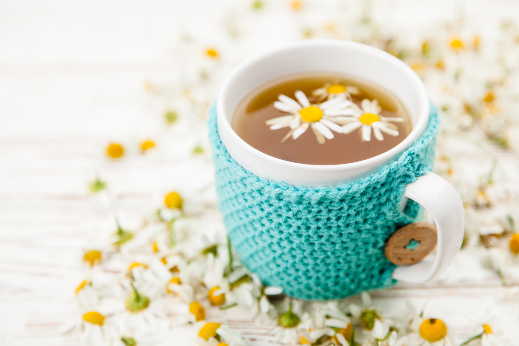
Tea leaves may be a great way to have your fortune told, but they’re a completely overused tea logo design element.
Other things we’re sick of seeing?
Cups/mugs of tea, tea bags, and tea pots. If you want to set yourself apart from the competition, you’re going to need to think outside of the tea box.
Ask yourself why you started your tea company in the first place. What niche do you fill? Designing a logo around your origin story ensures that people will always ask questions about your logo.
Start Designing Your Tea Logo Today
Thanks to this post, you now have several options when it comes to creating effective, unique tea logos.
To start creating, use our free online logo maker tool.
When you’ve settled on a design you like, be sure to keep checking back with our blog to learn more about how a strong logo serves as the foundation of all your future branding.


