Insurance Logos: 5 Awesome Trends to Follow in 2017
Posted on August 16, 2017 by Logo Design Tips and Tricks
A picture is worth a thousand words, right?
Actually, it’s worth 60,000.
Since our brains process images 60,000 times faster than text, your company logo is a chance to portray pages worth of information in one compact package.
So how do you make the best insurance logos? With easy to use tools like Online Logo Maker, it’s simpler than ever before.
Use this go-to guide to discover the best design tips for insurance logos of 2017. Read on for the top five trends.
5 Great Design Trends for Insurance Logos
Your logo is a chance to convey a message to consumers that they can understand at a glance.
You want it to be unique enough that it helps consumers recognize your brand, but not so complicated that they can’t make sense of it.
Let’s dive into the trends.
1. Shadows
The use of shadows can make a simple, two-dimensional image leap off the page. With a basic understanding of how to imagine and replicate a light source, it’s easy to achieve a logo with depth.
Shadow breaks have been featured in many new logos in 2017, particularly in overlapping elements to show a line break.
Utilizing this technique can take your logo from basic to superior.
2. Simplicity
Some of the most recognizable logos are the most simple. Think of the logo for Twitter, for example.
The simple white and blue bird logo evolved from much more complicated designs. For a company as iconic as twitter, simplicity is all you need.
If you’re not already a multi-billion dollar social media company, you can still harness the power of a simple logo.
3. Straightforward Text
Check out the example of the Insured ASAP logo.
It features the full website name, which helps customers retain the information.
It uses the colors red and black, which are colors that represent power and strength, and a white background which represents faith, meaning their customers can trust that they are in good hands.
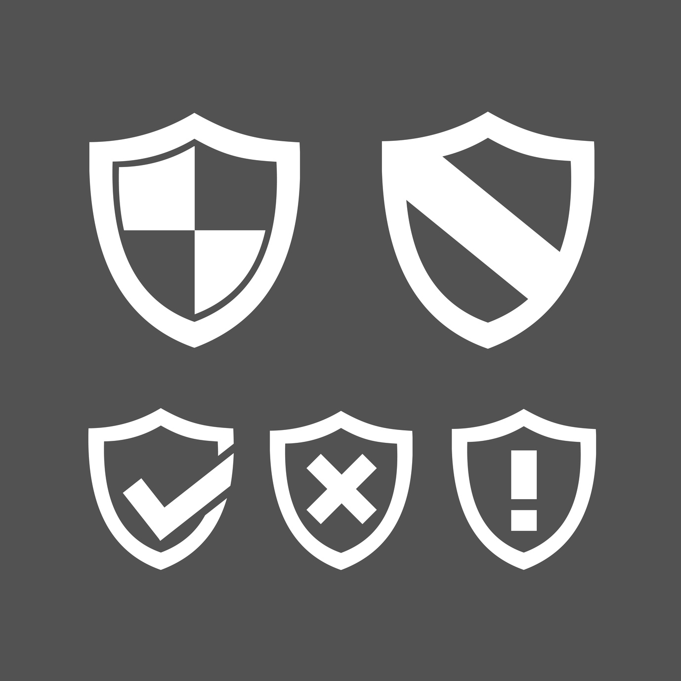
Even further, it showcases the image of a shield to communicate that their customers are protected. Nothing is hard to understand, and everything subtly evokes a feeling they want to communicate to their customers.
Even with text as the central feature, this logo still does a lot to represent the company message.
4. Overlays
Overlays are a great way to represent unity and transparency.
Overlays are also easy to achieve, and a great way to play with color mixing and create shapes that help to communicate your message.
Two or more elements combining in overlapping sections convey the company’s willingness to work together for the best results.
This is a powerful symbol for insurance logos.
5. Multi-centric
Concentric circles represent impact (bullseye), wisdom (the rings of a tree trunk), and harmony in relationships.
Plus, in today’s visual vernacular, concentric arcs have come to be a common symbol for wifi, making them also represent connectivity.
That is probably why multi-centric round stripes are such a hot trend for logos of 2017.
With color combinations, overlapping images, and graphic techniques, this symbolism can be easily incorporated to represent the harmony and strength behind your insurance business.
Now You Know!
Get more design tips and inspiration from the Online Logo Maker blog.
Questions? Get in touch with us by clicking here.
How to Design a Logo for a Rug Company
Posted on August 16, 2017 by Logo Design Tips and Tricks
Are you having trouble putting together a logo design for your rug company?
If you’re struggling with what to do, that’s actually a good thing. Too many companies slap their logo together with little thought. This often leaves them with a logo that doesn’t mesh with their brand and that they quickly end up regretting.
Your logo is a visual representation of your brand, so a lot of thought should go into creating it.
But, you don’t want to be stuck in a rut for too long. Eventually, you need to get something out there so your customers can start recognizing and establishing a connection with your company.
Let’s take a look at what you need to of to design a killer logo for your rug company:
1. Think About Your Audience
Your customers are more than just people who want to buy rugs.
In order to create the perfect logo, you need to think about what makes your customers unique. Knowing what makes them unique will help you design a unique logo that resonates with them on a personal level.
Get to know your target audience demographics for a bit before putting anything down on paper. For example, if your rug company attracts a younger crowd, you may want to design a logo with bold colors and trendy graphics.
If you attract an older crowd, you may want to go for a logo with larger print.
2. Match the Style to Your Industry
You need to make sure the style of your logo matches the type of rugs you sell.
Now, this doesn’t mean you need to replicate a rug design onto your logo design. But, your logo design and your rug design should reflect one another so customers know what you’re all about.
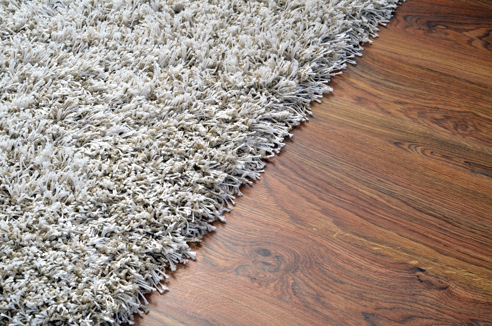
For example, if you sell all oriental rugs, you’ll probably want a design that’s sleek and contains muted colors. If you sell vibrant, shaggy rugs, you’ll want to go for a bolder design.
3. Keep It Simple
You probably see all sorts of crazy and intricate designs on the rugs you sell.
However, a design that looks great on someone’s bedroom floor doesn’t necessarily look great on a business card.
You’ll be putting your logo in small print a lot: on your website, company packaging, company apparel, and business cards.
Therefore, you need to keep it simple. A logo that has too much detail will just appear cluttered and chaotic in small print.
4. Think about Color
Color plays an important role in how people view your logo.
This is because people associate certain colors with certain emotions. For example, people associate red with passion, yellow with cheerfulness, and black with sophistication.
You’ll want to think about what message you’d like to convey to your audience before choosing colors.
5. Check Out the Competition
Checking out your competitors’ logos is a great way to figure out what’s working and what isn’t.
It will help you focus your design so it stands out from the rest and is remembered. It will also help ensure that you’re not infringing on anyone’s design.
Rug Company Logo: Wrap Up
Hopefully, this article provides you with more focus for your logo design.
Once you’ve got an awesome logo, let us know how it turns out! And if you have any questions about the design process, please drop us a comment below.
5 Designs to Help You Clean Up Your Barber Shop Logo
Posted on August 16, 2017 by Logo Design Tips and Tricks
Does your barber shop logo need a refresh?
Logos often encourage feelings of trust and satisfaction in a brand or product. They should be updated as often as business practices are. And in this fast-paced market, your outdated logo could be driving clients away.
Updating your logo can refresh your brand and inject new life into your customer base. Check out these five tips to find out more!
Old Timey Looks for the Modern Guy
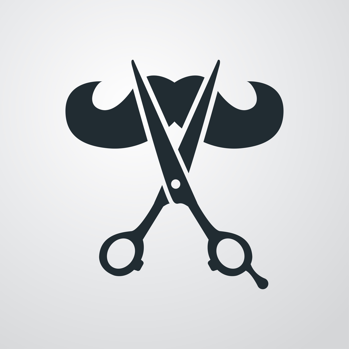
Let’s face it. Facial hair is popular. Everyone’s boyfriend is starting to resemble Grizzly Adams.
With this in mind, there’s nothing more important than keeping your favorite barber shop on speed dial.
But, there’s something classic about the pre-industrial designs of old. You know, back when gun slingers with greasy locks wore big hats? And they ordered strong drinks from a man with a mustache for days?
When it comes to designing your new logo, fun fonts signal creativity.
Clean and Simple
Before you start designing your new barber shop logo, identify logos you love. Choose two or three favorites.
Remember – clean lines and a simple statement will carry you a long way. You want a logo that is easily updatable.
Some of the best logos sport very simple black and white designs, a chic and dramatic choice.
Go Vintage With Your Barber Shop Logo
Everyone loves vintage designs. Barber shops are hot beds of creativity.
These eye-catching vintage designs draw the eye. They also bring to mind the demon barber of Fleet Street.
This kind of logo has a fresh touch, despite its vintage vibe. Add it to business cards and any other swag you want to emblazon your style. Your logo will become a walking advertisement on t-shirts, coffee mugs, and key chains.
Shaken, Not Stirred
There’s vintage and then there’s Bond street. This is no hipster. This is a man who takes pride in his three piece suits and a clean cut look. He’s the type of man who reads beard trimmer reviews from http://www.beardtrimmerreviews.co.uk/
For these kinds of logos, think classic and clean.
Remember to keep the lines straight and stylish. This is an easy style to update because not a lot of changes are needed. When clients come to know and love a service that has been around for decades, they will remain loyal.
The Classic
This man won’t be caught dead with a beard – and you’re going to keep him that way. He is a no frou-frou kind of guy and he likes his hair that way as well.
Think about the type of client you’re serving. When you do this, the idea for your logo will become clear. Some of these types can lead you to get a clearer picture of what you want for your barber shop logo design.
When you’re ready to take your logo design to the next step, check out this site for some practical tips on how to create your logo and take your brand to the next level.
5 Expert Logo Tips for Your Video Editing Service
Posted on August 16, 2017 by Logo Design Tips and Tricks
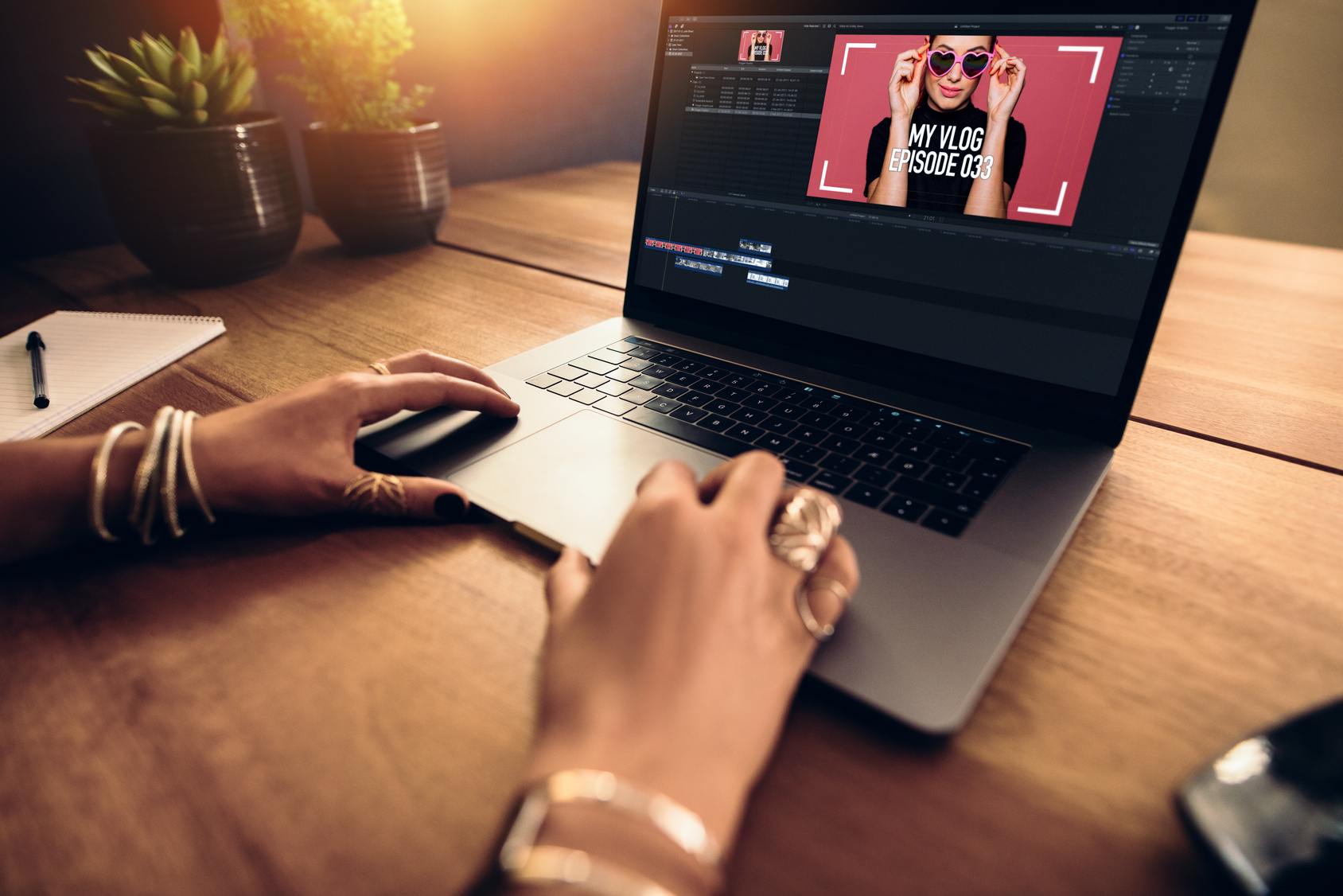
Whether you’re aware of it or not, your logo says a lot about your video editing service.
The colors, typography, and layout you choose can, for better or worse, influence your potential customers. In fact, in a 2015 study, researchers found that even the shape of your logo can affect how consumers view your brand identity.
That’s why, when it comes to expert logo design, the devil is in the details. Keep reading for our top 5 tips on creating the best logo for your video editing company.
5 Tips for Creating an Expert Logo for Your Video Editing Service
1. Choose the Right Shape
So what did those researchers find when it comes to logo shape? It turns out that logos with rounded, circular shapes seem “softer.” As you may expect, logos with a more angular design come off looking “hard” to consumers.
These associations go deeper. Companies with rounded logos actually seem more caring and sensitive to consumers. Harder shapes conjure up ideas of durability and strength.
Keep these associations in mind as you design your logo. When it comes to video editing services, a rounded logo can create a feeling of movement. That may be an association you want to encourage for your customers.
2. Pick Purposeful Colors
Color psychology is a trending topic in the logo design world. That’s because every hue you choose evokes quick, subconscious responses in your customers.
Blue, for example, tends to evoke feelings of trust and confidence in the minds of consumers. Red is highly stimulating, orange is attention-grabbing, and yellow seems energizing and warm.
Keep these ideas in mind while designing. The colors in your logo should match your brand’s overall image.
3. Typography Matters
Your font choice says a lot about your company’s products, message, and core values, depending on what you choose.
In general, serif fonts—those with small lines at the end of each stroke—come across as traditional and professional. Sans serifs—those font families without lines—seem more modern and innovative. Specialty fonts can seem creative, playful, or too busy.
Above all else, make sure the font you choose is readable, even at a small size. Your logo will show up on banners, business cards, and smart phones. Make sure you can read your company name across any iteration.
4. Look at the Whole Picture
While it can be easy to get caught up in the details of the design process, your customers will view your logo as one whole picture. That’s why you need to periodically take a step back and consider how well each element works with your overall design.
Get your logo down to just the essentials. Get rid of any element you don’t really need and make sure everything to include plenty of white space.
5. Don’t Be Afraid to Innovate
While it’s essential you keep these tips in mind as you design your logo, don’t let yourself feel bogged down by them. Sometimes an unexpected element in a logo can spark extra interest in a brand.
Start Designing Your Logo Today
If you’re ready to refurbish your logo—or create a new design from scratch—visit Online Logo Maker. We make it easy to design a beautiful, professional expert logo to advertise your video editing services.


