Electric Logo Designs for Electromagnetic Therapy Sites
Posted on August 16, 2017 by Logo Design Tips and Tricks

Many people struggle with sleep problems, chronic pain, and their general health. Electromagnetic therapy is a new and rising field that has been shown to have amazing healing effects in these areas.
For your electromagnetic therapy business to succeed, you’ll need an interesting and relevant logo. In fact, it takes only 10 seconds for consumers to have a first impression of a company based on its logo.
Keep reading for our tips on how to create a great logo design that will leave a lasting, positive impression on consumers.
Use Recognizable Electromagnetic Therapy Symbols
Because electromagnetic therapy is a somewhat new form of healthcare, potential customers might not be familiar with certain terminology or symbols yet.
By using symbols people recognize, it will make your logo much more accessible to a more general audience.
You could incorporate a lightning bolt or sparks to represent the “electro” part of “electromagnetic.” Similar to this, you could use a classic horseshoe magnet. The benefit of using these types of symbols is that it will link items and symbols that people are already familiar with to your business.
Be Smart With Colors
Colors aren’t just for aesthetics: it’s been shown that certain colors can create particular feelings and emotions to consumers.
As an electromagnetic therapy business, you want to express that you are trustworthy as a medical company. Many medical logos use blue, as it’s associated with comfort, trustworthiness, and calm.
You may also want to include some brighter colors in order to catch the eye of potential clients. Bright colors like yellow and orange might match well with the conception of electricity that would go along with your brand.
Notice the Trends
Keeping up with the current styles and trends is important for an innovative and new company. Having an outdated or vintage looking logo could make you look out of touch.
You could go for a minimalist look to keep it simple and trendy. Another current design trend involves something we mentioned earlier: color. Going for brighter, bolder colors is something that has recently become huge in logo design.
There are so many different types of logos, so follow the trends and pick something that works for your brand.
Don’t Be Afraid to Be Unique!
It might seem counterintuitive to put a tip to be unique right after the tip to follow the trends. Just hear us out: noticing and incorporating trends does not mean copying other logos and having no creativity.
For example, you can follow the minimalist trend while coming up with an interesting design for your company. You could use a recognizable symbol along with a symbol specific to your business as part of your logo, like a PEMF machine or a MAS therapy mat.
Here are some logo ideas that could set you apart from other companies:
- Use illustrations or a hand-drawn logo
- Try various color combinations that aren’t as popular
- Depict symbols other companies aren’t using
These are just a couple of ideas to get you going on a creative design that will make your company logo stand out. Don’t be afraid to take a risk or try something completely new!
Bottom Line
Hopefully these tips will help you create a great logo for your electromagnetic therapy company.
If you’re still feeling stuck or need some more help creating a logo, we are here to help! Try out our logo tutorial, or contact us to get started!
Spice Up Your Company’s Heating Logo With These 3 Ideas
Posted on August 16, 2017 by Logo Design Tips and Tricks
Heating, ventilation, and air conditioning (HVAC) is a booming industry. According to the Bureau of Labor Statistics (BLS), jobs in this field are expected to grow by 14% in the next decade, which is much faster than most other industries.
For HVAC companies, however, that additional growth means additional competition. To set yourself apart from other companies on the market, it’s essential to create a brand that customers will recognize and be loyal to. Creating an engaging heating logo is one great way to do just that.
Here are three ideas to help you learn how to make a logo for your heating company that will be bold and memorable.
Legibility is Key
The purpose of your logo is to make your company’s name and brand memorable. When customers see your logo, they should be able to immediately recognize it and associate it with your company. For this reason, it’s important that your logo is clear and easy to read.
One way to do this is to keep your logo simple. A logo that is cluttered with too many colors, words, and images is distracting and difficult to understand. When it comes to logo design, remember that, in general, less is more.
Of course, you don’t want to be too minimalist with your logo. A well-established brand like Nike may be able to get away without putting their brand name in the logo, but the same is not usually true for small businesses. Instead, Make sure your logo displays your companies name in a way that is clear and easy to read.
Remember the Importance of Color
The color is one of the first things a customer notices when they look at a logo. Think of Coca-Cola for instance. The iconic red-and-white coloring is immediately recognizable, even from a distance.
When choosing colors, try to choose something memorable, and that gives the right connotation. For instance, the color green is typically associated with nature, so probably is not a good choice for a heating company. Instead, consider choosing blues, which are associated with authority, or reds, which are associated with warmth.
Think of Where You’ll Print Your Logo
When you’re making a logo, it’s important to consider what it will look like in context. Since your logo is part of your brand, it will appear on all printed materials. A logo that looks great on your website might not look as good on a pen or a coffee mug.
For an oil or gas heating company, you’ll probably want your logo on hats, t-shirts, and trucks. Think about whether the colors and design you choose for your logo will translate well to these mediums.
Making the Perfect Heating Logo
By following these tips, you’ll be able to create an awesome-looking logo that draws people to your HVAC company.
If you’re ready to get started on your company’s heating logo, check out our free online logo maker. This tool will help you to make a logo that looks great and represents your business well.
5 Tips for Designing Therapeutic Logos
Posted on August 14, 2017 by Logo Design Tips and Tricks
Logos are much more than just brand identifiers.
The power that a well-designed logo carries is invaluable. They are a primary way of both sending a message to your audience and making a lasting impression.
A logo is also often a representative of the niche industry. Everything from imagery and color to the actual content needs to be considered. Bringing all of these elements together in a cohesive manner is a challenge.
However, once mastered, a logo can have long-term value.
Design Techniques for Therapeutic Logos
Designing a graceful logo requires certain elements that convey a comforting yet compelling vibe.
These types of logos are used for spas, massage therapists, acupuncturists, self-help professionals or even compassion card companies. This logo style must stand out as both welcoming and simple.
Let’s look at five tips to creating quality therapeutic logos.
1. Your Message Matters
When you’re designing a engaging logo, you need to know beforehand what message you want to send to your audience. The logo you come up with is more than just a nice image.
Think about your business, and decide what your overall goal is. A pleasant design should get all the information across without overwhelming the reader.
2. Color and Imagery
These two factors are very important in therapeutic logo design. Colors have been shown to have a psychological effect on our minds. Color psychology tells us that blues and greens, along with earth tones, have calming and peaceful affects.
Specific imagery can also help properly convey your message. Many spas and yoga studios use relaxing imagery like the lotus flower.
Find a unique take on peaceful imagery when designing your logo.
3. Keep It Simple
A common mistake in logo design is creating something too abstract and busy. Especially with a calming logo, it’s best to keep things simple and clean.
It needs to be relaxing to the eye and mind so the message stands out.
4. Text and Spacing
The text style, size and spacing of your logo is another way to help keep things simple.
Always align the text and imagery so that one element doesn’t distract from the other. You’ll also want to use a graceful yet readable font style.
Font size should be big enough to be read from a distance but not too big. A therapeutic design should never force itself upon the audience.
5. Know Your Audience
Ask yourself where your logo will be seen and why. A logo for a spa shouldn’t look anything like a logo for a motorcycle shop.
Simply knowing your target audience and what they want is invaluable.
This information should tell you what kind of logo design they will react to. Creating a design that is out of place will surely cost you customers.
Design Your Custom Logo Online
Our tool will help you create your logo without frustration or stress. We offer templates, font selections, and an interface that is straightforward and intuitive.
The process of creating your new logo is only a few clicks away.
Visit our website and blog to learn more about our logo creation services.
Logo Creation Tips for Your Aruban Real Estate Business
Posted on August 14, 2017 by Logo Design Tips and Tricks
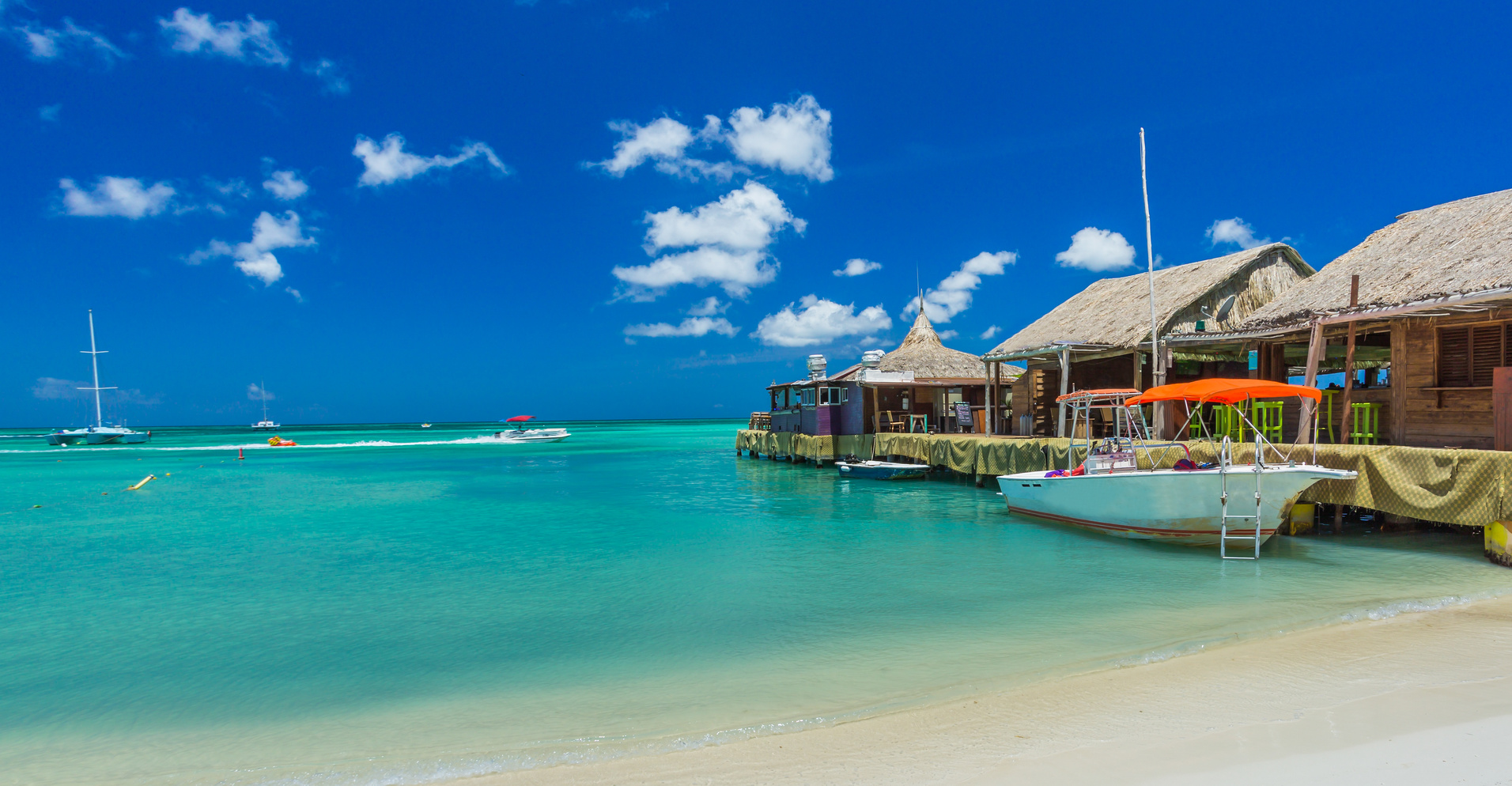
If you’re serious about marketing your Aruban real estate business, you’re going to want a logo that pops. Something that stands out, but will still drive home what you and your company are all about.
Logo design can feel intimidating for someone without the proper training, but you don’t need to have majored in graphic design to create a logo anymore.
The tools are now readily available and designed to be intuitive. You just need some style guidelines. We can help with that.
Leverage Your Name
If you really want your Aruba real estate business to stick in someone’s mind, make sure your logo includes some aspect of your company’s name.
If your name already is evocative of a certain image, keep following along that creative path. Look at a company like Two Trees Management. Their logo is simple enough, two trees in silhouette, but it’s sure to stick in someone’s mind.
Our brain remembers things best when we are presented with a picture accompanied by a distinctive correlating word. If you want customers to remember your name, this is the simplest way to do it.
Bring Your Personality
Not all business names will be lucky enough to fit with a generic picture. Many Aruban real estate businesses are named after their founders or owners.
In this case, it’s effective to let your company’s personality shine through in the logo. Businesses with strong brands appeal to their target clientele by presenting themselves as the kind of business those specific clients want to see.
If you’re fun, young, and light-hearted, use brighter, more audacious colors and tones. Don’t be afraid to design something cute and not too self-serious.
If you’re trying to appeal to a higher-end clientele, go for something more subtle and classy. More subdued colors and a minimalistic, dignified design.
Just make sure anyone who sees your logo can get a sense of who you are as a business. That’s the best way to forge a connection with your target clientele.
Choose a Consistent Theme
Your logo should not look like a sore thumb on a billboard for your business or your company’s website. Make sure it fits with whatever recurrent theme you have already inserted into your brand.
If you haven’t built a consistent theme yet, now’s a great time to start. The first step is to choose your color scheme. This should be the four or five shades of color you use on your logo, throughout your site, and on the styling of your business’s name.
Next, pick out what kind of style you want. If it’s minimalistic, use empty space to your advantage. Your website, as well as your logo, should feel expansive and open. Kind of like your ideal modern home. If it’s flamboyant and colorful, keep things busy-looking, like an eccentric’s house.
Get to Designing That Aruban Real Estate Logo
Follow these guidelines, use Online Logo Maker’s free tool, and you’ll be able to create a logo worthy of a graphic design artist.


