How to Know if It’s Time for a Logo Redesign for Your Couple’s Counseling Retreat
Posted on August 04, 2017 by Logo Design Tips and Tricks
The right couple’s retreat logo can have a huge impact on your business.
Sometimes, companies get it right on the first try and never have to look back (think Nike.) But more often than not, a logo has to be revisited to keep up with the changes in your company and the changes in the market.
This is especially true if your business has been around for a while. A logo created in 1983 probably isn’t speaking to an audience in 2017.
Redesigning a new logo for your couple’s retreat may seem like a daunting task. But giving your logo a new lease on life can pay off significantly.
But before you bust out the drawing board, take some time to consider if a redesign is really what you need.
Asking yourself the following questions will help you determine if a new logo is really right for you:
Has Your Business Changed or Expanded?
Think about what you offer during your couple counseling retreats.
Has anything changed recently?
For example, have you recently added new services? Have you expanded the location options for your retreats? Or, maybe you’ve included a religious element to your retreats?
If your business has changed or expanded in any way, it may be time to consider changing your logo to reflect that.
Do You Have New Competition?
As divorce is becoming more prevalent, more people are realizing the importance of working on their marriages and relationships.
This means that couple’s retreats are increasing in popularity. If you were at the top of your game ten years ago, it’s likely that you’ve now got some serious competition.
Redesigning your logo can help show your prospective customers that you’re up-to-date. Prove that your retreat is worthy of consideration.
Are You Speaking to a New Audience?
You’ve probably got a handful of loyal followers who rave about your retreats and return every year.
But remember, loyal customers aren’t your only customers. Likely, younger generations are interested in your retreats as well. A logo redesign may be just what you need to connect with this new, younger audience.
Has Your Brand’s Values or Mission Changed?
Likely, your couple’s retreat business has changed over the years.
If this is the case for your retreat programs, then it may be time to create a new logo that reflects these changes.
Is Your Logo Dated?
If your logo was created 10+ years ago, it may be time to give it an update.
A logo that was created decades ago probably doesn’t look very appealing. Plus, there’s a chance it’s not compatible with all of the recently created technological devices that are meant to showcase your couple’s retreat logo.
A data logo also communicates to potential clients that you’re stuck in your ways, or that you just don’t care about evolving. Especially for people trying to work on their marriages, your apparent fear of change isn’t appealing.
Your New Logo: The Takeaway
We hope this article helped you decide whether or not a new logo is right for your couple’s retreat business.
If it is time for an update, be sure to check out our online logo maker for some help.
5 Famous Surgeons to Inspire Your Plastic Surgery Logo
Posted on August 03, 2017 by Logo Design Tips and Tricks

When most people look at celebrities, they think that they’ve got something the rest of the population doesn’t. Their success must be attributed to everything that’s so special about them.
It’s true that many celebrities got to the top because of their talent. But they’re also good at branding. Celebrities can sum up what they offer in a simple logo.
Branding is the difference between being an excellent plastic surgeon, which is attainable for anyone who works hard enough, and a celebrity plastic surgeon whose practice is overflowing with clients.
In that vein, take a look at some of the celebrity plastic surgeons who’ve made it big. Consider not only their surgery skills but also the ways they’re able to communicate their abilities through branding and their plastic surgery logo.
1. Dr. Terry Dubrow
Most of America knows Dr. Terry Dubrow from the E! television show Botched. But in addition to starring in a television show, Dr. Dubrow is also an innovator. He regularly publishes in journals and co-authored The Acne Cure.
Dr. Dubrow is able to capitalize on name recognition, but he also has a strong marketing strategy. His practice’s plastic surgery logo features his initials written in an elegant font carefully nestled against a beautiful woman’s body.
His marketing, including his use of color and images, shows how he focuses on aesthetic beauty. Dr. Dubrow has excellent clinical experience, but he also conveys the need to see beauty in the whole body. And he’s able to accomplish all this through his logo.
2. Dr. Paul Nassif
Dr. Paul Nassif co-stars with Dr. Dubrow on Botched and he’s also known for his appearances on the Bravo Real Housewives franchise.
Yet, Dr. Nassif doesn’t market himself as a reality TV star. He also emphasizes his commitment to medicine as a science and beauty as an art.
His branding and plastic surgery logo represent his commitment to the blend of science and art. When Dr. Nassif is selling his services, he’s not selling his celebrity or a product, he’s selling a distinct vision.
3. Dr. Raj Kanodia
Dr. Raj Kanodia is another celebrity surgeon, but he markets himself using the celebrities he’s worked with. Touting skin care reviews from Kim Kardashian-West and Britney Spears, his practice’s website focuses on using visual aids to tell its story.
In addition to filling his website with images of beautiful women and before-and-after photos, Dr. Kanodia also includes images of himself showing off his professional prowess. His homepage shows him speaking at conferences, talking to the press, and meeting with patients.
Dr. Kanodia’s branding is more visceral than Dr. Nassif or Dr. Dubrow’s branding. He uses his branding not to describe his ability to create a work of art. And his plastic surgery logo doesn’t pretend to be coy: it includes images of the greatest works of art like the Mona Lisa to make his point.
Dr. Kanodia is one of the best plastic surgeons in the world. But he’s sought after by Hollywood elite and mentioned across the media because of the way he’s branded his practice. He directly targets celebrities and fame – he calls himself the Hollywood Doctor.
So, it’s no surprise that celebrities and fame are what he gets.
4. Dr. Sherrell Aston
Dr. Aston is the first New York City-based plastic surgeon in this list.
He’s not only a practicing surgeon but also a Professor of Plastic Surgery at New York University. Other leadership positions include past President of the American Society for Aesthetic Plastic Surgery and twenty-three years as Chairman of the Plastic Surgery Department at the Manhattan Eye Ear & Throat Hospital.
The way Dr. Aston brands himself is different to the west coast group. Dr. Aston participates in the same press events and hosts his own show on SiriusXM. However, he touts himself as a scientist first and only implies the aesthetic aspect of plastic surgery.
He focuses less on the look achieved and more on the method of achieving it by emphasizing his participation in the latest advancements in the field.
In other words, Dr. Aston uses his medical credentials to brand himself. He supplements it with a plastic surgery marketing strategy that is refined, clean, and emphasizes professionalism over beauty.
Perhaps he does this because he’s operating in a different market. Hollywood and other Los Angeles clients are a different target market than New Yorkers. However, his use of color and photos demonstrates that he is the best in the business in his niche – and his marketing reflects that.
5. Dr. Olivier de Frahan
The final plastic surgeon on the list isn’t based in the U.S. at all. Dr. Olivier de Frahan splits his time between Paris and London.
Unlike his American counterparts, Dr. Frahan did away with the trappings of a full website. And it’s his minimalist website that’s earned him a place on this list.
Dr. Frahan has the air of exclusivity, and he markets himself this way. He uses a simple, elegant image on a clean background. His website includes a list of his professional qualifications and the phone number to reach him.
His website and logo are reminiscent of old glamor and elegance. It’s not concerned with the latest trends. Rather, he’s the epitome of old world Paris – in the best way. Of course, having an office in the most exclusive area of Paris doesn’t hurt his image.
What can plastic surgeons take away from Dr. Frahan? The rule to designing a plastic surgery logo targeting the Grace Kellys and Coco Chanels of today is ‘less is more.’
It’s not clear who Dr. Frahan’s clients are, but one can rest assured they’re beautiful.
Conclusion
Branding yourself like a celebrity plastic surgeon sounds impossible from the outset. But as they say, celebrities are just regular people.
All the doctors discussed above are at the top of their game, but they’re not super human. Rather, it’s the way they market themselves that sets them apart from other top surgeons in the field.
The key takeaway from studying these celebrity plastic surgeons is that it is possible to convey celebrity status through a plastic surgery logo. So, put thought, time, and care into designing a logo.
It might earn clients that catapult careers.
5 Stats to Inform Your Telecommunications Logo Redesign
Posted on August 03, 2017 by Logo Design Tips and Tricks
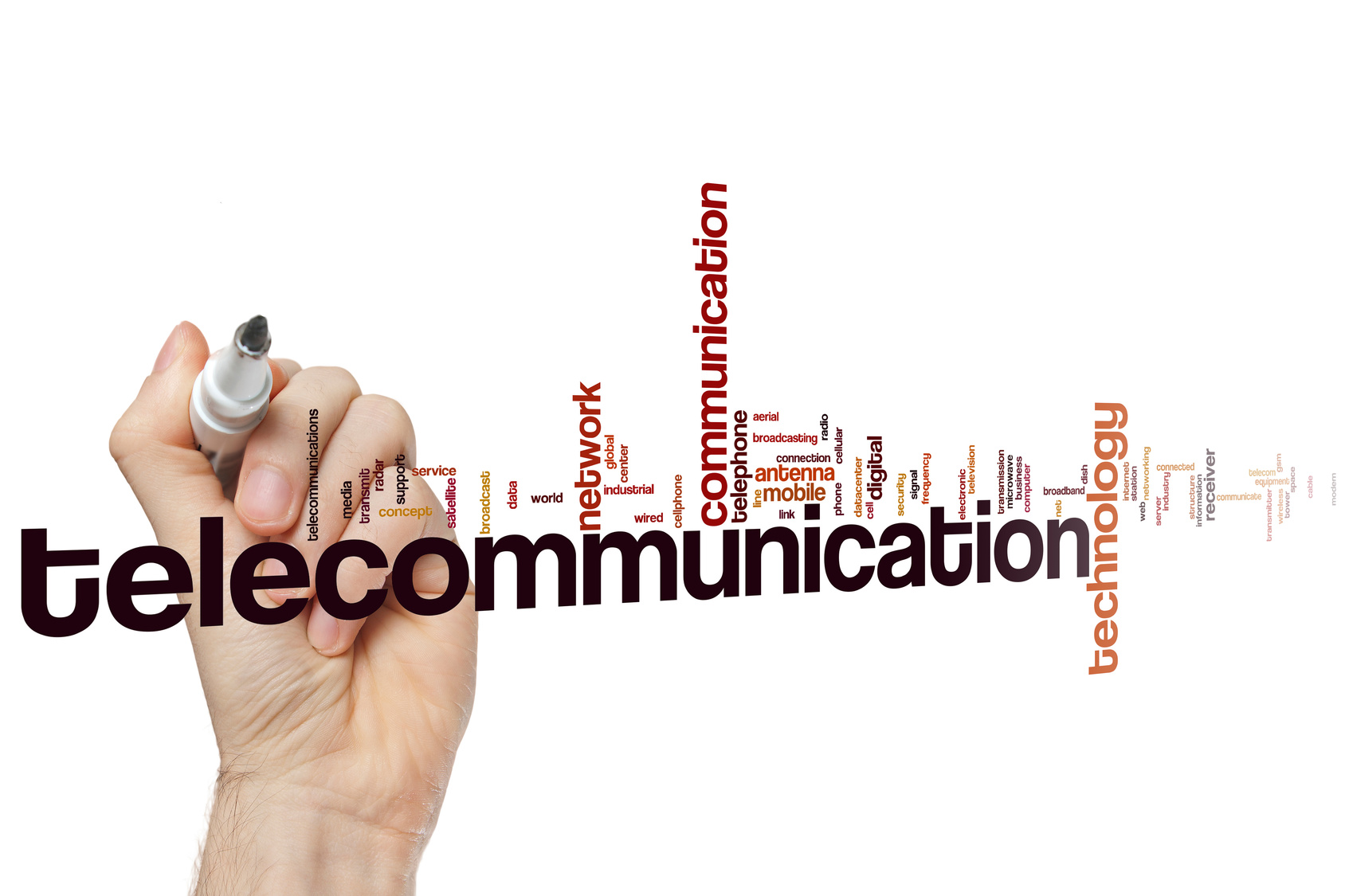
Are you planning a new telecommunications logo? This is an industry that moves fast, and you can’t afford to create a logo that doesn’t reflect the current concerns and desires of customers.
You need to be up-to-date, and we’re here to help.
Read on for five enlightening statistics that will help inform your logo redesign.
1. Broadband Is Growing
This year, 2017, there are over 930 million fixed broadband subscribers worldwide.
And that’s nothing. By the end of 2021, it is expected that there will be over 1 billion fixed broadband subscriber lines.
For telecommunications companies, broadband is big. For many of your customers, it will be the top priority, coming above TV and phone services, and your logo should reflect that.
Think about what broadband represents to your customers, and try and incorporate this into your logo.
For example:
- Fast speeds
- Staying connected
- Being up-to-date
- A reliable connection
You might include images which represent speed, reliability or connectedness – like circles and arrows.
2. Privacy Is More Important Than Ever
In the past, a key source of revenue for internet service providers was selling data to marketing firms to allow targeted advertising.
This is more difficult under new opt-in models, and online privacy is becoming more and more important to consumers. Which would you pick, a firm that sold your data, or one that protected your privacy?
Exactly.
Make sure your logo signals your commitment to privacy and safe storage of personal data. You could use symbols like locks, keys, safes, or streams of encrypted data to accomplish this.
3. 5G Is Coming
What’s more annoying than trying to use the internet on your phone, but having to wait hours for pages to load?
Almost nothing – and you can be sure your customers feel the same. However, with 5G on its way, slow speeds may be a thing of the past.
Ericsson predicts that in North America about a third of the smartphone base, around 100 million subscribers, will be 5G-enabled by 2022.
You can bet that consumers will be keen to stick with companies which are providing 5G, and your telecommunications logo should reflect your commitment to moving with the times.
Avoid logos which look old-fashioned or dated, and choose a modern design that shows how forward-thinking your brand is.
4. Telephone Communication Is Important to Businesses
With all this talk of the internet, you might think telephone systems are a thing of the past. However, that’s not the case.
74 percent of small and medium businesses still consider voice communication as crucial to their business operations. By tailoring your offerings to appeal to these businesses, you’ll be targeting a profitable niche.
You should aim to provide up-to-date, efficient services, including features like three-way calling, conference call, text voicemail messages and cloud phone systems.
Combined with quality equipment, like Polycom Business Phones, you’ll have a valuable offering for small businesses.
Once you’ve planned these services, your logo needs to reflect them. Look at creating a logo that appeals to other business owners, as well as regular consumers.
5. Reliability Is Key
Being able to communicate with others in an emergency is crucial. It’s not just important to consumers – there are laws around it, too.
In the UK, mobile network Three was fined nearly £1.9m for failing to ensure customers could contact emergency services at all times.
Your telecommunications logo should reflect your reliability as a top priority. There’s no point in being the most modern, exciting, up-to-date provider if your services aren’t reliable.
Key Qualities of a Successful Telecommunications Logo
So, what are the most important qualities that your telecommunications logo needs to reflect? We’ve listed them below:
- Fast connection
- Security
- Privacy
- Reliability
- Modernity
Create a logo that reflects all of these attributes and you’ll be well on your way to success.
Elegant Inspiration for Your Jewelry Logo
Posted on August 03, 2017 by Logo Design Tips and Tricks
How do you create the perfect logo for something that speaks for itself?
The perfect piece of jewelry needs no explanation when you present it as a gift to someone. So how do you create a logo that will make just as much of a statement?
Online Logo Maker has been able to show you how to create some pretty riveting logos for your businesses. But what kind of logo will work the best for your jewelry business?
It is definitely a tall order, so make sure that your jewelry logo is perfect before you send it out to represent your company.
Come along as we help you to find some elegant inspiration for your jewelry logo.
Use A Simple Color Scheme
Just because you are designing a logo for a luxury brand, doesn’t mean you should go overboard with colors.
Don’t be afraid of minimalism. Make sure you go as simple as possible with your color scheme.
The best option would be to use one or two simple colors to play off of each other like black and white. You can also incorporate gold to mirror your own jewelry.
You should be looking not to confuse your audience with an over-the-top logo. Plus, you don’t want it to take away from the beauty of your pieces.
There are reasons why some of the biggest brands have such simple designs.
Use a Sleek Font
As with your color scheme, use a simple font for your jewelry logo. Leave the intricate designs for your necklaces and wedding bands.
The right kind of font gives shoppers a sleek and memorable way to recognize your brand.
If you couple the right colors with the right font, you can add your jewelry logo onto almost anything. You can even imprint it onto your own jewelry, to get anyone who sees it curious about what else you make have to offer.
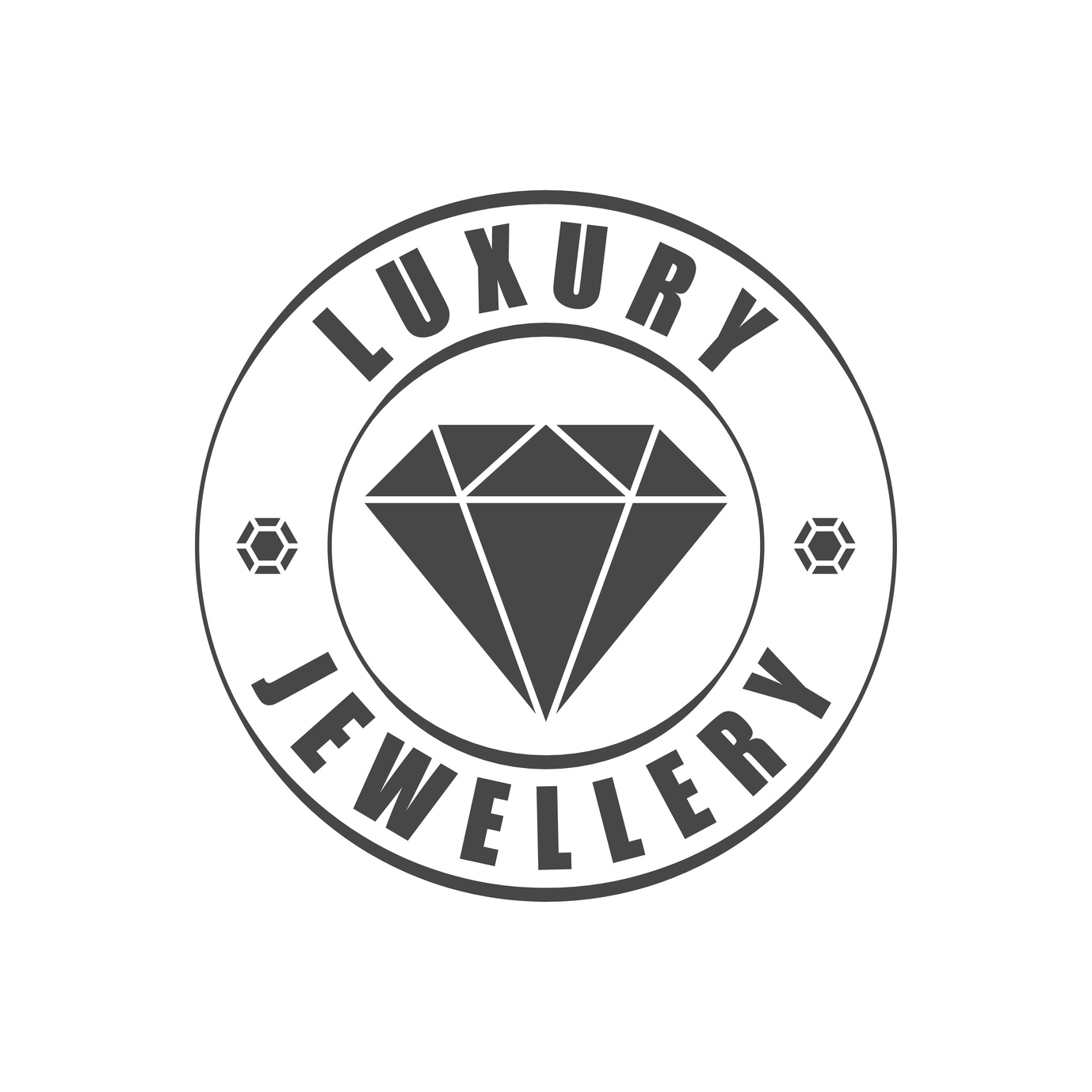
Incorporate Jewelry Into Your Logo
But how will people know that your logo is representing a jewelry company? Well, this is where you can add your own personal touch.
We would suggest that you add some sort of graphic of a piece of jewelry into your logo in a creative way. By adding font and color to a tasteful graphic to tie it all together, you will have a dazzling logo.
Take Glamira’s logo for their brand of platinum engagement rings. They take a simple font and color scheme and add the silhouette of a diamond to represent their brand.
Elegant Inspiration for Your Jewelry Logo
With these helpful tips, you will be able to create the best logo for your jewelry company.
It’s time to create a logo that’s just as unique and eye-catching as the pieces that keep your clients coming back for more. Of course, you might not get it right the first time! Use our free logo maker tool to help you test out different options!
If you have any more questions on how to spice up your logo, feel free to send us a message through our contact page.


