What Are The Different Types Of Logos?
Posted on July 31, 2017 by Logo Design Tips and Tricks

You know that an eye-catching logo is a key component of a successful business, but did you also know that there are different types of logos to choose from?
Read on to learn more about the different types of logos out there. We’ll also share some tips to help you decide which logo type will work best for your business!
Types Of Logos
Lettermarks
Lettermarks — also known as monogram logos — create a logo centered around a company’s initials. The logos for General Electric, CNN, and Hewlett-Packard are good examples of this.
Lettermarks are great for companies that have longer names and need a simple, streamlined logo.
One of the most important things to keep in mind when designing a lettermark is the type of font you will use.
When you use a lettermark for your company’s logo, it’s important that you choose or create from scratch a font that fits your company’s personality. A geometric font works well for companies with a more elegant style, while serif fonts are best for businesses with a more traditional message.
You’ll also want to make sure that whatever font you choose is legible so that people know which letters are being used. Your brand will definitely suffer if people can’t read your logo!
If you have a new business that you’re designing a logo for, it’s also helpful to print the company’s full name below the lettermark. This helps with brand recognition and lets people know immediately what the initials in the logo stand for.
Wordmarks
Wordmarks — also known as logotypes — are very similar to lettermarks. Instead of using letters, though, a wordmark is a font-based logo that uses the business’s full name. Major businesses that use wordmarks for their logos include Google, Facebook, and Visa.
Typography is important for wordmark logos, just like it is for lettermarks. Pick a font that reflects your business’s products or services and make sure that it is legible.
Other things you’ll have to keep in mind for both lettermark and wordmark logos are color, use of capital and lowercase letters, and kerning (the amount of space between letters).
A wordmark is one of the best types of logos for new businesses that need to get their name out there. However, they work best for companies that have a fairly short name. If your business’s name is too long, a wordmark might not be ideal since a long name will often make the logo design look cluttered.
Wordmarks also work well for businesses with distinct names that are easy to remember. Again, Google is a great example of this.
Pictorial Marks
Unlike the types of logos discussed above, which focus on words, pictorial marks — also known as logo symbols or brand marks — are icon-based. Some common pictorial marks include the Twitter bird and the Target bullseye.
This type of logo can be tricky for new companies since they don’t initially have strong brand recognition — there’s a solution for this problem further down, though!
When you use a pictorial mark for your business’s logo, the most important decision you have to make is, of course, which image you’re going to use. There are a few questions you need to ask when making your choice.
Do you want the image to relate to your company’s name? Do you want it to say something about your product? Should it evoke a specific emotion?
A pictorial logo doesn’t have to be a specific image image, either. Lots of company utilize abstract marks in their logos — for example, Nike uses the swoosh image and the Pepsi has its split circle logo.
Abstract marks are great because they give you freedom to design a logo that represents your business without any cultural implications attached to a specific image.
Whether you choose a specific image or an abstract one for your pictorial mark, you’ll want to make sure that it’s simple enough for people to remember and recreate. A complicated image won’t stick in people’s minds easily, and it will also be difficult to print on your merchandise and business cards.
Pictorial marks are great for companies that want to take their brand worldwide. This is especially true if your business’s name is difficult to translate. However, they’re not ideal if you think your business model might change later on.
Mascots
A mascot is a character that represents your company, like the Kool-Aid Man or Tony the Tiger. When properly utilized, the character will become synonymous with your brand.
Mascots are an especially useful logo type for brands that want to appeal to families and children with their product or service. This is why so many brands that sell food or toys incorporate mascots into their logo design. Mascots increase familiarity, encourage customer interaction, and are overall excellent marketing tools.
If you’re thinking about the type of mascot you want to use for your business, remember that they can be difficult to transfer across platforms. This is especially true if you’re planning on using a highly detailed illustration of your mascot.
As with other logo types, it’s best to keep your mascot illustration as simple as possible. If it’s too complex, it will be hard to transfer to small things like business cards.
Combination Marks
As the name suggests, combination marks combine elements of multiple types of logos. They usually combine a pictorial mark or mascot with either a wordmark or lettermark to create a unique logo.
Adidas, for example, uses both a pictorial mark (the flower) and a wordmark (the company name) in its logo.
Combination marks are great for new businesses that don’t yet have a lot of brand recognition.
When you put an image and your name together you can set yourself apart from your competition, establish your brand, and make sure people know your business’s name right away.
This type of logo is also nice because it gives you some flexibility with your branding. Once you gain more recognition, you can drop your business’s name from the logo and rely solely on the image, if you want. You can also use the image by itself in certain cases and the full combination mark in others.
Combination marks are also one of the most popular types of logos because they’re easier to trademark than logos that are just based around an image.
Emblems
Emblem logos consist of a font inside of a symbol like a badge or a crest.
Starbucks and Harley-Davidson are two major brands that utilize emblem logos. Many schools and government agencies also rely on them because they have a classic style and are usually easy to recognize.
When designing an emblem, make sure that it is fairly simple so that it can be recreated across different platforms. An overly complicated logo will be difficult to embroider on clothing or print on a small business card.
Emblems are hard to get right because it’s difficult to split them up or downsize them so they can be used on a variety of products. Because of this, they are used less frequently than other types of logos.
However, just because they’re rare, that doesn’t mean you shouldn’t use them. When done well, emblem logos can really make a statement and set your company apart from your competition.
Other Things To Consider
You now know what the different types of logos are, but how do you decide which type is best for your business? Remember, the logo is one of the most important aspects of your business — especially if you’re a new company that doesn’t have a lot of money to spend on advertising.
Personal preference should be considered before pulling the trigger on a type of logo, but you should also think beyond just what you like. When you’re choosing between the most popular types of logos, there are a few things you should keep in mind.
Be strategic. Ask yourself the following questions when deciding on the type of logo you want to use to represent your business:
- Is it different from my competitors?
- Is it simple and easy to replicate and recognize?
- How will it look on my company’s products?
- Can I easily implement it across different surfaces (T-shirts, brochures, business cards, mugs, etc.)
- Does it match my company’s core values and message?
- How will it tie my brand together?
- Is this the image I want my company to have for a long time?
- What emotional response will people have to it?
Start Designing Your Logo Today
Now that you know a bit more about the different types of logos out there, it’s time to make a decision and create your own!
If you’re feeling lost or unsure of your design skills, don’t worry. There are tons of tools out there that can help you create the best logo for your company.
Did you know that we have a free online logo maker tool? Give it a try today!
If you’re still having trouble coming up with a good logo, check out our blog for some great design tips. We can’t wait to see what you come up with!
A Guide to Creating Crystal Clear Window and Door Company Logos
Posted on July 28, 2017 by Logo Design Tips and Tricks
Clear window and door company logos is a boost to any business. It covers products and company material in a way that solidifies the best brands and keeps customers coming back for more.
And nothing is more important than clarity when it comes to the visual properties of your logo. Not only will it be easily recognizable, a clear logo will work wonders on your windows and doors to announce your quality and unique capabilities.
When we think of the most iconic logos they all have clarity in common. They use pictures, colors, and contrast to be clear and bold from any distance.
Make sure your logo is clear and bold too. Here’s how:
Typography for Door Company Logos
The best logos announce quality from a single glance. But they continue to hold value over time and gain recognition and strength.
You may get to a point where your logo design is so recognizable, like Rolex or Target, that you might not need words.
But many logos, from Coca-Cola to Google, embed typography and words into the logos themselves. Most small businesses will need a similar approach at first.
When using words remember you need to make a clear impression right away. A fancy font may look cool but does it have the clarity to carry your company name from a distance?
Don’t let the words get lost. Especially on doors and windows, you need a clear statement that is easy to see.
Color Theory
High contrast colors will make it easier for people to see your logo. And the right colors will also let potential clients start to associate emotions with your brand.
There is a difference between warm and cool colors and the feelings they project. Cooler tones like blues and greens might be more associated with stability and comfort.
Warm tones are exciting and fun.
Whatever emotion you convey, using contrasting colors can make a logo pop and be more clear for any viewer.
Make Sure You Have A Clear Canvas
When we think of McDonald’s we think of the golden arches. When we think of Apple there is a glowing shape beckoning from the back of an iPhone or computer screen.
In logo design, a logo is only as good as its placement. For ultimate clarity in window and door company logos, you need to make sure your logo is on the best quality surface.
Whether your logo is on replacement windows in Ventura County or announcing your company brand anywhere in the world, make sure you match the finest logo with the finest glass.
Make It Yours
Clarity isn’t just a quality of eyesight and vision. Clarity is a quality of singleness of purpose and great branding.
A clear logo doesn’t just look great it announces the unique properties of your brand. Make sure you design a logo that is clear about your brand.
The good news is you can use the latest trends and still come up with a clear logo for your business.
More than 3 million brands have used Online Logo Maker to build their brand. We can help you too.
Check out our tutorial today and see how easy it can be to design a logo for your brand.
The Best Ceiling Fan Logos Are Cool. Is Yours?
Posted on July 28, 2017 by Logo Design Tips and Tricks
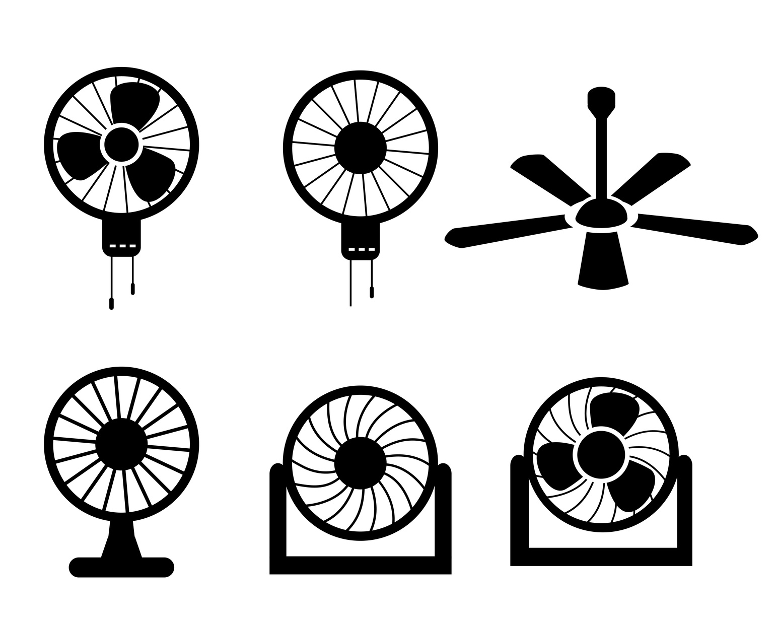
A ceiling fan may not be the first element you think of in home design.
But the truth is that the ceiling fan is the focal centerpiece of any room. And the design of the fan can make – or break – that room’s appearance.
Whether your company sells traditional or modern ceiling fans, you need a logo that will attract homeowners to your business.
How can you create a solid home decor logo that will enable you to stand out from the competition? Read on for five ways to create the best ceiling fan logo.
Choose the Right Color
The human brain is hard-wired to respond certain ways to certain colors. Color offers a powerful, nonverbal method of communicating meaning and mood in logo design.
- Warm colors such a red, orange, and yellow are usually used to convey energy, warmth, and playfulness.
- Cool colors like green, blue, and purple are often associated with serenity, calmness, and harmony.
- Neutral tones like gray, brown, and black are typically viewed as earthy, classic, and practical.
Which color is right for your company logo?
Avoid Cliches
Sure, you could incorporate a fan into your logo, like hundreds of other companies. But that’s hardly going to make you stand out from the crowd.
The best logos – for ceiling fans or any other product – are unique. You have to think outside of the box. Delta Airlines doesn’t use an airplane for its logo, just like Apple doesn’t use a computer.
Think long and hard about your brand until you come up with something other than the standard cliche.
Use a Custom Font
Speaking of cliches, nothing could be more cliche than being the millionth company to use Papyrus font.
A great way to break the mold is to use your own custom font. If you want to make a standout logo, team up with a designer and create a font that suits your brand’s personality.
Are your ceiling fans classic? Colorful? Minimalist? Ornate? Your font should be a reflection of your products.
Keep It Simple
It’s tempting to cram as much information into a logo design as possible. In reality, though, the most successful logos are the simplest.
What does Nike use? A swoop. What does McDonald’s use? Golden arches. These designs are incredibly simple, yet they’re recognizable in an instant.
That’s the kind of logo design you want for your ceiling fans.
Incorporate Motion
A recent trend in logo design is to incorporate movement or a sense of action.
The logo for Twitter originally began as a perched bird to a bird taking flight. Recently, they updated their logo again so the bird is flying in an upward direction instead of straight ahead.
What are some ways you could incorporate movement into your logo design?
Final Thoughts
A logo is your customers’ first impression of your company.
Don’t simply slap your company name into a box and call it a day. To get the best ceiling fan company logo, give it some serious time and thought and define what makes your business different than the rest.
Are you ready to design your logo, but you’re not sure where to start? Please contact us with any questions or concerns you may have.
Stay Secure With These 5 Tips On Designing A Driveway Alert System Logo
Posted on July 27, 2017 by Logo Design Tips and Tricks

Many people make the false assumption that it’s easy to design a logo. However, logos are much more complicated than people realize. A logo is the visual representation of your brand.
If you’re looking to design a logo for your driveway alert system business, then here are the top 5 tips for designing a logo that makes people feel safe and secure!
1. Consider the Purpose of Your Logo
Before designing a logo, you need to establish what the purpose of your company is and what you’re trying to achieve.
Doing some research on your competitors could help to work out what makes your brand and product unique. You need to reflect your unique selling point in your logo.
You can ask existing customers for feedback on your ideas about logos.
2. Keep It Simple
It’s important to avoid going over the top and too flashy when designing a logo for a driveway alert systems company.
If there is too much going on in your logo, then it won’t be recognizable to potential and existing customers.
Logos represent your brand – driveway alert systems need to evoke security, safety, and trust. Maybe include a symbol representing an alarm, a camera or even a padlock to represent security and safety.
3. Where and How Will it Appear
Before designing a logo it’s important to consider where it’s going to be used and how it will appear to customers. There is a wide variety of places you can display your logo; business cards, posters and billboards, social media and websites.
This is important to consider in advance because if you design your logo with lots of details, then it may not be visible in a smaller format on social media.
4. Color and Fonts Matter
Many people associate colors with different feelings or ideas.
For example, perhaps you could use blue for your logo because research shows that many people associate blue with security, trust, and order. Once you have decided which color to use, then be consistent throughout your marketing.
You may also want to choose a font for your driveway alert systems business. But remember that many of the most recognizable logos, such as Nike or Apple, don’t have any text. When considering fonts select something that is clear and reflects your brand.
5. Be Creative and Original
Being creative with the design of your logo doesn’t mean being complicated. It’s about creating something new and original that stands out against your competitors. This sometimes requires thinking outside of the box.
Coming up with an original logo is not easy. But it’s useful to think beyond the simple image and text. Instead consider the possibilities of using negative space, shadow, and double meanings to create a great logo.
Final Thoughts
Now that you have all the 5 top tips for designing a great logo for your driveway alert systems company, you’re ready to start our online logo making program. On these programs, you have the ability to create, edit, and complete your company logo. Follow these 5 tips to ensure you have a great logo for your driveway alert systems business.


