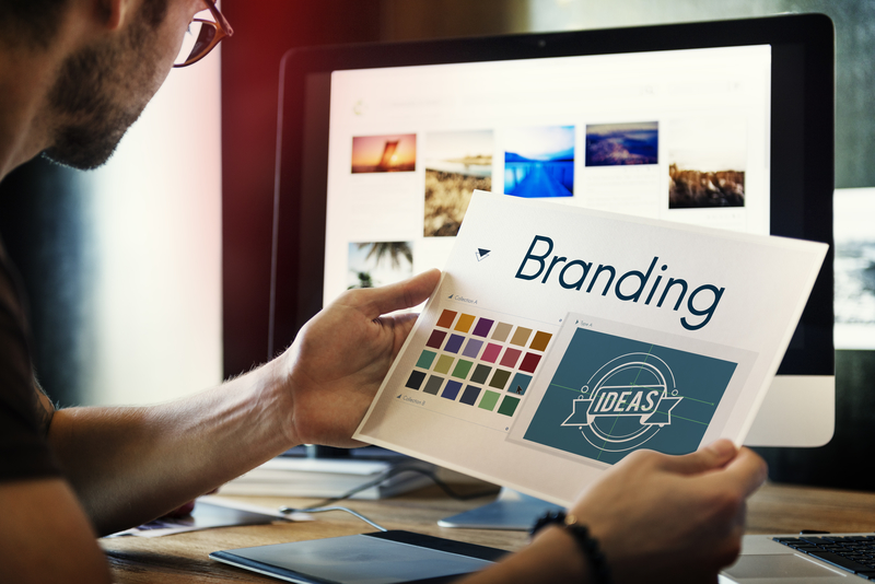
Bulk up Your Supplement Sales: 5 New Logo Design Tips
Posted on July 25, 2017 by Logo Design Tips and Tricks

A good logo can make all the difference.
But for every iconic Nike swoosh, there’s a botched American Airlines redesign around the corner. So it’s important to create a logo that leaves a lasting impact.
If you want to boost sales and brand recognition, a new logo can be the way to go. But be careful before diving in head first to a logo redesign.
Crafting a logo requires more than a name and picture. It’s your companies first chance to make a first impression. So it needs to be taken seriously.
Here are 5 design tips you need to create the best men’s supplement logo.
Keep it Simple
The first tip is also the most important – keep it simple.
It might sound cliche, but it’s a tried and true strategy in branding. Having a busy logo is one of many signs that it’s time to find a new logo.
The key to a great logo is finding something easily identifiable and memorable. Complex logos are often difficult for consumers to surmise and should be avoided.
Consider all the greatest logos: Apple, Nike, and Coca-Cola. They all benefit from simple yet effective designs.
Be Versatile
Think of all the places you see logos in a day. Overwhelmed yet?
Logos are everywhere in modern life. As a result, it’s more important than ever to have a versatile representation of your brand.
When creating a new logo, first consider whether or not the design works in different settings.
Your logo should look good with different color schemes. Take a look at the D-Bal Crazy Bulk review page. It showcases how good a logo can look on different colored bottles.
Can your logo also work on a billboard and a smartphone? If not, it’s time to pick a new design.
Use Prominent Colors
Logos should look good with different color schemes. But choose wisely when considering your colors.
Your new logo should use a color palette that is bold and eye-catching. There are countless other men’s supplement companies competing with you. It’s your job to stand out.
Find colors that attract customers to the logo and help to communicate your message.
Create a Message
Your logo represents your brand. So it also needs to represent your brand’s message.
Logos that are comprised of random shapes and patterns are rarely successful. Successful logos communicate a story about your brand to an audience.
The best logos look good on the surface. But they also have a deeper message that is revealed upon a closer look.
A New Logo
You may have thought up a brilliant logo idea. But hold off before making it the official representation of your brand.
It’s crucial that you check to see if your logo has already been used by other brands. This can protect you from copyright issues that can cause a big headache down the road.
You also don’t want to copy someone else’s work. Your logo needs to show off your own brand’s uniqueness.
Use your creativity and make sure to double check that your creation is original.
Are you creating a logo? We can help. Learn about our free logo creator today.
What Makes a Watch Logo Stand the Test of Time
Posted on July 25, 2017 by Logo Design Tips and Tricks

Fine watches are synonymous with precision, engineering, and design. In fact, the watch logo of a fine watch can indicate its quality as well as its worth.
Like any other brand, a watch logo can immediately conjure ideas of wealth, quality, and elegance. Businesses work over time to solidify their brand by creating a track record of customer satisfaction and working to embed ideas of quality in their logo.
Linking brand quality to logo design is one way businesses associate the finest watches with a sound investment. In fact, watch companies like Rolex are recognized for holding their value over time.
What makes a watch logo stand the test of time? Let’s look at the design elements that rule the watch world:
1. Reflect the Brand With Your Watch Logo
One of the reasons it’s so important to brainstorm ideas when designing a logo is that a logo can be a lasting first impression for your business. In the case of Rolex, now recognized as the leader in watches, what could be more representative than a crown?
But using a crown alone isn’t enough to make a logo capable of standing the test of time. The design is elegant and stylish– a mirror reflection of the qualities inherent in many Rolex watches.
For a logo to persevere it has to represent the brand. For instance, one reason vintage Rolex watches for sale are so sought after is because the logo is linked to industry leadership and the crowning achievement of watches.
Since Rolex takes a year to craft a watch, has scientists working on designs, and conducts individual testing of each dive watch, it’s fitting they are forever recognized as royalty.
2. Associate Your Brand With Core Values
We all know there isn’t a little king living inside your watch moving the hands. But linking Rolex to royalty has been a successful strategy over time.
Other watch makers use this same association technique. In addition, they take into account what consumers most connect with demanding conditions.
What could be more important to a diver or a pilot than their watch? Breitling employs both wings and an anchor in their logo.
In addition, the watch is both elegant and secure– represented by ornate wings and a solid anchor. Who wouldn’t want the same watch that everyday heroes depend on?
The strategy is so successful that Breitling moved beyond the air and sea. Their watches were also worn by astronauts.
3. Make the Most of Your Logo
One thing is clear– the best watch makers work hard to create logos that will represent their brand over time. This is especially important with watches that offer such a small space in many times to show off their logo design.
But who can deny that a fine watch logo is recognizable right away? Our eyes flash to someone’s wrist and recognize the quality right away.
You don’t need heaps of space to make the most of your logo. You just need the best design to represent your brand.
Every business is unique. Watches are no different. Although watch makers clearly are leaders in creating lasting logos that stand the test of time.
You can too. Check out our 5 logo design trends to promote your business.
Tips to Create a Friendly Design for your Dental Logo
Posted on July 25, 2017 by Logo Design Tips and Tricks
Visiting the dentist can be downright scary for some patients. To ease this fright, dental practices need to show their friendly side and that goes beyond flashing a smile.
This is where branding efforts come in. Your dental logo is one of the most efficient ways to communicate your brand’s message.
Although small in size, it speaks volumes. A friendly design can tell patients that they should feel calm and relaxed when they visit you.
Read on to learn some tips for creating a logo that will capture your warm personality.
1. Simplicity is Key
The most effective friendly logos are usually ones with fairly simple designs. You don’t need to pack a bunch of elements into your design to say what you need to say.
You should determine what the core elements of your brand are. Why is quality of care so important to you? What makes you such a welcoming practice?
Take only the most important aspects of your brand and apply that to your friendly design.
2. Use Lighter Colors
Color scheme is a very important element to a logo. Certain colors can strike different moods, and cause you to have different associations.
For a dental practice, you’ll want to use lighter colors. Light blue is one of the most common, yet appropriate colors you’ll see in dentist logos.
That’s because blue is a calming color. It is associated with positive emotions and objects, such as trust, understanding, and the sky.
For example, Northbrook Dental Office uses a medium blue in their logo. Although there is no icons or images, you still get a friendly vibe from its font and color.
You should avoid dark, bold colors. For obvious reasons, red may scare your patients.
3. Ditch The Cliches
Yes, you’re a dental practice so teeth are the most identifiable object associated with your industry. However, they make for the most cliche, overused dental logos.
Not only that, but it also can create dissonance for the company. Typically dental work isn’t associated with happy connotations.
If you want to use a tooth, try to put a positive spin on it. For instance, if you work mostly with kids, you can animate (see more below) your logo for a more friendly design.
4. Friendly Design Symbols
If you’re going for a welcoming approach, you should consider using fun symbols in your logo. This is especially applicable if you focus on family dental services.
As mentioned above, you can put a positive take on teeth by just animating it. Give it a smile (and face), and it looks a whole lot less intimidating. You can use animations of other objects, such as toothbrushes or floss, too.
If able, there’s also the option to make a play on words within your name. Let’s say you have the word ‘Smile’ in your practice’s name. You can try incorporating a person flashing a bright smile into your logo.
Time to Create!
Are you ready to get the world smiling? Our online logo maker is just the tool for you! Create a fun, friendly dental logo that will get everyone showing their teeth in a good way!
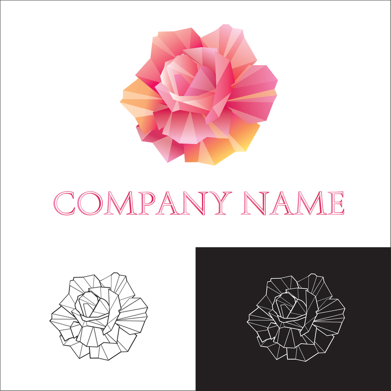
A Red Logo for a Red Rose Delivery Business? (Maybe)
Posted on July 25, 2017 by Logo Design Tips and Tricks
Have you ever considered what the color of your logo says about you?
Different colors can evoke varying emotions and uniquely alter our perception of an image. Whether you have a black, green, blue, purple or red logo can make a big difference in how your company is perceived.
Research reveals that people form an opinion of an object within the first 90 seconds of viewing it. And up to 90% of their impression depends on color.
It’s important that you choose the color that best represents your company. Read on to learn more!
A Rose’s Red Logo Smells Just as Sweet…Or Does It?
Choosing a logo for your rose delivery business might seem like a no brainer.
Everyone knows that roses are red and violets are blue. Naturally, a rose delivery business should have a red logo!
Or should it?
That all depends on what you want your image to reveal to potential customers. Let’s take a look at what different colors might mean to your company’s logo.
A Color for Every Emotion:
There are hundreds of colors to choose from, so it would be impossible to list them all.
Here are a few of the most popular color choices commonly used by brands, and their corresponding associations.
- Red: passion, love, energy, action
- Blue: honest, strong, caring, trustworthy
- Green: growth, organic, fresh, caring
- Black: sophisticated, seductive, formal
- Purple: creative, imaginative, nostalgic
- Yellow: happy, playful, logical, confident
This list is just a start. But it may give you an idea of how different colors can impact your brand’s meaning.
Which Color Says it Best?
If you know exactly what you want to say with your business logo, the choice might be simple. But, what if you want to appeal to a larger range of emotions?
Should you try to narrow your logo down to just one color? Or should you instead broaden your meaning to include several colors of the rainbow?
Would choosing a multicolor logo mean the same as the individual colors combined? Maybe not.
Research indicates that a multicolor image equates to bold, playful and expansive. So, combining red, blue, and green won’t necessarily add up to mean a combination of the three individual connotations when used independently.
When choosing the color that defines your company best, consider the audience that you wish to target. A company that delivers luxury roses may aim to target mostly couples in love, so a red logo would be a perfect solution.
But if you were hoping to target children, you might rather choose yellow. And if your target audience was primarily pet owners, then you may be better off opting for blue.
Think of who you want to appeal to, and what you would like to represent. Then choose the color that speaks for you best.
Conclusion:
Color has the amazing ability to say a lot without using words. Its presence can mean more than a thousand words.
Make sure that the color you choose for your company logo is telling your customers what you want them to hear. Click here to get started designing your perfect logo today!


