The Science Behind Fashion Logo Design Colors
Posted on July 05, 2017 by Logo Design Tips and Tricks

Logos are an important component of any company’s marketing strategy.
A clear, recognizable logo helps to establish a company’s brand. Customers will begin to associate your company with that logo, which will help encourage repeat business. This builds your company’s visual identity.
That said, not all logos are created equal.
You want your fashion logo design to resonate with customers. To do this, it must incorporate certain design principles that will make it visually appealing and compelling.
Studies show that using the right color combinations in a logo can increase brand recognition by up to 80%.
While color choices might seem like a matter of preference, there is actually a science behind it. Paying attention to color theory will help you create a more effective fashion logo design.
Let’s take a look at how to science of colors can impact a logo.
Color Influences Emotion
Have you ever seen a particular color, and it raises a variety of emotions?
It’s not just your mind playing tricks on you. There is ample evidence that colors actually have the ability to influence emotion.
Colors are generally divided into warm and cool colors. Warm colors are your reds, yellows, and oranges, while cool colors are your blues, greens, and purples.
Warm colors tend to arouse active emotions. This can include emotions like anger or anxiety, as well as excitement and creativity.
By contrast, cool colors lead to passive emotions. Cool colors can make people feel calm, or comfort, but can also lead to melancholy.
When choosing the colors for your logo, think about what kinds of emotions you want customers to experience.
For instance, if you want your brand to be associated with fun and high energy, then you might want a fashion logo design that includes red or yellow. If you would rather communicate consistency or dependability, colors like blue and brown might work better.
Memory Affects How We Perceive Color
Another way colors affect people is by bringing up associations with that color. Memory can certainly have an impact on the way we perceive colors.
Sometimes this can be deeply personal.
Perhaps it’s the color of your favorite crayon from kindergarten. Or, maybe it was the color of your prom dress.
In other cases, a universal memory and or association is brought up. For instance, most people associate the color green with nature or the color blue with water.
If you want your customers to associate certain environmental or cultural features with your company, color choice can influence that.
Shades and Hues
When it comes to fashion logo design, the color itself is not the only factor to consider.
Colors come in different shades and levels of brightness. Whether a particular color is dark, dull, light, or bright can impact how customers perceive it.
For instance, dark colors tend to indicate a more serious, or somber tone. Bright colors are more lighthearted and playful.
The shades of colors you use can influence what customers believe your business is about.
Take pastel colors, for instance. These colors are typically associated with babies. Using them in your logo could lead customers to assume that your brand is for children.
Dark colors, on the other hand, may lead customers to believe that your brand is geared towards professionals.
Whatever shades of colors you choose to use, keep these associations in mind. You always want your color choices to complement your brand identity, rather than confuse it.
Making Colors Work Together
While many logos are monochromatic, other logos use two or more colors.
Using multiple colors in your logo can help your company draw on different aspects of different colors.
For example, you can use colors that are similar to each other, like blue and purple, to emphasize the use of a cool color palette. This will reinforce the associations with cool colors.
Or, you might choose to use contrasting colors. Using blue and yellow in the same logo can tell a more complex story about what your brand is.
How Color Affects Fashion Logo Design
While there are many scientific facts about the impact of color in general, there is also specific research on how color is perceived in fashion.
Obviously, color is extremely relevant in the fashion industry. The color of a certain piece of clothing has a great impact on how a customer will react to it.
Additionally, the color of your fashion logo design will influence how customers perceive your brand overall.
For instance, blue in the fashion industry is associated with competence and confidence. Think of the blue shirts and navy blazers that businessmen often wear. Blue is considered a classic and reliable color.
Meanwhile, colors like green are considered more rugged or outdoorsy. Purple brings with it an air of sophistication or even royalty.
You should choose the colors for your fashion logo design based on what you want customers to think of your company.
If you are marketing mostly to customers who need professional clothing, blue should appear in your logo. Or, if you want to show that your clothing is high-end, purple might be a better choice.
Building Your Brand
At the end of the day, there are no right and wrong answers when it comes to choosing the colors for your logo. Rather, the colors you use should be based on the preferences of your customers, and the goals of your brand.
Remember, the purpose of your logo is to create a brand identity. You want customers to look at your logo, and immediately make associations that help them understand what your business is about.
You also want something that will stick in your customer’s mind. This way, when they see your logo in an advertisement, or on a product label, they will immediately call your business to mind.
If you’re ready to start working on a fashion logo design, then check out our free logo creating tool. You can incorporate the principles you’ve learned in this post into making an awesome logo for your business.
The Role of Color Psychology in Jewelry Logo Design
Posted on July 05, 2017 by Logo Design Tips and Tricks
You know all about the latest color trends when it comes to jewellery design. You have pieces in rose gold and have adorned your necklaces with show-stopping pendants in every shade of the rainbow, much like the thoughtful palettes often used to showcase modern engagement rings in Canada, where colour, emotion, and meaning play an important role in presentation.
But what role does the psychology of color play in your jewellery logo design or re-design?
Read on to find out.
The Fire Shades: Red, Orange, And Yellow
When you’re picking shades for the pieces you display in your online jewellery company, you likely think about what would look good on a variety of skin tones, is representative of your brand, and is up-to-date with current trends.
The same should be said of your logo colors.
First, we’ll examine the psychological impact of fire shades.
Yellow
Yellow is associated with optimism.
If you design pieces primarily sold for special occasions — graduations, engagements, or birthdays — be sure to include lots of yellow in your logo. It will make shoppers excited about the road ahead, while instilling a sense of joy in them.
Red
Red is a color you need to be careful with.
While it’s great for making customers stop and pay attention, it’s also been proven to cause stress and raise blood pressure levels. People also associate it with sales — meaning that if your products are higher-end and expensive, you’re setting shoppers up for disappointment.
To temper the psychological side effects, use red in your logo design when associated with a natural image, like a rose.
Orange
Orange reminds customers to think outside of the box.
Psychologically, we associate the color orange with excitement, risk-taking, and confidence. If your line is more avant-garde, play into it by using orange in your design.
The Soothing, Regal Shades: Blue, Green, and Purple
Now, let’s take a look at shades that carry more symbolism psychologically than the fire shades. Blues, greens, and purples make us think of certain experiences and can alter our perceptions of ourselves and others.
Blue
Blue calms down and relaxes anyone who sees it — after all, why do you think so many of us feel calm by the seashore?
If your brand wants to convey a sense of dependability and stability, be sure to include this hue in your logo.
Green
Psychologically, we associate green with nature. Are you a natural, hand-made artisan jeweler? Do you take inspiration from images of the woods or other natural elements?
If so, be sure to include this shade in your logo.
Purple
Purple has long been associated with royalty and expense, meaning it’s a perfect color choice for the logo of a high-end brand.
It also has psychological associations with fantasy, making it a great choice for jewelers selling costume jewellery or with designs rooted in the inspiration of a by-gone era.
Create Your Jewellery Logo Design Today
Birthstones aren’t the only way to get symbolic when it comes to the colors you use in your jewellery line.
As you’ve learned from this quick post, the colors you choose to include in your jewellery logo design can evoke certain feelings in your target market. But just like when you’re stringing beads, sometimes it can take a few tries to get the perfect combination.
Use our free online logo maker tool to test out a variety of jewellery logo design options. Make sure your logo looks as lovely as your pieces themselves!
Green Means Grow: Create the Ideal Lawn Care and Landscaping Logo
Posted on July 05, 2017 by Logo Design Tips and Tricks

No matter what type of business you run or brand you own, a quality eye-catching logo is important.
When it comes to landscaping and lawn care companies, a logo has to really reflect the products, services, and niche of that company.
Are you ready to make the best landscaping logo for your business? Check out our handy guide to creating lawn care logos below!
Create the Ideal Lawn Care and Landscaping Logo
Whether you sell weed eater products or provide amazing landscaping services, your logo needs to reflect who you are.
Keep it green– but don’t make it boring
The color green is heavily associated with nature, lawns, and landscaping. You should definitely incorporate the color green into your logo, but overdoing it can make your logo (and your business) disappear into crowds of another run of the mill landscaping companies.
Try using green variations that are typically seen, like dark forest green or lime green. Use it sparingly and be sure to use color theory to really make those colors pop. Most quality online logo makers will offer wide ranges of colors to use in your logo art.
Check your focus
What is your business’s main focus? Do you provide landscaping services? Do you sell nursery plants?
Really zone in on what it is you do. If you commit to providing multiple services and goods, look at your most successful or most consistent service. Base your logo around that.
Choose imagery that fits your brand
This is common sense for the most part. If you sell pine trees, don’t look for a stock image from an online logo maker that features flowers or oak trees.
The images used in your logo should be specific. You provide a niche service, so show it off in your logo!
Find a happy medium with detail
Landscaping companies will more than likely use their logos in large formats for their trucks, billboards, or offices. Since you don’t have to worry too much about small-scale design, in this case, you can get pretty detailed with your logos.
However, there is such a thing as too much detail. Logos should still be relatively simple, eye-catching, and easy to read. You don’t need to incorporate a full photo of a landscape into your logo.
If anything, a landscaping logo with vector art or simple illustrations work best.
Avoid cliches
Landscaping logos, in particular, can fall victim to cliches. Does your design in mind feature a big green globe? How about a simple tree?
These are cliches in the logo world. As a general rule, a basic symbol of what your business is shouldn’t be the entire logo. A cupcake bakery shouldn’t just boast a big pink cupcake for its logo, and neither should a landscaping company show off a big basic green tree.
Get creative! You’re making a piece of commercial art for your business. Incorporate nature elements that apply to your niche, but don’t oversimplify it or get lazy with thinking outside the box.
How was our guide to landscaping logos? Got a logo you’re proud of that you’d like to share? Show it off in the comments below!
5 Traits of a Versatile Dog Grooming Logo
Posted on July 05, 2017 by Logo Design Tips and Tricks
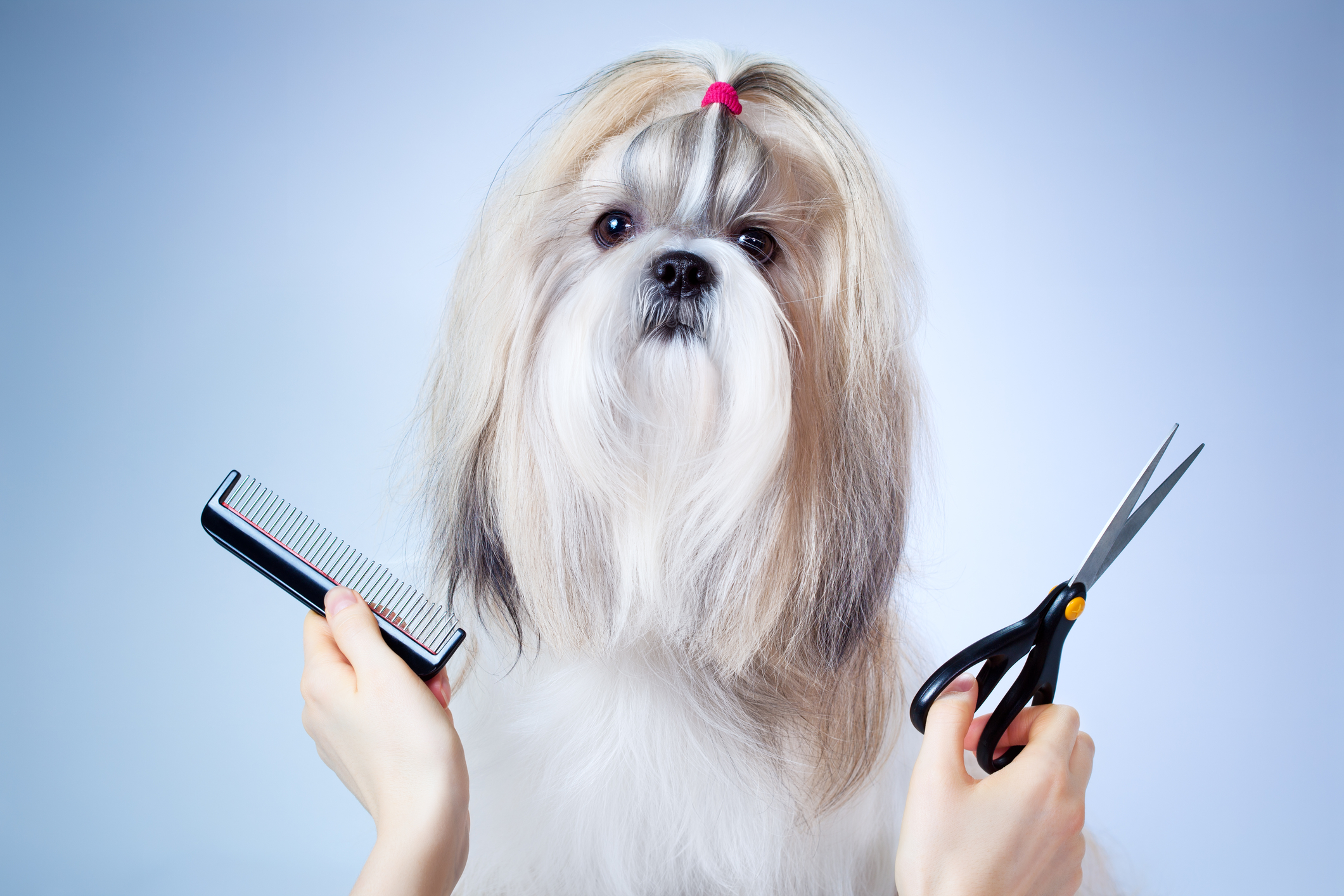
There are so many different designs out there, so how are you to design a logo that helps your business stand out? Versatility.
Versatility is important when it comes to designing a dog grooming logo. The logo is going to be the symbol of your business and must be designed in a way that allows it to fit conveniently anywhere you are looking for customers.
Want to know more about making your logo versatile? Keep reading for our list of 5 characteristics needed to create an effective, versatile dog grooming logo!
Making the Perfect Dog Grooming Logo
1. Colors
A great way to ensure your logo’s design is versatile is to begin designing in black and white. By starting in black and white, you are ensuring that your focus will remain on the shape and the overall concept of your logo.
Plus, by beginning in black and white, you are also making sure that the logo is effective, regardless of coloring.
When you get around to adding colors, make sure you don’t use any more than three. This will help you get the maximum impact from each color while also keeping your logo simple and easy to recognize.
Another thing to keep in mind is that colors are more expensive to print. The more colors you add to your logo, the more expenses your business will need to account for in the long run.
2. Space
Every logo design is going to have white or negative space and it should always be consistent.
Think about it. If your logo has a silhouette of a puppy in a crate, you will need to make sure both the crate and the puppy are distinguishable from one another, but not too far apart that the viewer cannot tell what’s going on.
The spacing should not be too close, leading to elements overlapping each other when it is printed, but spacing should also not be too big that viewers cannot associate between elements.
In both cases, the logo fails to effectively communicate with viewers, and an ineffective logo will only hurt your business.
3. Size… Does it Matter?
Make sure your logo is effective at every size. More often than not, you will see your logo being rescaled to fit on a multitude of products.
That means you, as the designer, need to take into account how the logo will look at various sizes. Try scaling the logo design at different sizes and consider the effectiveness.
Will your logo be effective if it’s blown up to fit a billboard? What about if it’s shrunken down to fit onto a business card?
If your logo design can’t pull it’s weight at a particular size, then it’s not an effective or versatile enough.
4. Uniquely Recognizable
The idea of having a logo is to make your brand recognizable to customers and potential customers at a glance. That means that your logo will need to be just as special as your company.
Make sure your logo doesn’t resemble another company’s, especially if they are well-known. This will only diminish your brand’s name and reputation while setting you up for legal trouble.
To help avoid any resemblances, it’s a good idea to check out some of the competition’s logos, so you know exactly what to avoid.
5. Details
How much detail should go into your logo? This depends on what your business’s message is and how you are trying to convey it.
Pay attention to the lines, colors, fonts, and everything else. It’s important that these aspects of your logo work together to convey your business’s message.
Are you looking to portray a message about midwest homes for pets? Then be sure you show it in your logo’s design!
At the same time, too many details can be difficult to print. It is therefore advisable to keep only the details needed to effectively convey your business’s message.
Get to it!
Creating a unique dog grooming logo can prove to be difficult, but a great and versatile logo can be the difference between a successful business and a failing one.
So, what are you waiting for? Get started on your logo now!


