5 Elements of a Compelling Gallery Logo
Posted on June 30, 2017 by Logo Design Tips and Tricks

Just like paintings and other forms of artwork, logos carry a whole lot of meaning.
Designing a logo comes with a lot of responsibility.
If you are designing a logo on behalf of an art gallery, that responsibility doubles. After all, you’re in the business of compelling people through imagery. Your audience is definitely going to hold your gallery logo design under more scrutiny than, say, a restaurant’s logo design.
So how do you make sure you create a logo that your audience will love?
Keep reading to learn about the 5 essential elements of a compelling gallery logo.
1. Research Your Target Audience
You know not everyone is going to have the same feelings about a painting, but there are certain paintings that evoke very similar emotions.
The same can be said about logo design. It’s impossible to create a gallery logo that absolutely everyone finds compelling, but you can certainly create one that the majority of your audience will be interested in.
In order to make that happen, you first need to understand your client base. Considering you work in an art gallery, understanding your client base should be quite easy. You already know the type of people who come in on a day-to-day basis., who invests in memberships, etc.
For example, if you attract an older crowd, you’ll want to go for larger prints. If your crowd is younger, then you’ll want to incorporate vibrant colors and cutting-edge designs.
2. Make Sure It’s Unique
While it can be good to check out what the competition’s doing, sometimes too much snooping can make you a copycat.
Make sure you understand the common styles of your industry without infringing on another gallery’s trademarked look. Not to mention, you don’t want your audience confusing your logo with someone else’s.
3. The Right Color
You know better than anyone to never underestimate the power of color.
Just like an artist carefully selects the right oil paint colors, so too should you carefully select the right colors for your logo.
This is because the psychological power of color can be very persuasive. There are so many color types to choose from- warm, neutral, vibrant, dark, saturated. And all of these will send a different kind of message to your intended audience.
4. Shy Away From Metaphors
In the world of art, everything is supposed to “mean something.”
While it’s nice if your logo does have a special meaning, don’t overdo it. If you focus too much on portraying a certain meaning, your logo won’t appear clever or artistic, it will only appear gaudy and complex.
Remember, you are going to be using your logo in a variety of mediums. Keeping it simple is the best way to ensure it translates onto all of these spaces.
5. Create Multiple Designs
You’re probably not going to nail your logo design on the first try, and that’s okay.
Create a few different designs, and set aside a day or two before sharing them with anyone. This will allow you to see it with fresh eyes the next time you look at it.
Compelling Gallery Logo Wrap Up
We hope this article gets you excited about creating a compelling logo for your gallery.
As you can tell, a lot of thought and consideration goes into creating the perfect logo.
If you are ready to bring your ideas to life, be sure to check out our tutorial for our online logo maker. This exciting tool allows you to create an affordable logo in no time at all.
And of course, drop a comment below with any questions you may have about logo design.
How to Incorporate a Message Into Golf Logos
Posted on June 29, 2017 by Logo Design Tips and Tricks

Your brand’s logo makes an important statement. Ultimately, it’s your business’s entire mission statement summed up.
It needs to be clean, concise, and show what you’re all about in a second or two. While this sounds simple in practice, it’s far easier said than done.
There’s a ton of work that goes into creating the perfect logo! Especially since you’re already competing for eyes on a nearly minute-by-minute basis.
The golfing industry is no different. Featuring your golf logos can be a great and easy way to get noticed. All you have to do is create a message worth wearing or showing off.
Here are some ways you can cleverly incorporate a message into your golf logos.
How to Incorporate a Message Into Golf Logos
1. The Right Message For the Right Product
The first step in creating a logo that resonates with your audience is to evaluate your business.
What type(s) of product do you sell? What types of people generally use these products?
These are two of the biggest questions you’ll need to ask before coming up with logo placement.
Sometimes, simpler is better. For instance, many golfers associate Tiger Woods with the Nike logo because of his hats and polos.
Obviously, the product you’re trying to sell will play a part in how your logo takes shape.
If you run a golf betting tips website, for instance, you can incorporate a dollar sign into the ‘s’ of the word ‘tips’. Combined with some green font, this makes the consumer think about money.
2. You Don’t Need to Reinvent the Wheel, But You do Need To Reinvent Your Brand
Remember, simplicity is often better. A lot of the more popular logos these days make use of a minimalist style.
In fact, generally speaking, it isn’t necessarily the logo that does the talking. Instead, many companies opt to feature small, subliminal logos or signs within white space.
Or sometimes you can use composite images to create an awe-inspiring effect. Take the Spartan Golf Clubs logo, for instance. At first glance, it’s simply a golfer swinging a golf club with what seems to be a power bar next to him.
But upon closer inspection, note that the power bar, golfer, club, and whitespace create an effect of a Spartan warrior’s helmet.
The best golf logos are ones that are creative enough to warrant a second glance.
3. Incorporate Golf Equipment Into Your Logo
Here’s a fun way you can get a message into your golf logos: feature some golf equipment.
For instance, if your logo contains the letter ‘t’ you could draw the logo to feature a golf tee.
Or if you’re a business that manufactures golf balls, you can use a golf ball as the ‘o’ within your logo.
By using golfing equipment within your logo, you’re letting your audience know what it is you sell. In essence, you’re doing the legwork for them. They won’t need to guess or Google, as your logo does all the talking.
Better Logos for a Better Business
Sometimes it can be difficult coming up with the perfect logo. If you could use some help, or just want to take a swing at creating a logo yourself, be sure to check out our tools.
Your business deserves to be seen by the world, so get creative and have some fun in the process!
5 Pet Store Logo Ideas for Serious Animal Lovers
Posted on June 29, 2017 by Logo Design Tips and Tricks
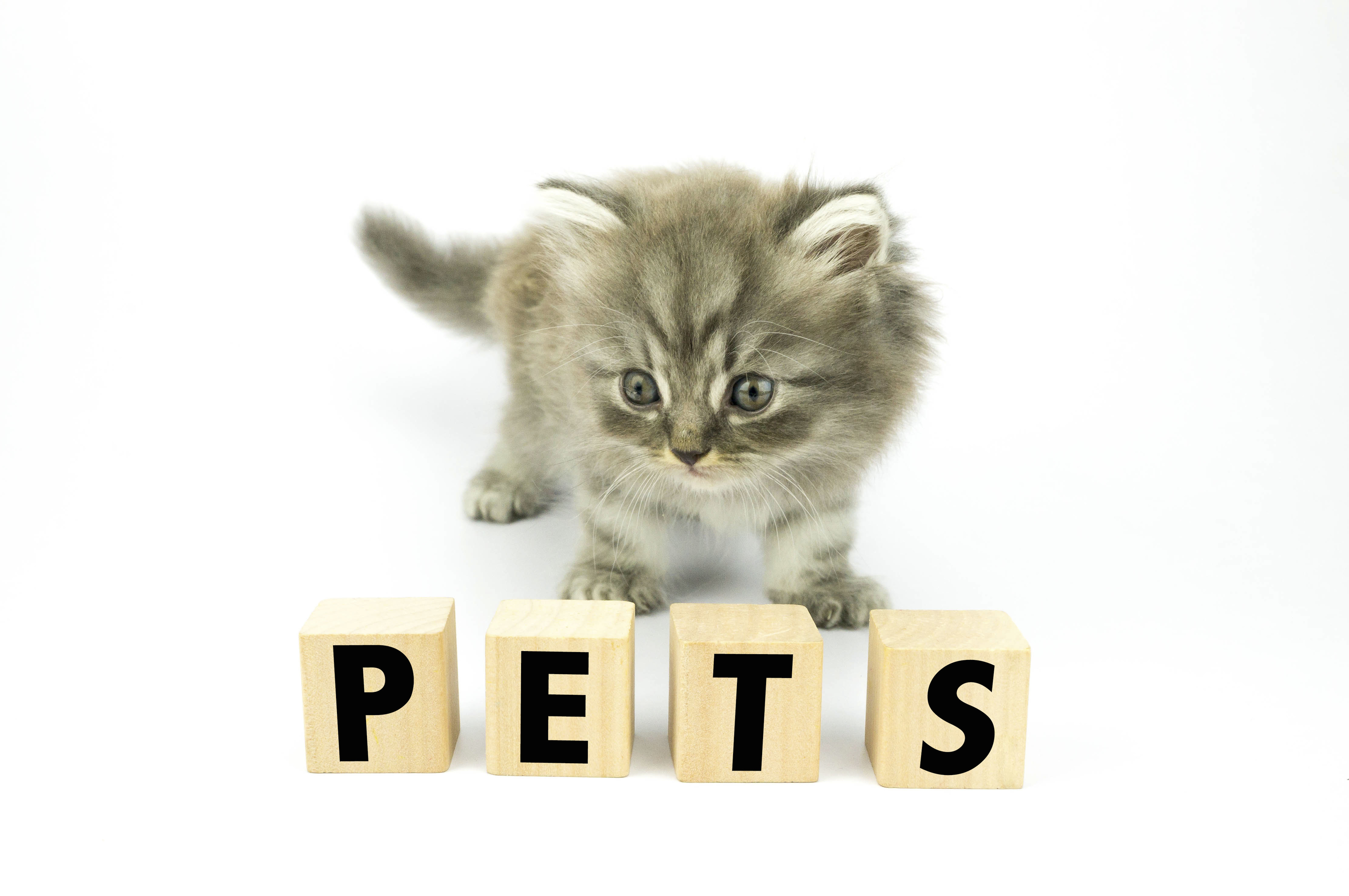
For many pet owners, starting a business that caters to our furry best friends can be a dream come true. It’s a chance to earn a living while spending all day showering these cute and lovable creatures with affection. One key thing to consider for any potential entrepreneur is choosing a pet store logo to represent their brand.
It could help determine how big of a piece they get of a very big pie. Since 1994, the pet industry has quadrupled in size and there are no signs of it stopping. It grew to nearly $67 billion in 2016 and is expected to approach $70 billion this year.
The importance of having a great pet store logo, therefore, cannot be understated. Luckily, we’re here to help with some design tips.
Here are five pet store logo ideas for serious animal lovers looking to break into the pet industry.
1. Tailor your logo to your specialty pet products and services
There are a number of different types of specialty pet products services a business could offer.
A logo has to get a clear message across as to what product or service is being offered. If it’s possible to remove the guesswork for pet owners, they’ll understand more quickly what you’re trying to sell them. It may also aid them in deciding whether or not to step into a shop.
2. Use imagery that represents the pets you cater to
It sounds simple, but when pet owners see images of animals related to their own critters it grabs their attention. They automatically tune in to what a shop might be selling. That’s a big plus for business owners.
A fish logo works for aquariums and fish stores. Bugs and reptiles resonate with lovers of such critters. Dogs and cats, of course, act as a signal to owners of such pets.
3. Consider the type of pet owners you’re targeting
Think about the type of people who will want to use your service. If the business is a neighborhood pet shop, consider the location and its residents. For a digital-based service, the logo must reflect that platform.
A logo that doesn’t fit in with the real estate won’t resonate with potential customers.
4. Don’t be afraid to go big, if it fits your business
If a business is geared toward a more posh and opulent crowd, it shouldn’t be scared to show that in its logo. If the target is everyday pet owners that’s perfectly fine as well. Cater to the crowd you desire.
Being bold can work if the business calls for it. For example, the logo from this breeding shop that has American bully puppies for sale is sleek and the message is clear. There’s nothing wrong with pushing the envelope.
5. Think about how your logo will look in different spaces
Promoting a business means a company’s logo will appear on a number of different mediums. These come in all shapes and sizes and may include signage, advertisements, business cards, letterheads, websites and social media profiles. A logo must be easy to identify on all of these
Get started on making a pet store logo!
Ready to create the next great pet store logo? Online Logo Maker has some great tools and design tips available to everybody. Don’t forget to check out the free online logo maker to help you get started.
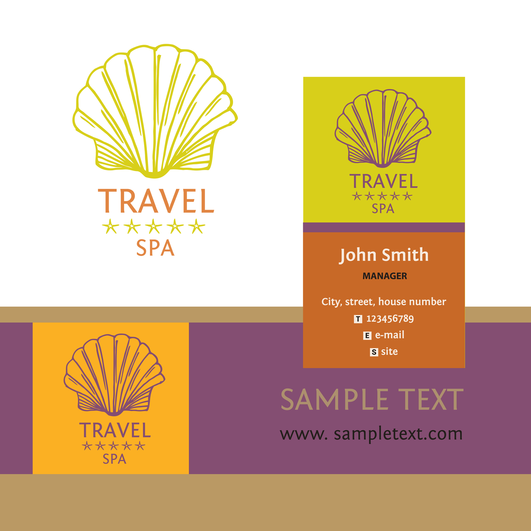
5 Tips to Designing an Adventurous Travel Logo
Posted on June 29, 2017 by Logo Design Tips and Tricks
Adventure vacations are a growing part of the travel industry. More people want to make physical activity, nature, and cultural immersion a significant part of their leisure travel.
Agencies that specialize in adventure vacations need a logo that does more than stand out in a crowd. Their logo must convey a sense of exploration and inspire trust.
Here are 5 tips for designing a travel logo to help grab the attention of an adventure traveler.
Ideal Customer
The most important aspect of award-winning logos can’t be seen: an understanding of the ideal or target customer. Effective logos start with a clear understanding of the people who buy the kind of product or service the company sells.
And, the more precise the description of the ideal customer can be, the greater the likelihood of creating a knock-out logo.
Color
Color in a travel logo is essential to setting the right tone for marketing materials in print, online, and clothing and other merchandise.
According to general color theory, orange creates a sense of joy, freedom, and optimism. For adventure travel in natural environments, orange is a good choice. It can work well with green, blue and brown, the colors of plants, water, and earth.
Pairing orange with purple — the color of royalty, reflection, and intuition — can create a striking yet elegant logo, which might be suitable for luxury resorts.
Blue and red are generally not the best choices as the primary color of a logo for adventure travel. Blue is too often seen as cold, official, and staid. Red does convey passion but just as easily represent anger and danger.
Font
Logos often include the name of the company or a tagline. Those that seek to convey strength, adventure, and excitement, use a font with a modern typeface.
Modern fonts convey strength and style. They are seen as progressive, assertive, and chic, three descriptions that align with adventure travel. Examples of modern fonts are Bodoni and Elephant.
Using Didot Italic can heighten the sense of luxury.
Symbols
Logos that use representative graphics and shapes instead of literal ones, allow the client to find a more personal connection to it.
Examples of symbols that can evoke thoughts and memories of adventure are a compass, the globe, mountains, and exotic trees.
For adventure travel agencies that specialize in specific activities such as hot air ballooning, parasailing, or rain forest excursions, using relevant silhouette imagery can be powerful.
Simplicity
The goal of a logo for an adventure travel agency is to instill excitement, trust, and a feeling of possibility in the customer, not overwhelm them with information.
Logos that are simple are more easily recognized and pleasing to look at. They are also more versatile than intricate and complex ones. A good logo can be used in almost any situation without creating visual conflict.
Keeping It in Perspective
Creating a logo is important because it speaks for the company. But it’s not written in stone. Every company has modified their logo over time. So don’t worry if it’s not perfect.
Use these tips to create a great travel logo to attract the right customers. Then, as your business grows and you gain feedback, modifications can be made, if necessary.
Like with adventure travel, the journey is part of the fun.


