Are You Sending the Right Message with Your Logo Color Scheme?
Posted on June 15, 2018 by Logo Design Tips and Tricks

When you are trying to grow your business and your brand, one of the biggest sticking points can be your logo. When you are designing the perfect logo, you want it to send the right message about your company, your brand and what you stand for.
You thought it was all in the picture, the logo design and the wording, which it is. But you didn’t consider how important the color scheme was.
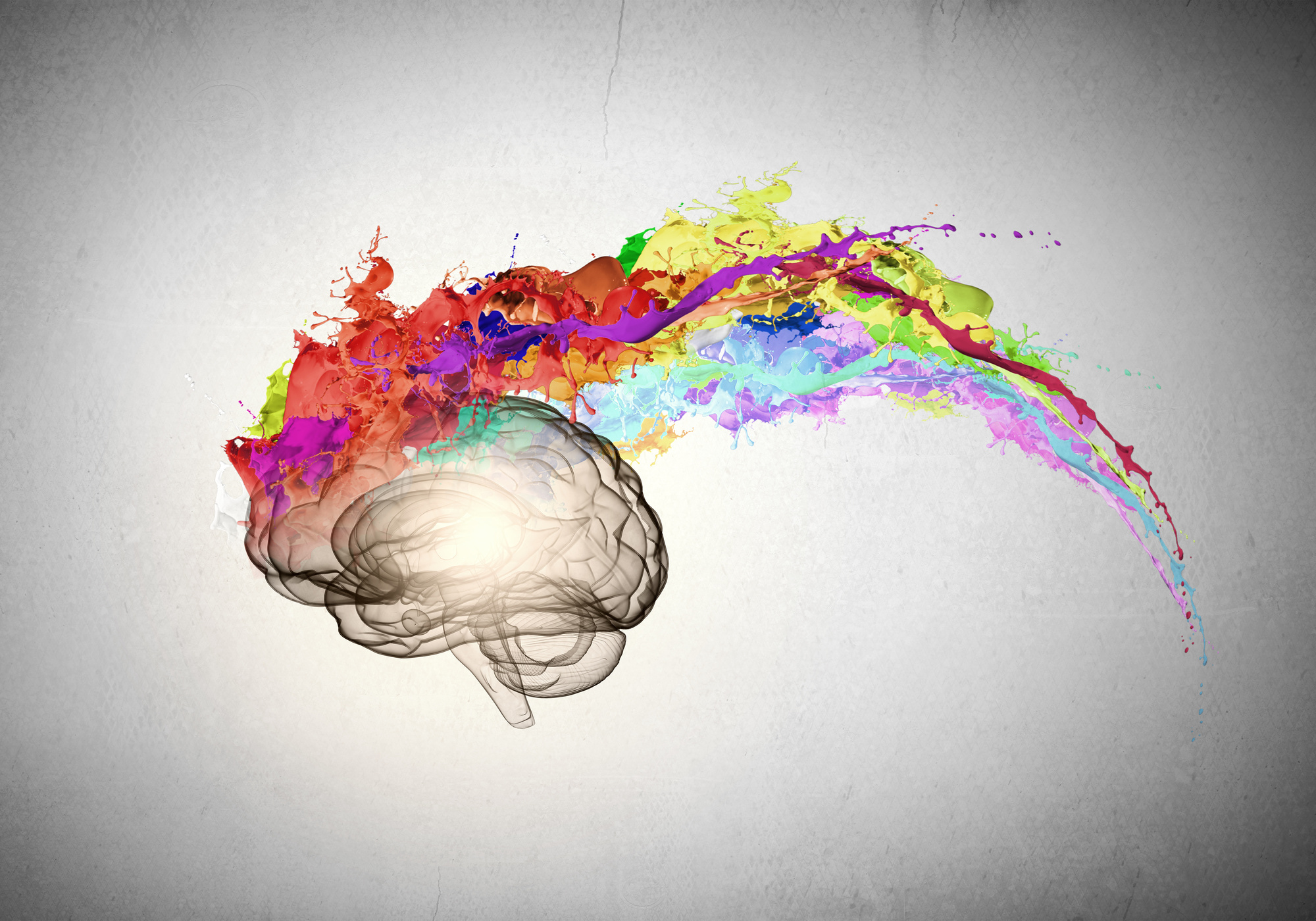
Your logo color scheme can be one of the most important aspects of your logo. Your colors tell a story about your brand that people pick up subconsciously in the brain.
Great, so you need to pick the right colors for your logo.
But there’s a problem.
What are the right colors? What do the different colors mean? What are your colors saying about your business?
This article will guide you through the whole process.
Let’s begin.
What Your Color Scheme Say’s About Your Business
Your brand’s logo is one of the most important aspects of your business. What many people don’t realize when they start to design their logos and branding is that color schemes send a message.
When picking the colors you’ll represent your business with; you should be thinking about what message your logo color scheme is sending to your audience. Color increases brand recognition by up to 80%.
It’s important to think about your branding when designing a logo. 90% of all purchasing decisions customers make subconsciously. That means it’s vital for your company to choose a color scheme that evokes positive emotions.
Picking Your Logo Color Scheme
When you look at branding, the colors you choose can have a powerful effect on your customers. Color is both emotional and practical and can make a big difference to what people feel when they look at your logo.
As always, just because something is true doesn’t mean it’s easy to figure out for yourself. So how do you go about picking the right colors for your business?
Well first, you should understand the symbolism and psychology behind colors. There’s a lot of logo design trends in 2018, but it should all start with color.
Let’s explore some of the things you should be looking out for when picking your logo color scheme.
The Meaning of Colors
What’s in a color? A lot apparently. Colors you pick for your brand and logo can have a subconscious and psychological effect on your customers.
Let’s look at some of the most popular color choices and see what message they send to customers.
Red – Think Passion, Danger, Energy & Excitement
Red is a color you’ll see pop up in logos all throughout the business world. The color red has a lot of varied associations.
In your logo, you’ll find that using red is a powerful way to pack a punch. It’s also known to be a color that reveals desire and passion.
It’s no surprise that brands like Ferrari run with the color red in their logo. Everything about the company revolves around passion, power, danger, fire and to some even sexuality.
The color red can mean bring out a lot of subconscious feelings:
- Red can evoke strong emotion
- It encourages appetite
- Red increases intensity and passion
- The red rose even symbolizes love
- In marketing, it can increase the heart rate
- It can create urgency in sale posters
- Companies use red for impulsive shoppers
Companies like Netflix, McDonald’s, Kelloggs, YouTube, Coca-Cola & Target are all big lovers of the color red in their branding.
Blue – Trustworthy, Calming, Depressed & Highly Communicative
Blue is one of the most universally used colors out of all of the color palette options. You’ll find blue to be a highly versatile color that can communicate a lot of different feelings to your customers.
If your company is looking to give off the impression of reliability, trust, and great communication, then blue might be for you. You only need to look at some of the largest communication companies in the world such as Facebook, Twitter, and Samsung to see that this is true.
The color blue is also considered a calming and peaceful. often associated with the ocean and the sky. Remember though that the emotional feeling of ‘being blue’ refers to depression and sadness.
Here are some of the emotions that blue can subconsciously evoke:
- People associate blue with water and peace
- It’s most preferred by men
- It curbs your appetite
- It’s thought of as a cold color
- Blue gives the perception of consistency through life
- It increases productivity
- It’s the most used color in offices
- In marketing, blue’s considered non-invasive and productive
- It creates a sense of security and trust in your brand
You’ll find some big corporate companies like Facebook, Twitter, Pepsi, Ford, Dell, Walmart and Skype that all use blue in their logos and branding.
Yellow – Optimistic, Cheerful, Happy & Playful
Yellow, also known as the color of sunshine is one of the more fun and playful colors. Adding this color into your branding mix can give your customers a smile.
It’s also one of the most noticable colors, which is why you see yellow used in street signs. It sends out messages of joy, friendship, and energy.
Yellow has associations with mental clarity and intelligence. You’ll also find yellow used in cautionary situations like life jackets, hazardous areas and even in cautioning tape.
Here are some of the emotions that yellow can send your brain subconsciously:
- Yellow can increase cheerfulness
- It’s a warming color
- Can cause fatigue on the eyes
- Stimulates your brains processes
- Stimulates the nervous system
- Yellow can encourage communication
- In marketing yellow can represent optimism and youth
- It’s used to grab customers attention in windows
You can find yellow in company logos such as Ikea, Nikon, Cat, Sprint, McDonald’s, Best Buy and Denny’s.
Which Logo Color Scheme Suits Your Companies Message?
There’s a lot of different choices when picking your logo color scheme. The three main primary colors, red, yellow and blue are some of the most used across all industries.
Deciding on the right color can make a huge difference in the message you are sending to your customers.
How to Choose the Best Colors for Your Food Logo Design
Posted on May 30, 2018 by Logo Design Tips and Tricks

Logo design is vital for every business. Your logo is the first piece of imagery your customers look at and is their tool for identifying your brand.
Most businesses stress over several logo aspects: the font, the design, etc. But few businesses stress over a major detail: color.
Color can make a person feel different ways.
If you want your customers to convey a certain feeling, research color psychology. This is key when creating a logo for a food company; you want your customers feeling hungry, happy, and satisfied.
If you’re creating a food logo design, here’s a look at each color and what it entails. Here’s your guide to choosing the best color for your logo.
Red
Red is one of the most diverse colors in color psychology. Red conveys passion but it also conveys dominance and strength. When someone looks at the color red, they feel very strong emotions. But these emotions can lead to hunger.
Admit it: you love food. For lots of people, food is their passion. Hunger is a dominating emotion, which represents red’s dominating influence.
Red is a popular logo design choice because the color attracts attention. When you see a glimpse of red hue, you become interested in the logo.
Red also has powerful physical effects. This includes increased metabolism and blood pressure. For food logo design, looking at red imagery can boost your appetite!
Orange
Lots of food and beverage companies use orange in their logo. That’s because orange reminds you of hunger and thirst. When you see the color orange, you think of a refreshing tangerine or a delicious sweet potato.
Orange is also a vivid color. Like red, you naturally gravitate toward the color orange.
But rather than convey dominance and passion, orange conveys warmth and comfort.
Compare orange to a homecooked meal and red is scarfing down a burger. This is why lots of restaurants use orange in their logo.
Cooks are especially prone to the color orange. Orange ignites creativity — and who better to indulge in the creativity of food than a cook? If you create kitchen utensils, orange is a great color to use in your logo.
But there are issues when using orange as a logo. Different print media display orange differently; this includes on the web, on paper, and on television. If you want to use orange in your logo, discuss your options with a graphic designer.
Yellow
There are two colors that food brands commonly use for their logos: red and yellow. Red was mentioned, but now it’s yellow’s time to shine. Yellow is an intense color, therefore it attracts intense emotions.
Yellow is beneficial because it’s attention-grabbing and conveys feelings of happiness. Yellow also represents food attributes: the sun helps food grow and delicious foods such as corn and lemons are yellow.
Like orange, yellow can be rough on logos. If you decide to use yellow in your food logo design, combine yellow with another color. Yellow is hard on the eyes and is difficult to read.
When mixed with a dark color such as black, yellow help brighten up the design.
Green
If you have an eco-friendly, vegan or humane food brand, green is the color you should choose. In this modern day, green is all about the earth. When someone looks at the color green, they feel a sense of joy and satisfaction.
But make sure you discuss your green logo with a graphic designer. Green is a powerful color; therefore, certain shades can seem unappetizing.
Blue
Blue is the epitome of a cool tone. This color activates relaxation and serenity. Not exactly a color you want to use in your food logo design.
But some logos look great with blue. For example, blue does great with seafood. Fish come from the ocean, which is blue. Therefore, blue is fitting. But if you run a farm, a blue logo won’t match as well.
Purple and Violet
Purple is one of the most difficult colors to use with food logo design. This color is another cool tone, which is always difficult in food industries. Purple also conveys imagination and spirituality, which aren’t very appetizing emotions.
Like green, purple is great for food brands with humane value. Purple activates your psychic senses and your morality. It helps you become a humanitarian and ignites compassion.
While a fully purple logo won’t convey much strength, adding purple hues will make your logo more powerful.
Black and White
If logo designers are unsure of which colors to choose, they go with black. Do you wonder why the little black dress is a wardrobe staple? Black looks good on everyone and is perfect for any occasion.
This idea applies to logo design. Black is legible, always makes the perfect font color, and can be used as an outline for an image.
But there are times when your logo is placed on a dark image. Therefore, have the same logo available in white.
While both colors aren’t “food-friendly,” you can easily draw an outline of a food-inspired image.
Brown
Browns are often used for eco-friendly food brands and farms. Brown signifies the earth; it’s wholesome and natural. When someone looks at the color brown, they think of the soil that grows their food.
But brown can also be unappetizing. If you use brown, combine other colors such as green and yellow for an earthy feel.
But foodies also associate chocolate with another food source: chocolate. If you make chocolate, dark brown or brown-black is always appropriate for chocolatiers.
Pink
Pink doesn’t invoke feelings such as hunger but can work in food logo design.
Pink represents femininity, love, and understanding. But pink also reminds us of some tasty treats: cotton candy, bubblegum, and even strawberry flavors all have a pink color.
If you’re in the sweets business, a pink logo will activate a sweet tooth.
Time to Use These Yummy Colors for Food Logo Design
When you promote your food brand, you want your customers feeling their taste buds go wild.
Pictures and videos of food do the trick, but you can activate this sense with your company’s logo. The secret to this effect is choosing the right color.
If you can’t decide which color to use, a designer can point you in the right direction. Or, you can make your logo online. Get started here.
Does Your Company Logo Pass the Color Psychology Test?
Posted on December 13, 2017 by Logo Design Tips and Tricks
You’ve created a logo design for your company. You’re excited about how it looks, you’ve gotten good feedback from coworkers, and you’re ready to debut your new brand. But have you checked to make sure that it passes the color psychology test?
People tend to have the same reactions to colors, which means that marketing executives can predict how consumers will react to a logo. Every color has a different connotation, and you want to make sure that the colors in your company’s logo are sending the right message.
Read on to discover how to find the right color for your company.
1. Learn How To Pass The Color Psychology Test
Before choosing a color for your company logo, you should know what kind of message you want to send. Do you want people to see your brand as something expensive and exclusive, or do you want to seem affordable? Is your image young and fun, or stable and dependable?
The color that you choose has a huge impact on what people will think of your company. Since green is associated with nature, for example, companies usually use green if they want people to associate health or environmental friendliness with their brand.
On the other hand, companies use red if they want to give the impression of being bold or daring.
If you don’t know the psychology of color, your business could be giving the wrong message without realizing it.
2. Remember Gender
Men and women respond to color differently, so you should know who your target audience is and choose your colors with them in mind.
23% of women list purple as their favorite color, for example, while only 1% of men do. If you’re using purple to market your company towards men, you might be turning customers away without even realizing it.
Similarly, pink is still seen as an exclusively feminine color. If you’re not creating a women’s lifestyle brand or something similar, you should tread carefully using colors in shades of pink.
Colors like blue, white, silver and black are more neutral. You can even combine these colors for great results — check it out!
3. Use Emotion
How do you want people to feel when they see your logo? Emotions are a huge part of marketing, and they’re also an important aspect of the color psychology test.
Yellow inspires people to feel happy, hopeful, and optimistic. Think about the McDonald’s iconic golden arches, for example, and how their marketing always tries to inspire a feeling of happiness.
Blue, on the other hand, is a color that signals to the consumer that they can trust your brand. It’s a common color for finance and healthcare industries to use.
Design Your Logo Today
Now that you know how color can influence what people think of your business, use your new skills to create your logo. Our online logo maker helps businesses create the perfect logo for them, even without graphic design experience.
How will you use color in your business’ logo? Are there any tips that we missed? Let us know in the comments below!
How to Find Your Painting Company Logo Color Scheme
Posted on September 15, 2017 by Logo Design Tips and Tricks

What’s the secret to designing a stellar logo for your company? It all starts with selecting the right color scheme.
Your logo is one of the first things people think of in association to your brand. The right color palette is so instrumental in branding that it can increase brand recognition by up to 80%.
Color has more of an impact on people’s emotions and decisions than you might think. Before landing on a color scheme, you need to first understand how your customers react to certain colors.
Painting companies can’t afford to get their logo’s color scheme wrong. Let’s find the perfect painting company logo colors the first time around. Read on to learn more.
The Best Color Schemes
There’s no one color scheme that creates the perfect painting company logo.
Colors are at their most effective when they fit the companies brand and brand message. Each color evokes a different response in people. You need to be aware of the different responses and if your color scheme fits your brand.
For example, bright colors are a great way to grab a potential customers attention. However, they can also seem aggressive in some peoples eyes.
Conversely, quieter color schemes can make a logo look more professional. They also can be overlooked in favor of bolder colors.
Let’s take a look at an example of a good color scheme. Rhino Shield of California combines both light and dark colors in their logo.
In other circumstances, a large black figure in your logo could spell certain doom. It could prevent the logo from catching anyone’s attention. However, this logo does a great job of contrasting the darkness with light blue and yellow.
This color scheme helps to create a logo that is both on brand and attention grabbing. This is what you should aim for when deciding between color schemes.
Colors and Responses
A painting company logo should have the right mix of colors in their scheme. The best way to approach this is to understand the types of responses associated with each color.
Let’s first consider the bright colors. These are colors that create strong responses – for better or worse. They can make people feel energetic, warm, or aggressive.
Red is a bright color that evokes a strong response. If you’re looking for something more understated, you could consider an orange or yellow.
Orange is an approachable color that’s associated with fun and energetic brands. Yellow can make customers feel cautious, but it’s also warm and inviting.
Blue is a popular choice for businesses trying to give off a corporate or professional vibe. While not the best choice for painting companies, it can be a good fit for more serious brands. Green is typically associated with earthly brands such as landscaping or food companies.
Typically, it’s best to stick to one or two colors in your logo design. Adding too many colors can make logo’s too busy and hard to read.
A popular alternative to having multiple colors is to add different shades to your logo. This is a great way to spice up a logo without altering the brand message.
If you’re still having trouble deciding on your color scheme, try using a logo maker tool. Play around with it until you find a scheme that’s satisfying.
Your Painting Company Logo
Are you ready to make your logo?
Remember that color schemes are only effective when they stay true to your brand. Make sure you pick a color that fits your company and evokes the desired response from your audience.
Contact us to get started making your great logo today.