5 Creative Logo Design Ideas for a Label Company
Posted on September 01, 2017 by Logo Design Tips and Tricks
How do major brands and large companies come up with such recognizable and creative logo design ideas? Did they instantly become household names based on the labels printed on their food packaging or other goods?
While there is more to a business than their logo, a company’s brand is an important staple for a customer’s ability to identify them.
As a designer creates a new logo specifically for a label, it becomes their responsibility to understand what will catch attention while also helping to define what represents the product. From labels on crafts to labels on canned food, these small images define the identity of a business.
Have you been contracted by a label company to design unique labels for their brands? Here are 5 creative logo design ideas to get you started.
Follow Gestalt Theory principles
The Gestalt Theory relates to our brain’s ability to generate visual forms from simple unrelated pieces. It’s like a puzzle that is already outlined for you and your mind simply needs to fill in the blanks.
The same principle also applies to images that appear to be one thing, but when looked at from a different perspective, can seem to be something else.
A good example of this principle is the Chick-Fil-A logo. With a design that could be seen as either the letter “C” or as a chicken, it fits this mold perfectly and leads into other factors like color.
Using color? Keep it simple
There is a science behind color that can majorly affect your logo’s effectiveness. Each color has a specific psychological meaning behind it.
With red evoking strong emotions like love and yellow promoting cheerfulness and warmth.
When designing a logo for something small like custom hem tags on t-shirts, be sure to limit the amount of color, so it is easy to recognize.
Determining how you want your customers to feel will be a good starting point when choosing your logo colors. Remember to keep it simple.
Be a minimalist
When you look at many of the well-known brands today, do you see intricately detailed and complicated logos? Not at all.
Instead, we see simplicity and minimalism. Look at Apple, Google, and Target as examples.
Apple uses a simple, white apple outline with a small bite taken out of it. Google uses nothing more than its name with a few primary and secondary colors. Targets uses, well, a red target.
These all prove that the logo design doesn’t need to be anything fancy to be effective. That same concept relates to the font as well.
Find the right font
It is important to design your logo with a font that sends the right message.
The font has many different tasks that it needs to accomplish all at once. It gives your logo a unique look while also maintaining professionalism and attracting attention.
While a crafting business may decide to go with a cursive or calligraphy style font, a t-shirt company may elect to go with a more classic serif font for their labels.
Oftentimes, it is the customer that will tell us how effective our logo really is.
Ask for feedback
This may not sound like a design idea at first, but it’s important to realize that there are many creative people all around us.
Utilize social media sites like Facebook and Instagram to get advice and constructive criticism on your label ideas. You might be surprised how helpful others can be.
It may even be useful to put your top social media username on your labels to attract more followers to those sites.
Conclusion
Your logo will be the main visual component of your business’s brand identity. Along with labels, it will also appear on business cards, advertisements, and your websites.
Having a strong logo will be a key contributor to your business success.
What design ideas have you come up with while putting together your labels?
Designing an Ecommerce Logo: What to Keep in Mind
Posted on August 24, 2017 by Logo Design Tips and Tricks
An online shop survives on customers being able to find its website easily. It’s also important for a site to give a good first impression so that customers will want to explore more.
Designing and using an ecommerce logo can make a difference in both of those areas. It’s important especially for small businesses or businesses that are new to the online market.
If you’re in the process of creating or redesigning your ecommerce logo, we have a few tips for you to keep in mind.
You want to make sure your logo does everything it should to give your site a boost.
Include Your Name in Your Ecommerce Logo
Logos are a great way to grab a customer’s attention when they first land on your site.
You should be sure to include your company name as a text element that goes with your visual element.
Customers should know exactly whose site they’re on. As they start to explore your site they’ll begin to associate the products with your name.
The next time they’re shopping for what you sell, they’ll know exactly what site they want to go to.
Even if they can’t remember your exact web address, they’ll be able to search for your company by name. They won’t use a generic search which could lead them to a competitor.
Do Your Research
If your ecommerce site is one out of dozens in your industry, your logo is your first chance to stand out from the crowd.
Spend some time looking at your competitors and what they’ve done with their logos. You may find that there are industry logo trends that several of them have used in their designs.
If you do notice a pattern, keep that in mind when designing your logo. You may want to use some of those same elements so that you’ll be recognized as a part of that industry. You will also want to incorporate fresh ideas that will make your company stand out.
Picture How it Will Look on a Product
As your site catches its following, there may be the chance for you to promote your brand by using your logo in more places than just your homepage.
You may want to include it on promotional items, such as t-shirts, cute mouse pads, pens, etc.
If you design your logo to look just as good in real life as it does online, your opportunities for marketing and promotion will expand.
Start Designing
The first step to designing your ecommerce logo is identifying what it is about your company that you want a logo to say.
A logo may seem like just a small part of your marketing strategy. But it may be the first chance you have to grab your customer’s attention and communicate with them about who you are and what you do.
If your logo doesn’t inspire customer’s to explore your website more, you’re missing out on an opportunity to generate business.
Have any questions on designing an ecommerce logo, or ready to start creating? Contact us today!
How to Make an Stylish Logo for a Sign Company
Posted on August 24, 2017 by Logo Design Tips and Tricks
The most iconic logos share one trait: they’re simple.
That’s not to say that the design process is–far from it. In fact, designing a stylish logo can leave even the most talented designers scratching their heads.
If you’re stuck while making a logo for a sign company, don’t panic. We have plenty of ways you can make this process better and fun.
Here’s how.
Question: What’s a Stylish Logo for This Company?
“Stylish” could mean many different things for different clients. For instance, let’s say that the sign company in question makes striking signs in Texas. That’s a different aesthetic from a client in New Hampshire.
So, you need to consider the context that people will see your logo in. What kind of people will view this logo? Will it appear on a billboard or a family-friendly establishment?
Put yourself in the shoes of the audience. Once you have answers to these fundamental questions, logo design will come much more easily to you.
Consider Words, or Not
Whether to include words or not in the logo is a case-specific question.
Consider if the sign company has a catchphrase that might fit on your logo. Maybe you could come up with one, with their consent. You should try to experiment with different phrases and fonts with an online logo maker.
On the one hand, a nice phrase included in a logo can really stick in a person’s head (have you heard about Google.com?). But, too many words can become sensory overload for the viewer.
Sometimes, it’s better to keep things wordless.
Pop with Color and Imagery
There are many different ways you can make a perfect logo through visuals alone.
If you can hone in on a good image, it could be perfect for your logo. Like the Nike swoosh, certain images have the potential to make a company stand out. The same is true for the sign company you’re designing a logo for.
Colors can catch a viewer’s eyes, too. Take a look at the different effects of color on the mind. If you can harness those properties with lighting technique and color contrast, you’ll catch eyes like fish in a barrel.
Still, don’t overdo it. Just because you have a lot of ideas doesn’t mean they’re all fantastic.
Your thought process before you turn in the final product should be jammed with thoughts and experimentation. But if there’s too much going on in the logo itself, disaster could strike. Just look at some of the biggest logo fails ever.
The final logo should be crisp, clean and simple.
It’s Time to Create
With the right information, you’re much better prepared to make a stylish logo for a sign company. The right logo will attract eyes to that company while also leaving you satisfied with the research and work that went into your design.
Are you looking for more tips and advice on logo design? If so, feel free to check out the tutorial on our website.
Good luck!
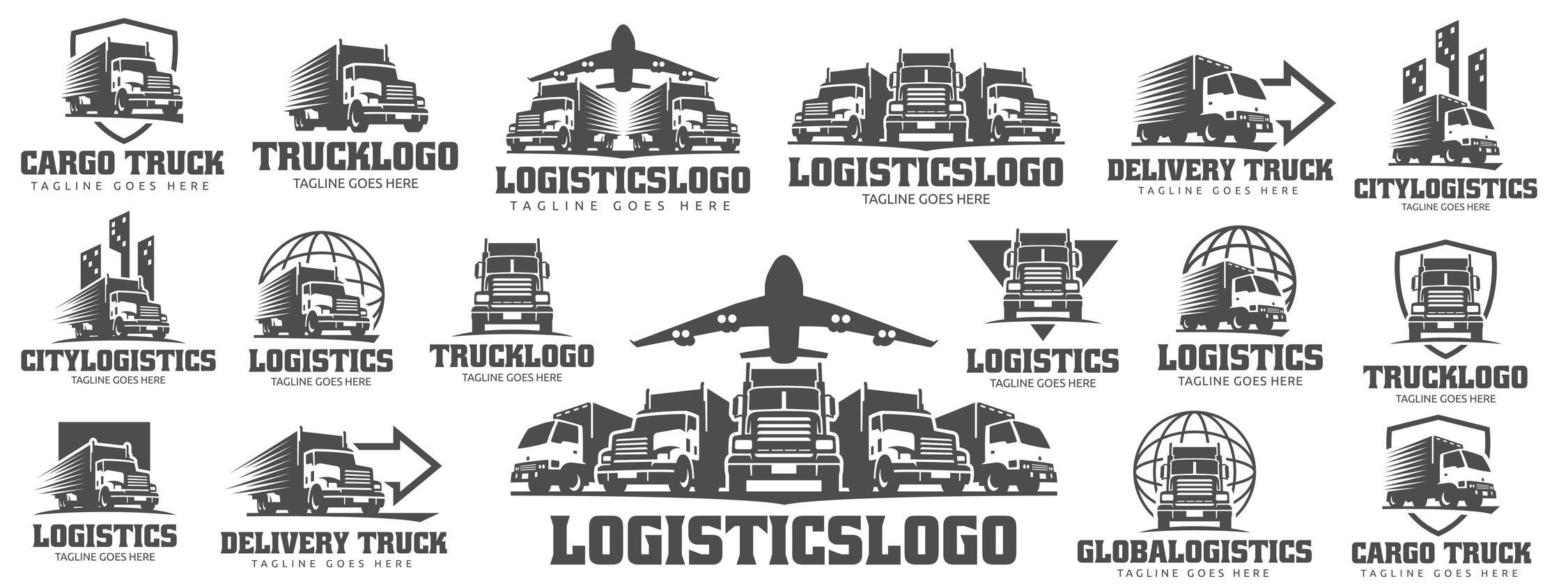
5 Consumer Stats to Inform Your Shipping Logo Design
Posted on August 23, 2017 by Logo Design Tips and Tricks
Your brand logo is a symbol of your company’s standards, products, and performance.
However, many retailers do not realize a shipping logo is just as important. Sometimes, it’s the deciding factor in product comparisons.
To stand out throughout the purchase cycle, retailers need to understand consumer opinions. Market perception is just as strong as market demand, especially in communication strategies like logo design.
Translation? If you want to increase your conversions and make more sales, your logo design needs to grab the attention of everyone who sees it — and has to be powerful enough to stick in their minds.
Here Are 5 Consumer Stats to Inform Your Shipping Logo Design
1. 90% Of Consumers Say Free Shipping Is the #1 Incentive
The only thing better than fast shipping is free shipping, according to a recent survey of over 1,400 people.
Some consumers will even wait an extra day or two if it comes at no extra cost to the item purchased.
Electronics and clothing items are usually wanted right away, in which case consumers will pay for shipping. Other things like household items may not be needed as rapidly. Consumers will gladly wait to receive such items for free.
When designing your shipping logo, keep in mind the products you offer.
How much are they worth to your consumer? Enough to pay for shipping?
2. Two of the Top 5 Countries Shopping Online Prefer Digital Currency
Having an online market often means having a global audience.
China is number one in the world for the most frequent online shoppers. Of which, more than half of these consumers prefer digital currency.
India is not far behind. The country places fourth for having the most frequent shoppers per month, yet comes in first place with over 70% of consumers using digital currency.
Customers in Germany, the UK, and the United States are all regularly clicking “go to cart” and “checkout,” too.
This makes digital currency an easy way for everyone to get the latest trends, no matter the shipping address.
3. 50% of Consumers Opt For One-Day Shipping
This statistic highlights the old truth: the faster, the better. It really is that simple.
Many consumers want an estimated time slot of when to expect their package. However, updates are more than welcome. Email or text updates when the package is ready, shipped, and delivered can help.
This has an added benefit of more exposure for your shipping logo. To best tie-in fast shipping to your logo design, think of what reminds you of speed and efficiency.
4. Home Furnishings For Home Delivery Orders Are Increasing
About 30% of consumers are planning to make big, bulky purchases in the coming year.
Retailers need to consider things like special load boards for freight, depending on the total weight and distance traveled.
Retailers have to get the delivery right the first time always, but there literally is more riding on a big order. A trustworthy logo can help establish customer rapport from the start.
5. 82% of Consumers Expect Proactive Communication Throughout the Shipping Process
This is an age-old truth of establishing good relationships – communication.
Using SMS or email strategies are such simple tactics retailers can implement for high customer satisfaction ratings. In fact, of the consumers looking for consistent communication, 45% are tracking by SMS and 85% are checking their emails for updates.
Additionally, the more you send something out to your consumer, the more opportunities you have to expose your logo.
Demand and Design
Designing your shipping logo means taking many things in to consideration.
Your established brand logo and products are the foundation. However, consumer shipping opinions and statistics are important, too. Use the data here to your advantage, especially when it comes time to design your logo.
Have your delivery logos made a difference in customer satisfaction and relations? Let us know in the comments below.


