What Your Accounting Firm Logo Says About You
Posted on June 15, 2017 by Logo Design Tips and Tricks

There are over 130,000 accounting firms in the United States.
While this is wonderful news for those who are looking to get into the accounting industry, it means that current accounting firms have more competition than ever before.
Accounting firms in the United States have already had to make changes to keep pace with the ever-evolving accounting industry. Additionally, digital marketing for accounting firms is more popular than ever.
Having an SEO strategy, a great website and even social media presence are crucial. And with more avenues than ever to advertise your firm’s services, it’s easy for your brand message to get muddled.
It’s also harder to set yourself apart.
While some firms sink huge percentages of their marketing budget betting on high-risk and ultimately ineffective strategies, others are focusing on strengthening what is arguably the foundation of branding:
An accounting firm logo.
But if it’s been a while since you upgraded your accounting firm logo, or are curious about what your firm’s logo may say about you as an individual CPA, you need to read this article.
In it, you will learn the kinds of messages that different accounting firm logo designs send to both current and potential customers.
Is Your Accounting Firm Logo Stressing Out Your Clients?
As tax deadlines approach, more and more Americans start to feel anxious, angry, and of course financially strained.
They’re desperate to find an accounting firm that has the ability to get their tax bill lowered, and to get them a higher tax refund.
Your firm may do this for businesses or individuals through the use of professional tax software not available to the average citizen. It may also rely on your employees’ comprehensive knowledge of tax law and years of experience.
Whatever the specific strengths of your firm and your accountants, you need to ensure that your logo puts the stressed-out minds of taxpayers at ease.
But if your logo is filled with reds or bright oranges, you could be sending the wrong message.
Red tones will call to mind unpaid bills, missed payment deadlines, and other financial negatives. It’s called “in the red” for a reason, after all!
Orange, while it may work for other industries, will similarly stress out your target market. While any overly-bright color will certainly be attention-getting, it will be for all the wrong reasons.
Instead, we suggest that you opt for more soothing, calming tones. Colors that project an air of confidence, collectedness, and above all, serenity.
The colors you include on your accounting firm logo need to say, “Relax. Let us handle this for you.”
To accomplish this, include soft blues, pastel colors, and even lighter greens.
Is Your Accounting Firm Logo Sending An Unprofessional Message?
Let’s set a quick scene: you’re driving along the interstate, and you see a billboard advertising services for a funeral home. The advertisement looks great, but then you spot the funeral home’s logo in the bottom of the billboard.
It’s of two men, grinning and giving a thumbs-up in front of a drawing of a coffin.
OK, so most poorly-thought-out logos (hopefully) won’t be that extreme.
But if you elect to include any imagery on your logo, you do need to work to ensure that it speaks to the professionalism of your firm and the services it offers.
Avoid anything overly cartoony, and even consider avoiding including people at all. Remember that people have been trained to connect certain images to specific industries and services.
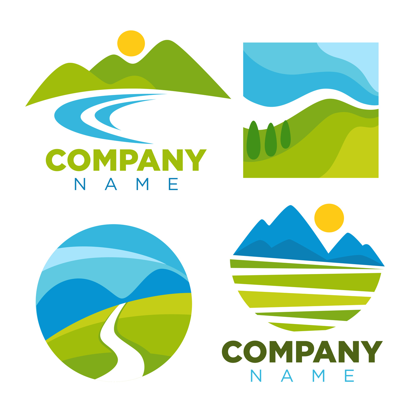
While you want to avoid relying on cliched images (we’ve seen enough mountains in CPA logos to last us a lifetime) there are certain pictures that just make sense.
Natural images always seem to do the trick, as does art that works within the letters of your firm’s name. If you’re going for shapes, circles and triangles call to mind financial cycles and divisions of assets.
Avoid dollar signs and depictions of money. This just makes you look like a sketchy check-cashing business that you don’t want to go to after it gets dark.
When In Doubt, Keep Your Accounting Firm Logo Simple
As tempting as it can be in the “hipster” and “social media age” to go for something cute and unexpected, most people don’t want to see “risk-taking trendsetter” and “accounting firm” in the same sentence.
Projecting a crisp, clean, and yes, minimalistic logo for your accounting firm still allows for a certain degree of creativity.
Yet, it’s not so distracting that it muddles the message of your firm, or causes potential clients to doubt your abilities.
Don’t be afraid to include lots of negative space (AKA blank space) in your design. There’s nothing wrong with writing your name in black and blue lettering.
To add a more unique touch, have a typography professional create a font just for your firm.
Plus, having a simpler logo means that it will also be much easier to resize. Your logo will go on lots of different correspondence: your email signature, your business cards, your letterhead.
However, it will also go on your website, your Twitter and other social media accounts, and maybe even the sides of your building.
A clean, simple logo ensures that it will look great no matter where it’s placed.
Ready To Create The Perfect Logo?
Thanks to this post, you’re now much more aware of what will and what won’t work when it comes to creating the perfect accounting firm logo for your brand.
You’re also more in tune with what your current logo might be saying to consumers — so you can know whether or not it’s consistent with the overall message of your firm.
But don’t just settle on the first idea that comes to mind. Just like in finding solutions for tricky tax situations, the first answer is usually never the most effective one.
That’s why we suggest using our free online logo maker tool to help you test out a variety of different designs before you make a commitment to one.
Never underestimate the importance of your logo. To learn more about how to incorporate it into your overall marketing plan, spend some time on our website and blog.
Popular Company Logos Aren’t Accidental: Here’s Why & Tips to You Can Use
Posted on June 15, 2017 by Logo Design Tips and Tricks
We can all think of logos that we’d recognize anywhere.
Popular company logos like these helped to build brand recognition, connect with a wide market, and they’ve stood the test of time.
But they also required lots of thought and planning. Want to learn more?
Take a look at the meanings behind some of the most recognizable logos out there.
Mount Adidas
There are lots of different logos, all representing lots of different companies — from those selling the best vacuum cleaner to those providing carpet cleaning services.
But we all recognize the most popular company logos, which include Adidas’ triangular shape of three stripes. But did you know it’s actually a mountain?
It was created to represent the constant challenges that athletes have to overcome in order to become legends.
The Arrow Of Amazon
Everyone can recognize the yellow, smiling arrow of amazon.com. But look a little bit closer. Did you notice that the arrow is actually pointing from the “A” to the “Z.”
This shows that Amazon has it all, from A to Z — a claim they’ve certainly proven to be true!
The Secrets of FedEx
This is another arrow-themed discovery. Look carefully at the letters of the “E” and the “x.” You’ll notice that in the space, an arrow pointing forward is formed! This is meant to show that no matter what, FedEx will keep your packages moving forward in the delivery process.
The Nike Swoosh
The lesson from this logo? Don’t ever underestimate new talent. Carolyn Davis, the woman who designed the iconic Nike “Swoosh,” was still in design school when she was asked to create a potential logo for the brand.
The price Nike paid for one of the most recognizable symbols on the planet? $35.
Don’t worry, though — Carolyn later was rewarded with 500 shares of the brand’s stock.
The swoosh also illustrates the importance of designing a logo with your specific products in mind. Nike knew they needed to create something that could be visible from anywhere — even on a shoe!
This is certainly something to keep in mind when creating your logo, whether you’re selling apparel or household items. It’s also a reminder that sometimes, simplicity really is the best option.
Wendy’s Real-Life Connection
In logo design, it always helps to create something that helps you to tell a story.
Case in point?
The smiling, red-headed pigtailed girl of Wendy’s logo. It’s actually a portrait of the daughter of the company’s founder.
Learn From The Secrets Of Popular Company Logos
These facts aren’t just interesting nuggets you can pull out on your next date. These popular company logos show that everything is intentional, tells a story, and usually connects to the history or overall message of the brand.
You need to apply that same attention to detail to your own logo design process.
For more tips and inspiration, check out our branding and design blog.
When you’re ready to start creating, use our free online logo maker tool to ensure your logo represents your company in the best light.
Why You Need a Great Bookkeeping Logo
Posted on June 14, 2017 by Logo Design Tips and Tricks

There are slightly over 2 million bookkeepers in the U.S.
Even though most of them are employed in-house in various companies, some run their own bookkeeping companies.
Whether you’re in the process of establishing your own outfit or already have one up and running, here is why a great bookkeeping logo will be central to your success.
Strike a Great First Impression
We’re built to form quick first impressions of the people and things we meet and see.
In business, it’s no different. The first impression your bookkeeping company gives potential clients influences how they size you up.
How do you ensure your company gives a good first impression? Design an eye-catching logo. Avoid flashy colors. Keep it minimalist.
The next time you’re sending out a proposal, give your company letterhead a second look. If you aren’t satisfied the logo communicates your brand promise at first sight, redesign it.
Demonstrate How Different You’re from Competitors
In tech, a company can secure a contract not because it has a great logo, but because it has a reputation for delivering innovative solutions.
On the other hand, bookkeeping is a fairly straightforward task that doesn’t require any innovation. Most bookkeepers are genuinely competent in maintaining accurate financial records.
To stand out from the pack, you need to offer something more; a strong brand prospective clients would love to be associated with.
A sharp, attractive logo is what you need to prove your uniqueness to potential clients.
Earn Trust and Respect in the Industry
A great bookkeeping logo doesn’t just knock your competitors off the ground, it also earns you their trust and respect.
You see, a lot goes into designing a logo that breathes greatness. Frankly, thousands of bookkeepers have given it a shot and they come short each time.
So when you, somehow, manage to create a logo that’s two or three cuts above the rest, other bookkeepers and even accountants will notice and respect you and your firm.
With a strong command of trust and respect in the industry, your bookkeeping company will quickly evolve into an industry leader. This is a position that can earn you lots of clients.
Showcase Your Creative Side
Really, of all the abilities required of a bookkeeper, creativity ranks among the lowest.
OK. You may need some creativity to customize bookkeeping software to suit your needs, but that’s not even your job. It’s the software provider’s job.
In a profession where people are crunching figures and dealing with paperwork all day, a show of some creativity can win you clients, especially those who work in creative sectors and have a preference for creative people.
What better way to showcase your creative side than having a creative logo for your company?
Your Quest for a Great Bookkeeping Logo Begins Here
Creating a great logo requires a creative mind, a strong sense of color, an intricate understanding of what your brand stands for and, importantly, the right logo making tools.
It could take multiple attempts before you achieve the logo your company deserves, but that’s part of the process.
Don’t give up. Keep reading our blog for fresh design tips, and also keep tinkering with your logo until you hit the mark. Sometimes, greatness does take time!
How Creating a Cleaning Company Logo Can Launch Your Business
Posted on June 14, 2017 by Logo Design Tips and Tricks

These days, cleaning companies are more popular than ever.
While home cleaning apps were once all the rage, now consumers have realized that they need the expertise of a professional service — not a college student looking for a quick part-time job — to get their home sparkling.
How can you create a branding strategy that communicates that your services provide timely, trustworthy, and thorough services?
It all starts with the perfect cleaning company logo.
In this post, we’ll tell you how to create the perfect one.
Get Personal
Professional clean up services are much more personal than most business relationships. After all, your employees will be in someone’s private home, cleaning up potentially embarrassing messes they’ve made.
It’s likely that, especially if families have a particular housekeeper for a long time, a relationship that is both personal and professional will develop. This is a good thing, as it helps to establish trust.
It also helps you to get more referrals and to grow your business.
Your cleaning company logo needs to reflect this unique relationship. Why not include an image of the housekeeper, doing some dusting or vacuuming inside a home?
You could also depict a client coming home to a clean house after a long day, looking happy as the housekeeper looks on. No matter which image you go with, it should indicate a sense of trust, relief, and a job well done.
Try Something New
Of course, thanks to the birth of cleaning apps, an increase in professional cleaning services, and good old fashioned flyers, the competition is fierce.
But you don’t need to slash your prices or place a time limit on your employees’ work in order to compete.
Instead, you need to create a cleaning company logo that is of-the-moment without being too trendy (you don’t want it to look outdated in a few months.)
One popular tactic you could try? Include hand-drawn, professional illustrations in your logo. This could include a colorful, pencil-sketched drawing of cleaning supplies, a stylish housekeeper holding a mop, or anything else you can dream up.
Flex Your Creative Muscles
Many businesses simply don’t realize the wonderful branding opportunity that the text of a logo offers. They get so caught up in finding the perfect image, that they often forget about typography and font.
For example, you could create letters out of dust, and have a drawing of a cleaner sweeping them away. Or, you could create letters out of different cleaning tools. Think things like brooms, buckets, and feather dusters.
To really get a leg up on the competition, don’t be afraid to go a bit bold. Bright colors, block lettering, and other out-of-the-box font styles are all a great way to set yourself apart.
Plus, these logos especially pop online.
Ready to Make Your Cleaning Company Logo?
As you can see, a logo gives you creative freedom, a great branding opportunity, and a chance to connect with a wide market.
Remember that everyone needs a home cleaning service — so you’re playing to a wider audience than most businesses.
To that end, use our free logo maker tool to ensure you’ve selected the best design possible. Always check back with our blog to learn more about the latest in logo design!


