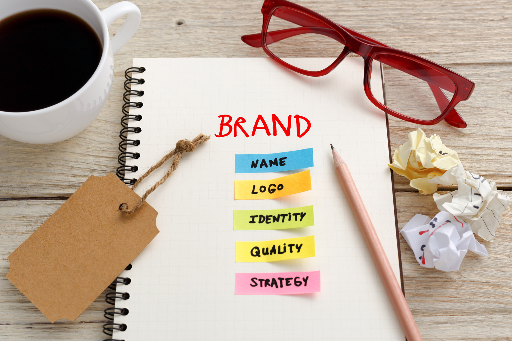
Can Your Website Benefit From A New Logo?
Posted on June 14, 2017 by Logo Design Tips and Tricks

No matter how much you love your logo, if it’s poorly-designed, it could be costing you business.
A bad logo design won’t just lose you customers, it will also hurt your company’s reputation.
You need to make a change — and fast — before you end up on a list like this one, calling out brands with the worst logos.
Take a look at some of the top reasons why it might be time for a new logo.
Your Logo Is Dated
Ever look back at yourself in photos from ten years ago and think, “I can’t believe I wore that?”
Well, the same thing can happen with your brand’s logo.
This is the dangerous caveat of following trends. If your logo looks like it’s ready to cater to any customers who are willing to hop in a time machine and head back to 1976, then you need to update it to fit the needs of today’s market.
This time around, go for a more classic look.
Your Logo Is Cliched
A loan company with a logo showing stack of pennies. A real estate agent whose logo is a house. Two people in wheelchairs kissing on a logo for disabled dating sites. An eye doctor who thought including a pair of glasses on his logo was a unique idea that no one else had thought of before.
Be honest with yourself: is your current logo in the same league as those listed here?
If so, it’s definitely time for a new logo.
Having a logo that looks just like everyone else’s communicates lots of things to your potential customers — and almost all of them are negative. Especially if you work in a creative field, where your job is centered on coming up with one-of-a-kind ideas, a cliched logo could be costing you customers.
If you find your company’s logo looks the same as your competition’s, it’s time for a change.
Your Logo Doesn’t Represent Your Brand Anymore
Sure, your logo may have been the perfect fit for your brand when you first started out, ten years ago.
But like any successful business, you’ve had to evolve in order to fit the growing needs of your target market.
Maybe that target market has even changed altogether.
A new logo is a wonderful, effective, and concrete way to announce a rebranding to both current and potential customers. It sends a clear signal that you’ve undergone a major shift as a company — which is a great way to breathe new life into lagging sales.
It may even cause customers that previously wouldn’t have glanced your way to follow you on social media, comb through your blog, and even make purchases.
Breathe Life Into Your New Logo Today
Now that you know it’s time to switch things up, we know you’re eager to get started. But don’t jump in just yet.
Take the time to learn about what does make for an effective, timeless logo design by reading our blog.
When you have a few good ideas in your head, use our online logo maker tool to find the strongest contenders.
How to Approach Your Marketing Agency Logo Redesign
Posted on June 14, 2017 by Logo Design Tips and Tricks
Do you feel like your marketing agency logo needs an update?
Your brand is always evolving. Therefore, you need to make sure you have a logo that evolves with it.
However, redesigning a logo isn’t always a quick fix. There’s more to it than just changing the color scheme or the font.
So what should you do to make sure you nail the redesign process?
Read this article to find out our top marketing agency logo redesign tips!
1. Look At Your Old Logo
When redesigning, you don’t need to completely throw your old logo out the window and start from scratch.
Look at your old logo, and recycle the elements that seemed to work well with your customers. Keeping some elements of the old design will help your customers feel connected to the new one.
For example, when Pizza Hut redesigned their logo, they kept their most vital element- the red roof over the words “Pizza Hut.” Changing the roof color probably would’ve been too much. By keeping it, they were able to still establish that connection while updating other elements of their design.
2. Simplify
When it comes to logos, less is usually more.
If your marketing agency contains a number of names, consider minimizing these to one or two for your logo.
Or, think about how your receptionist answers the phone or what name friends use to refer to your company. If there’s a shorter version that people refer to you as then this version can be great for your new logo redesign.
Also, don’t just simplify words. See if you can simplify any colors or pictures as well.
Think of some of the most well-known logos in the world: Apple and Nike. Their designs are so simple, yet everyone recognizes them.
Go through your whole logo design section by section and minimize where you can.
3. Optimize Readability
If you have to squint to read your logo’s font, it’s probably time to give it an update.
You don’t have to completely change the font style, but update it so it is lighter and more legible.
However, if you do feel like it’s time to change the font, make sure you change it to something that reflect’s your company’s persona.
For example, if your company is more traditional, go for a traditional looking font.
Whether it’s next to a video in print magazine ad or on a billboard, your logo is going to be everywhere. In order to establish brand recognition, your logo always needs to be readable at first glance.
4. Check Out Your Competitors
When redesigning your logo, it never hurts to check out the competition.
You can draw inspiration and idea from what they’re doing right. Or, go completely against the grain and redesign so your logo stands way out amongst the crowd.
Marketing Agency Logo: Wrap Up
Hopefully, the tips have gotten excited about redesigning your marketing agency logo for your marketing agency!
Please drop a comment below if you have any questions about your redesign strategy.
Personal Fitness Logos: Does Yours Fit Your Brand?
Posted on June 13, 2017 by Logo Design Tips and Tricks

If you work in fitness, you already know how important personal and professional branding is.
Especially as your training program gets larger, and you have more avenues to reach audiences, it’s easy for your brand to get lost.
One way to make sure you stay as consistent as you tell your clients they should be?
By creating unique and motivating personal fitness logos to build your brand.
Learn some of the best ideas on where to get started in this post.
1. Create Designs That Focus On Results
Most clients hit the gym because they want to make a change. They want to look better, improve their fitness, and even fight dangerous diseases like obesity and diabetes.
Of course, if you’ve ever pushed yourself in the gym, you know how tempting it can be to quit. And if you’ve ever struggled to lose weight, you know how tough it can be to take that first step.
Effective personal training logos need to be just as motivational as fitness experts themselves. Through your logo, you want to transform personal training.
They need to advertise and convey that what clients are looking for is possible, and they need to focus on results. We love the idea of having a thinner body outlined in a different color, inside of a larger person. Additionally, images like a client lifting a barbell over their heads or high-fiving with a trainer on a scale are also motivational ideas.
2. Use Colors To Keep Your Logo Welcoming
Lots of people don’t get the fitness expertise and help they need because they’re intimidated by the atmosphere of a gym. Or, they could be embarrassed and insecure about working with a personal trainer.
It’s one of the reasons it can be so tough to get clients.
While your image choice needs to rely on motivation, your color choice can reflect a welcoming, no-judgement vibe.
Bright, festive tones like blues, pinks, oranges, and greens help to keep things positive.
3. Reflect Your Training Style
Every personal trainer has a different, distinct style — and personal training logos need to reflect that.
If you teach barre fitness, it wouldn’t make sense to have a logo featuring weight training. If you’re a kickboxing coach, your logo should illustrate that.
The same goes for your individual training method. Are you a tough love trainer? Your logo could show you cheering on a sweating client on the treadmill. If you have a softer touch, your logo could include an image of you helping a client hold a barbell.
You’re Ready To Create Motivational Personal Training Logos
Thanks to these tips, you know how to create personal training logos for your gym or fitness brand that will convince even the biggest couch potato to make a change in their lives.
If you have several different ideas, we suggest using a free online logo maker tool to see which one looks the best. You could even poll clients and employees to select the favorite.
No matter which logo you choose, these tips will help you create one that grows your brand and your business — while shrinking the waist sizes of your clients.
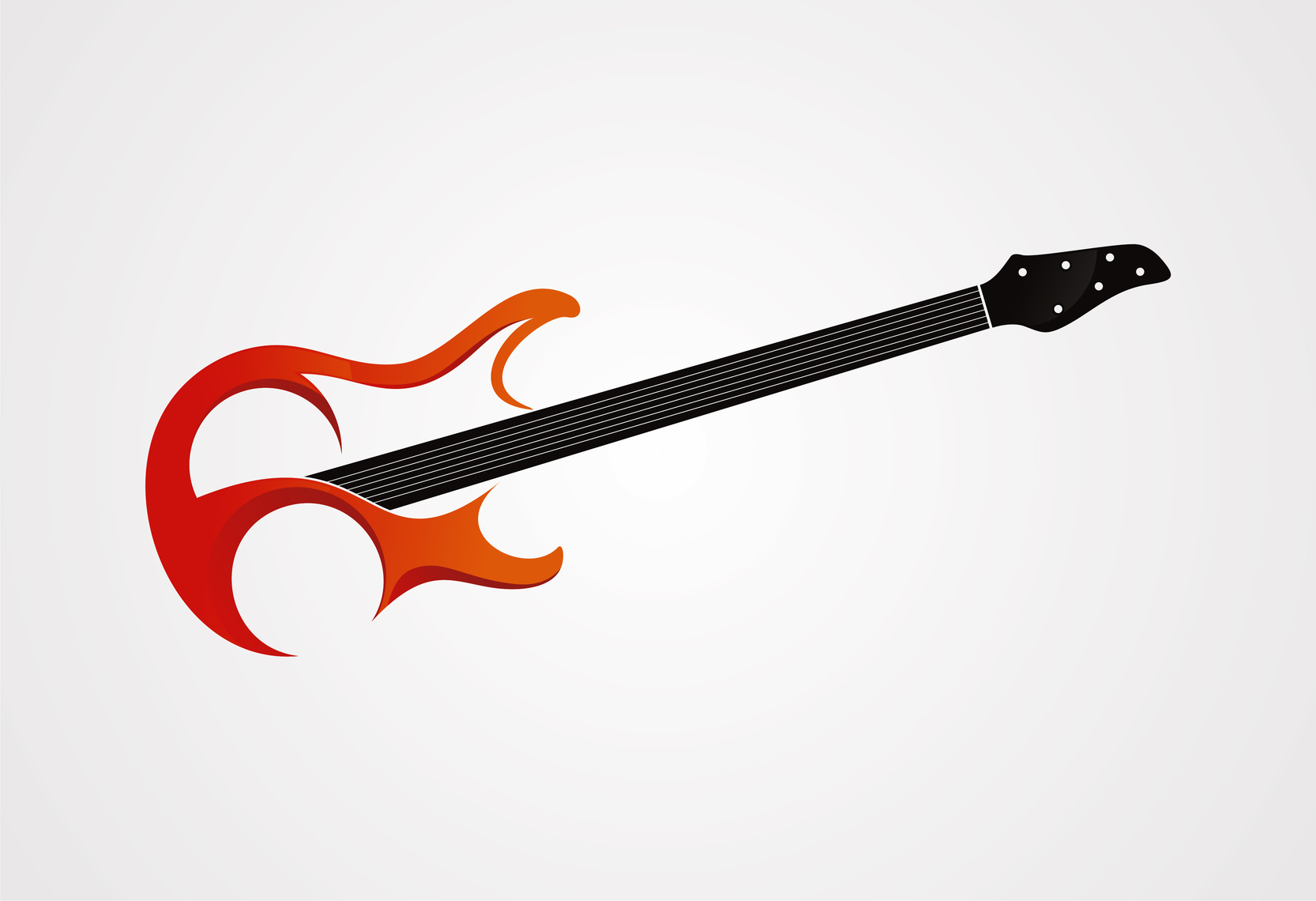
How to Make a Band Logo That Fans Recognize
Posted on June 13, 2017 by Logo Design Tips and Tricks
So, you’re almost ready to put out your first EP, you’re getting better gigs than just local dive bars, and now you’re focused on your band’s merchandise.
Before you do anything else, you need to come up with a logo for your band!
Learning how to make a band logo is a fun part of the creative process, but it can also be an important part of your marketing process. While everyone loves penning songs and passing around the tip bucket at shows, musicians have to eat, too!
Your logo can help your fans to recognize your band, looks great on your social media accounts, and helps to get your name out.
You can even include it on your instruments, like your guitar or custom bass drum head.
But the process isn’t as easy as you might think. Keep reading to learn how to make a band logo that’s as recognizable as Weezer’s Flying W or Metallica’s lightning bolt letters.
1. Consider The Genre
One of the reasons why band logos like Metallica’s are so successful is that they fit perfectly within the genre of music the band plays.
Heavy metal and lightening bolts? Sounds about right. The Beatles, a British band, taking over Abbey Road in London? Perfect. Punk rockers The Misfit’s skeleton? Makes sense.
No matter what kind of music you play, your logo should reflect it.
2. Consider Your Fans
Of course, a band lives and dies by its fan base. Sometimes, your fans know your band just as well as you do. Plus, they’re equally as creative.
Why not crowdsource your fans and ask for their input? You could even (giving proper artistic credit to the winner, or course) have a logo design contest!
It’s a great way to make sure you have lots of options, as well as an awesome chance to connect with your fans.
3. Consider Your Lyrics
Especially in bands that have multiple members, finding people that share the same creative vibe is tough (after all, look at how many band breakups there have been!)
But once you find the right mix, it’s easier to figure out what your band is really all about. Look at your lyrics to find your overall message. Is there a particular line that stands out to you and your fans? A major hit you want to celebrate?
It worked for Omaha-based musician Conor Oberst of Bright Eyes, who sung about a “yellow bird” in his song “Poison Oak.”
He created a logo and album art including the yellow bird. The yellow bird soon became one of his most recognizable logos, generating lots of merch and even fan tattoos.
You Know How To Make A Band Logo
With all the information on how to make a band logo here, your merch table will be more popular than ever — and so will your band.
But since you’re the creative type, we know you probably have several ideas floating around in your head already. Use our free online logo maker to test them out! For more logo advice, sign up to become a member with us and check out our blog.


