How to Create a Logo for Your Mechanic Website
Posted on March 21, 2018 by Logo Design Tips and Tricks
For many companies, the logo is an essential, memorable part of their brand. From Apple’s apple logo to Allstate’s “good hands” logo, you tend to associate these brands with the logo, and it makes them more memorable. If you want your business to be successful, you’ll need to create a logo that will push you forward.
There is no perfect way to create a logo. Many famous logos come from random inspiration. Others are very simple while still being effective. Here are a few tips on how to create a logo for your mechanic website.
1. Determine a Type of Logo
There are various different types of logos, from font-based logos that focus on company names to abstract graphic logos like Nike’s famous swoosh. For many mechanic websites, the ideal logo is a combination of both.
This combination will usually include a car or some aspect of mechanics, such as gears or a wrench, as well as the name of the company. This type of logo is a no-brainer and one can never go wrong with it.
2. Think About Color Scheme
Colors can have a dramatic effect on a person’s mood and how we perceive certain objects. Companies know this, and use their color scheme in their logos to convince us to purchase their products. For example, many banks use blue in their logos to portray trust and stability.
When choosing a color scheme for your logo, you will want to figure out what type of message you’re trying to convey. Will you go with a reliable brown color or a harmonious green color scheme? Either way, you’ll want to figure that out sooner rather than later, as it will be the base of your logo.
3. Think About What You Do Best
When creating your logo, you’ll want to consider what your business’ specialty is. Are you known for fixing up luxury cars? You might want to consider including an Audi in your logo. Is your customer service the best in town? Consider including a mechanic to represent you.
Wherever it is that you feel your business is strongest, you will want your logo to focus on that. Customers will be able to make the mental connection in their head and understand what your company stands for.
4. Understand the Competition
In every aspect of your business, you’ll want to know where your competition is doing well and where it is lacking. Logo design is no exception. As you start to create your logo, make sure you identify where your competition is succeeding and what its shortcomings are.
By improving on the success of your competition and avoiding their same shortcomings, you will have the best logo in your local market. This will, inevitably, draw more customers and ensure more success.
Are You Ready to Create a Logo?
If you need help creating a logo for your mechanic website, look no further. Once you’ve figured out what you want to capitalize on and what kind of color scheme and message you want to deliver, a professional can help take you all the way.
Check out our online logo maker to get started on making the logo that will set you apart from your competition for good.
5 Ideas for Medical Logo Design Inspiration
Posted on March 21, 2018 by Logo Design Tips and Tricks

Renowned designer Milton Glaser talks about the necessity for good design. “To design is to communicate clearly, by whatever means you can control or master,” says Glaser.
This is as true of medical logo design as any other branded asset.
Medical logo design is incredibly important to help your brand stand out from the competition. It’s a sign of originality and authenticity, which are two of the most significant factors in helping your business to stand out.
There’s no such thing as a plug-and-play graphic design. Every medical logo design is going to be different. That’s because every medical practice is different.
There are some universal design principles that you can apply to your brand’s visual identity, however.
Here are 5 ideas for your medical logo design to get you started.
5 Ideas For Your Medical Logo Design
The rules of design change as fast as the industries they represent. There will always be a new fad or gimmick to chase. Spending your time on time-honored designed principles is a better use of your energy and resources, as a result.
Here are a few classic design principles to help you find the best medical logo design for your practice or medical product.
Idea #1: Develop A Business Plan
It goes without saying, but you should spend a bit of time doing a classic business analysis before launching your even thinking about your medical logo. Your intended audience will greatly impact your medical logo design. So will your niche or industry.
Working in a highly technological field? Think about incorporating a pixelated logo to convey your technical savvy. Going into holistic health? Perhaps you might want to use the color green and some naturalistic imagery.
If your business is a patient monitoring software consultancy, your target might include hospitals, healthcare IT departments, or medical device manufacturers. Your design should reflect digital sophistication as well as medical reliability.
Idea #2: Investigate The Competition
Clarifying your brand identity should give you an idea of which direction your design is headed. Now it’s time to do some market research. After all, there are lots of medical logos in the marketplace.
The pharmaceutical industry in the United States alone is worth $450 billion annually. That’s a lot of competition.
One of the main reasons for market research is to make your brand unique. You can learn from your competition, as well. Spend some time researching the most common colors and typefaces for medical logos. These will serve as your building blocks to spin into your own custom medical logo.
Tip #3: Define Your Mood
Your logo is the first chance to broadcast the feeling you’re trying to associate with your brand. Do you want that to be calming? Or are you looking for more of an exciting image?
Think of the way things are often branded to market them towards men. Men tend to be reluctant towards anything soft or introspective. They also gravitate towards action-based aesthetics that help them feel confident and in control.
If you were designing a medical logo for a men’s product, a cotton candy pink logo with lots of flowers might not be your best bet. A little firecracker burst to give a pyrotechnic pop to your branding might be just the ticket, though.
The goal would be a little different if you’re designing a logo for a medical publication, as another example. This medical logo would need to convey authority and trust. Perhaps a pen crossed with a stethoscope might fit the bill?
A familiarity with symbolism in visual culture will serve you well when designing your logo. Visual elements are loaded with meaning. Make sure that you do some research that the symbolism is the same in other cultures if you’re working internationally, however.
Tip #4: Simplify
Your design is coming along and now it is time to refine your efforts. You likely have some ideas for typography and color design after doing your market research. You also have some design elements to convey the feeling of your brand.
Now it’s time to break these down into a memorable, iconic form. A great logo is unforgettable. It will stick with the audience from first glance and linger with them for years.
Think of the Nike Swoosh, for instance. It’s one of the most recognizable logos of the last 100 years. It’s also a glorified checkmark.
Or think about the iconic Apple logo? The first Macintosh’s featured a rainbow-hued Apple icon. Later iterations simplified the logo down to a single, solid color.
Simpler designs are easier to remember. They also convey the most important aspects of your medical practice, quickly and efficiently. Look at the colorful, stylized M of Muse Treatment‘s logo, as an example
Idea #5: Perform Market Testing
The greatest graphic design wasn’t created overnight. Nor was it created in a vacuum. Major corporations tend to have extensive marketing departments and overflowing budgets to test their designs.
You might be obsessed with your new medical logo but that doesn’t mean your customers will be. You’ve got to test the waters. Your visual branding is for the public, after all.
That’s not to say you need to spend a mint on market testing. Even running your medical logo by a few trusted friends with good taste and some design knowledge can be a major added bonus.
Market testing can actually save you money in the long run. Imagine if you had a bunch of merchandise printed with a logo nobody likes? That money would be down the drain.
You could possibly use your social media networks for some informal market testing, as well.
You could host a competition for your social media followers asking them to give you feedback on different logos. The hashtag campaign could make for some free publicity as one more additional benefit!
Ready To Design A Logo For Your Medical Business?
The rules for design are always changing. So are the tools that we have at our disposal. It’s possible for independent business owners to make world-class logos for their medical businesses if you know what you’re doing.
Your brand is unique. You have the vision to share with the world. Your logo will let the rest of the world what that vision is.
Get started with our free online logo maker today!
How to Create a Logo for Your Resume Writing Service in 11 Easy Steps
Posted on March 19, 2018 by Logo Design Tips and Tricks

When it comes to the logo for your resume writing service, you’ll need to go big or go home. Business logos are often the first things potential clients will see, so yours needs to make a statement.
There are lots of details to consider when creating your logo, but happily, we’ve got you covered. We’ve put together a list of 11 steps from conception to completion, that’ll make designing your logo as easy as pie.
Keep reading to find out how.
1. Think of Your Audience First
Before you do a single thing, get out your notepad (digital or paper, whatever floats your boat), and get into the mind of your ideal client.
To define your target market, you’ll need to ask–and answer–questions like:
- Where do they live?
- How much do they earn?
- What do they do each day?
- How do they find stuff out?
- Do they have a certain way of speaking?
- What kind of vocabulary do they use?
Once you have your answers, it’s time to move on.
It’s All About Them (Like It or Not)
The key thing to remember here is, what your clients would want and like is way more important than your own personal preferences.
For example, you might like the cutesy, kawaii-with-lots-of-fuzzy-pandas-and-smiley-popsicles kind of style. But if you’re marketing to professionals in need of a high-end resume writing service, a cute fuzzy logo isn’t going to cut it.
On the other hand, if you’re reaching out to prospects fresh-out-college, then something cool and a little more laid-back might be just what the doctor ordered.
2. Check Out the Competition
Next thing to do is to go online and check out your neighboring resume writing service websites. There, you’ll be able to take a good look at their logos and the kind of customers they appeal to.
What can you learn from your competitors? Is there a certain pattern in the style they use? Are crisp, clean lines all the rage with your client base, or do they prefer something a little softer?
You’ll also want to focus on who of your competition is the most successful. Chances are, their logo is one that sticks in the consumer’s mind. So, take note and learn from their successes. That could be you, one day.
3. Brainstorm with a Pencil
Now you’ve got an idea of who you’re trying to attract and what’s worked so far, you can start to design your logo for your resume writing service.
Again, take out your pad and pencil (it could be an Apple pencil, we don’t mind), and go to town. You want to get every line and curve, every thought and lightbulb idea onto that sheet of paper.
From steps 1 and 2, you’ll probably have a good idea of what you’re aiming for. Now, the only limit is your imagination, so draw everything that comes to mind.
As you move down through our list, it’ll be easier to narrow down which design is the one for you.
4. Keep It Simple
You want your logo to be memorable, and to make it stick you’ll need to keep it simple.
The best logos use minimal colors, symbols, and text, but make the biggest statement. Love them or hate them, brands like McDonald’s, Apple and Starbucks have got it right.
These 3 brands use just 2 colors in their logo, simple shapes, and no text. Well, unless you count Starbucks, whose instantly recognizable typeface is a logo in itself.
The point we’re making is, keep fuss to a minimal. Your logo represents your brilliant, professional and easy-to-use service. Unnecessary clutter will take away from that message and put potential clients off.
5. Keep It Clear
When creating a logo for your resume writing service, you need to send a clear message to your clients about what it is you do. So, think about the exact service you’ll be giving your customers, and tailor your logo accordingly.
The Ultimate Medical Academy, for example, has a clear and comprehensive resume-writing guide. The guide tells readers exactly what their resume should look like.
In the same way, write down a clear description of your service, and what your client should expect from it. Now, incorporate that clear message into your logo.
6. Tell Them Your Name
The full version of your logo should include the name of your resume writing service. You want people to know what you’re called, and for your company name to stick in their mind.
After all, before he was The Artist Formerly Known As Prince, Prince was, well, “Prince.” It was his brand name, catchy and memorable and cool. It was only after he got super-famous he could drop the name without a backward glance.
So, if your resume writing service gets so massively famous that the world will already know who you are, then great. But, for now, use your company name.
7. Go Bold and Stand Out from the Crowd
You could stay conservative and use a sheet of paper as part of your resume writing service logo. It’s safe, recognizable and easy to remember, after all.
But, if you’re itching to think outside the box and be a little more daring, then you can do that, too.
Think Outside the Box…
You can still incorporate paper into your logo, but instead of a pristine sheet, maybe turn it into something else. A crumpled ball of paper, a pretty paper airplane or an origami bird all have something in common: they’re made of paper.
Another tool you can use is that of hidden images. Hidden images show intelligence and creativity, which will definitely strike a chord with many in your target audience.
… Or, Go Nuts
If you’re determined to go even bolder, though, then we tip our hats to you. The 3 brands we mentioned before did just that, and with great success.
Apple used a simple logo that seems predictable, except for one thing: the bite mark in that humble apple is iconic. Take a look at it–you’ll see what we mean.
And McDonalds’ logo is just a take off the first letter of their name, but it makes a huge statement.
Starbucks, though, takes the prize for one of the world’s most successful and obscure logos. Who’d have thought of associating a mermaid with a cup of joe? Not us, but it works.
8. Choose Your Colors Wisely
You’ve fleshed out the bare bones of your logo idea, and your resume writing service is getting its mascot. But before you go full-steam ahead, you need to think about colors.
It’s easy to think, I’ll just pick the colors I like. There’s a little more to it than that. For one thing, it’s very likely that the colors you use in your logo will also be used across your website, in your stationery, and any merchandise you might produce.
Another thing you have to think about though is, where will your logo be displayed? If it’s solely web-based, then the colors you use won’t matter as much.
If your logo will be printed, either in color or black and white, though, the colors you choose will make a difference. Pale shades or fainter colors don’t pick up well in black and white and can be difficult to match even for a color printer.
9. A Picture Speaks a Thousand Words…
Now you’re coming to your final choice of logo image, and it’s going to give your resume writing service wings to fly all over the internet.
So, take another look at the ideas you’ve come up with and make sure you’re choosing the right logo for your business. Does the image say what you want it to? Will people look at it and know what it is you do?
Look at your choice critically and get some outside advice. Trusted friends and family will be able to give you the critiquing you need so you can tweak your logo to perfectly reflect your service.
10. …But Your Typeface Makes All the Difference
You’ve got your image locked down and that is a feat, so give yourself a mighty pat on the back!
The last thing you need to choose is the right typeface that’ll bring your image to life and tell the world who you are.
When choosing your final font, it needs to be:
- Extremely readable
- Easy to scale up and down in size and weight
- Well-balanced with your image
- Fits your business ethos
Your font says a lot about you and will provide many of your customers with the first impression of your business.
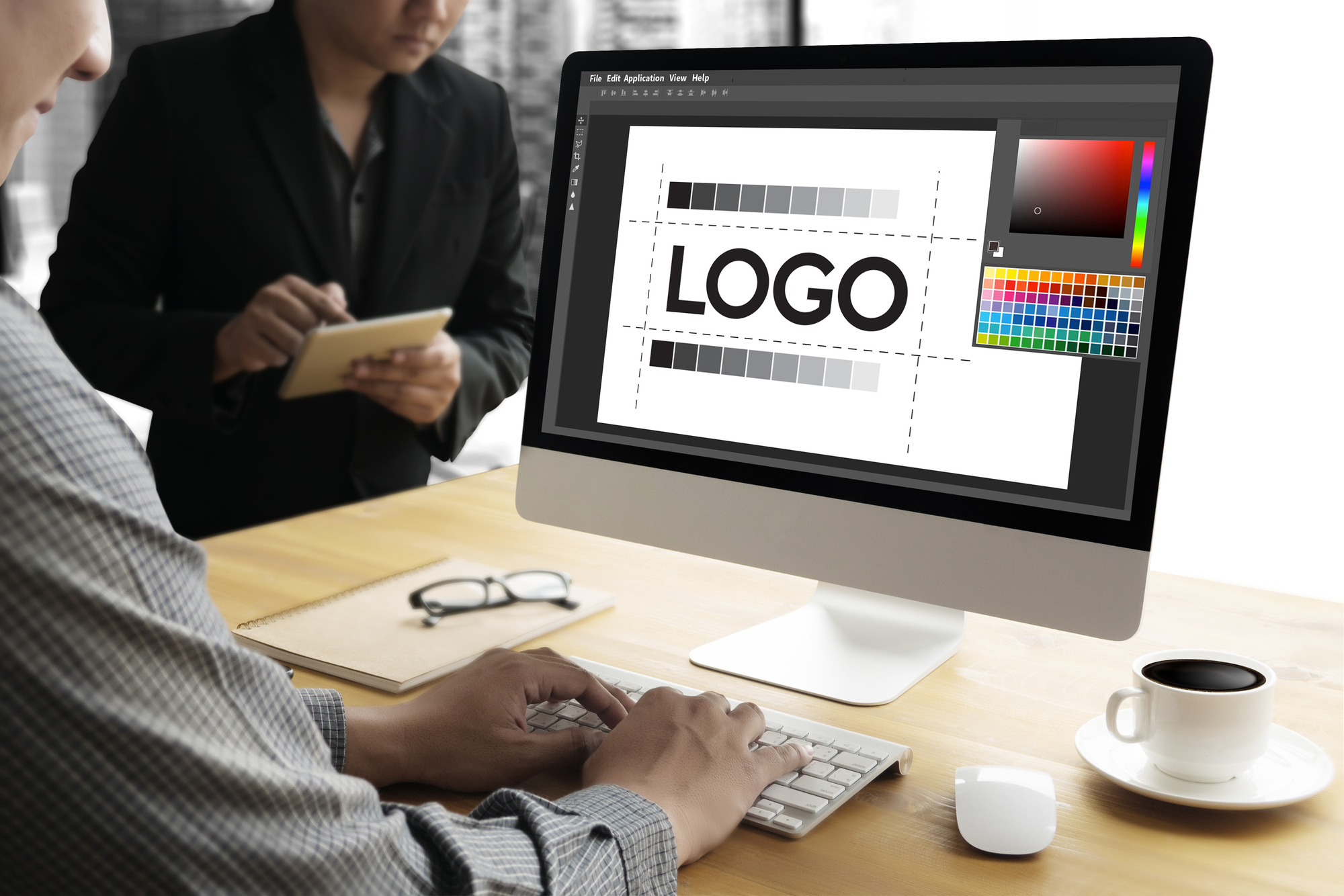
11. Make It a Vector SVG Graphic
The final step in the process will get you the most beautiful and user-friendly logo of them all.
Once you’ve got the exact design of your logo down pat, you’ll need to make it digital. The way to do that is to make it a vector graphic.
Vector images are different from traditional JPEGs because you can scale them down or scale them up, all the way to infinity. And you won’t lose a single pixel.
With our premium logo-creation pack, you’ll get full branding with VSG graphics, so you can use your logo on absolutely anything.
The Perfect Logo for Your Resume Writing Service
Your business logo is one of the first things potential customers will see, and it speaks volumes about you and your company.
Make your logo say exactly what you want it to so it’ll appeal to the target market you’re aiming at. Go for substance over style, keep it clear and simple, but don’t think it needs to be boring.
Instead, keep our 11 steps clear in mind, and you’ll soon have the perfect business for your resume writing service.
What are you waiting for? Check out our tutorial on how to create your free logo now.
5 Animated Logo Ideas for YouTube Marketing
Posted on March 19, 2018 by Logo Design Tips and Tricks
When it comes to branding your business, having a solid logo design is one of the most important aspects to focus on. It will serve to both help you stand out from the competition and also draw your audience in.
People love video because it’s the easiest form of media to consume. Therefore, you should always incorporate YouTube into your marketing strategy. When it comes to logos, videos are a great way to take things a step further.
Having an animated logo can make your brand that much more memorable in the eyes of your consumers. But, there are things you need to keep in mind when it comes to YouTube marketing.
Let’s take a look at animation ideas to help you stand out.
1. Add Glow
Adding a glow effect to your logo is a simple way to make it more eye-catching to your viewers. You have a lot of room for customization, as well.
You could make your logo’s glow gradually brighter over time, or you could maintain a certain level of the effect until you transition into the rest of your video.
Regardless of how you incorporate it, a glow effect is a quick fix for logos that need a little more character to them.
If you find yourself with concepts for a new logo, you can use our logo maker software to get your ideas out.
2. Animated Written Text
Written text animation is a great animated logo solution for your business’s name or slogan.
The premise is simple: rather than having the text fade onscreen, each letter could be individually animated so that it looks someone is writing it out by hand.
In a society full of people with short attention spans, using animated text is a solid way to hold your viewers’ interest.
3. Incorporate Your Business Theme
This is one of the most important animated logo ideas to keep in mind due to the endless amount of possibilities it has.
For instance, let’s assume that your company is associated with sporting goods. You could incorporate sports themes into your logo animation, either with text or with the logo itself.
How you implement this is up to you, and the only limit is your creativity.
4. Sync Your Logo with Your Intro Music
Your business doesn’t have to be in the music industry to make use of this. Most animated logos have a jingle or song that plays when they first appear onscreen.
Having your logo pulse in time with the music (such as with bass or a kick drum) can add an extra layer to the animation that consumers are sure to appreciate.
5. Hide and Reveal
A logo that is both simple and intriguing, such as the one you’ll find on https://www.brokedick.com, can be a powerful asset.
But, you can still take a simple logo a step further. Like glow effects, hide and reveal animation is easy to implement and can apply to any type of business.
Having a logo start out small and inconspicuous before bringing in the rest of the text and image is a much more engaging way to present your brand than bringing the whole logo in at once.
Take Your Time with Your Animated Logo
Since you will likely reuse this animation over and over, it’s important to get it right the first time. This will allow you to get the most out of your time (and budget) that you put into working on it.
Regardless of the industry, logos are one of the many ways you can stand out from competitors in your industry. To learn more about their importance for your business, check out our blog.


