How An Effective Brand Logo Design Can Grow Your Recovery Facility
Posted on November 24, 2017 by Logo Design Tips and Tricks
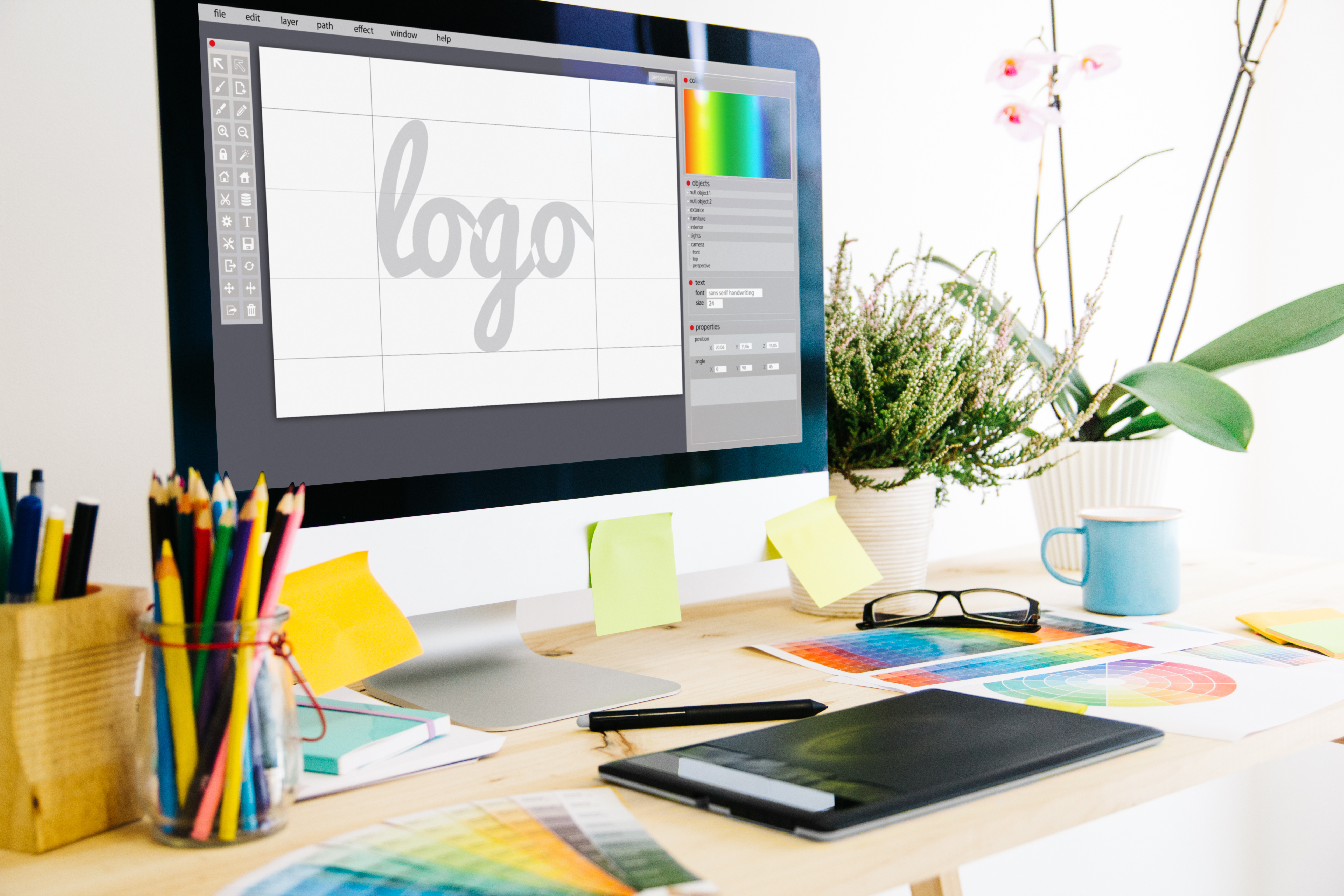
Every marketer makes the case for effective brand logo design.
No matter the size of a company or the market in which they operate, they argue that every business needs a great logo.
The same applies when it comes to recovery facilities.
And yet, we take marketers at their word when they promote the benefits of a brand logo design.
This causes many recovery facility business leaders to ask themselves – what are the benefits of brand logo design for us?
To answer this question and more, we’ve put together this list of how an effective brand logo design can result in benefits for you business that you never imagined.
Keep reading to find out how a great logo can transform your recovery facility business.
1. A Brand Message
Marketers are always talking about the importance of branding.
But what exactly is branding?
According to the American Marketing Association, branding is:
“A name, term, design, symbol, or any other feature that identifies one seller’s good or service as distinct from those of other sellers”.
This reflects the essential role of logos. Name, terms, design, symbol all function together to create a logo.
Ask yourself: what brand message do I want to convey through my logo?
As a recovery facility, you may want to give clients and patients a certain impression. This may include values such as:
- Caring
- Sympathetic
- Scientific
- Professional
- Safe
- Trustworthy
Establishing the brand message you want to communicate in your logo design is the first step to an effective brand logo design.
2. Be Original and Memorable
The competition to produce an original and memorable logo in your niche market is extremely fierce.
However, it’s essential that you make sure your logo is designed to stand out from the crowd.
It’s not enough for your identity to be just another recovery facility. Instead, you have to carve out a niche for yourself. This niche in the market needs to be reflected in your logo design.
You can achieve this by thinking outside of the box.
Producing an original logo is essential to be memorable for your clients. You want people to think of recovery facilities, and instantly see your logo in their mind’s eye.
3. Simplicity is the Best
Now you may be asking — how can I create an original logo that communicates my brand message, while also keeping it simple?
The truth is that many people assume logos need to be complicated to achieve everything they set out to do. When in fact the opposite is the case.
If you’re still confused, think about the simplicity of Twitter’s bird logo or Apple’s half eaten apple.
Despite the simplicity of these logos they are effective, original and memorable.
You can achieve this with your logo as well. You just need to concentrate on how to convey your message in the simplest way possible.
4. Scalable Marketing Materials
As a recovery facility, you need to produce a logo that can be used in many ways. This is because the best logos are versatile.
You might create a fantastically engaging logo. But unless you can use it consistently across your marketing materials, it’s not going to be effective.
The best logos look great on any of the following:
- Business Cards
- Websites
- Social Media Accounts (e.g. Facebook)
- Signs on buildings
- Merchandise
- Office Materials
- Company Vehicles
Having a scalable logo for your recovery facility business means that it is recognizable and memorable wherever it’s found.
5. Appear Credible and Established
An effective brand logo can also contribute to making your recovery facility business appear credible to patients, customers and business partners.
If you’re serious about offering your clients a professional service, make sure you have the professional logo to go with it.
Looking credible and established with your well-designed logo is key to growing your recovery facility business.
An effective logo also demonstrates your commitment to the business.
Clients are looking for a sense that your recovery facility is well-established and stable.
6. Explain Your Name With a Brand Logo Design
Have you ever heard the name of a company and wondered what service or product they provide?
Many companies are named after the founder, use an acronym of the name, or make up a new word.
Do you already have the words “recovery facility”, or something similar, in your company name?
If not, an effective logo design could provide people with further clues about what your company is about.
An example of this is how the recovery facility The Recovery Village use a green tree to symbolize peace and nature. These are exactly the types of values and ideas you want to communicate through your logo.
7. Make a Connection with Your Clients
Even recovery facilities have to make emotional connections with their clients if they are going to be successful.
There are so many competing companies out there, it’s difficult for clients to remember them all.
But most clients are likely to visit the recovery center that sticks in their mind. With an effective logo, this could be you.
8. Use Color Effectively
One of the most powerful ways to establish a connection is with clever use of color.
Every marketer knows that color matters when it comes to design and marketing.
However, few realize the full potential of color. By using certain colors for your logo you can tap into the associations people make with these colors.
Experts suggest that red signifies passion, love, and energy, while yellow represents optimism and hope.
Whereas blue refers to order, care, trust and security. And finally, green means nature and health.
Think about the associations you want to make with your clients and select the right colors to achieve this.
Create Your Own Logo
Now you know the how an effective brand logo can benefit your recovery center business, you are ready to create your own logo.
Do you have any further questions about how an effective logo design could grow your recovery facility company? Leave a comment below.
Get in touch with us to try out our logo making tools today.
5 Tips on Designing a Sexy Logo for Your Business
Posted on November 24, 2017 by Logo Design Tips and Tricks

Let’s be real here: sex sells. If it didn’t, people wouldn’t find themselves making millions of dollars writing erotica for Kindle. But the truth is, most businesses can benefit from a bit of sexy branding.
If your brand is playing it safe to no avail, you should consider a sexy logo. But before you get started on it, you need to do it right. Follow these five tips to keep eyes locked on your brand.
Don’t Be Too Crass
When you think about a sexy logo, it can be tempting to imagine something crude or disturbing. But oftentimes, it’s best to let your brand speak for itself.
The key here is making your logo “suggestive.” You don’t need to beat people over the head with the sexiness of your logo. You just need to let the mind wander, wherever it may go.
In this respect, it’s a lot like your brand’s name. Whether you run a gentleman’s club or an erotic publishing agency, it doesn’t sell to give your brand an over-the-top and crude name. It makes people feel uncomfortable or even disturbed.
At the same time, you want people to be aware of what your company is all about. This is why your brand can use innocent-sounding words in a context that’s anything but.
Subtle logos communicate this same desire, but for the visual counterpart to your name. But a subtle logo is about more than just sexiness!
You wouldn’t have a real estate logo that’s just a house. So why would you have a sexy logo that’s just a sexual reference? Instead, trust in the minds of your customers: they’ll probably get it.
Think Curves
For a number of logos, it’s best to use a sharp and angled design. But while this makes sense for a brand like FedEx, it doesn’t for a sexy logos.
This is because of what you’re trying to communicate. If your logo is sharp and angled, it’s communicating from a place of sterile detachment.
This is why companies working with businesses do this. Having a logo that communicates your robotic nature shows that you won’t make human mistakes.
A logo with sex appeal focuses on the desires of your customers. And while they may want something less than human from an accountant, they may want something more human here.
A curvy logo has several sexy implications. It suggests a lot relating to human anatomy and activity. But above all else, it reflects humanity.
People want something human out of any sexy branding they encounter. So you should really emphasize a suggestively curvy logo for your company.
Simple Is Best
Simplicity is a good part of any logo, sexy or otherwise. You want your customers to follow your creation, not get lost in it.
Think of a good sexy logo like a map. It can be decorative and interesting, but it also needs to take the customer to their destination of choice.
You have things to communicate with your logo. You want people to know who you are, what you do, and how to find you. It’s a lot, but you should be careful not to lose your audience with needless complexity while providing this information.
Remember that simplicity is the best policy for your graphic design. A lost customer can never spend money on your product or service. And this is made worse when you consider the fact that you only get one chance at a first impression.
The advice we’re providing you is that what’s simple is best. But another way to put it would be “simple is sexy.” Because what’s sexier than an interested person giving you the money you need?
Contrast Matters
Color contrast is the most important part of designing every logo. As with simplicity, putting a fair amount of contrast in your brand’s logo will improve the visual imprinting of your brand.
In general, it’s best to use colors that contrast without clashing. This means using brighter colors on darker backgrounds. If you’re not sure what colors provide good contrast, this wheel can help.
Out of all of the tips on this list, a high level of contrast is the most important. Without it, you can end up with a forgettable or even unreadable logo.
A well-contrasted logo makes your brand stand out. So remember that while you’re looking for a sexy logo, you’re also looking for a sensible one. Following this step is one of the only ways to make it happen.
Choose Your Font Wisely
Let’s say you saw what would be an incredibly sexy logo. There’s only one problem: the font is comic sans. The contrast between message and font would be beyond harmful to a brand.
This would actually make the company look laughable. But the fact is, a good font strategy is about more than just not choosing the wrong font.
It’s about actively choosing the right font. One of the best companies for this has been Angels of London Incall.
The website succeeds by using a cursive, gold font that communicates eroticism and mystery. While it isn’t too on-the-nose, it’s also related to the subject matter and communicates a mid-20th-century elegance that suits the brand.
You can’t use the same exact font as Angels of London. But you can find a way to create a font that suits your brand in the same way. Remember, the font is the workhorse of your logo.
Start Making A Sexy Logo
If you’re interested in designing a sexy logo, we can help. our logo maker helps people design logos for all purposes. It’s easy to use, free, and incredibly effective.
We want to take your brand to the next level. If you want to work with us, register today.
5 Creative Tips for Designing Niche Ecommerce Logos
Posted on November 24, 2017 by Logo Design Tips and Tricks

A memorable logo is important for any business. Big corporations spend millions of dollars to ensure they have the best logo possible.
While a good marketing strategy will help Ecommerce logos find their footing, you need to have an interesting logo from the start. Without a logo that sticks in the minds of your customers, all the marketing in the world won’t do you much good.
What’s needed to create a memorable logo? Continue reading to learn our favorite tips for any niche Ecommerce company.
1. Clear and Concise
The saying “less is more” still rings true.
If you have too much going on in your logo, it becomes heavy and messy. Anyone who sees it will get lost in the details and will find it harder to recall that logo.
It’s best to make design choices that get the point across in a simple and easy-to-read way.
2. Flexible for All Formats
If your logo is only readable at one specific size, you’re doing your company a disservice right from the start.
Logos have to be flexible in order to get the most use out of them. You want the logo to read well on mobile devices but also look good on any website that may host your logo.
When designing your Ecommerce logos, make sure to always have this idea of flexibility in mind.
3. Use Visuals to Enhance the Logo
Adding in some kind of visual effect can make all the difference in your logo.
It’s better not to use something overly large or complicated. Take the logo from Military Coins USA, for example. The little star next to their name looks stylish and simple, and it enhances the overall look.
You’ll want to find the same kind of balance in your own logo.
4. Horizontal Design
To give your customers the best user-friendly experience, try to use a horizontal design for Ecommerce logos. This can help to stretch out the page, giving your customers a larger look at your overall product page.
The less they have to scroll down and search for something specific, the more they’ll stay engaged in your website.
Plus, a horizontal design can easily be pared down to go with other kinds of formats, since there’s more area to work with.
5. Share Clues About Your Company
When your customers look at your logo, you want them to instantly get a sense of who you are as a company. This kind of instantaneous connection will go a long way in building customer loyalty and will help strengthen your branding.
The type of font you choose for your logo says a lot about your company. The kind of visuals you include and how you incorporate them tells customers about your company in a single glance.
Always keep the story of your company in mind with every design choice you make. This ensures you’re getting the most out of your logo.
Good Ecommerce Logos Strengthen Your Business
It may seem daunting to come up with that perfect logo that will essentially be the face of your company.
By making good use of these tips, you’ll find the entire process easier and more rewarding.
Want to get started creating a new logo? Try out our free online logo maker!
How A T-shirt Logo Design Can Help Advertise A Plastic Surgeon
Posted on November 24, 2017 by Logo Design Tips and Tricks
What if you could turn your clients into your best advertisements?
This may sound too good to be true. However, it is possible if you create a compelling T-shirt logo design.
Your satisfied patients will be happy to promote you by wearing an attractive shirt. This helps build your brand and instantly establishes your positive client relationships.
T-shirts are one of the most unexplored ways of advertising your plastic surgery practice.
What makes a good T-shirt logo design?
A good logo instantly advertises what you are best at. Plastic surgeons are best at transforming patients into their ideal selves.
Your logo may contain a cartoon woman admiring herself in the mirror. Or you may show an athletic woman sunbathing at the beach.
The exact design of the logo is up to you. The final design should be iconic and reassure prospective customers that plastic surgery will make them healthier and happier.
Make the logo large enough to see from a distance. However, leave room for any informational text you need on the t-shirt.
Statistically, most plastic surgery patients are female. You should offer shirts in colors such as pink, white, and light purple in order to appeal to women.
Now that you know what the shirt should look like, how will it help advertise your practice?
Instant Branding
Create custom clothing for your staff as well as clients. This helps to give your staff a clean and uniform appearance when customers walk through the door.
Encourage employees to wear the custom t-shirt logo design on days such as “casual Friday” or at special events.
This helps prospective customers instantly identify your staff if they have any questions. Putting your contact information on the shirts also encourages new customers to contact you.
Free Swag
Consider giving t-shirts away for free instead of selling them. This helps your clients to feel like they are special and that they received added value.
This will prompt happy customers to wear the shirt and talk about their experiences. Prospective clients will be likelier to undergo things like weight loss surgery when they hear how well it went for someone else.
Logo Recognition
The main reason to create a good T-shirt logo design is to make sure people recognize your logo. Be sure to use this logo on your website, in your office, and in your more traditional advertisements.
A good logo creates a link between your business and prospective customers. Those seeing it on a shirt will remember things like your commercials and your billboards.
Ultimately, a good logo turns every person wearing it into a walking billboard. This is one of the most reliable ways of advertising your business.
The Bottom Line
It is difficult to advertise in a way that helps your business stand out. Good advertising is often very costly, too.
Designing and printing custom t-shirts costs relatively little. It provides an opportunity to enhance customer relationships and further your brand.
To begin creating a great T-shirt logo design, try visiting the Online LogoMaker today!


