What Etsy Can Teach You About Wedding Logo Design
Posted on October 05, 2017 by Logo Design Tips and Tricks
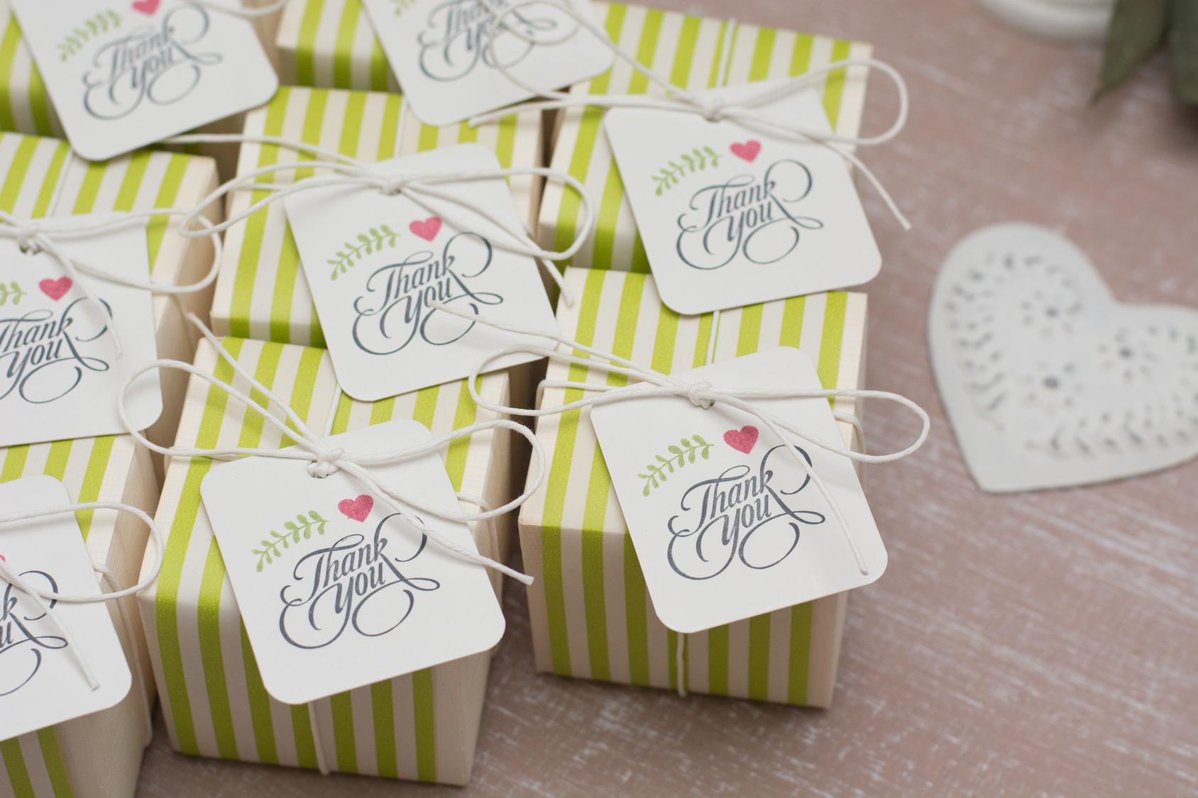
Every spring, fresh editions of magazines flood the shelves. They feature gorgeous new ideas for wedding inspiration for brides-to-be.
As you pour through those glossy pages you will find articles on everything. It can range from the proper way to set a table, to ideas for wedding logo design.
Having a well-themed wedding is the central focus for these magazines and the goal of every new bride.
But what does it take to create one of the stunning images you see gracing dancefloors and envelopes? How can you create a professional looking logo for your own wedding? Continue reading to find out.
Using a Wedding Logo Design
From the moment your guests walk into your wedding venue you will need to give them information about things like where to go and what the seating arrangements are.
Creating a custom sign to place outside the venue is a great way to give your guests information they need about the event.
Some venues host multiple weddings on the same day and giving your guests this extra hint will make sure everyone finds everything they need. By including your logo you are ensuring that they know they are going to the right place.
Wedding Attire
You might be surprised to find that there are multiple opportunities for you to feature your wedding logo design in your outfit.
In fact, some innovative brides have even begun to create personalized jewelry featuring their logo.
Other brides have chosen to embroider their veils and handkerchiefs. If that is still a little too obvious for you then embroidering your wedding logo design in blue on the inside of your dress is a beautiful option. For many women this makes their dress feel truly unique.
Dining
The most obvious place to use your image is on the paper products you use for the day of the event. From cocktail napkins to menus, there will be plenty of opportunities for you to feature your beautiful design.
Accent plates could also be purchased that feature your chosen design. You can use it to trademark your party favors, adorn your wedding cake with it, or simply use it to embroider the tablecloths.
Some women have even used it on glass jars from sandsationalsparkle.com. Sand ceremonies are popular and work for any wedding. This personal touch really takes it to the next level.
The Importance of Consistency
After you have chosen to design a logo for your wedding, you will want to head over to Etsy to get some inspiration. Once you have scanned many of the options there, you will have a better idea of what you want yours to look like.
You will see design ideas for different fonts and sizes that can shape the most basic outline of what you want to make. The angle of every item in your logo is very important. By changing it you will change the way the eye moves over it and this has a significant impact on perception.
If you are ready to begin creating today, try this online logo maker. It has some really great and easy-to-use features that will allow you to create a custom design that will leave all your guests dazzled.
4 Essential Tips for Designing a Brilliant Information Technology Logo
Posted on October 03, 2017 by Logo Design Tips and Tricks

Impressive logos are an integration of visual art elements, color theory, and psychology concepts that represent a company in a quickly identifiable way. An information technology logo is the instantly recognizable face of a business, as some of the most successful IT companies have proven.
Exceptional logo design is more important now than ever before. We see and even interact with logos in entirely new ways thanks to the digital age. An effective, classic design that sets an IT company apart in an expanding industry is a must-have.
What does it take to design a brilliant, unforgettable information technology logo?
Read on to learn 4 essential tips for great information technology logo design.
Stay Simple
When it comes to an effective information technology logo, simplicity is the secret. Information technology is complicated and this is why potential customers are seeking your services. They’re not looking for a code to crack.
Keeping your logo clean and direct is key. Some of the most well-known IT companies have the simplest logos.
Good design conveys the business or company’s mission in a powerful, straightforward way. Don’t dilute your message with a busy or complex logo.
Often, you don’t even need the logo to include a brand’s name or description. Some of the most well-known logos have no name or words but can be quickly identified.
The Color and the Shape
Colors should be limited but appropriate. Keep in mind you’ll be dealing with a lot of other businesses, so your color choice and design need to convey professionalism. A great example is a logo for NENS, a company that provides IT services to many industries.
Logo shape has a significant effect on the overall feel of a logo, also. Round shapes tend to evoke a sense of love or community, while straight lines and straight-edged shapes suggest strength and stability. The best logos find a way to use both elements for connection and confidence.
Getting the Message Across
Great logo designs tell who you are and what you do. The information technology industry has many facets. It’s a good idea to incorporate some part of your particular business into your logo if possible.
An obvious representation isn’t the rule, however. More subtle designs masterfully show customers what company they represent and then creatively suggest the company’s purpose.
Your Information Technology Logo Should Be Unique
IT logos should leave an impression. In a computer-driven world, there are many companies offering IT services. Don’t get lost in a sea of logos.
While it’s a great idea to draw inspiration from popular logos, don’t be tempted to model your design too closely to theirs. This can make your design seem unoriginal, which suggests that your company may be the same.
Similar logos are also easily confused with other companies. You want your logo to make people think of your business, not anyone else’s.
Consider these things when deciding on a one-of-a-kind logo:
- What does your company value and represent?
- What kinds of services do you offer?
- Who are your target customers?
- Can you describe your company in 1-3 words?
- What makes your company different or special?
Asking yourself these questions is a good starting point when thinking up a unique but fitting logo.
Build Your Brand on a Strong Logo
Your logo is a crucial piece of your brand’s identity. It has to be a high-quality design that is memorable. When customers see the logo, they see you.
Let us help you design an incredible logo for your brand. It’s fast and easy. Visit our website to get started today.
How to Design an Inviting Nightclub Logo
Posted on October 03, 2017 by Logo Design Tips and Tricks

Why is the logo you choose for your business so important? It’s the same reason why your business name is important.
If you can make it memorable, it will make your brand easier to stick in the minds of your audience. And that’s the top priority of marketing – to make consumers think of your company when they need your product or service.
As for your logo, its sole purpose is to help consumers identify your company and its products. If you own a nightclub, then you know how brightly lit signs and logos can attract party goers.
But the question here is how should you design your nightclub logo?
Well, let’s review a few tips to help you along.
Brainstorming Your Nightclub Logo Design
What’s great about logos is that you can place them anywhere. Once you design one, you can use it for your pens, magnets, business cards, fliers, t-shirts, signs and other marketing collateral.
This also means you need to give a lot of thought to your nightclub logo design. After all, you don’t want to have to rebrand your business with a new logo down the road, especially if you’ve already gained some recognition.
So as you’re planning out your logo, consider the niche area of your nightclub, the customers you want to attract and location of the club.
For instance, if you’re a high-end restaurant bar with rich clientele, you could go with a logo that’s classy. Then if it’s in a prestigious neighborhood or an urban area, the logo would vary greatly.
Keep your customers in mind; what’s acceptable to one group may not be acceptable to another. For instance, a lasso and horse may be attractive in urban Texas communities, but wouldn’t fly in a prestigious neighborhood.
Selecting the Colors and Font
If you haven’t done so already, you should read into the psychology of colors and even font styles. The type of letters and colors you choose play a big role in the branding of your company.
For instance, you may want to go with bold colors for a nightclub that has pizzazz. Red and gold are great options in this case. For instance, you may find this being used to promote the Scandal Guestlist.
Or if you want to get people excited about your new nightclub, you can use varying textures in your logo. This will make it interesting and hopefully intrigue folks to check out your club.
Other than going with flashy logos, you can opt for something that’s dignified and strong. This is ideal for brands that have a more serious tone and atmosphere.
DIY Logo Design
Now, it’s time to decide how you’re going to create your nightclub logo. If you know exactly what you want, you don’t need to hire someone to design it for you.
All you need is the right software to create it yourself. The DIY route is popular these days, thanks to tools like Onlinelogomaker.com.
This is a quick and easy-to-use online software made specifically for designing logos. If you’re trying to redesign or design a new logo for your nightclub, then check out Onlinelogomaker.com today.
5 Design Tips for a Strong Marketing Logo
Posted on October 02, 2017 by Logo Design Tips and Tricks

In the competitive industry of marketing, standing out can be a challenge. With a great marketing logo, companies can attract new customers and retain them for longer.
But what makes a well-designed logo that grabs the attention of every customer who comes across it?
Here are 5 creative ways to use design for a great marketing company logo!
1. Use Simplicity
It may be tempting to make a complicated, elaborate logo. However, the most effective logos tend to be the most simple.
Sometimes the simplest and best technique is to think of a logo off the top of one’s head – and to go with it! It’s likely to be a simple shape and design, with two or three colors at most. Any more than that and the logo can become less memorable.
A good logo that is simple and easily recognizable is more likely to stick in the customer’s mind – which is exactly what any business owner wants.
2. Be Creative
Although logos should be simple, that doesn’t mean they shouldn’t incorporate elements of creativity.
A logo might be literal. For example, it’s common for dental practice logos to incorporate an image of teeth, but such a common logo won’t help a business stand out. To add some creativity, they may try a different tactic like an abstract design of a grin instead.
Many logos don’t represent what the company itself sells, though. Either way can work, as long as the logo is unique!
An eco-friendly marketing company might use imagery that comes from nature, like trees or plants. Even though that business may not sell plants, these types of images can tell the buyers more about the brand.
3. Go Versatile
The best logos are easy to reproduce and resize.
As a company grows, their marketing logo is likely to end up in different places. They should be sure that the logo will look good everywhere it ends up!
- Can the logo be easily viewed on small – and large – scales?
- Does it use colors that are easy to print in different formats?
- Is it so elaborate that printing it will become expensive to produce?
These are all considerations to keep in mind during the design process.
4. Know the Audience for Your Marketing Logo
In a field like marketing, it’s especially important that a company demonstrates its awareness of the audience.
Their logo should help connect with the target audience they want to reach. A black-and-white logo might send a more conservative message than one with bright colors, for example.
If a company wants to appeal to a young, tech-savvy audience, they should appeal to them in a way that’s different from marketing to an older or more traditional audience.
Of course, a logo should also be able to appeal to a diverse group. But knowing the target audience is key.
5. Make It Timeless
A marketing logo needs to be timeless, so it will be relevant for as long as a company exists.
A highly trendy logo, such as one that uses a color that’s currently in style, might not have the same pull ten or twenty years from now. For example, the color known as Millennial Pink is trendy right now, but will likely go out of style in a matter of years.
It’s helpful to be aware of current design trends when creating a logo. But they shouldn’t dictate how a logo looks in the end.
The company Grin, which works in influencer marketing, offers a great example of a timeless logo: it incorporates a human figure into the company title. This logo implies something about the company – people connecting with people – but is timeless enough to be relevant no matter how the field of influencer marketing changes.
Final Thoughts
Making a great logo is one of the most important things any company can do to market themselves. Humans are very visual, so having a logo helps companies stick out in the minds of customers.
Of course, making a good marketing logo takes a lot of planning first.
Ready to start testing out designs? Try this online logo maker to get started.


