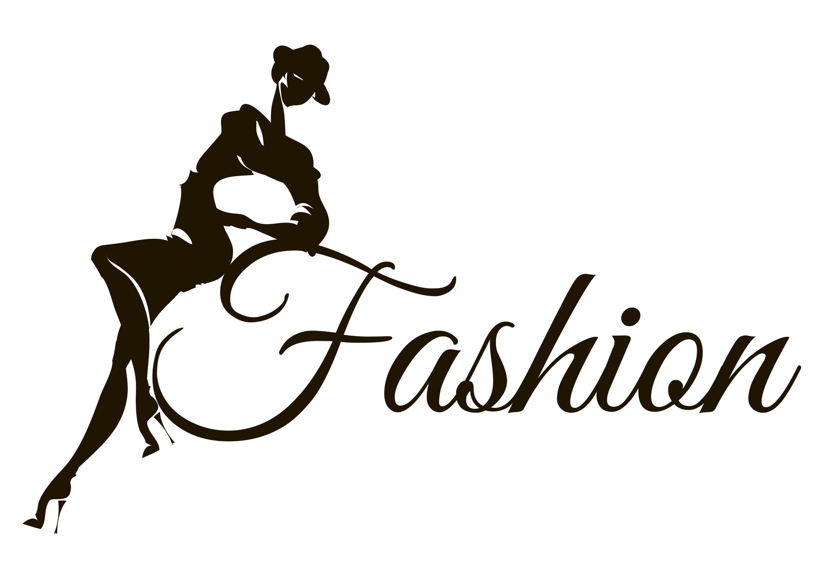
5 Essential Fashion Logo Design Tips
Posted on September 27, 2017 by Logo Design Tips and Tricks
There are certain iconic logos that we can all immediately think of. But despite that, some companies still underestimate the importance of their logo.
The truth is, company logos matter and the approach you take to designing one should depend on the industry you’re working with. Fashion logo design can be more creative and artistic because that’s the nature of the industry as well.
If you’ve been tasked with creating a logo for a clothing company, you should be aware of some best practices. Read on for five tips that will help you design the perfect logo.
1. Make Use of Color
Even the most corporate clothing company is still in the fashion business, which is by nature a creative field. As a designer, that should give you more creative freedom when creating the perfect logo.
Think of the way you want a customer to react when they see the logo and consider what colors work to accomplish that. There is a strong connection between emotion and color, so you want to be sure that the hues you’re using make the customer feel the way you want them to.
2. Get to Know the Brand
Fashion logo design is not a “one size fits all” kind of task. The fashion industry is broad, and one company’s personality can vary vastly from another’s.
Get to know the company’s personality by spending time on its website or talking to stakeholders, and let that personality guide your creative process.
If the client you’re working with caters to a higher end, chic clientele, you want to keep your design simple and elegant. Conversely, if a client is more whimsical, you can make your design a little bolder to reflect that.
3. Understand the Target Customer
Just as it’s important to know the personality of the brand you’re working with, you also need to understand the customer they are targeting. That will influence your logo design.
A brand like Nickis, for example, sells children’s clothing and accessories. Its target customer would be parents with kids age 0-16. A logo that is appropriate for that audience is not the same as a logo that would appropriate for a woman in her early twenties shopping at an outlet site.
4. Make It Simple and Shareable
A logo design should be memorable, and there are two main factors that go into that. First, the design should be simple enough that people can understand it immediately. This isn’t the place to confuse customers or make them think. You want something that they can look at, understand, and engage with right away.
Second, the design should be sharable. Think about how important images are on social media. The logo you design should contribute to their social media profile in a positive way that is on-brand with its other messaging.
5. Be Open to Inspiration
Knowing everything you can about the clothing company and the target customer can provide important guidelines for logo design. But to truly create something that stands out, you’ll also need creative inspiration.
For fashion, be open to finding inspiration as you’re walking down the street.
You may see someone dressed in the style that the company caters to, and that could help you understand what direction the design should go in.
Ready to Get Started with Your Fashion Logo Design?
Once you have the inspiration and insights you need to create the perfect logo, you should be able to rely on the easiest online logo maker to get it done. For more information on how to get started, please view our tutorials, which will provide you with all the information you need.
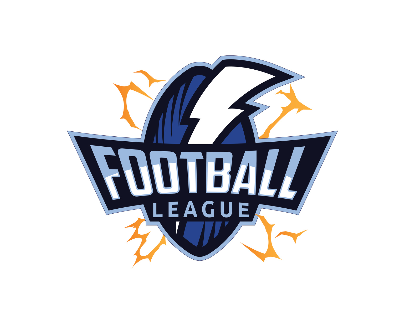
How To Design An Attractive Football Logo For Your Team
Posted on September 26, 2017 by Logo Design Tips and Tricks
The NFL has been in the news a lot lately, even causing people who wouldn’t consider themselves football fans to pay attention.
Football can teach you skills that will provide benefits throughout your adult life. It can help you to be more disciplined, bring you closer to your teammates, improve your fitness level, and boost your leadership skills. All of which are the basis for success in any career.
Perhaps this is why so many people want to create and join their own football teams.
To build teamwork, spread the word about your team, and just to make your weekend games a little more fun, you should design a football logo.
But what elements do you need to make it work?
Read on to find out.
A Defining Image
The most important aspect of your team’s logo?
It’s central image.
It can be tough to choose the one that’s right for you. However, think about what makes your team unique. If you’re all retirees, you could use a tongue-in-cheek image, like two crossed canes that have sharp, dagger points at the end.
Or, you can choose the image based on your town or neighborhood. Is there a statue that everyone stops to look at on your block?
What about a historic symbol or image that’s close to your team’s heart?
The sky’s the limit here.
Bold Colors
Another crucial part of your logo design?
The colors you choose to fill in your image with. In general, it’s a good idea to stick to just two or three. However, don’t be afraid to go bold!
You want your fans to be able to spot your players on the field.
Plus, choosing specific “colors” for your team also helps you to connect with your fans. Now, they know the colors they should wear on game day, or which shades they should use to paint their signs.
Need some inspiration?
Check out the NFL Matchups feature on the UltimateCapper website. This tool allows you to clearly see the chosen colors of some of the most popular teams. You’ll likely notice that when you see these shades, you instantly know which teams are playing.
Wouldn’t it be nice for your team to have that same brand recognition?
A Logo That’s Easy To Resize
Your football logo will have to go a lot of different places. Think team jerseys, signs, your social media accounts, and even on temporary tattoos fans can wear on game day!
You want to ensure that your design can fit everywhere it needs to go, without becoming muddled.
When creating your logo, make sure that you’ve selected an image that’s easy to resize.
Ready To Design Your Football Logo?
Thanks to this post, you have some great ideas to get you started on the process of designing your own football logo.
In fact, you probably have more than a few ideas floating around in your mind.
Talk to your team, vote on your favorite colors and images, and then use our free online logo maker tool to draw a few mock-ups.
Need more design tips? Check out our website and blog for more advice about how to take your logo to the next level.
How the Marijuana Logo is Changing In the Dispensary Industry
Posted on September 25, 2017 by Logo Design Tips and Tricks

At the beginning of this year, our country introduced a combined total of eight states permitting the legal use of recreational marijuana. The number of states joining will continue to grow in years to come.
With the use of marijuana products becoming mainstream, there have been weed companies popping up left and right. Due to the increase of these businesses, there has been a desperate need for these companies to stand out to the consumer with a memorable logo.
The weed leaf and smoke clouds have become far too overdone. So how are companies changing the marijuana logo? Read on to learn more.
Marijuana Logo Makeover
There are many different types of marijuana companies such as medical marijuana doctors, recreational dispensaries, weed bakeries, delivery services, and Healthy Hemp hemp extract providers. Even though these companies are all fairly different from one another, they are also very similar and need a way to stand out from the crowd.
Many companies are sticking to the basics when it comes to their logo, but they’re also giving it a modern twist. You can find many weed providers trying their best to incorporate a weed leaf into their name or picture of their weed logo.
Giving the leaf geometric angles, making it an optical illusion, or being very minimalist with it are just a few ways your typical marijuana logo is getting a makeover.
Funky Fonts
Many marijuana companies are making their logo stand out with a creative font that may resonate with consumers.
Just like any popular brand, marijuana companies will be able to create a memorable logo with just their font. Marketers know this is an effective way of brand memorization because it has worked for international companies such Coca-Cola and Google.
Since marijuana’s future looks like it has the potential to one day be as huge as the alcohol industry, it is extremely important for passionate brands to make an imprint on their customers. Their logo needs to instill loyalty in the customers they already have, and create interest to any new customers.
Knock-Out Names
Just like companies in any other industry in the world, there is no need to tell customers what kind of product you sell within the name of your company. We know that McDonald’s and Wendy’s sell burgers without needing “burger” in the name.
So, why would you need the word “weed” in a marijuana logo?
Many marijuana companies are getting more and more creative with their names. They are keeping the marijuana logo simple and standing out in other creative ways. Even though this may be the hardest to sell at first, it will ultimately be the smarter way to stand out in the industry.
Final Thoughts
Making the logo is the easy part, however, getting creative with your ideas is where things get hard.
If you are a new marijuana business or thinking about creating a start-up, make sure you stand out from the crowd! Maybe even smoke a joint to get those artistic juices flowing.
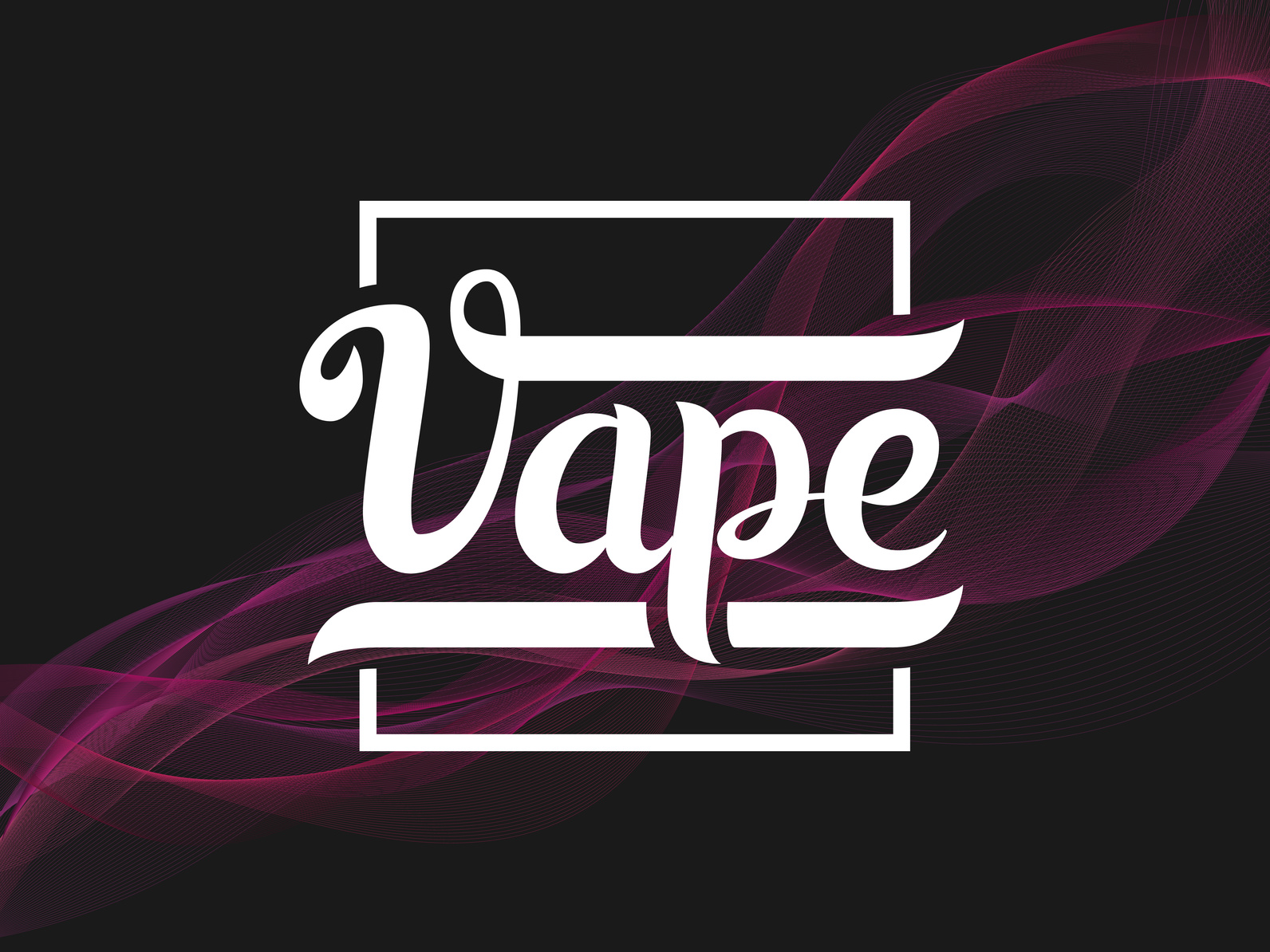
5 Tips for Creating an Amazing E-Cig Logo
Posted on September 25, 2017 by Logo Design Tips and Tricks
E-cigarette sales racked in over $2.5 billion in 2015 alone. Considering that that was a $1 billion hike from 2014, the numbers for 2017 are expected to be sky high.
These numbers show us the competition among e-cigarette companies is growing.
So, what’s an e-cig business to do to gain an edge over the competition and come out on top?
Every successful company has an amazing logo that not only sticks out in people’s minds. These logos influence smokers to start – and continue – using e-cigarettes.
Here are 5 tips on creating e-cigarette logos that will stick in people’s memories!
1. Have a Vision
The logo is not just something that’s stamped on the front of a store, on t-shirts, or on a website.
An amazing logo is what people think about in the hour after they learn of a company. It’s what they see a day, a year, or 5 years after buying that company’s product.
An e-cigarette company should establish what they want to accomplish through their logo. Then, they need to see it through for years to come.
To do so, it’s good to draw from inspiration with the intent to deliver something unique. Because e-cigarettes are still a growing industry, there’s a lot of room for creativity.
2. Convey the Brand Through a Symbol
A symbol can be the most effective way to share and communicate a brand.
With that said, there is no room for ambiguity in a logo symbol. Too little detail can be confusing, and too much detail can distract the consumer.
Illustrations of wispy vapor lines or a vape pen itself are common e-cig logos. Though they seem simple, they’re explanatory and to the point.
Of course, the details are also what transforms an ordinary logo into an amazing logo. After all, people are more likely to remember a unique logo than a generic one.
So, finding a balance of creative delivery is key.
3. Work In the Company Name
Every amazing logo incorporates the name in a creative way.
Yet, if it’s not readable, people will have a hard time finding the company in the future.
That’s why a strategic choice of font is so critical. The font needs to hold some relevance to the brand. It also needs to work well with the logo and the logo’s color.
It’s more important to focus on presenting the company’s name in a readable and engaging way. The other aspects of the logo, like the symbol, should communicate the rest.
4. Choose Colors That Reflect the Brand
Colors not only draw in an audience. They reflect and convey the brand.
Colors can help consumers learn more about a brand itself. Since there are different e-cig brands, certain ones benefit from specific colors.
For example, a luxury e-cigarette company can use purple or black in their logo. These colors are often associated with wealth and prestige.
An e-cigarette that’s all about being eco-friendly should incorporate green in its logo. E-cigarettes geared towards femininity can make effective use of shimmery tones, pastels, and pink.
5. Stay in the Game
As more e-cig companies develop, e-cig logos will become a dime a dozen.
So, it’s vital to keep an eye out on the competition. That way, a logo doesn’t get lost among other the other e-cig logos.
And lastly, it never hurts to take the customer’s feedback into account.
Design an Amazing Logo for E-Cigarette Business Success
Part of constructing and maintaining an efficient e-cigarette logo is staying current.
Every growing and successful e-cigarette brand needs a strong logo.
So, stay updated with all the current advancements in digital logo making. And create an e-cig logo that other companies will try to emulate!


