Typography Tips for Your Medical Logo
Posted on August 07, 2017 by Logo Design Tips and Tricks
When you have a medical site, you want to make sure your logo sends the right professional message. There are many types of logos you can create, and most of them involve choosing a font as well as creating an image.
The words in your medical logo are accentuated by the typography you choose. Make sure you follow these key tips when choosing the font in your logo.
Make Sure It’s Readable
When you have words in your logo, you want to ensure the typography is easy to read. You don’t want people to wonder what it says. Even more, you don’t want folks to think it says something inappropriate!
Being fancy is far less important than giving the right feel and clear information. Consider accessible fonts if you want to emphasize your customer-friendliness, and bold square fonts if you want to highlight your authority.
Be sure to test your logo and typography before you commit. Share options you’re considering on social media and let your fans and customers vote. This will help you discover if you are unintentionally sending the wrong idea with a logo.
Find a Font with Personality
Medical information can be hard to digest for many readers. While you’re answering questions like “Does sermorelin work?” your reader’s mind may be wandering.
To counteract this, use a font in your logo and throughout your website that has a distinctive feel. When you have personality in your presentation, you will hold visitors’ attention much more easily.
You have important information to share. Make it accessible by using a font that grabs attention while sending the right message about your brand.
Find Balance Between Your Logo and Type
The typography that looks best with your logo will depend on the image you’re using. A bold, large image will look better with a stronger text. A finer typography will go well with a more delicate or detailed image.
You want the eye to see both the image and the text, so neither one should outshine the other. If they don’t feel balanced, keep trying different fonts.
Finding a fresh, clean font that matches your image may take time, but it’s well worth the effort.
Check the Logo at Multiple Sizes
Once you’ve implemented the previous tips, you’re almost ready to go. However, there is one last step.
Check your logo in a variety of sizes, from very large to very small. Your logo will be on large signs and banners and on free pens you give away. You want to make sure the logo is clear and legible in multiple sizes.
You should also check how your logo looks in both color and black and white. It shouldn’t have too many colors, or it will be difficult and expensive to print. You want a logo that can move seamlessly from business cards to T-shirts.
Are you ready to create an incredible medical logo? Online Logo Maker is the perfect tool. With both a free and premium version, you can find the versatility you need. Get started today!
Top 10 Professional Cloud Hosting Logos
Posted on August 07, 2017 by Logo Design Tips and Tricks

Cloud hosting is a huge industry, and it’s growing all the time. Did you know that cloud computing is projected to increase from $67 billion to $162 billion from 2015 to 2020?
That’s a lot of money.
Cloud hosting is clearly a smart industry to be part of, but with so much competition you need to make your business stand out from the crowd.
The perfect business logo is unique, well-designed, and clearly reflects your values and sticks in the mind of potential customers.
Feel like there are only so many ways to design a stylized cloud? Think again.
We’re sharing ten of the best professional cloud hosting logos to help you get inspired.
Let’s do this.
1. eggCloud
The eggCloud logo combines two unique images in a striking, memorable way.
It’s not quite what you’d expect from a cloud hosting company, but that only serves to make it even more memorable.
Try brainstorming different words that relate to your business or values, then combining them with a cloud in your logo.
2. rocketcloud
The rocketcloud logo depicts a rocket taking off, with a stylized cloud beneath it.
This is a smart way to add energy to the design and create a sense of ambition and success in a way that a simple cloud just couldn’t achieve.
3. cloudhome
Want to appeal to certain type of buyer with your logo?
The cloudhome logo achieves this by weaving a house symbol into a large cloud, making it clear that they’re targeting homeowners.
4. CLOWD
Altering the spelling of your business name is a great way to make yourself stand out, as illustrated in the CLOWD logo.
Multiple different cables ‘raining’ from the cloud is a fun, techy touch.
5. FiberLynx Hosting
The Fiberlynx showcases a commitment to security with a traditional badge design.
It’s made unique via the simple but effective technique of cutting an ‘F’ shape out of the side of the image.
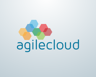
6. agilecloud
The agilecloud logo is a wonderful example of a cloud design that’s been made to look subtle and professional.
Rather than the kind of white, fluffy cloud you might see in a children’s book, a cloud shape is made up of multiple colored hexagons.
This brings to mind connectivity and teamwork, both of which are really important when it comes to cloud storage.
Think outside the box when creating your design – don’t just go with the most obvious representation of the word ‘cloud.’
7. safecloud
If you want to emphasize a key selling point of your service, your logo is the place to do it.
The safecloud logo combines a cartoon cloud with a lock to make it clear that they take security seriously.
8. BlueCloud
The BlueCloud logo uses bright colors to catch the eye of the viewer, and this certainly makes it stand out.
A relevant tagline, ‘Raining business’, also helps make them more memorable.
9. BlueHost
Cloud hosting doesn’t have to represented by a cloud, as this simple but effective logo from BlueHost demonstrates.
If in doubt, stick to the less is more rule when designing your logo.
10. Krystal
If your name translates well into an image, why not use it as the starting point for your logo?
That’s what Krystal has done with their diamond design, and it creates a logo that’s both memorable and unique.
How to Create Effective Cloud Hosting Logos
Feeling stuck on how to create the best cloud hosting logos?
Here’s what to do:
- Outline your key services
- List your main values
- Brainstorm images that reflect your values and services
- Experiment with different styles and combinations
With a little work, you’ll soon be ready to create the perfect logo for your hosting company.
Rebrand Your Pressure Washing Business with Just a Logo
Posted on August 07, 2017 by Logo Design Tips and Tricks
Coming up with a new logo for your business is no walk in the park.
Any decent logo should accurately convey your brand’s vision and message. For many companies, the logo is the first thing customers associate with the brand.
Can you imagine Nike without the swoosh? Or Apple without the apple?
Most consumers will instantly recognize these brands from the logo alone.
Just like these iconic companies, your logo is the foundation of your image and marketing efforts. Redesigning a great logo can go a long way toward generating better brand awareness and visibility.
Read on for some simple tips to rebrand your pressure washing business with just a logo.
Keep It Simple
One of famous designer Dieter Rams’ guiding principles for design is that it should be unobtrusive. In other words, your logo design should be simple and functional.
We’ve all seen logos with too much going on — whether it be text or colors.
Make sure the logo for your pressure washing business clearly conveys your brand’s identity in the simplest terms possible.
Where Will Your Logo Be Used?
As commerce continues to shift into new venues, remember to think about where your logo will be used as you redesign.
If your company is primarily an app or website, you’ll want to consider those factors as you create your logo.
Pick Your Colors
Colors can be tricky. You need to pick colors that fit well with your brand but are not too intrusive.
The best principle to follow with colors: keep them very simple. A good logo should look good in color and in black and white.
Embrace Negative Space
If you’re not familiar with this technique, the designer cuts an image out of the negative space with the logo.
The arrow in the FedEx logo is a great example of using negative space to enhance a design. It’s subtle and helps convey the brand’s message of moving forward.
Keep Your Message Clear and Readable
While that fun, creative font you found may have a use somewhere, your pressure washing business’s logo may not be the place for it.
Think of some of your favorite brands. Are their brand names easy to read or difficult?
More than likely, they’re written in a simple font that’s easy to read and recall.
Make It Timeless
Most logos need to be updated from time to time. But the best logos require minimal or no change at all over the years.
When designing your logo, don’t go for the latest trend in design. Try to err on the side of longevity, rather than trendy.
Make It Yours
Don’t forget — it’s your logo. It needs to convey your brand’s message and unique space in the market.
Don’t be afraid to add some unique touches that separate you from the crowd.
What’s next for your pressure washing business logo?
Now that you understand some of the principles behind designing a logo for your pressure washing business, it’s your turn to get started. Whether you’re totally scrapping your old design or just want to make some tweaks, a strong logo is important.
Check out our free online logo maker today. Our tutorial makes it a snap to get going, even if you’ve never designed anything before.
Healthy By Design: Creating a Pharmaceutical Logo
Posted on August 07, 2017 by Logo Design Tips and Tricks
The pharmaceutical business is highly competitive. There are thousands of companies in the market vying for attention.
That’s why your pharmaceutical logo needs to be impactful. It must deliver a message of trust and good health.
And you don’t even need to hire a professional to have a professional looking logo. You can design your own logo.
What Makes A Pharmaceutical Logo Effective?
Like all logos, the logo for a pharmaceutical company should be created with the right colors and fonts in mind. But attention must also be paid to many other elements.
Here are a few things you’ll want to consider.
Be Mindful of Your Use of Colors
There is psychology behind colors.
For instance, purples and blues have a calming effect. Red, on the other hand, kicks up feelings of distress or alarm.
What feeling do you want your logo to put out there?
Balance Your Fonts and Icons
When designing your logo, be sure that the font size doesn’t overpower the icon or vice versa. If one of these elements is much larger than the other, it will throw the entire logo out of balance.
And having an icon out of balance indicates to the consumer that your company is out of balance. Not a good quality in pharmaceuticals.
Minimize Your Fonts
This doesn’t mean to make them small. It means that you’ll likely want to stick with one font, maybe two at the very most.
Too many fonts make a logo complicated and it looks unprofessional.
Know How It Will Look in Black and White
In a world of so much color, it’s easy to forget that your pharmaceutical logo is sometimes going to appear in black and white. Such as in newspapers.
Or it may show up on a coupon. For example, a customer may get a vesicare coupon and immediately connect it with your logo.
So be sure that the design is effective first. Then add in the color.
Avoid Complex Symbols
Navigating healthcare can be a complicated and stressful process for a lot of people. So it’s vital that pharmaceutical and medical symbols have a simple design.
This conveys the message of simplicity in working with you. For many who are turning to your business for their health, this will be a welcome relief.
Understand Your Target Audience
When you’re designing your logo, remember that you’re trying to appeal to your target audience and not the entire world.
Does your pharmaceutical logo represent the current practice in the hospital? It should.
Incorporate Original Images
If you’re using an image in your logo, keep it original. In other words, avoid stock photos that consumers are likely to have seen elsewhere.
When it comes to health care, people want to feel they’re getting a personalized experience. An unoriginal logo will not deliver that message.
The Bottom Line?
There are many different types of logos with different purposes. But through the proper use of design, your pharmaceutical logo should:
- Be simple, yet self-explanatory.
- Evoke a feeling of faith and assurance.
- Leave a lasting impression.
- Convey extraordinary health care products/services.
- Keep people coming back.
Ultimately, your logo will establish you as trustworthy part of the healthcare industry. And when it comes to health, that’s what everyone wants.
If you have any other tips for creating an effective pharmaceutical or medical logo, please feel free to share. Comment below!


