Get Set Up for Success With a Home Staging Logo
Posted on August 03, 2017 by Logo Design Tips and Tricks

Want to run a successful home staging business?
If so, you’ll need a catchy home staging logo. After all, business is incomplete without a logo — it’s the most important part of your branding strategy,
Having a home staging logo solidifies your brand. It allows you to expand your business’ reach. A logo also boosts recognition of your company. It shows you’re a dependable home staging provider.
Designing a logo is a vital piece of getting your home staging building started. But creating a logo isn’t as easy as using shapes and words. The right logo can boost your business’ success. The wrong logo can deplete your company’s brand.
Want to learn about creating a memorable home staging logo?
Keep reading!
3 Tips for a Quality Home Staging Logo
Don’t fall into the trap of creating a poor logo. Here are tips to keep in mind.
1. Make it Memorable
A strong logo has to be memorable. However, there’s a fine line between memorable and over-the-top. Your logo needs to be memorable for the right reasons.
When creating a quality logo, focus on these qualities.
Versatility
The logo you create needs to be versatile. This logo will not only appear on business cards, but you’ll also use it on:
- Company website
- Company swag (think t-shirts, koozies, etc.)
- Official company documents
The logo you choose needs to be versatile. It should look good in color and in black and white. It should fit a small business card or a massive billboard.
Simplicity
Sometimes simple is best. Your logo doesn’t need to be elaborate. Think of Nike and their instantly-recognizable, iconic Swoosh.
Brand Appropriateness
The logo needs to relate back to your business. The colors and symbols used to create the logo should have meaning behind them. Your logo should tell the story of your brand.
2. Look at Existing Logos
Before committing to a logo, do some industry research.
You want to ensure that the logo you choose is unique. Having a logo that is similar to another home staging company will be problematic.
When hosting open houses, you want your clients to remember your business. During your research, be sure to make notes of common themes in home staging logos.
Do home staging companies in your area use font-based or graphic based logos? Is there a color palette that is used often?
Know what logos have created the most success and then create a similar one for your company!
3. Know Your Likes and Dislikes
Not a fan of minimalist logos? Do you gravitate towards certain colors and fonts? Want to avoid complex 3D designs?
Know your likes and dislikes during the logo design process. You don’t want to be stuck with a logo that you don’t love. Plus, rebranding can be expensive and time-consuming.
Create an Amazing Logo Today
Have logo ideas that you want to make reality? Are you ready to start building your company’s brand?
If so, Online Logo Maker can help. We offer the ability to design logos online, in just a few minutes.
Contact us today to learn more about our services.
5 Things to Avoid in Logo Redesign for Vape Companies
Posted on August 01, 2017 by Logo Design Tips and Tricks
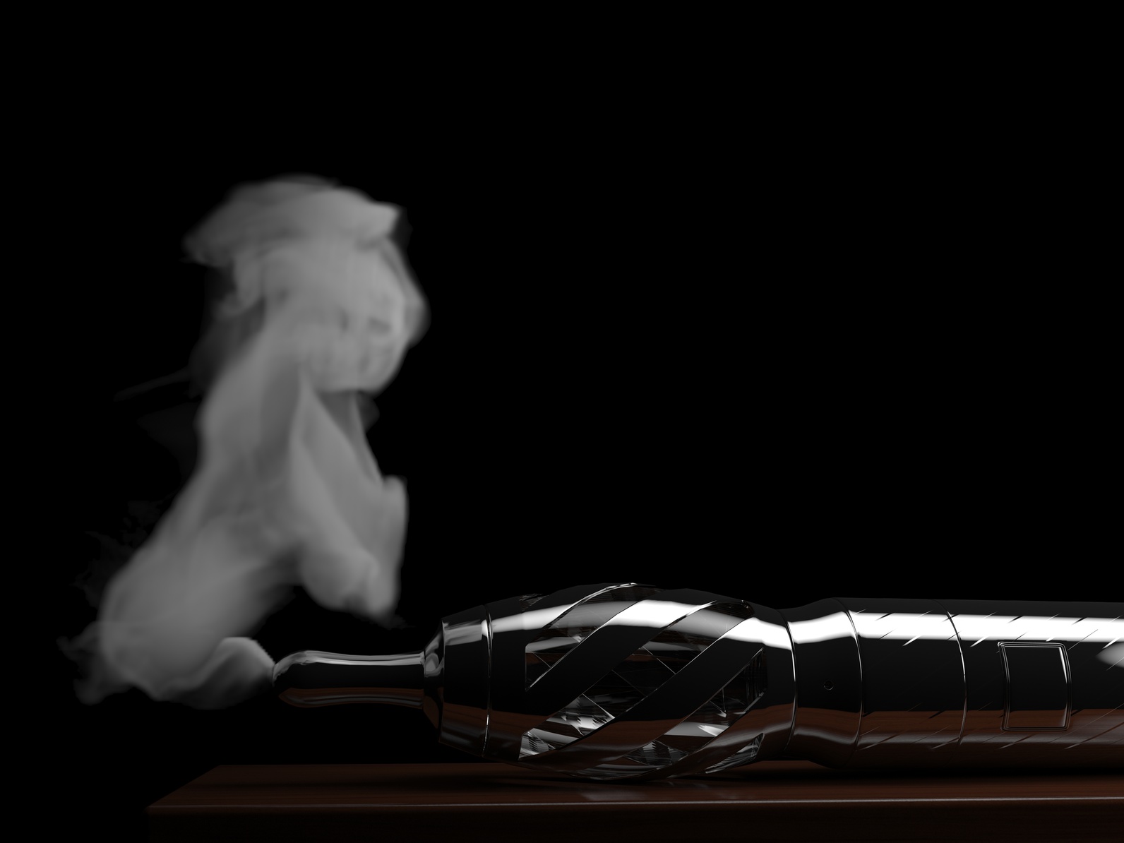
Are you a vape company considering a logo redesign?
It’s an important decision that can have long-lasting effects for your brand image.
Consider this: Consumers need just 10 seconds to form their first impression of your brand’s logo.
But aside from the importance of your logo’s design is its color. According to a Loyola University Maryland study, color can increase brand recognition by up to 80 percent.
As a vape company in a competitive industry, your logo can be what sets you apart from the competition. This means you need to get it right the first time.
What are five things to avoid in your logo redesign?
1. Copying Another Brand’s Logo
When it comes to redesigning your logo, you simply can’t afford to copy another company.
When it comes to creating a logo, take the time needed to research the logos of other well-known vape companies. This will help you avoid unintentionally designing a logo that too closely resembles another.
But remember to pay attention to other logos too. This will help prevent you from being sued for a trademark infringement. Besides being expensive, it can also be the sort of bad publicity that hurts your reputation.
2. Using Stock Images
Using stock images in your logo is just an all-around bad idea.
It’s an unoriginal way to create a logo. After all, these images are available to the masses and might be so popular that they are identified by others as not being “yours”.
It can also open you up to a potential lawsuit if you aren’t legally able to reproduce a stock image you use.
It takes an average of five to seven impression for a consumer to recognize your logo. Make it one that’s truly original and you can leave a lasting one on your audience.
3. Being Too Complex
One of the hallmarks of a successful logo is that it’s unique but simple.
Nike’s swoosh and the McDonald’s ‘M’ are just a couple logos that stand out as being creative but easy enough to be recognized with ease.
A logo that is too detailed or complex can be harder for a consumer to remember. This can prevent you from maximizing the reach of your brand.
When it comes to the vaping industry, Smok’s logo has become synonymous with TFV8 coils. It’s a powerful marketing tool that can result in increased sales.
4. Following Trends
Following trends in your industry is an important part of staying relevant and keeping sales high.
But when it comes to redesigning your logo, you shouldn’t let it revolve around the latest trends. Your logo should be created in a way that helps to make it timeless.
This is because you want to avoid another redesign anytime soon. It is expensive to reprint items and packaging, among other things. You also want your logo to become something consumers recognize and identify with your brand.
5. Typographic Errors
This may seem rather elementary, but typographical errors when creating a logo can be a big deal.
This isn’t a matter of simply spelling things correctly. You need to ensure that all fonts match and that there are not any unnecessary spaces in the text of your logo.
Also, pay attention to how any text is centered relative to images. Avoid having text that is off-center, unless you are intentionally doing it.
The Importance of a Successful Logo Redesign
Redesigning your logo is an important opportunity for your business. Your logo is often a consumer’s first impression of your company.
This means that it can be a catalyst for a consumer’s interest or it can turn them away because of the impression they have from it.
Take the time you need to be sure that the logo you are creating is one-of-a-kind and a strong representation of your business!
How to Incorporate Shapes Into Your Baby Products Logo
Posted on August 01, 2017 by Logo Design Tips and Tricks
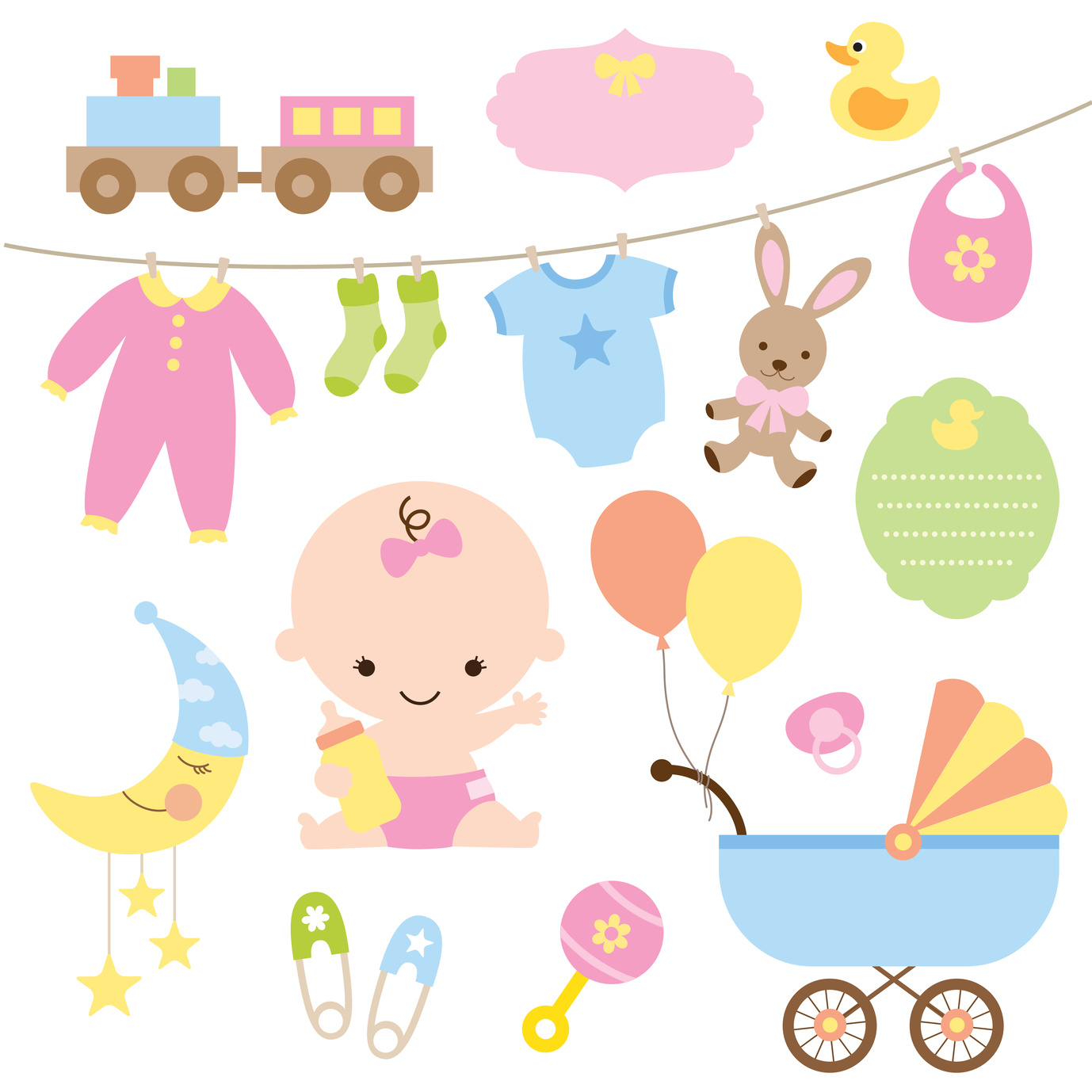
Every parent has a “hack” that has made living with the children easier. Some parents see the potential to turn this hack into a business.
It might be some attachment to a baby crib or a handle extension/back scratcher for a stroller. Whatever it is, you think it will make parenting easier and put some money in your wallet.
While there are a number of things that have to be done before you can take a product to market, we’re going to just focus on one of those. The logo.
Creating a logo for baby products entails not just an understanding of the appeal of your product but also the story that a logo can and should, tell.
Look at the Familiar
The best logos stand on their own, without a company name or other descriptor. There’s a good chance that you can draw a logo and someone would name who it represents right away.
Think the golden arches, an apple, the swoosh. Pretty easy right?
While those are all very distinctive logos from three separate business types, they do have one thing in common. Shapes.
Using Shapes in Your Baby Products Logo
A shape can tell a story.
It can evoke a feeling.
Understanding these can help you to utilize them in your logo design. Now think about your product.
Is it’s primary use for babies or for parents? While you of course always need to keep your purchasing audience in mind, your usage audience is important in this case as well.
You’ll want to evoke definite feelings in a parent that your product is useful, safe, and needed. Shapes can help you do this.
Indicating the Product
A popular trend is to use the logo to give a sense of the product it represents. Take for example the logo for the stroller company Baby Bug.
It uses soft, round shapes to indicate the shape of a stroller AND a ladybug. It’s a good example because it uses shapes in both a practical and fanciful way.
Another example is the company Tiny Love. They have a somewhat simple logo, it’s their name encased in a shape, one that represents a heart yet it isn’t a literal heart.
In these two examples, we see the two sides of the spectrum for using shapes in a logo for a baby product. Either in a literal “this is a picture of what we sell” style or in something more abstract.
Is there a better way to go? There is no universal yes or no to this answer because it depends on the product and the way that your particular company wants to represent itself.
Consider that earlier idea – is this for the baby or the parent? The answer to that may guide your decisions on the best way to use shapes.
The Total Package
We have to mention the importance of typography in your logo. Using the right font is just as important as the way you incorporate the shapes into the logo for your baby products.
Since this is about a baby product, it makes sense to use a phrase that parents have said since time began to illustrate this point. “It’s not always what you say but how you say it.”
The best logos use type, color, and shapes to tell a story. When considering incorporating shapes into your logo think about what story it should tell and how that story should make someone feel.
What Are The Different Types Of Logos?
Posted on July 31, 2017 by Logo Design Tips and Tricks

You know that an eye-catching logo is a key component of a successful business, but did you also know that there are different types of logos to choose from?
Read on to learn more about the different types of logos out there. We’ll also share some tips to help you decide which logo type will work best for your business!
Types Of Logos
Lettermarks
Lettermarks — also known as monogram logos — create a logo centered around a company’s initials. The logos for General Electric, CNN, and Hewlett-Packard are good examples of this.
Lettermarks are great for companies that have longer names and need a simple, streamlined logo.
One of the most important things to keep in mind when designing a lettermark is the type of font you will use.
When you use a lettermark for your company’s logo, it’s important that you choose or create from scratch a font that fits your company’s personality. A geometric font works well for companies with a more elegant style, while serif fonts are best for businesses with a more traditional message.
You’ll also want to make sure that whatever font you choose is legible so that people know which letters are being used. Your brand will definitely suffer if people can’t read your logo!
If you have a new business that you’re designing a logo for, it’s also helpful to print the company’s full name below the lettermark. This helps with brand recognition and lets people know immediately what the initials in the logo stand for.
Wordmarks
Wordmarks — also known as logotypes — are very similar to lettermarks. Instead of using letters, though, a wordmark is a font-based logo that uses the business’s full name. Major businesses that use wordmarks for their logos include Google, Facebook, and Visa.
Typography is important for wordmark logos, just like it is for lettermarks. Pick a font that reflects your business’s products or services and make sure that it is legible.
Other things you’ll have to keep in mind for both lettermark and wordmark logos are color, use of capital and lowercase letters, and kerning (the amount of space between letters).
A wordmark is one of the best types of logos for new businesses that need to get their name out there. However, they work best for companies that have a fairly short name. If your business’s name is too long, a wordmark might not be ideal since a long name will often make the logo design look cluttered.
Wordmarks also work well for businesses with distinct names that are easy to remember. Again, Google is a great example of this.
Pictorial Marks
Unlike the types of logos discussed above, which focus on words, pictorial marks — also known as logo symbols or brand marks — are icon-based. Some common pictorial marks include the Twitter bird and the Target bullseye.
This type of logo can be tricky for new companies since they don’t initially have strong brand recognition — there’s a solution for this problem further down, though!
When you use a pictorial mark for your business’s logo, the most important decision you have to make is, of course, which image you’re going to use. There are a few questions you need to ask when making your choice.
Do you want the image to relate to your company’s name? Do you want it to say something about your product? Should it evoke a specific emotion?
A pictorial logo doesn’t have to be a specific image image, either. Lots of company utilize abstract marks in their logos — for example, Nike uses the swoosh image and the Pepsi has its split circle logo.
Abstract marks are great because they give you freedom to design a logo that represents your business without any cultural implications attached to a specific image.
Whether you choose a specific image or an abstract one for your pictorial mark, you’ll want to make sure that it’s simple enough for people to remember and recreate. A complicated image won’t stick in people’s minds easily, and it will also be difficult to print on your merchandise and business cards.
Pictorial marks are great for companies that want to take their brand worldwide. This is especially true if your business’s name is difficult to translate. However, they’re not ideal if you think your business model might change later on.
Mascots
A mascot is a character that represents your company, like the Kool-Aid Man or Tony the Tiger. When properly utilized, the character will become synonymous with your brand.
Mascots are an especially useful logo type for brands that want to appeal to families and children with their product or service. This is why so many brands that sell food or toys incorporate mascots into their logo design. Mascots increase familiarity, encourage customer interaction, and are overall excellent marketing tools.
If you’re thinking about the type of mascot you want to use for your business, remember that they can be difficult to transfer across platforms. This is especially true if you’re planning on using a highly detailed illustration of your mascot.
As with other logo types, it’s best to keep your mascot illustration as simple as possible. If it’s too complex, it will be hard to transfer to small things like business cards.
Combination Marks
As the name suggests, combination marks combine elements of multiple types of logos. They usually combine a pictorial mark or mascot with either a wordmark or lettermark to create a unique logo.
Adidas, for example, uses both a pictorial mark (the flower) and a wordmark (the company name) in its logo.
Combination marks are great for new businesses that don’t yet have a lot of brand recognition.
When you put an image and your name together you can set yourself apart from your competition, establish your brand, and make sure people know your business’s name right away.
This type of logo is also nice because it gives you some flexibility with your branding. Once you gain more recognition, you can drop your business’s name from the logo and rely solely on the image, if you want. You can also use the image by itself in certain cases and the full combination mark in others.
Combination marks are also one of the most popular types of logos because they’re easier to trademark than logos that are just based around an image.
Emblems
Emblem logos consist of a font inside of a symbol like a badge or a crest.
Starbucks and Harley-Davidson are two major brands that utilize emblem logos. Many schools and government agencies also rely on them because they have a classic style and are usually easy to recognize.
When designing an emblem, make sure that it is fairly simple so that it can be recreated across different platforms. An overly complicated logo will be difficult to embroider on clothing or print on a small business card.
Emblems are hard to get right because it’s difficult to split them up or downsize them so they can be used on a variety of products. Because of this, they are used less frequently than other types of logos.
However, just because they’re rare, that doesn’t mean you shouldn’t use them. When done well, emblem logos can really make a statement and set your company apart from your competition.
Other Things To Consider
You now know what the different types of logos are, but how do you decide which type is best for your business? Remember, the logo is one of the most important aspects of your business — especially if you’re a new company that doesn’t have a lot of money to spend on advertising.
Personal preference should be considered before pulling the trigger on a type of logo, but you should also think beyond just what you like. When you’re choosing between the most popular types of logos, there are a few things you should keep in mind.
Be strategic. Ask yourself the following questions when deciding on the type of logo you want to use to represent your business:
- Is it different from my competitors?
- Is it simple and easy to replicate and recognize?
- How will it look on my company’s products?
- Can I easily implement it across different surfaces (T-shirts, brochures, business cards, mugs, etc.)
- Does it match my company’s core values and message?
- How will it tie my brand together?
- Is this the image I want my company to have for a long time?
- What emotional response will people have to it?
Start Designing Your Logo Today
Now that you know a bit more about the different types of logos out there, it’s time to make a decision and create your own!
If you’re feeling lost or unsure of your design skills, don’t worry. There are tons of tools out there that can help you create the best logo for your company.
Did you know that we have a free online logo maker tool? Give it a try today!
If you’re still having trouble coming up with a good logo, check out our blog for some great design tips. We can’t wait to see what you come up with!


