How To Create The Perfect Logo For Your Cannabis Business
Posted on July 18, 2017 by Logo Design Tips and Tricks

The cannabis industry is exploding and is on track to become one of the fastest growing over the next decade.
Even with its current and projected success, marketing your cannabis business requires more thought and discernment than many other types of business we.
You’re aiming to be a “production grower”, not just a grower of cannabis.
You want to further the production of an industry, and to do this you need the right logo.
Need some help choosing the perfect logo for your cannabis business? Read on for tips on how to pick a logo!
How to Choose the Right Logo for Your Cannabis Business
Choosing the perfect, effective logo for your cannabis business can be simple if you follow these three suggestions.
1. Promote Your Cannabis Business With Care
Those in the cannabis industry must approach their marketing tactics carefully.
The emerging industry can still be a subject of controversy among the public. Although support is growing, there is still some skepticism and curiosity surrounding it.
Make sure that your logo does not cheapen the industry, or promote any negative stereotypes. For example, you don’t want to limit yourself by promoting to a certain genre. And, you definitely do not want your logo to appear to target minors.
Choosing a logo that is geared towards young or stereotypical audiences might harm the overall perception of the industry.
2. Choose a Design that is Unique
You want a logo that is all your own, and one that is attractive to consumers as well.
Make sure that you are not infringing on the copyright of another company’s logo because that can create serious problems for your business.
Consider the color of your logo. Different colors are associated with various emotions and actions.
Choose a design that appeals to as large an audience as possible. The cannabis industry is working towards gaining credibility and most desire cannabis production to be taken seriously as a trade. Choosing a versatile logo will help to grow the production of your brand, as well as the validity of the overall industry.
While some industries may need to widen their scope to appeal to a fun-loving, laid back crowd, the cannabis industry can widen their scope by appealing to a more conservative crowd.
As a production grower in the cannabis industry, appealing to the largest possible audience will help to further your brand and show others that there is more to cannabis than they may have thought. This will help your business, and the overall industry, to be taken seriously.
3. Consider Enlisting Professional Support in Creating Your Logo
An online service that offers professional logo maker tools and templates can be very helpful in creating the perfect logo for your business.
They can assist you in choosing a unique design that will help your company stand out and will authentically represent your brand.
An online logo maker can help you to create a high quality, original, professional-grade logo anywhere at anytime you choose.
Creating a great logo for your cannabis business in one of the first steps to growing your brand. To get started creating the perfect logo for your company, click here!
5 Breweries to Inspire Your Craft Beer Logo and Brand
Posted on July 18, 2017 by Logo Design Tips and Tricks

It started out as a hobby.
Now it’s a multi-billion dollar operation. In fact, in 2016 the craft beer industry sold $23.5 billion in beer. This accounts for 22% of total beer sales in America.
The number of independent breweries tops the 5,300 mark. For craft brew makers the growth is exciting and promising. But that overflowing growth brews up one thing: competition.
The nation’s taste-buds are shifting. In a market constantly flooded with new brands, what can a new brewer do to get noticed?
The second thing to do is begin brainstorming your new craft beer logo. The first: understand your customer.
The Mind of the Beer Enthusiast
To stand out and rise a head above the competition, craft breweries are focusing on their branding. Yes, the beers must still speak for themselves, but beer enthusiasts want to be courted.
The surge in craft beer popularity reveals a lot about today’s beer drinker. They are turning away from Big Beer name brands to try newer, experimental flavors with an edge.
They seek out tastes from a limited small-batch offering pulled from a portable CO2 keg tap at a beer garden. Forget grabbing some cans from the corner liquor store.
In fact, recent trends show that millennials (the biggest lovers of craft beer) buy four or more different brands per month.
Are you looking to tap into the craft beer craze? Maybe you’re thinking of rebranding? After you brew your exceptional creation, you need to market it.
Check out what some breweries are doing to grab beer drinker’s attention (and keep it). Use their stories to inspire your own craft beer logo ideas.
We’ve chosen 5 different styles of branding used by successful breweries. Which style best fits your brew?
SIMPLE: New Belgium Brewing Company
We’ll start here because it’s a simple choice.
What comes to mind when someone says Fat Tire?
If you don’t immediately picture an old-style bike, then you most likely don’t drink beer. And you are reading the wrong blog post. (But keep reading. There’s a lot of great info!)
One of the cool things about this industry is the flexibility it allows. Unlike large beer companies, independent breweries aren’t stuck to a single label design. But beware: too much creativity may not be a good thing.
The rapid growth experienced by New Belgium Brewing Co. is a classic lesson in that old principle KISS (keep it simple stupid).
As the brewery grew, developing new beers and product series, the temptation to get more contemporary also grew. The artwork changed with every new release. Then, in 2013, New Belgium realized they had created a disconnect, not a recognizable flow.
The fix: take it back to the basics.
Spokesperson Bryan Simpson summed it up for Beer and Brewing magazine. “We took a long look at our portfolio and decided we wanted more consistency across the cold box. We needed to look like one family of brands. . .”
It took almost a year to complete. Did going back to simple work? According to Simpson 2014 was an excellent year with 19% growth.
That deserves a KISS of approval.
NATURE/OUTDOORS: Uinta Brewing Company
It’s not uncommon to find a craft beer logo and branding style that find inspiration from nature.
But, at Uinta Brewing nature is not only their brand, it’s the brewery culture. Their two passions: brewing great beer and protecting a great planet.
Since 2001 the brewery has run on 100% renewable energy (wind, and more recently, solar). And they even offer bins in the brewery parking lot for recycling brown glass.
Named after the tallest range in Utah, the Uinta Mountains, it’s no accident the brewery’s beer reflects an outdoorsy vibe. Their Golden Ale Par Series celebrates and raises awareness for our national parks.
From the website: GREAT beer is brewed with environmental stewardship, support for community and a whole lot of passion.
Wondering if this love for nature helps with brand awareness? Check out their Instagram to see photo after photo of Uinta beer. Staged with nature as a backdrop.
Their tagline: Earth, wind and beer.
It’s only natural they’re so popular.
HISTORICAL: 21st Amendment Brew
One thing is certain, craft beer drinkers are changing. As palates become more sophisticated so do the desires to know the “back stories” of the beers they drink.
For 21st Amendment Brewing, history is the cornerstone of their operation. While researching a name the founders immersed themselves in San Fransisco’s rich brew history.
They discovered there were 40 craft brew operations within SF city limits in the early 1900s. Then came Prohibition. It wiped out an entire culture. Then came the 21st Amendment. And a culture has been revitalizing ever since.
That story is the inspiration for the artwork that goes on the cans (yes! great artwork can exist on cans) of 21st Amendment Brewery.
MUSICAL: Dogfish Head Craft Brewery
Beer and Rock ‘n’ Roll. Beer and jazz. Music and Beer. They just go together.
Maybe it’s because the sound of beer bubbling into a pilsner is like music to the ear.
With a name like Dogfish Head, you’d expect something out-of-the-box. The brewery’s commitment to music has not only inspired their craft beer logo and labels, it has inspired their beer.
They created an entire series of beers as a tribute to their love of music. Artists and bands include Miles Davis, Deltron 3030, Robert Johnson, and their American Beauty Imperial IPA, not only inspired by the music but also the members of the Grateful Dead.
And in 2011 the brewery really got its groove on when they released Faithfull — no that’s not a typo — which is a reference to the 1998 Pearl Jam song.
Full music immersion doesn’t stop at the suds. Dogfish Head actually hosts their very own music festival every fall, Analog-A-Go-Go. The two-day beer and music festival features food, an artisanal marketplace, a vinyl exchange, and plenty of Dogfish Head brew.
It seems they have certainly found their muse.
A Craft Beer Logo that Tells a Story: Grimm Brothers Brewhouse
Who doesn’t know the yarn-weaver bellied up to the bar every Friday night after quittin’ time? His stories are fanciful, adventurous and — although not believable — memorable.
So it is with beer. Minus the unbelievable part, of course.
What better way to tell stories than through the use of fairy tales? The scary ones, not the happily-ever-after type.
Enter Grimm Brothers.
But the brewery isn’t based on the name alone. The stories influence everything.
From the philosophy of brewing (old-style German) to the artwork on every can, the brewers (who aren’t brothers) have taken the art of storytelling to the next level. Their craft beer logo and label designs even mimic the fonts used in the original storybooks.
The website tells their story perfectly:
“Inspired by the stories collected By Jacob and Wilhelm Grimm, they have crafted their beers to tell not only the story of Craft Brewing, but the harrowing and dark tales handed down through the generations.”
Become a Part of a Culture
Jon Taffer of Bar Rescue infamy hits the nail on the head of foam when he said in a recent interview: “Craft beer has created a culture, not a trend. A trend grabs market share and then disappears and gives it back. A culture grabs market share and then keeps it. The craft-beer culture isn’t going anywhere in America.”
Are you ready to become a part of the culture?
Your craft beer logo is the physical, emotional, or philosophical expression of your brand. Not to mention the style of craft beer you brew.
Learn how you can create your own free craft beer logo today.
Tips For Designing A High Quality Menstrual Cup Logo
Posted on July 18, 2017 by Logo Design Tips and Tricks
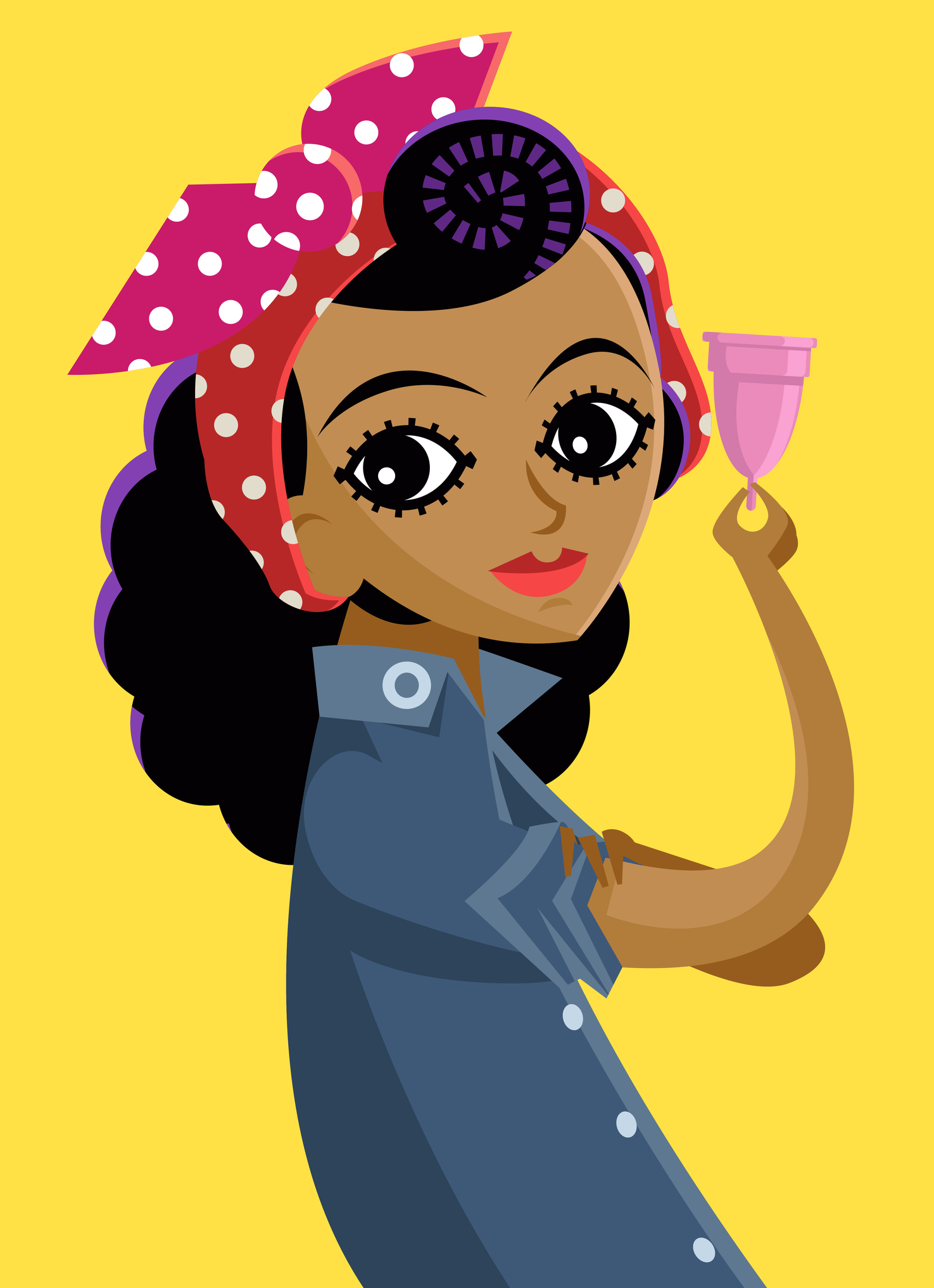
Is your menstrual cup logo sending a positive message about your brand?
If you’re not sure, keep reading. We’ve got some great tips for designing a high-quality menstrual cup logo.
Take Psychology Into Account
Keep in mind the psychology of colors of colors and shapes when designing your logo to make sure it’s appealing to your target audience.
Color
Whether you’re selling the Mooncup or another menstrual cup, you’ll need to make sure the colors used in your logo fit your product.
Different colors have different effects on consumers. For example, blue is a calming color while red is associated with strength and sometimes aggression. Pink gives off a fun and flirty vibe, which is why it often shows up in advertisements for feminine products.
Pink is not the most appealing color for women, though. Studies have found that women actually prefer blues, greens, and purples. They tend to avoid orange, gray, and brown.
It’s also a good idea to stick to pastel colors and softer tones when designing a logo for a business that sells products to women.
Shape
The shape of a logo also matters a great deal. People associate shapes with different emotions in the same way they do with colors.
Round shapes like circles and ovals evoke feelings of trust, protection, and community. On the other hand, rectangles, squares, and triangles appeal more to the intellectual and scientific mind.
Focus On Fonts
Font is another important logo design detail. For feminine products, scripted or handwritten fonts usually work best.
While these fonts can be appealing, it’s important to also make sure to choose one that is easy to read. If nobody knows what your logo says, they’re not going to be interested in your business or products.
Make It Unique
If you want your brand to succeed, you have to be unique and stand out from your competition. Avoid cliches and make sure that, from your font to your colors, your logo is different from others in the industry.
You can still take advantage of the psychology of color and shape, just like your competitors do, but you also need to find a way to differentiate yourself.
But Keep It Simple
At the same time, don’t be so focused on being unique that you overcomplicate things. A logo that looks just like every other one out there is not going to be remembered, but neither is one that is hard to read or understand because it’s too busy.
Not sure how to be simple and unique at the same time? Take inspiration from some of the most recognized logos in the world.
Think of the Nike swoosh or Apple’s logo. These brands have got the logo game mastered.
Use Online Tools
You understand the principles of good logo design, but not everyone is a skilled designer who can apply them. Luckily, there are lots of free tools out there that make the job easier.
Try our free online logo maker today. You’ll have a unique, high-quality menstrual cup logo in no time!
5 Tips For Creating An Appliance Logo
Posted on July 18, 2017 by Logo Design Tips and Tricks

What’s the most important factor in good logo design?
There’s no easy answer, is there?
It’s amazing how something as simple as a logo can hold so much power. While easily taken for granted, a well-designed logo makes a statement that conveys a strong sense of the brand. It also offers the comfort of familiarity in a crowded marketplace.
What, then, needs to be considered when designing a logo?
There are five considerations that will help in the development of the logo. These will provide you with a strong, bold statement while looking good on your appliances.
Keep It Simple
A blank canvas begs to be filled.
While a logo can contain a multitude of information it’s more important to create something easily recognizable and self-explanatory. Simple designs tend to be timeless, requiring fewer revisions and updates as time passes.
Think of the simplicity of Nike’s Swoosh or McDonald’s Golden Arches. Both logos are quite basic in design but are immediately identified.
Include the Name
Too much text can easily become cluttered. Forgoing text altogether will ensure a much simpler design but creates a whole new problem.
Unless yours is an already established business with a strong brand awareness, not including the company name in the logo will require much more advertising to create awareness.
The inclusion of your name in your logo, whether stylized or in a simple Helvetica, does much of the marketing work for you.
Know the Brand
The better you understand your brand, the easier it is to find the appropriate imagery.
Apple’s use of the forbidden fruit with a bite taken out denotes knowledge.
NBC’s use of the colored peacock tail feathers represent the different branches of the broadcasting corporation.
If you can find a strong thematic image for your brand you have the opportunity to create something timeless. The better you know your brand, the greater the grasp you’ll have on its themes.
Choose Your Colors
With a rainbow of colors to choose from, it’s important to make sure your color scheme represents your brand and the product you’re selling.
If you’re in the business of selling a 12v refrigerator than you’d want to avoid the use of red and yellow which suggest heat and danger and excitement.
Conversely, a microwave in cool grays or blues gives the impression of being impassive or cold.
The easiest solution is to stick with white or black, depending on the surface they appear on. However, having a logo flexible enough to be color-matched to the appliance they’re selling can create a strong connection. Just be sure to be aware of the logo’s application.
Be Unique
Often the hardest rule to apply, having a logo unique to your brand is of great importance.
Often one of the few visual tools for the customer to differentiate between products, you’ll want to ensure that your logo is easily identifiable. Having something particular and specific that represents that strengths and quality of your brand will ensure that you stand out from the competition.
Final Thoughts
Logo design can be an intimidating prospect. It can often feel that all the best ideas have already been used.
By using the above guidelines, you have the tools to craft something that truly represents all the best aspects of your brand.
Don’t fight for attention. Demand it.


