How to Choose the Most Appealing Colors For Your Skincare Logo
Posted on June 20, 2017 by Logo Design Tips and Tricks
When it comes to logo design, there are a number of factors to consider. You’ll need to decide if you want to create a custom image, or use an interesting font. But above all, don’t neglect the importance of color!
The Meaning Behind Logo Colors
Neuroscience tells us that certain colors can have specific effects on our emotions and thoughts.
Even if we’re not consciously aware of it, the look and design of a product or logo have a major impact on whether or not we buy it.
For example, red is a color for risk-takers. It exudes power, energy, and passion. There’s a reason so many sports cars are painted this color.
Yellow is a similarly intense color, though it’s effects and associations can be varied. While it may convey cheerfulness and hope – it’s also associated with cowards.
Knowing the various meanings and undertones of different colors can help decide which colors best represent your brand. So, before choosing a logo color, think about how you want people to feel about your brand.
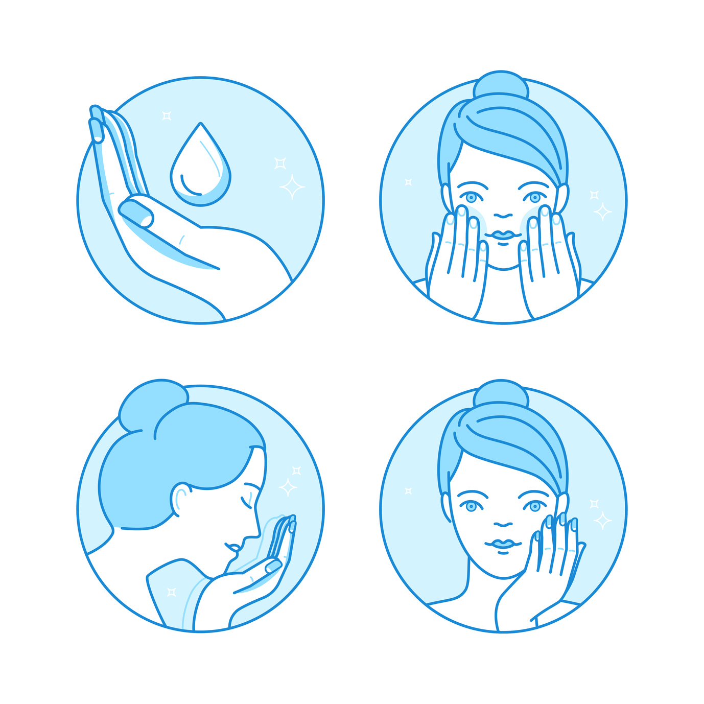
Applying Color Science to Your Skincare Line
When designing logos for a Skin Care line, you can’t overlook the importance of color.
If you want a product package that instills a sense of trust and calm, blue is a good color to choose.
Green is also a good color for skincare since it’s commonly associated with health and nature. Most people look for personal care products that promote good health and have natural ingredients. The color green provides a perfect balance in this sense.
If you have a high-end product, or want to put across a high degree of knowledge and leadership in the skincare industry, purple might be the color of choice.
Purple has been associated with royalty for years. It is also often associated with wisdom and longevity. For this reason, it’s a popular choice for beauty products.
Avoiding Color Overload in Logo Design
One word of caution when designing your skincare logos – don’t overdo it!
Even if you come up with a number of words or thoughts that represent your brand, don’t include every color.
Overloading your logo with different fonts, designs, and colors can confuse your audience. Choose one overarching theme, and select the right options to get that theme across. Similarly, don’t choose a color simply because it’s the “color of the year” or on trend at the moment. Trends change quickly, and you want to create a skincare logo that is always in style.
So, What’s the Most Appealing Color for Your Skincare Logo?
Unfortunately, that’s not a question that can be answered in a blog post. Do some research into your target market and how you want your skincare line to be perceived.
From there, think of some color combinations that will get these points across while accurately representing your product.
Once you have your colors chosen, you can think about the types of graphics you can create around them.
If you need some help choosing the right colors or logos, feel free to reach out to us for guidance.
5 Strategies For a Polished Furniture Logo Design
Posted on June 20, 2017 by Logo Design Tips and Tricks

There’s nothing like a great logo.
Companies like McDonald’s, Nike, and Apple have achieved worldwide recognition. And you can bet their instantly recognizable logos have helped.
Creating a good logo for your furniture business can be tough. It can feel like all the good ideas have already been taken, or you can be tempted to clutter up the design.
But fret not. In this article, we’ll look at five of the best strategies for good furniture logo design.
1. Consider Color
Color says a lot. Especially in a logo.
Different colors communicate different things.
For example, Companies like CNN and Target use a bright red that communicates energy and urgency.
Orange is more playful, which is why it is usually used by playful brands like Nickelodeon and Hooters.
Every color tells a story. If you want to communicate seriousness and authority, you wouldn’t use lime green. That would send the wrong message.
But your logo’s color does more than just send a message: it also increases brand recognition. And brand recognition is everything.
2. Don’t Limit Yourself
One of the most difficult things to consider when designing a new logo is how to keep it consistent with your brand.
But think about it: what does a swoosh have to do with athletic shoes? What does a yellow asterisk have to do with a super store?
Your logo does not have to be directly related to your product. Don’t fence yourself in like that.
For example, instead of trying to illustrate a Chesterfield sofa, design a logo that evokes the sort of elegance you want your brand to convey.
3. Keep It Simple
Think of the most memorable logos in business. Pepsi’s swirl, Twitter’s bird, WWF’s panda, you get the idea.
What do they all have in common?
They are all simple, right?
A simple, unique logo is far more memorable than a design with numerous elements. And in the age of smartphones, simplicity has never been more important. Even Instagram recently simplified their logo to make it easier to recognize on smaller screens.
If you have an existing logo, start chopping. Use fewer colors, erase extra lines. Simpler is better.
4. Use Negative Space to Your Advantage
In logo design, what isn’t there is almost as important as what is there.
Let’s look at the WWF panda logo again. Notice that the actual logo only uses black. The white of the logo is carved out of negative space that your eyes fill in.
The USA Network’s logo is similar. There is no “S” present in the logo, but the clever use of negative space fills it in.
Not only does this make your furniture logo design clever, but it also makes it more memorable. And isn’t that the goal of a logo?
5. Study What Works In a Furniture Logo Design
If a logo is memorable, it’s because it works.
Look at the companies you want to emulate. What are they doing in their logos that work?
And don’t restrict yourself to furniture companies. A good logo is a good logo, no matter what sort of company it is for.
Follow these tips, and hop over to our online logo maker. You’ll be sure to create a furniture logo design that is clever and memorable.
A Stylish List of the Best Fashion Logos in the Industry
Posted on June 20, 2017 by Logo Design Tips and Tricks
Do you consider yourself a fashionista? If so, you probably have a Pavlovian response when you see certain iconic fashion logos.
Even if you’re more the type to throw on any clothing that’s clean and fits, you likely are familiar with some of the world’s most unique fashion logos.
Here’s a list of the very best fashion logos, and what makes them instantly recognizable the world over.
The Fashion World’s Most Iconic Logos
Chanel
Coco Chanel is widely regarded as one of the world’s most stylish women. The interlocking C’s logo that distinguishes the Chanel brand is one of the most well-known fashion symbols.
As with so many pop cultural backstories, there are conflicting ideas of what inspired the double-C. Still, it’s universally acknowledged that Chanel herself designed the now-famous logo.
Burberry
Burberry’s equestrian-themed logo, which features a knight and steed riding together into battle, is said to reflect the fashion company’s specialization in outerwear.
Fun fact: the Latin term “prorsum,” which decorates the knight’s banner, means forward — as in forward-thinking fashion.
Hadid
Hadid Eyewear produces glasses and sunglasses that manage, almost magically, to be at once fashion-forward and timeless. The company’s logo is a large, clean-lined letter H that echoes this duality.
Nike
With the possible exception of the Coca-Cola logo, there are few logos as universally recognizable as the Nike “swoosh.” Believe it or not, the designer behind this fashion logo, Carolyn Davidson, was a college student when she came up with the swoosh in 1971.
For her contribution, Davidson received the whopping sum of $35, along with a certificate of appreciation and 500 shares of stock in the athletic shoe company.
Today, those 500 shares are estimated to be worth over $640,000. Not bad for 18 hours of work.
Levi’s
Jeans are perhaps one of fashion’s longest-lasting and most versatile garments. Worn by everyone from toddlers to construction workers to celebrities, these denim pants debuted in 1872 thanks to Levi Strauss, a dry-goods purveyor.
Remarkably, it wasn’t until nearly a century later, in 1967, that the now-iconic red “batwing” logo was developed by Walter Landor & Associates. Since then, however, it’s become a visual shorthand for the best denim in the world.
Gap
This clothing company, known for its affordable, preppy basics, notoriously changed its “blue box” logo back in 2010 — to an overwhelming chorus of criticism.
The short-lived new logo featured Helvetica text and a small, gradient square of blue. After less than a week, the logo was changed back to its old font, but this time without the blue box background. The executive in charge of the logo revamp resigned just a few months after the brouhaha.
Adidas
Three parallel bars have always been associated with the Adidas brand, in one for or another.
The trefoil logo, complete with the three bars, has been replaced with the current design that suggests a mountain. Both are still recognizable, and the history of the company (including its logo changes) is well worth a read for and fashion or history buff.
Which fashion logos do you consider most iconic or influential?
Feeling inspired to create your own? Use our free online logo maker tool to help!
A Guide to Creating a Beautiful Floral Logo
Posted on June 20, 2017 by Logo Design Tips and Tricks
Building a small business can be a lot of hard work.
An estimated 500,000 new small business start each month. And in order to get those businesses started, prospective businesses owners need to identify a target market, secure funding, hire staff, and find an operating location.
And that’s just scratching the surface.
With all the work that needs to be done, it can be easy to forget about creating a logo. That said, a logo is an essential part of your small business.
If you’re in the agricultural or floral industry, creating a floral logo can be an effective way to start building your identity.
Here’s what you need to get started.
Why you need a floral logo
Creating a beautiful logo is the foundation of any successful marketing strategy. Your company’s branding is a set of design and content choices — all of which will be influenced by what your logo looks like.
Your packaging, slogan, and web page design are all part of your company’s brand. These work together to build your company’s identity.
For instance, Coca-Cola’s brand is defined by iconic red and white coloring, paired with a cursive script. By using this consistent branding across platforms, Coca-Cola has made their product immediately recognizable.
When your business has a memorable logo, it helps to increase brand recognition. This, in turn, can lead to brand loyalty.
Logos are also great for communicating your company’s purpose.
So, if you own a flower shop or a greenhouse, pairing your business’s name with a floral logo is a great way to help customers understand your product or service.
Choose your color scheme
Before you start learning how to create a logo, you should have an idea of what you want that logo to look like.
As we already mentioned, an important component of branding is consistency. So, when choosing the colors for your logo, you’re also choosing the colors that will define your brand.
For a floral-based business, bright and vibrant colors are the best.
These colors will help customers associate your company with the natural beauty of your products.
That said, you also want to make sure that the colors you choose for your writing are legible. A good way to balance this is by using bright colors for the flowers in your logo and using a darker color for the wording.
Promote your products and services
When designing your logo, you want to make sure it accurately reflects your business.
So, for instance, if your flower shop specializes in roses, it’s probably a good idea to have a rose in the logo, rather than a sunflower. You want your logo to get your customers excited about your products, not mislead them about your business’s purpose.
Additionally, your logo should also include your company name, or at least your company initials. This will help customers to quickly associate your logo with your business.
If you’re ready to start building an awesome floral logo for your business, check out our Logo Maker. With this free tool, you can start making a beautiful, professional-looking logo in no time.


