3 Damaging Mistakes in Business Logo Building
Posted on June 16, 2017 by Logo Design Tips and Tricks
Whether you’re just starting your business or are in the process of a rebranding, logo building is one of the most crucial things to consider.
But even if you’re the creative type and think you have a great design, you need to make sure it’s not sending the wrong message to clients.
Are you making one of these three logo design mistakes?
1. Relying On Cliches
We get it — when you’re in the process of logo building, you want to create a design that’s recognizable. It is important that your clients and potential markets are easily able to make the association between your logo and what you’re selling.
But that doesn’t mean you should be doing what everyone else is.
For example, if you’re a company like Best Access Doors, your first instinct might be to base your logo around the design of closed door.
While a door is a good thing to include, how can you take it to the next level and avoid a cliche? Make sure your design shows an action, like the door opening!
2. Blindly Following Trends
Especially if you’re catering to a millennial market, it can be tempting to throw yourself at the latest trends, like using hipster mustaches and millennial Pink in your designs.
But doing everything the trends tell you to is a mistake for a variety of reasons.
For one, these trends just might not mesh well with the overall message of your brand. They also have a tendency to look dated fast. This means that a few months after you create your initial logo design, you’ll have to recreate it.
This can eat up both your time and money.
3. Doing Too Much
Bright colors, crazy fonts, a logo image that shows about five of the products you sell.
While it’s important that you try to take advantage of all the real estate your logo design gives you to connect with your target market, you don’t want to go overboard.
Doing this doesn’t just make your text difficult to read and your image hard to make out. It also makes you look incredibly unprofessional — even desperate.
You don’t need to pull out every bell and whistle you have in order to make a great impression on your client. Instead, you need to focus on creating a design that’s clear, concise, and in step with your overall branding process.
There’s nothing wrong with minimalism — and it sends the message that you can rely on the strength of your products and services to make the sale.
Avoid Making These Mistakes When Logo Building!
The logo building process may look simple, but as you can tell from this post, there are countless tiny details that can make a huge difference.
One final way to tell if your logo is making an impact or missing the mark?
See it for yourself! Use our free online logo maker tool to create several different mock-ups of your favorite design. Then, thoroughly critique them (several extra sets of eyes can come in handy here.)
Still feel like something just isn’t quite right with your design?
Read the advice on our blog for design inspiration, branding tips, and more.
The Ultimate Guide to Building Pest Control Logos
Posted on June 16, 2017 by Logo Design Tips and Tricks
Pests can have a hazardous impact on your health, the cleanliness of your home, and your overall well-being.
If you own a pest control company or provide pest control services yourself, then you need to create a compelling, recognizable logo that makes it clear pests don’t stand a chance against you!
What do the best pest control logos have in common? Take a look at this list of logo design and branding tips to find out!
An Actionable Image
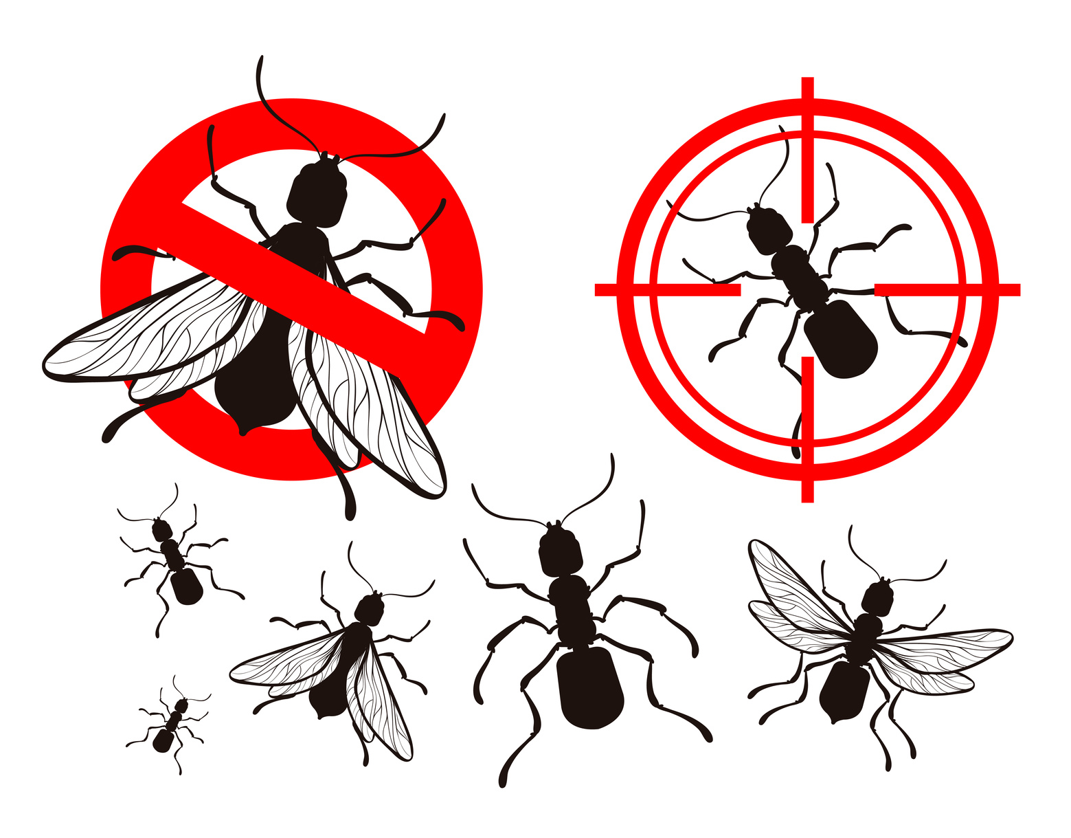
Most pest control logos include an image of a rodent or bug.
While you don’t want to come across as using a cliched image, you also want to send a clear message to potential clients about the nature of your services. Especially since many pest control logos are displayed on the sides of service cars, you only have a few seconds to make it count.
What can you do to promote brand recognition while setting yourself apart from the crowd?
Make sure that your logo shows an action. For example, look at the logo of http://naturapestcontrol.com. Instead of simply showing a bug, it shows a bug crawling up a plant leaf.
So, instead of showing a dead bug, show a service person spraying a few bugs.
A Bold Color Choice
In any industry, the colors you choose to include in your logo design can help to send the right message to consumers. For example, colors like blue and slate grey trigger calming reactions in the human mind.
This means that, while blues would be the right color choice for a spa, they’re not the right choice for a pest control service.
Instead, go for something a bit bolder, like a bright red, orange, or yellow. These colors transmit subliminal messages of power and authority — something you certainly have over bugs!
Communicate Your Methodology
In today’s world, pest control methods that take a more natural route are growing in popularity. Many consumers are much more aware of the potential for dangerous chemicals in cleaning agents and sprays.
If you’re a company that uses eco-friendly and natural methods, make sure your logo communicates that.
You can accomplish this in the images you choose to include, your color choice, (green would work well) and even your font.
However, some people want a heavy-duty, “call in the big guns” pest control experience. if they’re dealing with a serious infestation, they don’t want to work with a company that looks like it can’t handle the job.
Make sure that, whatever methods you use, your logo makes them clear.
Create Pest Control Logos That Stand Out Today
Now that you know just a few of the most important things to consider for pest control logo design, why not start creating yourself?
Once you’ve come up with a few possible design options, use our online logo maker tool (it’s free!) to test them out.
Looking for more branding advice? Want to learn more about the different ways your logo can connect you with your target market? Read our website and blog!
A Breath of Fresh Air: A Guide to Logo Redesign
Posted on June 16, 2017 by Logo Design Tips and Tricks

Have you noticed that your sales keep lagging?
Do you feel like your company just isn’t reaching the number of people it once was?
Has a new competitor shown up on the scene, making things harder for you?
If so, it’s likely time to rebrand. This entails making lots of changes. You might move to serve a wider market, you’ll redesign your website, create new content, and even revamp the products or services you offer.
But you also need to think about a logo redesign.
This is incredibly important, as it’s a tangible message to your customers that you’ve evolved — and that while you still offer the same fabulous things, you’re doing it in a whole new way.
What do you need to pull off a successful logo redesign? Read on to find out.
A New Take on a Classic
Logo redesign can be a tricky business. You want to make it clear you’re back and better than ever, but you also don’t want to confuse the customer base you’ve worked hard to build.
We suggest updating the main image of your logo.
For example, if you’re trying to get customers to buy app downloads, your logo might include a picture of a phone. Look at that phone — does it look like the iPhones or Androids of today? Or does it still show a flip phone?
Make sure your logo design illustrates that you cater to the current market — not the market of five years ago.
Switch Up the Font
Changing the typography, or font, of your new logo is another effective way to indicate evolution without muddling your brand and confusing your customers.
It’s also an easy update you can make every few years, to show that you’re with the times. Your font is the one place where it’s ok to get a little trendy!
Still, always ensure that you’ve selected an option that’s legible and visible from several feet away — and lots of different sizes.
You may even want to have a custom font created to really set yourself apart from your competition!
Try a New Tone
Lastly, consider changing up the color of your current logo! This is a great way to take things to a new level without compromising your consistency.
Consider the Apple logo — the bitten apple. Over the years, it’s been shown in a variety of colors and shades. Yet, because the design was the same, it never cost the brand customers.
One final piece of advice: always remember to upload your new logo across all your online presences. This includes your website, your blog, and your social media handles.
You want to ensure that your logo is the same everywhere to prevent customer confusion.
Create Your Logo Redesign Today
Now that you know how to breathe new life into your logo, it’s time to get your ideas down on paper!
That’s where our online free logo design tool comes in handy.
Of course, a logo redesign is only one small part of the rebranding process. For more advice on how to use your designs to reach a wider audience, check out our website and blog.
How to Choose the Best Colors For Toy Logos
Posted on June 16, 2017 by Logo Design Tips and Tricks
When you’re creating toy logos, you need to create a design that will appeal to both children and their parents!
As toy sales have grown by 7% over the past few years, you have to think outside of the jack-in-the-box to make a good impression on your potential buyers.
In this competitive market, coming up with a unique image and even special stylized font for your toy logos isn’t always enough. You have to use the psychology of color if you want to ensure that a child reaches for your toy on the shelf.
In this post, we’ll tell you everything you need to know about which colors will send the perfect message to your market.
Look At Your Age Range
Fascinatingly, children see colors differently depending on their age. If you’re marketing towards the 2 and under set, it’s best to use a direct contrast of darker colors against lighter ones.
For example, you may want to place a deep purple next to a lime green. This will help to draw younger children’s eyes to your toys no matter where they’re placed on a shelf.
For children over two years, it’s important that you use a variety of colors, as studies confirm that children don’t like products that use lots of the same shade.
So, instead of using three different types of red, use red, blue, and yellow.
Since children respond more to color than adults do, it’s an absolutely crucial part of your design. A general rule of thumb? The more colors you can include in your design, the better. For example, if you’re selling a skybound trampoline, go for a bright color like green or yellow.
Go Gender Neutral
Unless you’ve been living under a rock, you know that there has been a lot of talk in recent years about gender and the colors we use to market towards boys and girls.
These days, consumers would prefer toys that are gender neutral, meaning they can be used — and marketed to — boys and girls equally. Resist the urge to package dolls in pink alone.
To that end…
Know What Your Colors Are Communicating
Of course, even if children are the ones reaching for your toys, parents are the ones buying. As such, make sure you know what your colors are saying to them.
Blues indicate a sense of calm — great for craft-based toys geared towards older children.
Reds communicate excitement and urgency, meaning they’re perfect for outdoor activities or board games.
Yellows and greens feel comforting, which means they’re a great option for toys that are intended to help children settle down. They’ll also work well for toys that need multiple players.
Create Toy Logos Today
Thanks to the advice in this article, you’re ready to create toy logos that will help your product to fly off the shelves!
To get started, we recommend using our free online logo maker — and showing your favorite designs to your most important customer: your kids!
For more advice on how to use logos to help with branding and marketing, check out our blog.


