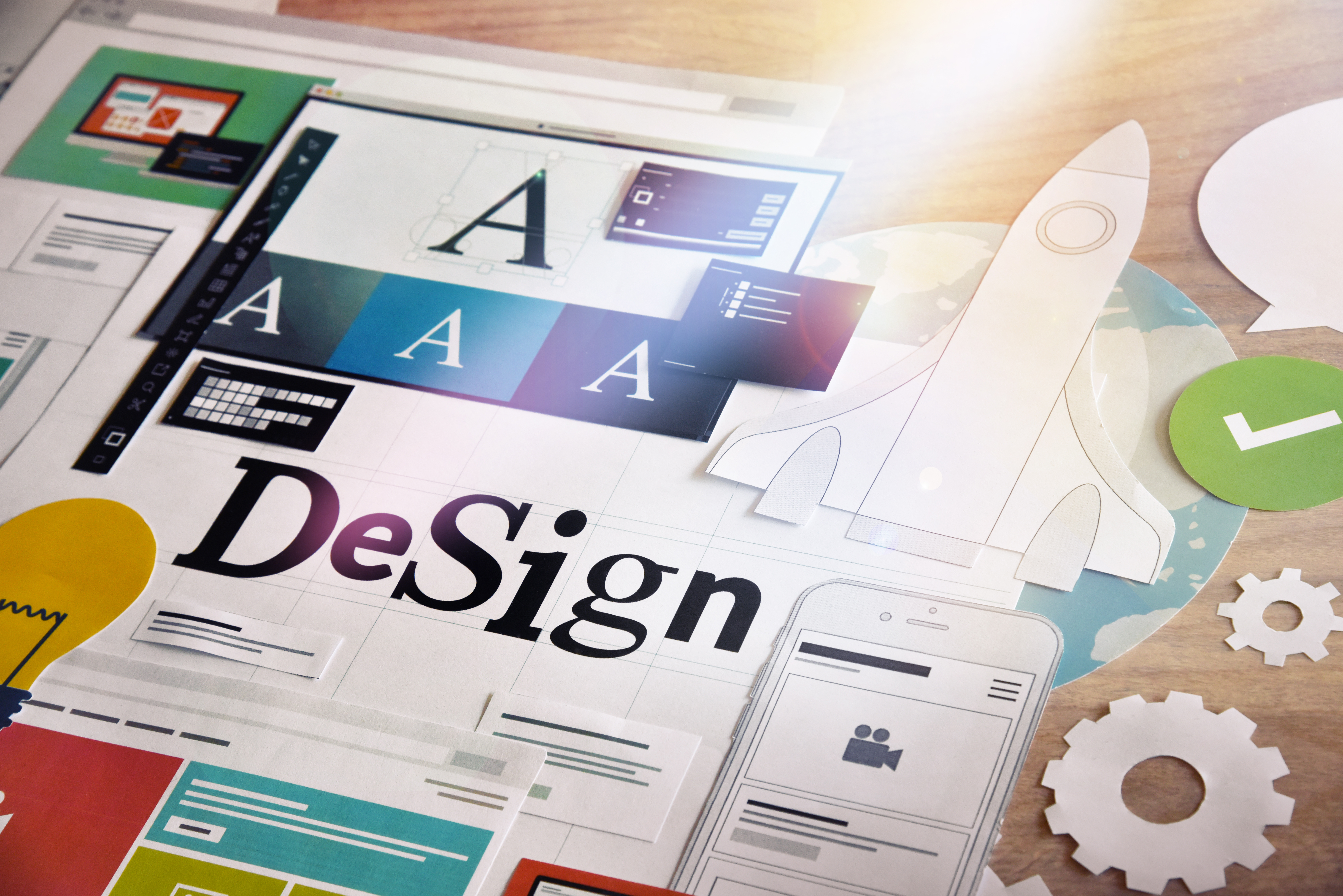
Need a Cool Logo? Get Tips and Inspiration Here
Posted on July 16, 2018 by Logo Design Tips and Tricks

The top characteristics of a successful brand include consistency, passion, and leadership. But you know one more thing that they did right? Their logos.
Their logos are unique. Why are their simple but elegant designs so memorable?
Chances are, you’ve already memorized the logos of the top companies today, such as Apple, Android, HP, and McDonald’s. These brands went through different changes and considered different things to come up with their logo.
What’s their secret? What makes a good logo exactly?
It’s not only one factor – it’s a lot of things that all have to come together. Dive in for some tips on creating your own cool logo.
Know What You Want to Convey
Before deciding on colors and graphics, you have to know what you want the logo to convey first. The logo is the face of your brand, and so it should represent your brand’s message, values, and personality.
It should have meaning, and it should be clear the moment your consumers lay their eyes on it. Ask yourself, what feelings do you want the logo to invoke in the audience?
When your company’s purpose is clear to you, you’ll make better choices when it comes to the design, colors, and other elements.
Research Your Audience
You know your company, now you have to know your audience. Your logo must be able to communicate your brand to them, so now your job is to think how your logo can do that.
If your target market is the upper class, you’ll want the logo to exude luxury. If it’s millennials, you might want your logo to have some quirky elements.
Consider the following factors when you’re deciding on your target audience:
- Age group
- Gender
- Location
- Socioeconomic segmentation
- Education
- Lifestyles
Once you’ve determined your audience, you’ll have a better action plan on making your logo.
The Right Colors Make All the Difference
One of the most important factors in making a logo is choosing the right colors. Each color has its own meaning, and each one carries its own ideas.
Learn more about meanings of colors, so you’ll get an idea of the reactions you’ll get from the audience. Don’t be afraid to play with the color palette! You can even turn the logo into gray scale just to see if it works better.
Examples of companies that make the right use of colors are McDonald’s, and Kellogg’s, and Coca-Cola. Notice how they all use red in their logos. Red is an extremely popular choice when it comes to food and beverage companies, as this color sparks the feeling of hunger.
However, note how Adidas and Apple’s logos are similarly effective as well despite the lack of popping colors.
Make Use of Negative Space
Want to be creative without adding too much graphics? Try playing around with negative space.
Negative space is the space around or between the subjects. The space around the Adidas logo, for example, is negative space, as well as space in-between the slanted stripes.
Many companies use this space to add a flair to their cool logos. Take the FedEx logo, for instance. The negative space between E and x looks like an arrow, doesn’t it?
It’s subtle yet clever. It leaves a lasting impression on its customers, which makes it an effective logo.
Another example is the Spartan Golf Club logo. The subject shows a golfer and the trajectory of its swing, but the clever use of negative space creates a second image of a Spartan helmet.
Know the Latest Digital Design Trends
Study the current market and be aware of the latest logo trends. This 2018, you’ll see a lot of minimalist cool logo designs. Simple shapes and fonts are everywhere, which is most welcome since they’re easy on the eyes.
However, it’s also a good idea to stay away from the current trends. You want your logo to still be relevant in the years to come. Sure, you can update it down the road, but that will require a lot of money and risks.
Furthermore, you want your logo to be unique. When the logos of every other startup businesses this 2018 look the same, how will your customers be able to differentiate you at a glance?
Custom Lettering is Your Friend
Sometimes, a logo doesn’t need more than a good font. Google, Canon, IBM, and The New York Times are only a few examples of brands that have effective logos despite only having letters in their logos.
What makes it effective (aside from colors), is the lettering. Most have commissioned their own typeface so that it’s unique to their brand. You won’t find it as an option in Microsoft Word, unlike Comic Sans that other brands seem to think as a good choice.
Another famous example is the Coca-Cola logo. The typeface is unique, which makes it easily recognizable.
It also spurred some imitations. Still, it will make you think of the beverage company.
This is another reason why you must consider getting a custom typeface – to make your brand stand out from the rest. Imitating a famous font only says that your brand is second-rate.
Make It Your Own
Ever noticed how every time you see an apple with a bite, you immediately associate it with Apple?
This is what you want to achieve – when people easily recognize the logo as yours even when it doesn’t have your name attached to it.
Observe the Evernote logo. An elephant head isn’t a very unique idea, isn’t it? Its relation to a note-taking app isn’t clear as well.
However, the way the logo represents the elephant head – from the folded trunk to the fold in the ear – makes it unique. Even without the Evernote lettering below it, you’ll think of the app when you spot the elephant head.
Twitter is also a great example, as well as Nike with the check mark.
Create Your Own Cool Logo Now
Have an idea for a cool logo? Make it into reality now with our online logo maker. Register now and create the perfect logo for your brand for free.
Not sure how to start or how to use our logo maker tool? Feel free to visit us now and check out our tutorial.
How to Design an Attractive Marketing Logo for a Facebook Page
Posted on July 11, 2018 by Logo Design Tips and Tricks
Branding and color choices can make or break a business’s chance of success. This is especially true as it takes more and more to stand out from your competition.
Because of how important logos and overall branding are, it can be stressful working on an idea for a client.
Are you currently tasked to create a marketing logo for a client’s Facebook page? Read our top seven tips below to nail it on your first shot.
Logos with Clever Double Images
Do you know what visual double entendre is? If not, that okay. Basically, it means one image can be viewed as two ideas or concepts.
Make both ideas or images relevant to your brand.
This creates interest for the viewer but also stamps your logo with a true sense of flair and authenticity. Get creative with this!
Carefully Choose Colors for a Marketing Logo
Color will evoke feelings in consumers, so you must know your client and their market. Be mindful of how your logo colors will translate to grayscale.
One other thing to consider is how your logo works with other elements on your Facebook page. If using the logo as the profile picture be sure it is cohesive with your cover photo.
It can take time to design a Facebook cover photo, but it will be well worth your time.
Less Detail is Often Better
This is a mistake people often make. They try to cram too much information into one little logo. Simple logos tend to withstand the test of time and can become iconic.
Think along the lines of Apple or Nike.
Don’t Jump on a Fad Bandwagon
Every once in a while a new idea becomes insanely popular within the logo and branding industries. Fight the urge to join in on these.
The fads will likely pass and then you are left with a logo that is either similar to many others or just will look dated in a few years.
Custom Typeface
Creating a typeface or font just for your client is one of the best ways to create a totally unique logo that will stand apart from others.
If you will be using a lot of text in a logo, don’t just use a standard preset. Clients are expecting (and deserve) more.
Be sure whatever font you end up with works well with images or other elements in the logo.
Use Negative Space
Another visual trick is using negative space. This is a trick to keep logos simple and on brand for your client. A popular example is the FedEx logo. Think about that space between the E and X.
Do you see the arrow?
Make It Meaningful
One final tip when working on a logo for a client is to make it mean something. The logo should tell at least part of a story about the brand or business.
Try to work in the core values if possible to portray trust and reliability to consumers.
Time to Create the Perfect Logo
Even if you were feeling stuck with creating a marketing logo before, with these tips you should have plenty of new ideas.
If you are ready to test out some of these ideas, check out our amazing online logo maker.
The 7 Coolest Tech Logos of All Time
Posted on June 19, 2018 by Logo Design Tips and Tricks

In today’s crowded marketplace, it’s never been more important to make a good impression. Your logo plays a crucial role in making a lasting impression on your customers. This is especially important in the hyper-competitive world of tech startups.
There are over 100,000 software companies currently operating in the United States. That statistic alone illustrates why a good tech logo is necessary for your business to stand out.
To help get you thinking about what constitutes a good tech logo, here are seven of the coolest tech logos of all time!
The Coolest Tech Logos EVER!
Graphic design is always changing. Tastes and trends are mercurial, shifting like the tides and the seasons.
That being said, a great graphic design should aspire to be timeless. It should weather the passing trends and transmit something essential about the brand’s identity.
To help you decide on a timeless tech logo of your own, here are some of the most iconic logos for tech companies of all time.
1. Apple
Let’s start with the classics. While Apple’s iconic tech logo has become omnipresent, it still effortlessly radiates cool, modern, and chic.
Steve Jobs and Steve Wozniak are more than just programming savants. They’re also marketing geniuses, judging from the fact that Apple’s logo has managed to remain synonymous with high tech for several decades.
To settle on their logo, Steve Jobs contacted designer Rob Janoff with a very open-ended design brief. “We’re calling it Apple,” was the only direction Janoff received.
Janoff’s iconic design is a testament to solid design principles. The missing chunk out of the apple was to help the tech logo be recognizable at any size, as well as to maintain a weighted balance.
You can’t enter a coffee shop or boutique without seeing Apple’s logo glowing from at least half-a-dozen screens. This will likely still be true in 50 years.
2. IBM
While it might not seem as “sexy” as Apple, it’s hard to argue with a tech logo that’s remained timely for over 45 years. Paul Rand’s updated logo for IBM is a landmark of timeless design that still somehow seems contemporary
Rand’s tech logo design is also a primer on solid design principles. The rounded inlay between the ‘I’ and ‘B’ is meant to approximate a globe. This was to emphasize the “International” of “International Business Machines.”
Chances are, you never even noticed. Paul Rand’s design is subtle and unobtrusive, as the best designs should be.
3. Pinterest
Pinterest’s logo has become so omnipresent we might not think twice about it. Take a second look, however, and you’ll notice some surprising details.
For Pinterest’s most basic icon, which is the letter P in a simple circle, it’s a testament to the timelessness of a monochromatic design. There’s something about red and white together which has created successful visual branding for countless entities, from Coca-Cola to The White Stripes.
It’s just as subtly cool when Pinterest does it. It also looks great against both light and dark backgrounds, making it appropriate for most print situations.
The full Pinterest logotype is what really stands out, however. Take a closer look and you’ll notice the bottom of the P is actually a pen nib, designed to appeal to Pinterest’s craft crowd.
4. Jelly
A relative newcomer on the scene, Jelly’s logo says a lot in a short amount of time. In today’s content-heavy world, a great tech logo should communicate as much as possible in a split-second.
Jelly is a search engine company, geared around conversational search engine queries, predicting the rise of speech-based search several years ago. Jelly was acquired by Pinterest last year, which is a sure sign their branding is working.
Jelly’s logo blends two ideas into a seamless whole. It’s a jellyfish which is also a brain. Without ever saying a word, it reminds us that we’re all just floating nervous systems within this complex ecosystem.
5. Orbotix
Coming across as playful while still being able to be taken seriously is no easy task. Boulder, CO’s Orbotix pulls it off gracefully with the robotic tech logo it uses for its smart robot products Sphero and Ollie.
The Sphero logo looks like a cross between a Pac-Man ghost and a Star Wars droid. Which is appropriate, as Orbotix also manufactures some Star Wars merch. The tech logo manages to be recognizable while also still seeming novel and contemporary.
6. Snapchat
Snapchat is one of the most popular apps with teens, who are notoriously difficult to please when it comes to being “cool.” Snapchat’s monochromatic yellow-and-white “Ghostface Chillah” logo pulls it off effortlessly.
It’s not hard to imagine a league of 18-year-olds getting the ghost logo tattoos. It’s also not hard to imagine a room full of investment bankers bending over backward to hand Snapchat cash, to capitalize on their hipness.
Snapchat’s logo hasn’t always been so graceful. Ghostface Chillah used to have a face, which created a busier, clunkier design. The new minimalist reimagination makes the tech logo design speak to nearly any demographic you could think of, with no text required.
7. Nest
The Japanese have a word called “Ma,” which means “a constructive use of negative space.” In logo design, Ma is your friend, as you have very limited real estate to communicate the most important ideas about a product or brand.
Nest communicates its vision of a smart home easily, using a lower-case ‘N’ as the doorway for a home. Smart, simple, chic, and to the point, if only all designs could be as graceful and elegant.
Are You Looking For A Tech Company Logo?
There are thousands of tech companies being created each and every year, so it’s hard to pick less than ten great tech logos. Hopefully, our roundup has given you some ideas on how to showcase your tech company in its most stylish light.
Over two million brands have created top-notch visual designs using our online logo maker! Create an account with us today and let us showcase your tech business in its best possible light.
9 Unique Real Estate Logo Ideas
Posted on March 11, 2018 by Logo Design Tips and Tricks

With over 2 million real estate agents in the United States, the competition is fierce. It’s more important than ever to set yourself apart from every other real estate agent around.
Which is why branding is so important. Part of an effective branding strategy is having a logo so clients can easily recognize you.
But you need to make sure your logo is unique. Here are some great real estate logo ideas to help get you started.
1. Use Color
When you’re looking for real estate logo ideas, what colors you want to use should be the first thing you think about. Colors are extremely important as each color conveys a different meaning.
Don’t go overboard on using colors. Too much and it will be confusing to people. You want to choose one or two colors that represent your brand best.
Try not to use colors that are trendy. Your goal is to create a logo that has lasting power.
It’s also possible to make a huge splash just by using black and white images.
2. Think of Symbols Outside the Home
When people think of real estate logo ideas, most think of using a house or some type of a dwelling. Except, that’s not really very memorable.
Instead, try using a symbol that might stick in people’s minds a bit longer. Geometric shapes would work well for the real estate industry.
Another way is to use images from nature to still convey a homey feeling without using an actual home. You could also use symbols from within the home as well.
Get creative and use symbols that symbolize who you are as a brand.
3. Make it Timeless
Your goal for creating real estate logo ideas is to find something that will stand the test of time. While certain trending ideas are useful, you don’t want to have to come back two years later and create something new.
Rather, try to find a logo that can be tweaked if it needs to be updated. The Quaker Oats brand has been using a Quaker on their cereal for over a century.
When they finally did some updates, it actually took them years of careful crafting before they made the changes.
4. Stick With Your Name
There are two options for real estate log ideas when you use your name. You can use your initials and design a really great monogram logo.
It’s perfect for people who either have very long names or difficult names to pronounce. You can also get creative with the various types of fonts and sizes that are available.
You can choose to use the monogram and another symbol or just use the monogram itself.
You can also choose to use your full name. Again, there are a variety of font styles and sizes you can use.
The best part is that your name will never go out of fashion. If in the future, you do need to make some updated changes, a new font can give you a whole new updated look.
If you do decide to go with a monogram or use your full name, make sure you’re fully committed to using your name for the rest of your career. Meaning, if you get married and take the other person’s name, you’d have to change your logo and branding strategies.
5. Make Your Real Estate Logo Ideas Fun
Buying or selling property is stressful for owners and buyers. Which is why it’s a good idea to create real estate logo ideas that are fun.
If part of your brand is that you make finding a dream home a fun and inspiring experience, then use symbols or artwork that show off your fun side.
Nike uses a swirl for their logo. It has nothing to do with running or shoes. But it does leave a lasting impression on people.
6. Keep It Simple
Whatever you do, keep your real estate logo ideas simple. Do not overcomplicate it.
You’re trying to gain a positive first impression with people. You do not want to confuse clients.
Sometimes you’ll see a company doing an advertising campaign that’s so outside the box that it leaves the viewer confused. That doesn’t help boost sales.
Instead, be creative but keep it simple.
7. Use a Slogan
A great slogan is one avenue you can take for your real estate logo ideas. A slogan is memorable and will always be attached to you.
Take the slogan, “looking out for your next move.” It has two meanings and is memorable. When a client is looking at Boise ID homes for sale, they now know who to call first.
Don’t make the slogan too long or complicated. A simple sentence that’s memorable and witty is enough.
8. Most the Most Out of Negative Space
The information on your logo doesn’t need to take up the entire space. Instead, leave some room for negative space.
You can actually do a lot with negative space. Take the FedEx logo, for instance.
Their use of negative space is so ingenious that most people don’t even realize they’re seeing an arrow in the “Ex” part of FedEx. Hidden images are fun and creative.
It’s subtle, yet powerful.
Negative space also forces the eye to be drawn to whatever is there. You could create a very simple logo with so much negative space that people have no option but to see your logo.
9. Active Versus Passive
Real estate agents are extremely busy. You’re always on the go.
Your real estate logo ideas can incorporate your active lifestyle into your brand. A bird in flight can show that someone is on the move.
You could even use a photo of a home that looks like it’s in motion.
You might also consider using a passive type of logo. That would convey that once you sell a home, the resident is there forever.
Make Your Free Logo Now
Don’t wait to set yourself apart from your competition. Get started making a new logo for yourself now.
It’s easy to get started. Check our tutorial that shows you how to create your own logo.