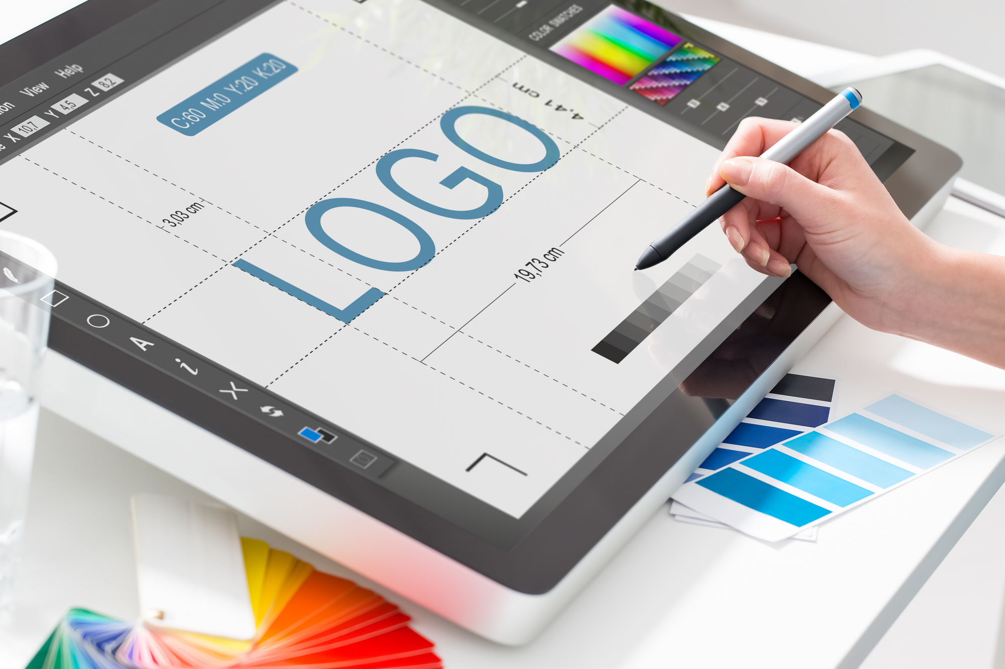
The Not-Photoshop Way to Design a Logo
Posted on July 18, 2018 by Logo Design Tips and Tricks

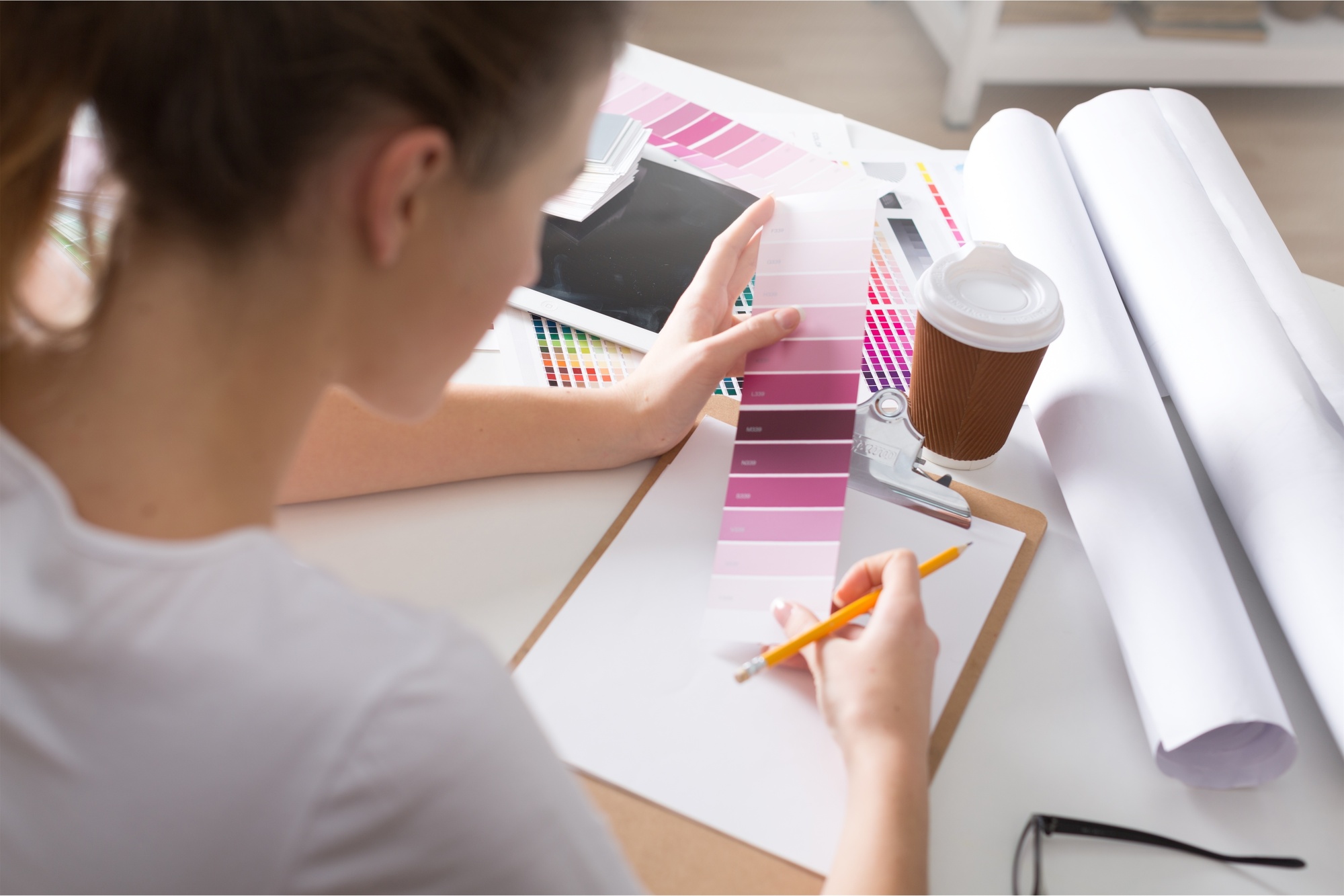
Logos are expensive.
Graphic designers make good money using the tools of the trade to make a logo for your brand. And they should.
After all, they are signing over the intellectual property that will hopefully propel your business into branding success.
Your logo is the face of your brand, but some people can’t afford to hire an expensive graphic artist.
For those people, the idea of learning Photoshop and paying for a costly subscription may not be the best solution.
Luckily, there are alternatives that are not Photoshop, and that’s what we will discuss here.
1. Choose an Online Logo Maker
There are a number of online logo tools to choose from, we recommend ours.
Using OnlineLogoMaker, you have access to how to’s and tutorials that will help you craft your logo in no time at all.
All you need to do is register for an account with your name and email and get to work on the logo that will drive you to brand recognition in no time.
We even offer support, so you don’t have to go it alone should you get stuck on a project. That’s why we are the best program to make a logo.
Steps to Using OnlineLogoMaker
Here’s how to use OnlineLogoMaker to increase your brand presence:
- Navigate to http://www.onlinelogomaker.com
- Register for a free account or log in
- Select Create a New Logo
- Start drawing
Getting a professional logo has never been easier.
2. Hire From Fiverr
A great option for those seeking an inexpensive logo without the Photoshop skills is to hire a freelancer on Fiverr.
Sometimes this results in outsourcing work to other countries, but with many options to choose from you can find a designer that understands your vision.
The great thing about Fiverr is good designers get a lot of work, and therefore have a lot of reviews. You can see, in advance, if you’re partnering with someone who is likely to deliver.
With prices starting around $5 for a logo design, it’s going to be your most hassle-free bet.
How to Hire a Freelancer
Use Fiverr to find the right person for the job!
- Go to Fiverr.com
- Type ‘logo design’ in the search box
- Select a designer in your price range with lots of positive reviews
- You’ll be prompted to create an account before purchase — Bonus: it’s free to create
Don’t miss out on professional design services when a new logo is at your fingertips.
3. Look For Free Alternatives
Through the advent of web applications, there are a number of Photoshop simulators and alternatives to buying the program itself.
These differ from online logo makers, which tend to be more simplistic because Photoshop simulators offer a number of robust features for savvy users.
These can be used to make everything from logos to marketing materials, ads and more. But be careful, because they do tend to have a learning curve.
How to Find the Right Not Photoshop Simulator
If you’re looking for something with all the capabilities of Photoshop, follow these steps:
- Navigate to Google
- Search “Photoshop Simulator”
- Select from products available
- Choose a simulator that you like
- Start a design
Photoshop simulators have many tools, like retouch and smudge tools. And they use layers to create unique vector images for those seeking a new logo.
4. Find a Logo Mobile App
Depending on what phone you use, your mobile app store likely has logo design tools available for your consumption.
Just navigate to your app store and type in “logo design” to see what’s available.
These range in price from free to a couple of bucks. Some will have in-app purchases, like templates, that might offer a design you fancy.
Generally, this is a cheap and easy option for getting a logo made to be visible online. But to ensure your logo has the print quality you desire, you are likely better off using one of the other tools mentioned above.
What to Look for in a Mobile Logo App
These may seem like a dime a dozen, focus your search around:
- The option to create high-resolution images suitable for print
- Lots of free or inexpensive template options
- Full range of colors and design choices
They have an app for that! Using a logo app makes logo design attainable for small businesses and freelancers.
5. Focus on Minimalism
Minimalism is all the rage. That’s a good thing for those seeking how to make a logo design without Photoshop.
It’s okay to follow the rule of “K-I-S-S”:
See what we did there? We think you’re smart for wanting a simplistic logo design. And graphic designers might agree, considering minimalist logos are on the rise.
Minimalist Design Pillars
The minimalist principles of logo design include:
- Simplicity
- Selective typography
- Strategic use of whitespace
- Attention is given to the design proportion
- Make it memorable and timeless
- Keep it clean
With these pillars in mind, you can draw up a logo design in no time.
6. Take Google Drawings for a Spin
If you’ve had to work collaboratively at all recently in your career, odds are you’ve used Google apps.
A new tool launched by Google called Drawings helps users like you define your brand.
Using Drawings you can do some of the same things as Photoshop but in a more simple format.
As a logo tool, Drawings allows you to select and arrange fonts and shapes to create simple designs. You can add and change colors, select photos, or free draw.
How to Use Google Drawings
Here are some quick tips for effective use of Google Drawings:
- Log into your Google Account
- Select the Google Apps Logo and click on Drawings
- Familiarize yourself with the icons in the toolbar
- Use the toolbar to begin your design
For those already familiar with Google Apps, a big bonus to using Drawings is the resemblance to other Google tools you’ve already learned.
If Not Photoshop, What?
Gone are the days where business owners have to ask, “If not Photoshop, then what can I use?”
There are a lot of good, free and inexpensive options for small business owners looking to get a great design.
These include mobile apps, web apps, Google apps and more! For other great tips on how to brand your business, visit us here.
Need a Cool Logo? Get Tips and Inspiration Here
Posted on July 16, 2018 by Logo Design Tips and Tricks
The top characteristics of a successful brand include consistency, passion, and leadership. But you know one more thing that they did right? Their logos.
Their logos are unique. Why are their simple but elegant designs so memorable?
Chances are, you’ve already memorized the logos of the top companies today, such as Apple, Android, HP, and McDonald’s. These brands went through different changes and considered different things to come up with their logo.
What’s their secret? What makes a good logo exactly?
It’s not only one factor – it’s a lot of things that all have to come together. Dive in for some tips on creating your own cool logo.
Know What You Want to Convey
Before deciding on colors and graphics, you have to know what you want the logo to convey first. The logo is the face of your brand, and so it should represent your brand’s message, values, and personality.
It should have meaning, and it should be clear the moment your consumers lay their eyes on it. Ask yourself, what feelings do you want the logo to invoke in the audience?
When your company’s purpose is clear to you, you’ll make better choices when it comes to the design, colors, and other elements.
Research Your Audience
You know your company, now you have to know your audience. Your logo must be able to communicate your brand to them, so now your job is to think how your logo can do that.
If your target market is the upper class, you’ll want the logo to exude luxury. If it’s millennials, you might want your logo to have some quirky elements.
Consider the following factors when you’re deciding on your target audience:
- Age group
- Gender
- Location
- Socioeconomic segmentation
- Education
- Lifestyles
Once you’ve determined your audience, you’ll have a better action plan on making your logo.
The Right Colors Make All the Difference
One of the most important factors in making a logo is choosing the right colors. Each color has its own meaning, and each one carries its own ideas.
Learn more about meanings of colors, so you’ll get an idea of the reactions you’ll get from the audience. Don’t be afraid to play with the color palette! You can even turn the logo into gray scale just to see if it works better.
Examples of companies that make the right use of colors are McDonald’s, and Kellogg’s, and Coca-Cola. Notice how they all use red in their logos. Red is an extremely popular choice when it comes to food and beverage companies, as this color sparks the feeling of hunger.
However, note how Adidas and Apple’s logos are similarly effective as well despite the lack of popping colors.
Make Use of Negative Space
Want to be creative without adding too much graphics? Try playing around with negative space.
Negative space is the space around or between the subjects. The space around the Adidas logo, for example, is negative space, as well as space in-between the slanted stripes.
Many companies use this space to add a flair to their cool logos. Take the FedEx logo, for instance. The negative space between E and x looks like an arrow, doesn’t it?
It’s subtle yet clever. It leaves a lasting impression on its customers, which makes it an effective logo.
Another example is the Spartan Golf Club logo. The subject shows a golfer and the trajectory of its swing, but the clever use of negative space creates a second image of a Spartan helmet.
Know the Latest Digital Design Trends
Study the current market and be aware of the latest logo trends. This 2018, you’ll see a lot of minimalist cool logo designs. Simple shapes and fonts are everywhere, which is most welcome since they’re easy on the eyes.
However, it’s also a good idea to stay away from the current trends. You want your logo to still be relevant in the years to come. Sure, you can update it down the road, but that will require a lot of money and risks.
Furthermore, you want your logo to be unique. When the logos of every other startup businesses this 2018 look the same, how will your customers be able to differentiate you at a glance?
Custom Lettering is Your Friend
Sometimes, a logo doesn’t need more than a good font. Google, Canon, IBM, and The New York Times are only a few examples of brands that have effective logos despite only having letters in their logos.
What makes it effective (aside from colors), is the lettering. Most have commissioned their own typeface so that it’s unique to their brand. You won’t find it as an option in Microsoft Word, unlike Comic Sans that other brands seem to think as a good choice.
Another famous example is the Coca-Cola logo. The typeface is unique, which makes it easily recognizable.
It also spurred some imitations. Still, it will make you think of the beverage company.
This is another reason why you must consider getting a custom typeface – to make your brand stand out from the rest. Imitating a famous font only says that your brand is second-rate.
Make It Your Own
Ever noticed how every time you see an apple with a bite, you immediately associate it with Apple?
This is what you want to achieve – when people easily recognize the logo as yours even when it doesn’t have your name attached to it.
Observe the Evernote logo. An elephant head isn’t a very unique idea, isn’t it? Its relation to a note-taking app isn’t clear as well.
However, the way the logo represents the elephant head – from the folded trunk to the fold in the ear – makes it unique. Even without the Evernote lettering below it, you’ll think of the app when you spot the elephant head.
Twitter is also a great example, as well as Nike with the check mark.
Create Your Own Cool Logo Now
Have an idea for a cool logo? Make it into reality now with our online logo maker. Register now and create the perfect logo for your brand for free.
Not sure how to start or how to use our logo maker tool? Feel free to visit us now and check out our tutorial.
Should You Start With a Circle Grid When You Design Your Logo?
Posted on July 13, 2018 by Logo Design Tips and Tricks

What do the logos of Pepsi, Google Chrome, G&E, and Starbucks have in common? They all use a circle grid in their design.
Using this grid is a trend so popular with current designs because it evokes a mix of beauty and slickness. In fact, psychology is at play with shapes as much as color when used in logo designs.
The question is, should you use a circle guide for your logo design? Will it help you broaden your reach, connect with your audience, and gain newfound popularity?
To help you answer those questions, we have some details and discussions to help you decide and contemplate before applying it to your design.
What is a Logo Grid?
A logo grid is a tool that aids in creating shapes, adding geometrical harmony in the logo design. These grids are also called construction guides, due to how the grid lines work as guidelines for measurements and shapes.
With it, you can incorporate circular elements along with complex patterns. Combined with other design elements a circular grid can grant you unique patterns for your logo design.
Keep in mind that the circular grid is not the only tool that you can use in your design. It’s a supplement to help you come up with the most optimal logo that benefits your company’s goals.
You can also use the rule of thirds from photography as a design principle for the grid. The golden ratio is also another design element that you can use for the grid or you can simply use the column and gutter grid.
Advantages and Cautions in Using a Circle Grid
An advantage to note when using a circle grid, or any grid in general, is that it helps create focus and organization. A circular grid allows for clean and polished looking designs for the logo with its implementation of varying sizes and placements according to ratio and visual appeal.
Another advantage of using a grid is that it helps the designer plan better for the elements involved in the design. This allows them to create harmony in creating the logo. And despite the initial thought that they are constricting, there is room for flexibility as the lines will help you see when making adjustments.
On the other hand, the utilization of a grid may appear to be restricting and the effect that it leaves on logos may end up looking almost similar to every design made. Another thing to consider is that you might end up getting caught up in the mathematical nature of the grid that you forget that you are building a logo, not a graph of an equation.
Those who would argue about using freehand design in logos view the grid as constricted, subjecting them to be stuck in a box in creating their logos. Another argument is creating your own grid would be time-consuming and difficult.
Should You Use a Circle Grid?
The answer varies among different designers. Before using a circle guide, consider the following factors:
Are the Grid and Geometry Relevant to the Design?
Is the grid relevant to the logo’s design? If it is, make sure that it is part of logo’s identity. Use them at the very beginning of the design and be faithful to its application. When executed correctly, you’ll have a logo that is visually appealing.
However, some of these will still need some visual tweaking as certain grids may not work with the design in mind. You will also consider the typography and color if it appeals visually and jives with the logo design.
A good example for this is the logo design for the Jewish Museum by Sagmeister & Walsh. In it, the designers utilized the geometrical design of the Star of David and made it as a key element into making this logo. It draws from the past, and with this identity in play, the logo gives out a fresh, modern look on the museum’s brand.
Prior Experience and Ease in Using the Grid
Are you comfortable in using a grid in your design? Have you tried using a grid before? If you are at ease and comfortable in using the grid, go ahead and do so.
Though you may also consider the thought of breaking out of the grid for your design. Regardless of which, it may necessitate the need for you to create your own grid for your logo design
Polish and Symmetry to the Design
This is more of a design suggestion but also a consideration. If you plan to use a circle grid to your logo, you may also consider how it can add symmetry to the design. Perfect circles are useful in setting up curves and corners for the logo.
The “All Day Ruckoff” logo by designer Kaelgrafi presented a good example of symmetry in the design. The way the construction guide presents the symmetry in the logo showcases the polished and clean look in its make.
What to Not Do with a Grid
In using grids for your design, make sure it adds value to it. Otherwise, it will end up as a crutch that simply acts as an excuse to a weak design. A design grid must enhance the logo, not distract from it.
Another is to not over-rationalize your design with empty metrics and imaginary geometry. An example would be like the backlash for the Yahoo! logo, where the explanation on the design grid being lazy to almost non-existent.
Give Thought When Using Circle Grids
When planning to use a circle grid, look at your design again and ponder about it for a bit. Do you think it would add appeal and enhance the logo? If it’s a solid yes, use it and make sure it gives your logo a more polished life to it.
What you want is something that enhances your logo, not a distraction.
Feel free to visit us today and discover more guides and tricks. You can also use our free logo maker to get started with making visually-stunning and appealing logo designs.
Is a Simple Logo Design the Key to Success?
Posted on July 09, 2018 by Logo Design Tips and Tricks
It only takes a customer ten seconds to form a first impression of your brand’s logo. In that ten seconds, they’re taking in everything. And while there are a number of different elements that go into creating a recognizable logo, like color, for example, all of those elements boil down to one simple rule.
That rule is simplicity.
Whether you’re working with a designer or attempting to create your own logo, you might be tempted to jazz it up with fancy designs or a lot of colors. But, in terms of creating a recognizable, trustworthy logo, that would be a mistake.
Read on to learn more about simple logo design and why it’s important for your business and your brand.
Symbolism and Recognition
Think about the Olympic Rings icon. It’s one of the oldest and best-known examples of a graphic logo. It is instantly recognizable and impossible to be mistaken for something else.
It was created in 1912 and hasn’t changed much in the 100+ years it has been around. But even though it’s simple, it’s incredibly effective. When you look at it, you know what it stands for.
There’s a use for every element in the picture, but you don’t need to know what those uses are in order to understand and relate the picture to the Olympics. It isn’t a sports-related graphic, it’s not trying to tell you what happens during the games, but you know exactly what it means when you look at it.
This is an example of how a simple logo design can take your brand from something your customers might recognize to something that they understand completely the second they look at it.
Logo Design Basics
There are a number of qualities that all good logos have. One of those qualities, and arguably the most effective, is the simplicity and clarity of a logo.
A logo is a brand’s face. As a company builds awareness of their brand, customers begin to make connections between the logo and the brand. If a logo is complicated, it makes it much harder for customers to make that association.
It’s very easy for uniqueness to get mistaken as complicated. In fact, it’s actually pretty hard to make a unique, simple logo. It’s for that reason that a lot of people opt to create complex ones instead because they’re actually much easier to design in a unique way.
But when you consider logo designs of popular companies, like McDonalds, Target, and Apple, you see how highly simplistic logos can be immensely helpful in creating brand recognition.
Make a Lasting Impression
A simple logo is much easier to absorb and understand. They’re easy to recall later on as well. They’re often easy to associate with a positive experience because it triggers memory centers in the brain and doesn’t bog the brain down with sending an unclear message, or too many messages all at once.
Sending a Clear Message
The design of a busy logo will send a convoluted message. Your customers might connect your brand and your logo, sure. But you could be seriously damaging your brand design efforts. You want to keep your logo targeted and simple.
If you do that, the message you’re sending with your logo will be clear, concise, and much more likely to be taken at face value.
Easy Recall
It’s much easier to remember one sentence than it is to remember one paragraph. The less information you’re being asked to memorize, the better your recall will be.
A complicated logo is a lot like that long paragraph. It’s filled with information and makes it harder for the average customer to remember it exactly the way you want them to.
Word of Mouth
If your logo is simple enough to commit to memory, your customer will also be able to describe it to someone else. So when they’re trying to remember the name of your company, or where you’re located, they’ll be able to tell them what the logo looks like instead.
Easily Recognizable
When your logo is simple, you can even recognize it from the corner of your eye. A much more complicated one will take a while and will require a precise line of sight in order to fully understand.
When you’re designing a logo, you know the purpose is to bring your brand to a customer’s mind right away. The quicker and easier this process is, the better it is for your brand.
Quick Emotional Reactions
Think about one of the major brands we mentioned earlier, like McDonald’s. When you imagine that logo, all of the emotions you feel should come up to the surface immediately. This is exactly the reaction you want from your customer as well.
If a logo design is complicated, your customer’s brain will spend more time trying to put together the picture of what they’re seeing rather than what they’re feeling when they see it.
Versatility
A good logo is one that can be used in all environments.
You’ll want to put your logo everywhere. You’ll want it in print, on a t-shirt, on business cards, on the web, on ink stamps, on signs, on promotional gifts, and more. You’ll want to make sure it looks good in color and black and white. It should translate well when it’s large and when it’s small.
Simple designs are best for this purpose as well. When there’s less to see, less gets lost in translation.
Harder to Counterfeit
When your logo is full of colors and complicated design, it’s much easier for other brands to copy it. A simple change is enough to consider it fair game for them to use and steal your status and followers.
If you stick to a few colors and a simple design with minimal details, it’s much harder to fool an unsuspecting customer with a counterfeit.
How to Design a Simple Logo
Trying to create a simple, effective logo can be a lot harder than you’d expect. But when you sit down and try to come up with a strategy, you can actually understand your business better.
Think about the elements that relate to your business and simplify them. Keep it fresh, modern, and unique. You’ll surely have your own process for creating your logo, but when you keep simplicity in mind, you’ll create something effective.
Your unique taste should leave a mark and no matter what it looks like in the end, your goal is to create something that’s focused on your brand.
Keep it Simple
A simple logo design doesn’t mean a simple business. It has no sway in what your business model or message is. In fact, it actually passes along a message of awareness and understanding to your customer. You want that first ten seconds that your logo is making an impression on your customer to deliver the message that you know what they want and how to deliver it to them.
For more information on logo development, visit us today.


