How to Choose the Best Font for a Vape Shop’s Logo
Posted on June 16, 2018 by Logo Design Tips and Tricks

Are you struggling to select the right font for a vape shop logo?
Do you feel like you can’t strike the right balance between professionalism and a font that appeals to your target market?
If so, then you need to read on.
In this post, we’ll tell you everything that you need to know to understand how to choose the most effective font designs for logos.
From legibility to branding, by the end of it, we’re confident that you’ll make the competition vanish in a puff of smoke — or really, a vape cloud.
1. Focus on Legibility
When you’re in the process of choosing the font for a vape shop logo, there’s one aspect that’s far more important than anything else.
That’s the overall legibility of the font that you select.
In other words, focus on fonts that are easy to read, whether from far away or close up. We know that, when you’re choosing fonts, it can be tempting to go for a design that’s attention-getting and outside of the box.
While that’s a great way to turn your target markets’ heads, they might be turning your way for the wrong reason. Remember that, if people can’t clearly read the name of your shop, then all of your logo design work will be for nothing.
A font that’s hard to read also doesn’t do much to further the sense of professionalism surrounding your brand.
You should also focus on choosing fonts that don’t lose their legibility when you resize your logo. You may need to shrink your logo down to a much smaller size so it can fit on social media profile pictures or business cards.
Always ensure that your brand’s name can still be read.
What can you do to make your brand’s name pop out even further, especially when you’ve had to seriously shrink your logo?
We suggest choosing a bright and bold color to print your brand’s name in. Things like neon greens, shocking pink, or even white against a black backdrop will all help make your brand’s name pop.
2. Consider Having Your Own Font Created
The best for logo text when it comes to designing the right look for your vape shop logo?
One that no one else has.
Especially in recent years, branding has become the single most important aspect of logo design. You need to do everything you can to set your vape shop apart from the competition and make a quick connection with your target market.
So, how can you make that happen in a space as small as a store logo?
By having your own, unique font created for your brand. People quickly associate a specific typography with a brand, which will lead to faster brand recognition than ever before.
For example, think about the loopy red writing of the Coca-Cola name or the luxurious and sleek black capital block letters of the fashion house Chanel. Even the famous Disney “D” shows you just how powerful a font can be.
These are all things that you need to emulate in your own design.
3. Less Is More
Unless you’ve been living under a rock, you know that minimalism is one of the hottest design trends of the moment — and with good reason.
However, many people fall into the trap of wanting to create a logo font and design that says as much as possible in a small space.
You might feel the desire to put images and symbols inside your block letters. You might want to make each letter a different color. You might even want to create a logo design that uses multiple colors.
However, this isn’t what you should go with if you want to give the impression of a professional logo font.
Remember that primary colors are always the most effective, as is a simple and clean typography.
4. Learn from Others
Do you feel like you’re still struggling to choose the best fonts for logos?
If so, then one of the best ways to make the right design decision is to take a look at how other vape shops have pulled it off.
One of the most popular ways that vaping companies can make it clear what they offer and stand out from the crowd?
By choosing vape clouds in the shape of letters for their fonts. Many brands also embrace the pun of the vape “pen” by having it write out their brand name within the logo design.
In other cases, brands work to embrace the simplicity that we referenced above.
For example, take a look at the Vape in the Box logo.
Its simple white lettering is perfectly offset by a bright teal background. The brand has chosen block letters, which are easy to read even from far away. The brand’s logo can also be shortened to simply the word “Vape” for smaller icons like social media profile pictures.
Ready to Choose the Best Font for a Vape Shop Logo?
We hope that this post has helped you to better understand how to choose the best font for a vape shop logo.
Remember to keep things simple, to focus on legibility, and to ensure that you’ve thought about how your font choice relates to your brand as a whole.
Of course, we know that sometimes, you need to try several different fonts and designs out to see which one you like best.
Be sure to use our online logo maker tool to help you make the right choice.
Looking for additional logo design and branding advice?
Keep checking back with our blog to learn how to make the latest design trends work for your brand.
Are You Sending the Right Message with Your Logo Color Scheme?
Posted on June 15, 2018 by Logo Design Tips and Tricks

When you are trying to grow your business and your brand, one of the biggest sticking points can be your logo. When you are designing the perfect logo, you want it to send the right message about your company, your brand and what you stand for.
You thought it was all in the picture, the logo design and the wording, which it is. But you didn’t consider how important the color scheme was.
Your logo color scheme can be one of the most important aspects of your logo. Your colors tell a story about your brand that people pick up subconsciously in the brain.
Great, so you need to pick the right colors for your logo.
But there’s a problem.
What are the right colors? What do the different colors mean? What are your colors saying about your business?
This article will guide you through the whole process.
Let’s begin.
What Your Color Scheme Say’s About Your Business
Your brand’s logo is one of the most important aspects of your business. What many people don’t realize when they start to design their logos and branding is that color schemes send a message.
When picking the colors you’ll represent your business with; you should be thinking about what message your logo color scheme is sending to your audience. Color increases brand recognition by up to 80%.
It’s important to think about your branding when designing a logo. 90% of all purchasing decisions customers make subconsciously. That means it’s vital for your company to choose a color scheme that evokes positive emotions.
Picking Your Logo Color Scheme
When you look at branding, the colors you choose can have a powerful effect on your customers. Color is both emotional and practical and can make a big difference to what people feel when they look at your logo.
As always, just because something is true doesn’t mean it’s easy to figure out for yourself. So how do you go about picking the right colors for your business?
Well first, you should understand the symbolism and psychology behind colors. There’s a lot of logo design trends in 2018, but it should all start with color.
Let’s explore some of the things you should be looking out for when picking your logo color scheme.
The Meaning of Colors
What’s in a color? A lot apparently. Colors you pick for your brand and logo can have a subconscious and psychological effect on your customers.
Let’s look at some of the most popular color choices and see what message they send to customers.
Red – Think Passion, Danger, Energy & Excitement
Red is a color you’ll see pop up in logos all throughout the business world. The color red has a lot of varied associations.
In your logo, you’ll find that using red is a powerful way to pack a punch. It’s also known to be a color that reveals desire and passion.
It’s no surprise that brands like Ferrari run with the color red in their logo. Everything about the company revolves around passion, power, danger, fire and to some even sexuality.
The color red can mean bring out a lot of subconscious feelings:
- Red can evoke strong emotion
- It encourages appetite
- Red increases intensity and passion
- The red rose even symbolizes love
- In marketing, it can increase the heart rate
- It can create urgency in sale posters
- Companies use red for impulsive shoppers
Companies like Netflix, McDonald’s, Kelloggs, YouTube, Coca-Cola & Target are all big lovers of the color red in their branding.
Blue – Trustworthy, Calming, Depressed & Highly Communicative
Blue is one of the most universally used colors out of all of the color palette options. You’ll find blue to be a highly versatile color that can communicate a lot of different feelings to your customers.
If your company is looking to give off the impression of reliability, trust, and great communication, then blue might be for you. You only need to look at some of the largest communication companies in the world such as Facebook, Twitter, and Samsung to see that this is true.
The color blue is also considered a calming and peaceful. often associated with the ocean and the sky. Remember though that the emotional feeling of ‘being blue’ refers to depression and sadness.
Here are some of the emotions that blue can subconsciously evoke:
- People associate blue with water and peace
- It’s most preferred by men
- It curbs your appetite
- It’s thought of as a cold color
- Blue gives the perception of consistency through life
- It increases productivity
- It’s the most used color in offices
- In marketing, blue’s considered non-invasive and productive
- It creates a sense of security and trust in your brand
You’ll find some big corporate companies like Facebook, Twitter, Pepsi, Ford, Dell, Walmart and Skype that all use blue in their logos and branding.
Yellow – Optimistic, Cheerful, Happy & Playful
Yellow, also known as the color of sunshine is one of the more fun and playful colors. Adding this color into your branding mix can give your customers a smile.
It’s also one of the most noticable colors, which is why you see yellow used in street signs. It sends out messages of joy, friendship, and energy.
Yellow has associations with mental clarity and intelligence. You’ll also find yellow used in cautionary situations like life jackets, hazardous areas and even in cautioning tape.
Here are some of the emotions that yellow can send your brain subconsciously:
- Yellow can increase cheerfulness
- It’s a warming color
- Can cause fatigue on the eyes
- Stimulates your brains processes
- Stimulates the nervous system
- Yellow can encourage communication
- In marketing yellow can represent optimism and youth
- It’s used to grab customers attention in windows
You can find yellow in company logos such as Ikea, Nikon, Cat, Sprint, McDonald’s, Best Buy and Denny’s.
Which Logo Color Scheme Suits Your Companies Message?
There’s a lot of different choices when picking your logo color scheme. The three main primary colors, red, yellow and blue are some of the most used across all industries.
Deciding on the right color can make a huge difference in the message you are sending to your customers.
8 Tips for Choosing a Great Logo Font For Your Brand
Posted on May 26, 2018 by Logo Design Tips and Tricks

In North America, the most successful brands include Google, Apple, Microsoft, Amazon, and Facebook. While this might not be breaking news, all of these companies have one crucial thing in common: Their brand is on point.
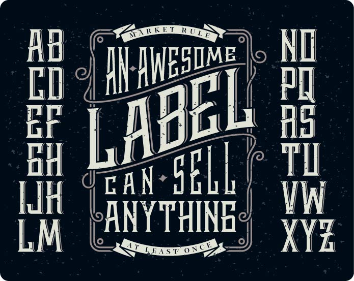
Specifically, all of these brands have a really engaging and unique logo font. Choosing a font can make or break the entire design of your brand. Therefore, it’s imperative that you have your font figured out for your business.
Here are eight tips on how the experts would go about deciding a logo font that your target audience can’t ignore.
1. What is Your Brand Identity?
Whether you operate a brick-and-mortar business or an online shop, you need to know what your brand stands for. Is it fun, professional, energetic, calming, or something completely different?
Know your business, as well as its products, and see whether a certain font relates to these factors. With your brand, you’re trying to convey a message; your font should simply aid in delivering this message in the most effective way.
Do you know your company good enough to design your logo?
2. Know Your Audience
The lifeblood of your business, your primary target audience is everything. For your logo and logo font, you’ll want to appeal to this specific crowd of people. Without a font and logo that engages these loyal customers, your business will start to plummet.
What are the demographics of your primary target audience? How old are they, which gender, what nationality, what are their hobbies, goals, occupations? Also, where will they see your logo font: Websites, banner ads, merchandise, physical ads?
Having a good grasp on who your brand resonates with will boost your brand past previous heights.
3. Know the Different Font-Emotion Pairings
When it comes to fonts, you’ll want to comprehend the basics. The difference between a serif and a sans serif could be the difference in a profitable business.
Here is a quick rundown of what each font type creates in terms of emotion:
-
Serifs: Fonts like Times New Roman, Georgia Italics, and Baskerville evokes a traditional, comfortable, and reliable feel in your readers.
-
Sans serifs: This is Helvetica Bold, Franklin Gothic, and Calibri, which translates to a clean, modern, stable message when used in your brand logo.
-
Scripts: These are your fancy typefaces, such as Bickham Script or Lavanderia, and all relate to the feelings of elegance and creativity.
-
Modern: Century Gothic, Didot Italic, and ITC Avant Garde Extra Light are a group of fonts that showcase progressive, stylish, chic businesses and trends.
-
Display: Lastly, fonts like Spaceage Round, Valencia, Cooper, and Giddyup all create this unique, one-of-a-kind feel for your brand logo.
Once you have tip #1 figured out – what your brand identity is – you can start thinking about the emotions you want your audience to feel.
4. Keep it Simple and Classic
By far the biggest tip in this list, don’t go too overboard.
Using too many fonts or colors (covered later) creates an artistic mess of your logo. Also, trending fonts could potentially be just that – a trend. You’ll want to avoid the flashy and current, opting instead for something that can remain timeless.
A clean, simple font is always preferred. Then you can use it in various mediums and be attractive no matter if the font is big, small, on a T-shirt or a billboard or a computer screen.
5. Research Your Competition
You should already be aware of what other companies in your industry are doing. As for logo fonts, it’s prudent to research which ones they’re using in their content and branding.
Now, this is not to say you should copy them. This is an incredibly lazy way of finding your logo font. Rather, learn what styles work – serif or no – and combine that with your brand’s personal touch.
Of course, only glean data on fonts from successful businesses in your niche.
6. Choose Solid Colors (But Not Too Much Color)
The color of your font is another huge emotion fueler. With the exact right hues and shades, you’ll have your audience feeling a certain way. It’s your job to make sure that feeling is what you want to sell your message.
If your brand is more calm and collected, go with grey like Apple. If you want to be youthful and exciting, red like YouTube, Coca-Cola, and Virgin is your best bet. Green promotes healthy, purple evokes creativity, and yellow provides a warm, optimistic sentiment.
The key is to not use too much color. Unless you’re Google or you have a brand name that involves a rainbow, stick to one color, maybe two. This will help with brand recognition anyways. One color, one clear font, one super slick brand logo.
7. Use Fonts Combined With Non-Word Logos
Your typeface won’t be the only facet used in your advertisements and merch.
Implementing your logo font into your non-word logo creates a full-bodied brand logo. Companies like McDonald’s, Adidas, and MasterCard use their fonts in conjunction with their main graphics (the golden arches, the three-petal flower, the red and yellow circles).
As time goes on, you can use this overall logo as a template for future versions. Going minimalistic, such as eliminating the words entirely or putting the graphic within the font, is a nice way to stay relevant.
Get creative with what’s known as typographic logos; you’ll have a special brand identity, one that everyone can get behind.
8. Incorporate Your Products Into Your Logo Font
Sometimes, you can utilize your products in the design of your logo.
Say, for instance, your business sells baseball equipment or merchandise. You can put baseball stitching in the font, paired with an elegant or sleek typeface.
Or, your health supplement made from plants could have a brand font that includes leaves in the serifs.
The possibilities are endless, so don’t be afraid to play around. It’s your company; you want to give your logo the best font for your brand message.
Use These Tips to Choose the Perfect Logo Font
Hopefully, through these eight strategies, you have a clearer picture of what your brand’s message is all about. This will directly relate to finding the ideal font logo to fully entice your customers. Do your due diligence, get your best logo font, and you’ll be on your way to an enhanced logo, more profits, and better business overall.
If you want help in creating your business’ brand logo masterpiece, learn how to make a free logo with our Online Logo Maker.
6 Logo Design Trends You Can’t Ignore in 2018
Posted on May 24, 2018 by Logo Design Tips and Tricks

Looking to revamp your business’s logo this year?
Your logo is very important to your business and your branding. It takes less than two-tenths of a second for a consumer to form a first impression based on your brand and logo.
If you want to create a logo that is sure to gain attention, check out these six logo design trends you can’t ignore in 2018.
1) Simplicity
Simplicity and minimalism are at the top of the 2018 logo trends. You will see many companies going back to the basics with their logo design. Simple logos are much easier to reproduce for marketing purposes. Simple lines and shapes make for a modern logo design.
2) Rainbow Colors
While many companies will be going the simplistic route, you will also be seeing lots of color from other businesses. Rainbow colors and gradients add life and excitement to a logo design. Think Instagram and the Olympics logos. These logos use lots of vibrant color, but they aren’t so busy that they are distracting to their audience.
3) Hidden Meanings
Hidden meanings in logos are always fun and creative. When done correctly, these logos are memorable and really stand out to customers. Some examples of companies that did this well are:
- NBC
- Amazon
- Baskin Robbins
- FedEx
These logos have hidden symbolism or meanings within them like the arrow FedEx that represents their express service and the “31” in Baskin Robbins to represent their 31 flavors. Creative, right?
4) Hand Drawn Logos
Hand drawn logos are continuing to be among the best logo design. Many small businesses are going this route to display a casual and credible feel to their customers. Creating a hand-drawn logo is a great way to make your business easily recognizable. If you are the creative type, you can make the logo yourself or outsource your idea to someone else.
5) Wide Spaced Text
Going back to simplicity, many companies are using wide spaced text for their logo design. If you have a short business name, this is a great option when you are designing your logo. Use a cool, intriguing font and you have an awesome logo for your business that is sure to gain attention.
6) Brushstroke Texture
Brushstroke logos feel very artistic. This is a great way to stand out in the crowd of trendy logos. Brushstrokes are like snowflakes. No two are so same. This makes this type of logo very authentic to each business.
Feeling Inspired by These Logo Design Trends?
When it comes to finding the best logo design for your business, you should enjoy the process. Instead of stressing out, consider getting assistance from professionals.
Take the inspiration you got from these logo design trends, and create your own logo by using our online logo creation tool to create the perfect logo for your company. Let us help you design a logo that stays true to you and your brand.
