The Secrets to Successful Ecommerce Logo Design
Posted on November 22, 2017 by Logo Design Tips and Tricks

If you’re running an online business, ecommerce logo design is more important than ever. Studies show that great logos are 13% more likely to get consumers’ attention, and 7% more likely to get them interested in the brand.
With how crowded the online marketplace is, you really need your logo to help you stand out from your competitors. You can’t just draw up an image and call it a day, though — there are a few secrets you should know to make sure you have the most effective logo possible.
Read on to learn more.
1. Keep It Simple
If you’re ambitious, you might be tempted to try to create something really intricate. However, less is more when it comes to great ecommerce logo design.
Remember that mobile browsing now accounts for over half of all time spent online. Will potential customers be able to see your logo clearly on a smartphone, or will it look cramped?
Think of the Nike swoosh. It’s about as simple as you can get, but it’s one of the most recognizable logos on the planet. Your design doesn’t have to be that minimalist, but it’s a great example to keep in mind.
2. Use The Right Colors
Did you know that nearly 90% of snap judgments about businesses were made based on color alone? Colors can change how people perceive your brand, so you should make sure that you choose the right ones.
A law firm, for example, would want to choose colors that are considered ‘serious,’ like navy. A business that advertises party products, on the other hand, could go with brighter colors like red or yellow.
Finally, think about what your logo will look like if it’s printed in black and white. It should still be just as striking in only two colors.
3. Don’t Follow Fads
It’s easy to want to hop on the latest trend in logo design or even pop culture. While there are some great trends, keep in mind that your logo needs to be able to stand the test of time. If you’ve designed it based on something that might only be relevant for another six months, you’ve hurt your business prospects.
You also don’t want to create a logo that could look outdated in a short period of time, because that just means you’ll probably have redesigns in your future.
Try to create something that will be just as relevant thirty years from now as it is today.
Make Ecommerce Logo Design Easy
You don’t have to be overwhelmed by the different rules, tips, and tricks in the logo design world. We have a service designed for entrepreneurs and business owners who want to make logo design easy.
Whether you’re an Amazon SFP or just starting out in the ecommerce world, we can help you create a logo that’s perfect for your business. If you want to create a logo quickly and without spending a ton of money, our app is for you.
You could have the perfect logo in just minutes.
Get started with our logo maker right here.
10 Tips for Designing Healthy Food Logos
Posted on November 16, 2017 by Logo Design Tips and Tricks
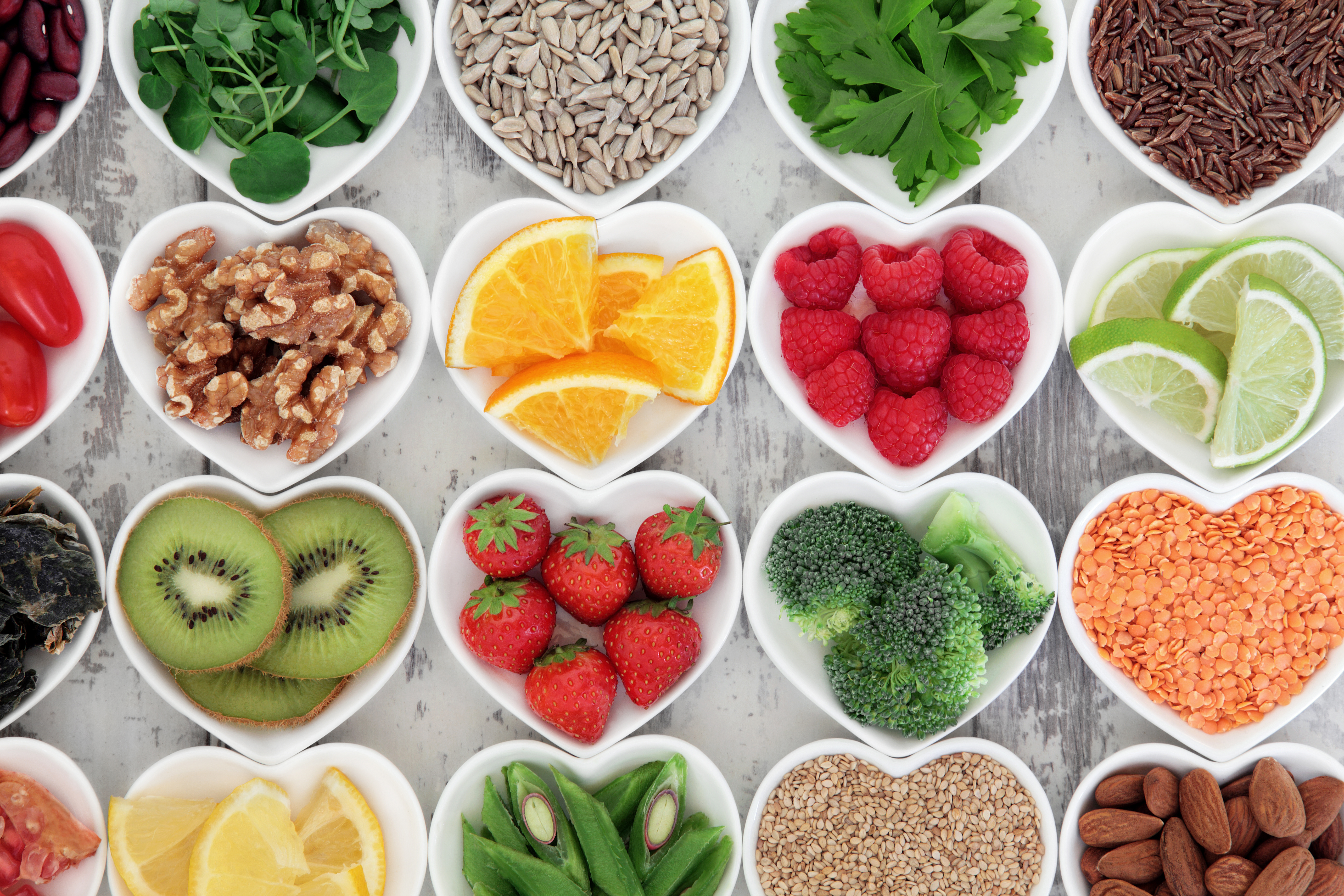
Creating a brand is all about representing who you are and what you do. It is your products as well as your purpose.
Particularly for a healthy recipe blog, it means more than having a passion for good food. Your brand is a commitment to offering quality advice on many healthy food topics.
As such, building your brand is no easy task.
Thankfully, there is one part of branding that is more fun than others – logo design.
A logo is like a ribbon wrapped around your brand. It makes the first impression and is the most recognizable part of your business.
There are many healthy food logos out there, but making a design stand out is not as hard as it seems.
Here are ten tips to making a beautiful logo for your healthy food blog.
1. Check Out the Competition
The best place to start your creative process is to get the inspiration flowing.
Check out leading recipe blogs that influence you. Better yet, look at the ones you are trying to compete with. See how they’ve branded their wording, typeface, and, of course, their logo.
The logo should be easy to identify on their page. It may stand alone or have a company phrase attached to it. Popular healthy food logos will likely have some sort of common trend.
Maybe they all have a certain shape or hint at cooking in the logo. Or, they might be simple and straightforward to the brand name.
2. Brainstorm, Brainstorm, Brainstorm
Once you have an idea of what is already working in the market, it’s time to make a logo that can handle the competition.
The first thing to do is to get all your ideas out. Make quick sketches of what comes to mind when you think of your brand. Don’t worry about making it look great yet, just get what’s in your head on paper.
From here, start to weed out the good design ideas from the bad.
Try to narrow them down to one or two healthy food logos to work on. It’s better to focus on a few quality sketches than to try to take many of them through the design funnel.
3. Think About Your Brand
If you’re having trouble picking a few logo ideas to work on, go back to your brand.
Ask yourself what will best represent your values and your writing style. Are you quirky and cool, or more calm and collected? Align your brand’s personality with the logo making process and you can’t go wrong.
For more help making a decision, put your ideas on sticky notes. Place them on a wall and start taking down the ones that you don’t think will work with your brand.
After a few minutes, you should have a much better idea of where to take your design direction.
4. Play with Shapes
The next step is to take your thoughts from paper to program. This will help your ideas for healthy food logos come to life.
As you’re getting the basic ideas on to your logo maker, start to play with shapes. Shapes carry big weight when it comes to logo design.
A circle represents strong emotional influences, like fostering community or appealing to a feminine market. The straight edges of squares and triangles hint to stability and practicality. Triangles are also associated with power and masculinity.
5. Consider Using Letters
Lines and curves don’t just affect shape psychology. They influence how typography stirs emotions in your audience.
Cursive is a cute tactic to use for women interested in health food. Men, on the other hand, appreciate bold lettering. If you want to stay gender neutral, try an angular typeface with subtle curves.
Think of the emotions you want your readers to associate with your blog.
Create a persona for them beyond the fact they want to eat healthily. This will help you picture the people you want to reach.
6. Plan for Scale
The shapes and letters you use should start to bring your logo together. These create a foundation for something meant to stand out.
Remember, your logo will be on everything you write, no matter if it’s on your blog or in an email campaign. As you use it across different mediums, you will be playing with different sizes.
Make sure your logo looks good in the corner of a social media picture and at the top of your landing page.
Plan for a logo that lasts beyond your blog. What if it ends up on a billboard one day or among other healthy food logos in a magazine?
7. Choose Your Colors
As you think about the different uses for your logo, consider how your brand colors will work with what you’ve created.
The best logos begin in black and white.
Working without color allows you to focus on the structure and feel of the logo. It also gives you an idea of how iconic a logo can be. The more recognizable and unique a logo is without color, the stronger your design is.
When you have the structure down, then play with a little bit of color to tie it all together.
8. Ask if it Can Adapt
Before you click “save” on your new healthy food logo, ask if it translates well across different mediums.
Remember, you want it to last as your business grows. Say your blog takes off and becomes a health food store or restaurant. What if you decide to write a book of recipes?
Don’t make your logo specific to just one part of what could eventually be a big business. Your logo should be timeless and adaptable.
Aim for something you can use to talk about complex culinary creations as well as simple ice cream dishes – like the one available when you click here.
9. Know the Difference Between a Logo and a Header
Don’t expect your logo to do everything. A healthy food blog has a stand-out, stylish header and a powerful logo.
A header gives you more room to play with colors, textures, and typography. There should be some similarities between these design features and those in your logo. But, you can’t just slap your logo at the top of a page and call it a day.
Take on the logo first, then design the header based off what you create. This ensures you have strong brand consistency, yet unique elements to excite readers on your blog.
10. Don’t Try Too Hard
The most important thing to do in the design process is to have fun!
Don’t pin the success of your blog on your logo. Although it is an important element of your brand, it is not worth stressing over.
Try your hand at making your own logo and see how it feels. Is this something you can commit to and move forward with? If so, you’re on the right path.
Trust your design instincts and have some close friends provide feedback. Then, write about your re-branding and get users excited to see your new healthy food logo.
Be Among the Best Healthy Food Logos
Designing a strong logo is a creative adventure.
It is not the intimidating, stressful process some think it is. All you need is a bit of inspiration, some time to design, and the right tutorials to get started.
From there, the rest is up to you and the program you use to create something beautiful.
What are you waiting for? Your logo design idea is waiting to make its debut.
Get to work and create the logo your healthy food brand needs.
Best Logo Design Trends for Your Marketing Company
Posted on November 16, 2017 by Logo Design Tips and Tricks
If you run an online marketing company, you need to stand out. There are over 100,000 advertising agencies in the United States. If your logo is bland, you can say goodbye to your customers.
You can create a sleek and unique online marketing logo easily, but there’s no surefire map to it. Instead, use your imagination.
And if you need help getting started, these five tips will supplement your creativity and help you make something special.
Hand Drawing For A Rustic Effect
Before planning your design, you need to think about your branding strategy. There’s so much you can represent with an online marketing logo, from a forward-thinking future to a rustic beauty.
The rustic effect can be effective for a number of companies, from marketing firms to e-card businesses. Maybe it could work for you.
Rustic style is more in fashion than ever. Whether you’re a logo designer or an interior designer, you feel the handmade fever. You can pay attention to it by creating a hand-drawn logo for your marketing business.
A Color-Spectrum Based Online Marketing Logo
A number of companies take advantage of the color spectrum in their logo. From the classic NBC peacock to something new and innovative like the Ravenshoe Group marketing firm, this technique offers plenty to work with.
The reason it’s so effective is simple: a color spectrum has incredible visual appeal. If you want to build a high-quality online marketing logo that people want to look at, all you need to do is embrace the rainbow.
The Power Of Minimalism
Like rustic and handmade imagery, minimalism has been in full swing for the past few years. And while we’re a bit past the fever pitch it once occupied, you can still make an amazing logo simply by accentuating the mundane.
Use basic shapes and simple lines to draw the eye. Sometimes less is more. This same idea applies to graphic design.
Contrast Is Essential
Color contrast is the only way for a logo to work. It’s easy to apply the right level of contrast to your logo, but you need to make an effort.
Luckily, there are some incredibly simple ways to design a unique and contrasting logo for your business. Use something like the Sessions College contrast wheel to help you out in this endeavor.
Every great logo embraces contrast, from MasterCard to Mountain Dew. Make sure yours does the same.
Use Our Logo Maker
If you want to design your online marketing logo, we can help. We can create you something no one else has, something that’s interesting, and can deliver your brand and business to the minds of your customers.
Don’t wait to create. Register with us today!
5 Trends to Keep in Mind When Designing a Beauty Logo
Posted on November 13, 2017 by Logo Design Tips and Tricks

Powerful logos speak messages to their audiences. What message does your company want to communicate?
As a beauty company, it’s likely you’ll want to hit on appeal and comfortability. Some of the most recognizable brands in this industry are so successful because they combine these two elements perfectly.
Think Olay, Avon, or Nivea. What do they have in common? They make their customers feel good about not only themselves but the brand itself.
When you can do this, you’re better able to gain customer loyalty.
Here are our 5 tips for creating a trendy beauty logo that will crush the game.
1. Use Modern, “Neat” Font
A logo’s font is easily one of its most recognizable elements. For a beauty brand, you’ll want to communicate cleanliness, modernity, and elegance.
We recommend using either a serif or sans-serif font that’s clean, clear, and easy to read. But, you don’t have to stick with the basics.
Look for one that will give you a contemporary edge. For instance, you can try ADAMCG Pro or Walkway Bold.
2. Color Me Pretty
Color is another highly noticeable feature that will make or break your logo. Fortunately, you have a lot of leeway for creativity.
The best color for you is really one that corresponds well with your company.
For instance, if you push towards bold and vibrant, go for electric red or pink.
Are you trying to be more of a “familiar face?” Light blue or green will do the trick.
As we all know, black is always in style.
3. Icon Mania (Maybe?)
If you want a logo with an icon or symbol, it must be completely relevant. You need to choose these images very carefully.
Some beauty companies use flowers as it’s a more feminine approach. That’s great if it works well with your brand, but if not, that’s okay, too.
Many of the top beauty brands ditch imagery for a neater look and feel. Avon and Neutrogena, for example, stick to a font that alone speaks volumes.
4. It’s All in the Name
Your business name should be the focus of your beauty logo. You should ensure that it sits at the logo’s center, and the rest is designed around it.
Why?
Because this looks fresher and more sophisticated. You don’t want other elements to overpower the name, either.
You can learn more about this by visiting Reflect’s website. As you’ll see, “Reflect” is front and center, and steals the show.
5. Beauty Logo Takeaway
The last tip we’ll leave you with is more of a general beauty branding tip. But, it’s too relevant not to mention.
Your beauty logo should mimic the idea your audience has of themselves. Beauty products allow us to express ourselves and show the world how we want to be seen.
Figure out how your audience wants to be perceived. Consider the archetype of your audience.
It will help showcase your design.
Let’s Wrap Things Up
Who knew such a small feature could carry such a heavy weight?
Luckily, you don’t have to be a pro to have an awesome beauty logo. You just need five minutes to kill and a desktop computer.
Our Online Logo Maker puts you in charge of your design.
Choose from many color palettes, font types, and more.
Get started today!


