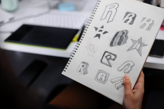
5 Steps to Successful Marketing Company Logos
Posted on December 10, 2018 by Logo Design Tips and Tricks

According to Forbes, 50% of consumers suggest their first use of a product or service is when they decide if they are going to be loyal to a company.
As brand image continues to be one of the important factors that play into whether a potential customer will give your company a chance, it is more important than ever to get your marketing company logos right.
A poorly designed logo could damage your company’s brand more than any other graphics component. The reason it could damage your brand so deeply is that you use it on every marketing piece you create.
Your marketing logo design is like your handshake before you can shake hands.
Continue reading this article to learn the five steps to take to great a marketing agency logo that will work for and not against you.
Marketing Company Logos – Your Handshake Before the Handshake
When you are working with your designers, developers and graphic artists, you need to make sure everyone is working together. Your logo should be on point with your brand, and all of your other materials should flow well with it. Failing to coordinate your teams could result in products that are great separately but not impressive when put together.
Now that you have the overall picture in mind let’s focus on your marketing logo design and the tips that will help you make a design that compliments your company.
1. Think Long-term
When you are designing your logo, you need to think long-term. Your logo is likely to evolve as time progresses. Create a logo that is easy to upgrade and freshen up as your company grows.
If you on growing a large company, you don’t want to create a logo that creates the perception you are a small business. While there is nothing wrong with a small business, you need to let your potential customers know what you are all about.
While you could rebrand and change your logo, this process will undo all of the branding work you did already.
2. What Type of Local Do You Want?
When you talk to your designer, they usually will ask you what type of logo you want. The types of logos are typography, illustrative, and abstract. Here are some examples of these logo types:
- Typography logo – A logo that is created from text. These logos can use different fonts and coloring to show your brand’s image and personality.
- Illustrative logo – These are logos that are imaged based. They usually have an image that shows what type of work your company does.
- Abstract logo – These logos use images but aren’t always images you would expect to link to your company. There may be some background or value you are trying to convey to the viewer through your logo.
You don’t have to choose one type of logo; you can create a combination of the three to find your perfect look. While you don’t need a complicated logo, you don’t want it to be too simple.
3. Color Palette
If your brand doesn’t already have a color palette, this is the perfect time to create it. Your brand’s color palette will be used in all situations from logos, website, promotional materials, team clothing and more.
As you are choosing colors, don’t simply choose colors off of what you like or what makes you feel good. There is a psychology behind colors and paying attention to what the colors do and how they make your potential clients act is important.
Depending on the country you are located, colors mean different things to different people. If you are an international company, make sure you are appealing to people globally and not only those that are in your country.
Ask your designer about a color wheel so you can get ideas for the colors you want to use for your company.
4. Choosing a Font
When you choose a font, you want to make sure it is easy to read and attractive. Like the logo of this company, you want to make sure people will remember your logo and link you to what you do when they see it.
There are so many different fonts to choose from as you’re looking through the options. You want to think of your logo as a whole and not forget about any imagery that will need to fit around the font you choose.
Fonts have different personalities. Some fonts are playful, and some fonts are serious. Choose the personality of the font you want to use to help you make your decision.
5. Don’t Be Boring
When you create your logo, you don’t want it to look like every other logo in your industry. Even if your industry isn’t a creative industry, you need to be creative or give your logo designer the freedom to design a logo that is out of the box.
Doing proper research before creating your logo can help you avoid the embarrassment of creating a logo that is too close to a competitor you hadn’t paid attention to. You won’t be helping your brand if people confuse you with your competition.
You can always use your competitor’s logos to get inspired for your own but never make a knock-off logo. Even if a brand is bigger and more successful than your brand, that doesn’t mean their style of logo is the right one for you.
As you look at the other company’s logos, see what components of the logos you like. You might like a certain shape, flow or color they used. You can put these elements into your own design but with a new flare that has your brand’s identity at the forefront.
Building Your Brand
Now that you have ideas for marketing company logos that will allow you to start working toward the perfect image for your brand, you are on the right track. Don’t stop making progress in building your brand.
Continue learning by reading our article on how to stand out from the competition today.
HR Marketing: Does Your Human Resources Logo Feel Too Impersonal?
Posted on November 29, 2018 by Logo Design Tips and Tricks

Having a good logo is important in any profession, but it’s especially crucial if you work in human resources. As a human resources firm, you want your human resources logo design to convey the right message.
If people are going to use your services, they need to be able to trust you. Your logo is the most visual representation of your company. It may be the first — or only — impression potential clients are going of off when making a decision about hiring.
Human resources is also a very personal line of work, and so you want your human resources logo to reflect that. The right colors or style could be the difference between getting business or losing it.
Below, we’re sharing some human resources logo inspiration that will get you thinking about the perfect logo for you. Read on to learn more.
1. Consider Your Brand
The best human resources logo ideas start with a clear understanding of what your brand is and what traits you want to portray. Before you start designing, you should take some time to think about the personality you want to portray to potential customers.
You likely want to come across as trustworthy, supportive, and knowledgeable, but what else? How do you want your clients to feel after they have used your services or interacted with your employees?
There is a lot that goes into human resources — from interviews to police check services, to on-boarding. To create a good logo, you’ll need to distill that down into a few simple ideas that can be represented visually.
2. Look at the Competition
Human resources logo inspiration can come from anywhere, including other companies in your industry. You never want to copy anyone else’s logo or style directly, but it can be a good source of ideas.
It’s important to pay attention to what you don’t like, in addition to what you do like. If you’re stuck on what direction you want your human resources logo design to take, it can be helpful to know what not to do.
3. Solicit Feedback
You don’t have to get your logo right on the first try. In fact, doing so will probably be impossible. Even if you know exactly what colors or text or graphics you want, there will be many possibilities for how to put them all together.
Feedback will be your most powerful tool in narrowing down your options to arrive at your final logo design. Ask trusted employees, friends in other industries, or even former or current clients. Even if there isn’t unanimous consensus, the feedback will be helpful in revising the design until you get to the finished product.
Ready to Start Designing Your Human Resources Logo?
There is a lot involved in coming up with the perfect human resources logo for your firm. You want something that will grab people’s attention, but also say the right thing about your company.
Try to keep your personal design sense out of the decision, and come up with a logo that truly represents what your company is and what you want it to be.
For more information on creating the perfect logo for your company, explore our blog.
5 Eye-Popping Logo Design Trends For Your Optometrist Business
Posted on November 28, 2018 by Logo Design Tips and Tricks
Did you know there are about 41,000 optometrists in the United States?
With so many optometrist businesses, it’s easy for an optometrist business to fall through the cracks and not get the attention it deserves.
If you want your optometrist business to set apart from the competition, you need to create an excellent logo. Here are some logo design trends to consider for your optometrist business.
1. Think of Simplicity
Your optometrist business doesn’t need flashy and over the top logo designs to attract customers. In fact, you need to be straight to the point to make your logo memorable for your clients.
The simplicity logo trend focuses on delivering a clear message without a lot of details. Those who want to modernize to appeal to a younger audience should take this approach.
For example, Optometrist Sydney has a simple and to the point logo design.
2. Clean Shapes
If you are a fan of simplicity and clean edges, you should consider clean shapes for your logo design.
Clean shapes are great to look at especially when they display subtle curves, lines, symmetry, and straight lines.
Let your clients know what your business is all about by displaying clean shapes in your optometrist logo. For example, for an optometrist business, it might seem like an obvious idea to use circles and lines to create glasses.
But you can have a lot of fun with this to not make it as obvious.
3. Make it Fun
Optometry is a serious business so one might not think to make the logo fun. However, the point is to make it memorable.
A logo will identify your business so why not make it fun and creative. You can use characters, fun colors, or any other ideas that could make your logo fun. There’s no reason why you can’t make it fun.
4. Draw Inspiration from Architecture
When you look at some buildings that are well design, you discover how aesthetically pleasing they can be. The lines are straight and everything is there for a reason.
Why not draw inspiration from architecture to put it into your building. For example, if you live in a city with an iconic skyline, you can incorporate it into your logo to let your clients know your business is based in that city.
5. Layer Patterns and Colors
Layering colors and patterns is a logo design trend that is making an impact. This logo technique includes taking advantage of colors, shade, and even texture.
It can be easy to overdo this logo trend so you need to make sure only pick a few concepts to play with. You could choose colors and shades or shade and texture. Try not to use them all at once or it could clutter the whole thing.
Logo Design Trends for Your Optometrist Business
Keep these logo design trends in mind when you design your optometrist logo.
Think about simplicity, layer patterns, and colors, and get inspired by architecture.
Need help with your logo? Contact us and we can help your logo vision come true.
Impress for Success: How to Stand Out from the Competition
Posted on November 26, 2018 by Logo Design Tips and Tricks

Your business needs to pop.
Getting noticed among countless competitors can seem like a daunting task. However, figuring out how to stand out should just be part of your business strategy. It doesn’t matter if you’re selling batteries or baking cupcakes.
Here’s what you need to do.
Update Your Website
A slow, ugly website will kill your business. It doesn’t matter if you’re not planning to sell anything online.
To glean ideas, scope out the competition’s websites. The goal isn’t to copy them but to learn from them. Are they using lots of bold, attention-grabbing colors? Is their site filled with gorgeous pictures?
Visitor management tools can help you determine if your plan is working. After reworking your website, you should see a corresponding spike in traffic.
Be Funny
Everyone, businesses and consumers alike, uses social media. There’s a good chance that your company already has a Facebook, Twitter, etc, account.
But are you putting it to good use? People don’t like rote, run-of-the-mill responses. they want humor. Excitement.
So, if you want to stand out from the crowd, try crafting a witty social media personality. Stay away from offensive humor and don’t deviate from the brand message too much.
Pick an Influencer
We live in the day of the influencer. Every day, regular people who have amassed a following on a social media platform. Finding the right person to promote your business is like finding a gold mine.
There’s a misconception that influencer campaigns are expensive. The reality is that you can spend as much or as little as you want. Instead of throwing all of your money at whoever has the most followers, find someone who appeals to your customer base.
Many people are willing to promote a company in exchange for goods.
New Advertising
Advertising is a constant expense. Your strategy should be flexible. Even if something is working, that doesn’t mean that you can’t be doing better.
Choose a bold advertising plan if standing out is important to you. Humor works for a lot of brands.
Certain brands can also get success by creating trends. Think tuxedo-wearing dogs running around a casino floor. The idea is to create a positive, alluring image that sticks wih people.
New Inventory
If your business relies primarily on selling a product, how’s your inventory? How long has the product been around? To keep people interested you might need to diversify your product line.
If that’s not an option, think of ways that your product can appeal to new consumers. If you’re selling soccer balls, think of ways to market them to retirement homes.
You’ll stand out by default if you discover a potential market that your competitors aren’t going after.
Choose a Logo
Your logo represents your brand’s spirit. If you choose something bland or unremarkable, it’ll be hard to tell your company apart from the competition. People will forget all about you.
A dynamic logo can change everything. Contact us for fresh ideas when you’re ready to get started.


