A Complete Guide to Packaging Design Software
Posted on October 23, 2018 by Logo Design Tips and Tricks

If you want to create some of your own package designs, investing in packaging design software can make things easier. Yet if you’ve never bought such software before, it can be difficult to know which option is best.
With that in mind, there are certain rules you can use to protect you from making rookie mistakes.
Keep reading to learn how you can pick the right package design software for your needs. Once you’re done, you’ll know how to find a design suite that’ll help you design professional package designs, even if you’re not a master designer.
Let’s begin!
How Much Are You Able to Spend?
It’s important you decide how much you can afford to pay for the package design software. This’ll help you narrow down your search so you don’t waste any time looking at software you’re not able to afford.
Some companies will provide a monthly payment option. This means you can just pay a small amount monthly, without having to fork out a lot up front. But if you go with this option, keep in mind that you’ll lose access if you stop paying.
Some companies will provide special rates if you’re a student. The amount you’ll be able to save will depend on the company in question. But it’s worth reaching out and asking them if they offer a discount for students and how you can enjoy this discount.
Work With Different Design Offerings
Each person has a different working style. The different package design software options on offer reflect this. You thus want to consider working with an option that best suits you. The initial software you download, might not be the best one for you.
Because of this, you should try to download a wide range of options and test them out over the period of one month. It’s worth noting that a lot of companies offer a free trial period that’ll help you develop a better understanding of the software. During this period, you can decide whether the software is right for you or not.
Read Software Reviews
Reviews can help make things easier as they’ll provide you with some expert perspective on what is best for you.
A good review should compare a wide range of offerings. It should also let you know what’s good and bad about a specific software suite. There should also be a mention of price.
Ideally, you should look for reviews that have some screenshots. Screenshots of the software allow you to see what the software looks like in action. This can help you appreciate the user experience provided by a specific software suite. If you’d like to see an example of such a review, you can read more here.
Should You Take Some Courses?
It’s worth noting that some package design suites can be quite complicated. If you have little to no experience with design, you’ll probably struggle to grasp how these software suites work. Following this, you might want to invest in some courses, to help you learn how such suites work.
There are many educational websites that’ll provide you with a selection of courses you can buy, to help you learn more about package design. These courses will teach you how to use specific software suites. But they’ll also teach you about certain graphic design rules you need to stick to, if you want to end up with good package designs.
There’s also the option of watching YouTube videos. But these videos might not have as good a production value. They might also not be as thorough as paid courses.
Try to Redesign Existing Examples
If you want to improve your skills, one thing you can do is work with existing package designs. There are two approaches you can use here. One thing you can do is try to recreate existing package designs in your chosen software suite. This can help you figure out how the software works.
Once you have this basic knowledge, you can then try to completely redesign the package in question. This can give you the chance to flex your design muscles and understand what separates a good package design from a bad.
Are You Going to Need a Printer?
If you’re getting into the package design game, you may want to produce some physical examples of your designs. To do this, you’ll need to invest in a printer.
You’ll probably want to invest in a high-end printer as that’ll ensure that your designs look good when they’re printed. High-end printers, typically allow you to print designs that closely resemble the designs you’ve developed on a computer.
If you’re going to have package design clients, you’ll likely need to print out some designs you can show your clients. If you have a high-end printer, you can ensure that the ‘examples’ look good enough to impress your clients.
The size of the printer is another thing you need to put some thought into. If you’re working with a wide range of product categories, you may need to invest in a printer that’s fairly large. This is so that your printing abilities aren’t overly restricted. For instance, you might need a printer that’s capable of dealing with A3 or even A2 sizes.
One of the biggest costs you’re going to face when using a printer is that of the ink. You might be able to get a discount if you buy your ink in bulk. Some of the newer printers are also more efficient in relation to their ink usage. Thus buying a new printer could help lower ink costs.
Packaging Design Software – Do You Know How to Pick the Right Option for You?
If you want to do any kind of package design, you’ll need the help of some packaging design software. But deciding on the right option isn’t easy.
In this post, we’ve explored how you can select the right package design software for your needs. It’s important you think about how much you can afford to pay. You also should spend some time reading the various reviews that are on offer.
Going through this process can seem like a slog. But once you find the right package design suite, you’ll be able to design awesome packages that’ll impress anyone you show them to.
Need some branding advice? Check out these 9 tips that’ll help you build your brand.
The Importance of Logos In Website Design Explained
Posted on October 23, 2018 by Logo Design Tips and Tricks

You know that designing the right logo is an essential part of your branding and print marketing process.
Your logo can help decorate your product labels, jazz up the cover of a product catalog, or even make your storefront stand out.
But have you stopped to consider the importance of logo design as it relates to your website? Are you taking the necessary steps to ensure that your logo is working as effectively in the digital world as it is in print?
This post is here to help you find out.
Keep on reading to learn more about why the use of company logos on websites — and other web presences — is so important.
We’ll also let you know where you can create stunning logo designs online.
A Logo on Your Website Builds Brand Recognition
You’ve worked hard to create products and services that you’re proud to stand behind.
However, no matter how unique what you have to offer to customers is, you’ll always have competitors. The right logo can help to set you apart from other brands within your industry. It ensures that people end up with the products they want from your brand and not the lesser version of what you have to offer from your competitors.
In other words, the right logo design can eliminate consumer confusion.
But there’s another reason for the importance of logo design within your website. A well-designed logo will increase your overall brand recognition.
This means that your customers will be able to create an instant connection between your products/services and your brand. That’s because you’ve included the main symbol of your brand, your logo, on your website.
After all, nearly 80% of Americans say that they prefer to do their shopping online.
In other words?
If you don’t brand your company online, you risk losing up to 80% of your business. Can you afford to lose 80% of your profits every quarter?
We didn’t think so.
Now, let’s talk about where else you should put your logo online.
A Logo Creates Consistency Across Your Web Presence
The importance of a logo isn’t only about helping you to increase your brand recognition on your website alone.
It also helps your target market and current customers recognize you wherever you are on the web. (Your company’s website isn’t the only place that your brand exists on the Internet — right?)
Take a look at your current social media pages.
If you have different profile pictures on your Twitter, Facebook, and Instagram pages? Your market is going to have a tough time determining if those accounts belong to your brand, or if they belong to another company with the same name.
But if your profile picture is consistently a photo of your company’s logo? Customers will know right away that it’s you.
The same goes for your third-party listing sites, like Yelp and Google My Business. Even if you write guest posts under the company name, your “About the Author” photo should be a picture of your logo design.
In brief: while using a company’s logo on your website is important for brand recognition, your website isn’t the only place that you should use it.
After all, you didn’t work so hard on creating your logo design to limit it to one place, right? And speaking of logo design…
When Should You Consider Professional Website Logo Design?
We’ve covered the importance of logo design as it relates to both your website and your overall web presence.
Now, let’s talk about how you can bring your dream design to life.
If you’re struggling to create a design that’s clean and simple but still reflective of your company’s values, hire a professional design team.
Of course, you need to know what to look for in a quality website design company. Companies like L Form don’t only help with SEO and responsive website design. They also assist you with corporate branding and logo design. Visit the site to learn more about what to look for in the right web design company.
You should also ask your web design team to help you to find the best place for your logo on your website. Remember that your company’s NAP (that’s name, address, and phone number) should appear on every page of your website. The same goes for your company’s logo.
This is because not every visitor to your website will land on exclusively your home page. If you’ve developed a strong internal and external linking strategy, they’re more likely to end up on specific blog posts or product pages.
The Importance of Logo Design: Wrapping Up
We hope that this post has helped you to understand the importance of logo design as it relates to your website as a whole.
Ready to try out some of your ideas, and see if they look as good on the page as they do in your head? Use our free online logo maker tool to get started.
Plus, even if you do decide to go with a professional web design company or graphic designer, having a few mock-ups of potential logo designs will help to make sure they understand your vision.
So, what else goes into making a strong logo design? How do you choose the right colors, fonts, and images to make a lasting impression on your market?
We’ll continue to cover all these topics and more, so keep on checking back with us for the latest logo news.
How to Create a Fun Basketball Logo
Posted on October 22, 2018 by Logo Design Tips and Tricks
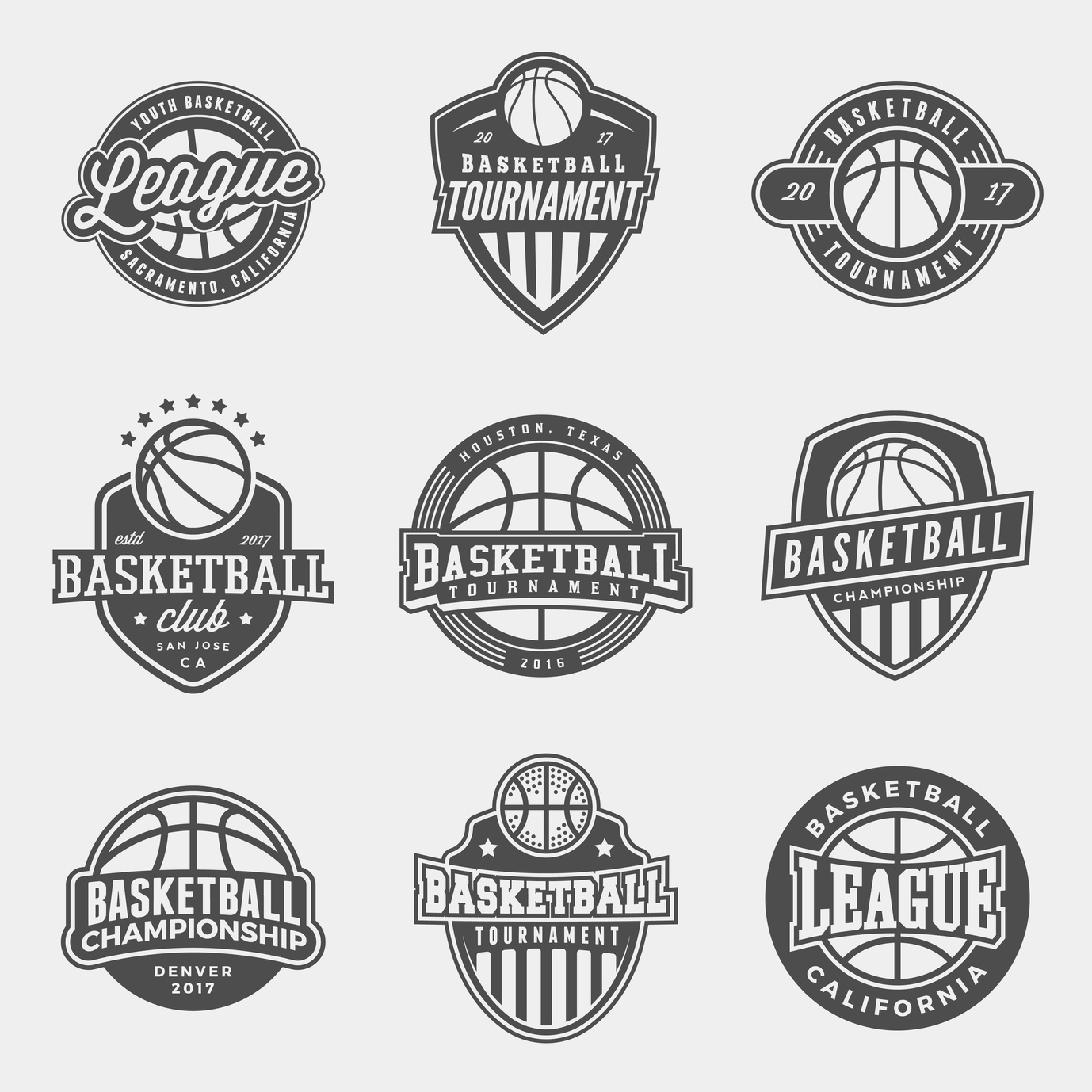
Have you been asked to design a basketball logo?
With basketball increasing its share in the sports market each year, it’s no surprise new teams are popping up all over the place.
As a result, older teams are looking to refresh their image.
A creative basketball logo helps a team to stand out. Not to mention, it can seriously increase merchandise sales. Here are the top tips for creating a perfect logo for your team, or for refreshing that old logo.
3 Tips for Creating a Fun Basketball Logo
1. Color
It’s key to have colors that stand out. High contrast and distinct color combinations will help the logo pop out on merchandise.
For example, if you visit this site about basketball hoop installation, you’ll see their logo uses yellow and green. The contrast of colors draws in your eye right away.
Try contrasting colors or simple black and white. The logo should also match the team’s uniforms, so it’s easily associated with them.
2. Get Inspired by the Game
Just like these classic NFL logos, you want your basketball logo to be inspired by the game itself.
Think about the classic NBA logo.
It’s a silhouette image of a player, in the dynamic movement of the game, running down the court, ball in hand. The image captures the excitement of the game — but is also clearly about basketball.
Gather inspiration from the game of basketball itself. The ball, the hoop, the players… all these elements can be used to capture the essence of the sport.
Keep in mind the icons you choose don’t need to be an exact depiction. Logos are known for being interpretive in their design. The image can be manipulated and stylized as long as it’s recognizable.
3. Think Simple
While it’s important to use imagery that speaks to the game, it’s equally important to keep it simple.
Choose one basic image and work off its premise. Don’t combine too many elements. The logo will be hard to remember and too crowded.
The most classic logos are extremely basic. Think of the golden arches, Nike swoosh, and classic Apple icon. They all have two things in common — simplicity and memorability.
Words also can be a part of the logo. But when it’s on merchandise or in the fine print, the words need to be easily read. Make sure your logo is recognizable no matter what size it is.
Many amazing logos in the NBA have the name of the team or town incorporated into them.
For example, the team logos for the Lakers, the Nicks, and the Raptors all incorporate their names into their logos.
Their logo, however, is still recognizable without the words. This is great for merchandising purposes.
Make Your Logo
You’re ready to make an awesome basketball logo. Just remember to:
- Think about color
- Get inspired by the game
- Keep it simple
If you use these three logo tips in your design, you’ll be sure to make a logo that resonates with basketball fans.
Need some more inspiration? Check out these sports logo ideas to get the ball rolling.
5 Smart Design Tips for the Perfect Plumbing Logo
Posted on October 19, 2018 by Logo Design Tips and Tricks

If you’ve just started a plumbing business, you’re likely interested in how you develop the perfect logo. But if you have little to no design experience, you may not know where to start.
This is a normal situation and can be easily solved once you’re aware of some basics.
Keep reading to learn 5 smart design tips that’ll help you create the perfect plumbing logo. By the time you’re done reading, you’ll know how to create a logo that’ll impress customers and even competitors.
Let’s begin!
1. Hire a Professional That Has Experience
If you want a professional looking logo, you need to hire a professional.
This might sound obvious yet when you consider the number of people offering logo design services it starts to make sense. That’s because many of these people aren’t good at designing logos. They’ll just take a templated approach and use a basic form of software to design your logo.
A professional, though, will ask you some questions about what you want.
They’ll also know how to make your logo express certain aspects of your business. For instance, suppose you provide special services for a specific area. An example might be hot water Canberra services. A professional can work out how to take this aspect of your business and incorporate it into the logo.
2. Don’t Rush
If you want your logo to look good, it’s important you don’t rush the process.
Make sure you take your time when working with a logo designer. If there’s something you don’t like, be sure to let them know and give them enough time to work on a new version.
3. Get the Opinions of Other People
It can help to get the opinions of other people. Consider asking a wide range of individuals what they think of your logo.
Be sure to get specific answers based on what they do and don’t like. You can then give this feedback to your logo designer and ask them to make the needed adjustments.
4. Do Your Research
You should also spend some time doing some research.
Find logos you like and send them off to the designer. These logos don’t need to have any kind of relation to plumbing. As long as they provide the designer with a sense of what you like, they’re fine.
5. Be Willing to Spend Enough Money
If you want a good logo it’s important you’re willing to spend enough money.
If you don’t you may end up with a logo that doesn’t look good. This can lead to it hurting the brand of your plumbing business.
Do You Know How to Design a Plumbing Logo?
Designing a plumbing logo is something that can be challenging if you don’t have a lot of design experience. But with the right tips, you should be able to make things easier on yourself.
You should think about hiring a professional and paying them a decent sum. You also want to be sure you have some examples of logos you like, which can help inspire the designer you’ve hired.
It can take some time to have your logo designed. But if you go through the needed process, you’ll eventually have something that truly meets your needs.
Designing a personal logo? Check out this post for some tips on how you can make your logo unique.


