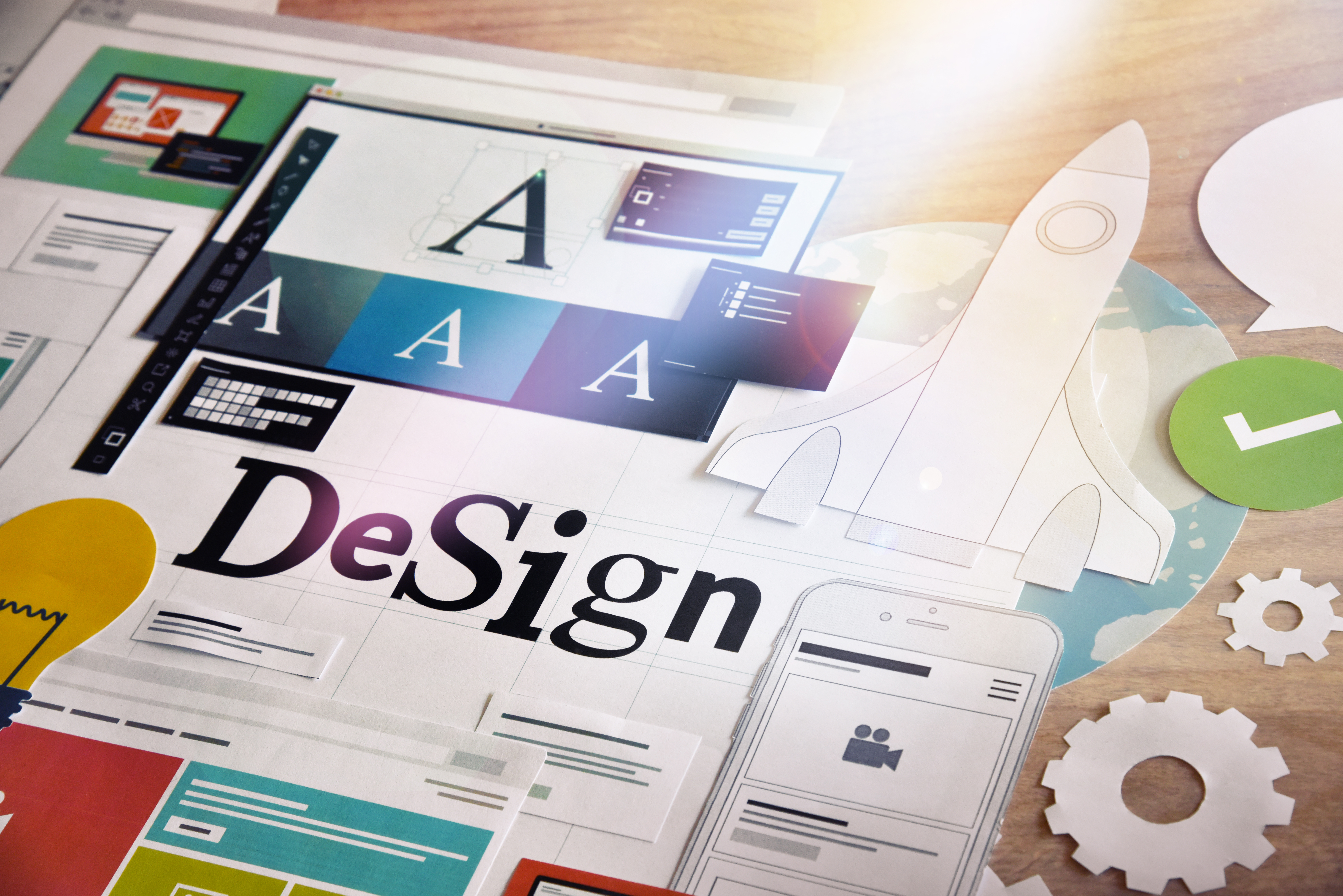
How to Design an Attractive Marketing Logo for a Facebook Page
Posted on July 11, 2018 by Logo Design Tips and Tricks
Branding and color choices can make or break a business’s chance of success. This is especially true as it takes more and more to stand out from your competition.
Because of how important logos and overall branding are, it can be stressful working on an idea for a client.
Are you currently tasked to create a marketing logo for a client’s Facebook page? Read our top seven tips below to nail it on your first shot.
Logos with Clever Double Images
Do you know what visual double entendre is? If not, that okay. Basically, it means one image can be viewed as two ideas or concepts.
Make both ideas or images relevant to your brand.
This creates interest for the viewer but also stamps your logo with a true sense of flair and authenticity. Get creative with this!
Carefully Choose Colors for a Marketing Logo
Color will evoke feelings in consumers, so you must know your client and their market. Be mindful of how your logo colors will translate to grayscale.
One other thing to consider is how your logo works with other elements on your Facebook page. If using the logo as the profile picture be sure it is cohesive with your cover photo.
It can take time to design a Facebook cover photo, but it will be well worth your time.
Less Detail is Often Better
This is a mistake people often make. They try to cram too much information into one little logo. Simple logos tend to withstand the test of time and can become iconic.
Think along the lines of Apple or Nike.
Don’t Jump on a Fad Bandwagon
Every once in a while a new idea becomes insanely popular within the logo and branding industries. Fight the urge to join in on these.
The fads will likely pass and then you are left with a logo that is either similar to many others or just will look dated in a few years.
Custom Typeface
Creating a typeface or font just for your client is one of the best ways to create a totally unique logo that will stand apart from others.
If you will be using a lot of text in a logo, don’t just use a standard preset. Clients are expecting (and deserve) more.
Be sure whatever font you end up with works well with images or other elements in the logo.
Use Negative Space
Another visual trick is using negative space. This is a trick to keep logos simple and on brand for your client. A popular example is the FedEx logo. Think about that space between the E and X.
Do you see the arrow?
Make It Meaningful
One final tip when working on a logo for a client is to make it mean something. The logo should tell at least part of a story about the brand or business.
Try to work in the core values if possible to portray trust and reliability to consumers.
Time to Create the Perfect Logo
Even if you were feeling stuck with creating a marketing logo before, with these tips you should have plenty of new ideas.
If you are ready to test out some of these ideas, check out our amazing online logo maker.
5 Ways a Stronger Logo Can Help Your CBD Company Thrive
Posted on July 11, 2018 by Logo Design Tips and Tricks

CBD is taking the vaping market and natural healing industry to new heights. This powerful substance is changing the way people think about how they consume hemp products, and why it’s beneficial in the first place.
As a business owner operating in this realm, you definitely know a thing or two about CBD’s positive effects. But, have you done a good job of communicating this to your market?
The more of an effort you make to educate current consumers and reach out to potential CBD users, the more successful your business will be. This involves doing everything from blogging about CBD to answering user questions to even having a stronger logo than the one you do right now.
Every part of your business adds up if you want to offer the best CBD experience possible. Here are a few things a strong logo design has to do with company success.
1. Catch the Eye’s of New Users
Have you ever been driving on the highway and did a double-take of a billboard you pass by? Do you often pick up products in the grocery store or at the mall because of the interesting logo the packaging displays?
CBD consumers think in the same way. Like with any other kind of shopping, when a user sees something they like, they’re going to be intrigued by it. As such, your logo needs to be interesting enough to get their attention.
A unique, out-of-the-box design is much more likely to catch someone’s eye than a boring, typical logo will. Play with different ideas if you’re trying to reach new customers.
See what other CBD companies are doing for inspiration, like Wellspring CBD which you can click to learn more info about.
2. Increase Brand Recognition
It doesn’t matter how many new customers you get if you keep losing them. Your logo also has to help build brand recognition, which in turn supports your customer retention strategy. Good logos keep people coming back for more.
Think about the most timeless logos out there. From Nike sportswear to McDonald’s fries and Apple computers, people are sometimes drawn to certain products just because of the logo they have. Create repeat business like this and your company is practically guaranteed to do well.
3. Make People Feel Something
As much as a logo’s design keeps people coming back for a few more purchases, it’s what they feel that turns them into loyal, long-term customers. Your logo has to stand for something.
Try to incorporate brand values or some sort of personal touch in your new design. You may have to give this a few tries until you get it just right, but when you do, the results will speak for themselves.
4. Establish a Strong Connection
When you stir an emotion within someone, you open a door to create a strong connection. Over time, a stronger logo design starts to build trust with users. It’s something they can look at and know they are going to get the quality they’re looking for.
This comes in handy in case something does go wrong and you need customer service to step in. It’s also useful to have such a strong logo because all it takes is seeing the logo on social media or passing by someone else using one of your products to keep building the connection you’ve established.
5. Stand Out Against the Competition
The final way a strong logo design helps your business thrive is that it makes you stand out. Think about it: the CBD market is already growing and it’s only going to get more saturated.
You need a strong logo right now if you want to stand out and stay relevant in the future. Get this taken care of and you’ll be in good standing to keep the market share you already have and continue to grow.
Start Creating a Stronger Logo Right Now!
Although a logo design has a lot riding on it, it’s not hard to come up with something great. All you need is a little bit of time to clear your mind, some inspiration to get started, and a logo making software to get the job done.
If you want to build a stronger logo for your CBD business, click here to get started.
Is a Simple Logo Design the Key to Success?
Posted on July 09, 2018 by Logo Design Tips and Tricks
It only takes a customer ten seconds to form a first impression of your brand’s logo. In that ten seconds, they’re taking in everything. And while there are a number of different elements that go into creating a recognizable logo, like color, for example, all of those elements boil down to one simple rule.
That rule is simplicity.
Whether you’re working with a designer or attempting to create your own logo, you might be tempted to jazz it up with fancy designs or a lot of colors. But, in terms of creating a recognizable, trustworthy logo, that would be a mistake.
Read on to learn more about simple logo design and why it’s important for your business and your brand.
Symbolism and Recognition
Think about the Olympic Rings icon. It’s one of the oldest and best-known examples of a graphic logo. It is instantly recognizable and impossible to be mistaken for something else.
It was created in 1912 and hasn’t changed much in the 100+ years it has been around. But even though it’s simple, it’s incredibly effective. When you look at it, you know what it stands for.
There’s a use for every element in the picture, but you don’t need to know what those uses are in order to understand and relate the picture to the Olympics. It isn’t a sports-related graphic, it’s not trying to tell you what happens during the games, but you know exactly what it means when you look at it.
This is an example of how a simple logo design can take your brand from something your customers might recognize to something that they understand completely the second they look at it.
Logo Design Basics
There are a number of qualities that all good logos have. One of those qualities, and arguably the most effective, is the simplicity and clarity of a logo.
A logo is a brand’s face. As a company builds awareness of their brand, customers begin to make connections between the logo and the brand. If a logo is complicated, it makes it much harder for customers to make that association.
It’s very easy for uniqueness to get mistaken as complicated. In fact, it’s actually pretty hard to make a unique, simple logo. It’s for that reason that a lot of people opt to create complex ones instead because they’re actually much easier to design in a unique way.
But when you consider logo designs of popular companies, like McDonalds, Target, and Apple, you see how highly simplistic logos can be immensely helpful in creating brand recognition.
Make a Lasting Impression
A simple logo is much easier to absorb and understand. They’re easy to recall later on as well. They’re often easy to associate with a positive experience because it triggers memory centers in the brain and doesn’t bog the brain down with sending an unclear message, or too many messages all at once.
Sending a Clear Message
The design of a busy logo will send a convoluted message. Your customers might connect your brand and your logo, sure. But you could be seriously damaging your brand design efforts. You want to keep your logo targeted and simple.
If you do that, the message you’re sending with your logo will be clear, concise, and much more likely to be taken at face value.
Easy Recall
It’s much easier to remember one sentence than it is to remember one paragraph. The less information you’re being asked to memorize, the better your recall will be.
A complicated logo is a lot like that long paragraph. It’s filled with information and makes it harder for the average customer to remember it exactly the way you want them to.
Word of Mouth
If your logo is simple enough to commit to memory, your customer will also be able to describe it to someone else. So when they’re trying to remember the name of your company, or where you’re located, they’ll be able to tell them what the logo looks like instead.
Easily Recognizable
When your logo is simple, you can even recognize it from the corner of your eye. A much more complicated one will take a while and will require a precise line of sight in order to fully understand.
When you’re designing a logo, you know the purpose is to bring your brand to a customer’s mind right away. The quicker and easier this process is, the better it is for your brand.
Quick Emotional Reactions
Think about one of the major brands we mentioned earlier, like McDonald’s. When you imagine that logo, all of the emotions you feel should come up to the surface immediately. This is exactly the reaction you want from your customer as well.
If a logo design is complicated, your customer’s brain will spend more time trying to put together the picture of what they’re seeing rather than what they’re feeling when they see it.
Versatility
A good logo is one that can be used in all environments.
You’ll want to put your logo everywhere. You’ll want it in print, on a t-shirt, on business cards, on the web, on ink stamps, on signs, on promotional gifts, and more. You’ll want to make sure it looks good in color and black and white. It should translate well when it’s large and when it’s small.
Simple designs are best for this purpose as well. When there’s less to see, less gets lost in translation.
Harder to Counterfeit
When your logo is full of colors and complicated design, it’s much easier for other brands to copy it. A simple change is enough to consider it fair game for them to use and steal your status and followers.
If you stick to a few colors and a simple design with minimal details, it’s much harder to fool an unsuspecting customer with a counterfeit.
How to Design a Simple Logo
Trying to create a simple, effective logo can be a lot harder than you’d expect. But when you sit down and try to come up with a strategy, you can actually understand your business better.
Think about the elements that relate to your business and simplify them. Keep it fresh, modern, and unique. You’ll surely have your own process for creating your logo, but when you keep simplicity in mind, you’ll create something effective.
Your unique taste should leave a mark and no matter what it looks like in the end, your goal is to create something that’s focused on your brand.
Keep it Simple
A simple logo design doesn’t mean a simple business. It has no sway in what your business model or message is. In fact, it actually passes along a message of awareness and understanding to your customer. You want that first ten seconds that your logo is making an impression on your customer to deliver the message that you know what they want and how to deliver it to them.
For more information on logo development, visit us today.
7 Hard & Fast Rules of Logo Making
Posted on July 05, 2018 by Logo Design Tips and Tricks
Branding is the best way to get your company noticed. It’s what you could call the summation of your marketing campaign, or even the face your company. What image you choose to project can make or break your business.
One of the biggest aspects of branding is your logo. Your chosen graphic becomes the figurehead for your company and makes your first impression.
Flashy logos project a different brand vision than subdued, text-only logos. It’s up to you what type of logo you want to project to consumers; just ensure it’s unique and representative of your vision.
However, despite the enormous variety in logo making, there are some hard and fast rules that good logos should follow. Deviate from the standard too much and you’ll send customers running in the opposite direction.
To help you get started we’re breaking down 7 rules for logo making that every business should follow. Let’s get started.
Logo Making 101
Logos are more important today than ever to represent your company. The explosion of the internet and web-enabled devices mean we’re becoming more and more visually oriented. U.S. adults spend over 10 hours per day looking at screens, and thus inevitably looking at logos.
Think tech companies for a second. Facebook, Twitter, Instagram, etc. You’re probably picturing either the website itself or its logo. They’re one excellent example of the capitalizing on screen-time with memorable logos.
So it all begs the question, what goes into a successful logo? What do you need to succeed? How do you create a logo as ubiquitous as Facebook’s or Twitter’s?
Well…
Hire a Professional
First and foremost, it’s best to consult a professional. This doesn’t mean you can’t have control over the creative process. In fact, it’s important that you do remain in control over most aspects of your logo.
However, complete control doesn’t mean shutting down suggestions from the people who design logos day in and day out. Professional logo designers know what works and what doesn’t.
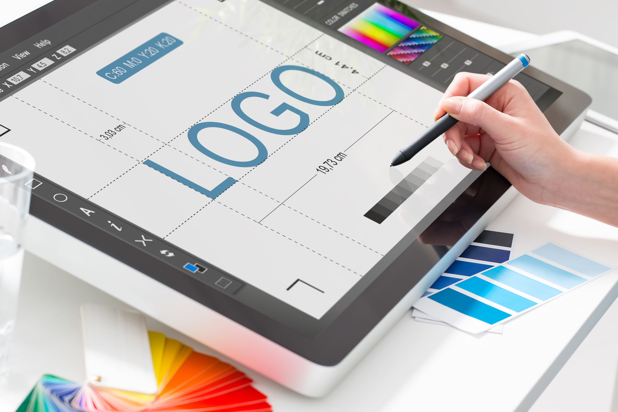
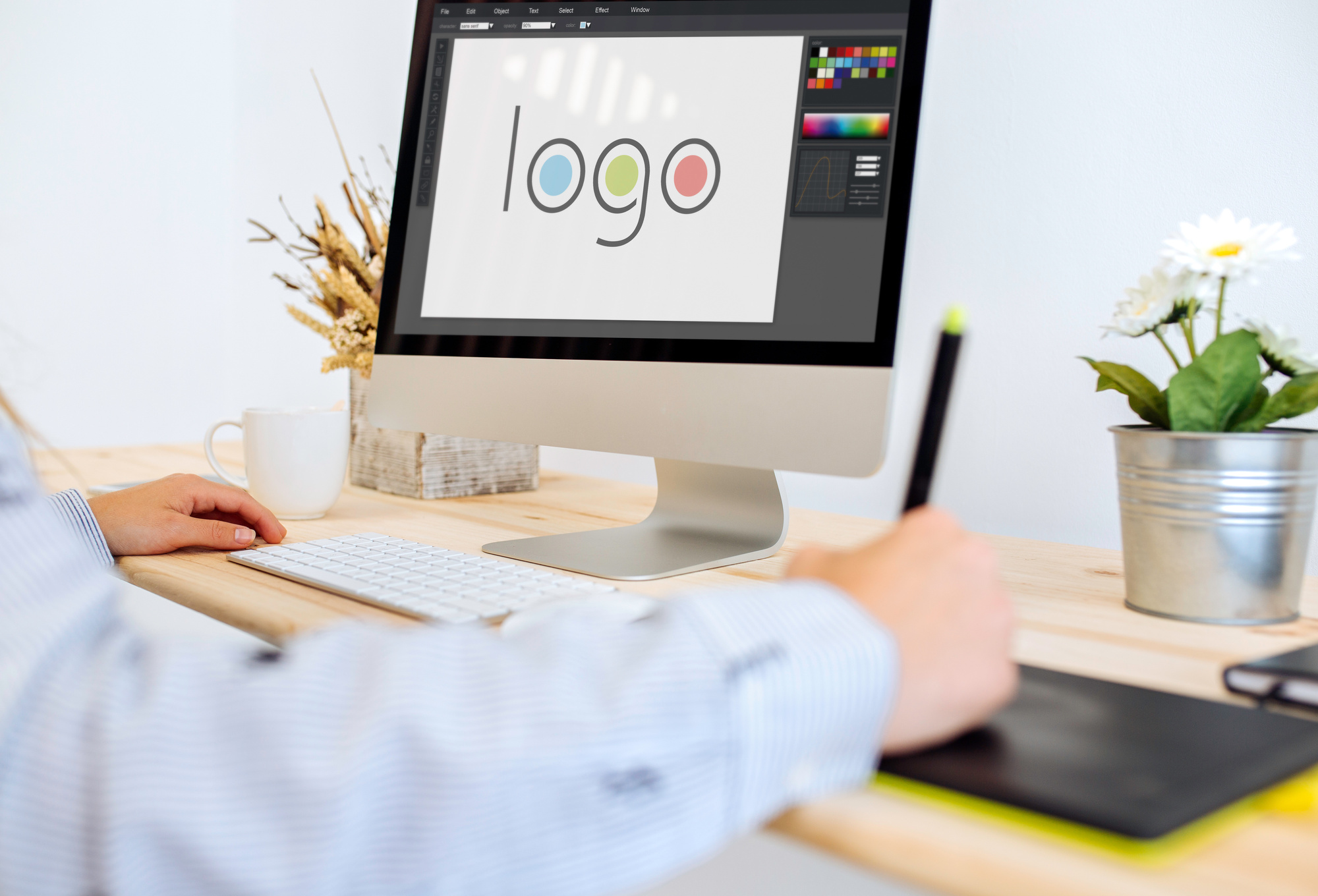
Plus, they have the expertise in actually creating your logo. Chances are your staff doesn’t have an in-house graphics professional. Logo design programs like InDesign and Illustrator take years to learn, and even longer to master.
Unique to Your Brand
Though just because you need to find a professional doesn’t mean you can’t start brainstorming in the interim. As we touched on above, keeping your logo unique is priority number one when it comes to initial design.
Think of it this way. You want your logo to remind people about your company. If it’s too similar to another company’s logo, the entire premise is gone before it started.
If you’re selling cars you want people to think of your dealership when they see tour logo. Not your dealership and the one right down the road. You need to capture as much consumer attention as possible.
Balance
So how do you keep your logo unique? Balance makes a good starting point. By balance, we mean keeping the elements of your logo proportional to one another. You don’t want the text to overpower the graphics, and vice versa.
Likewise, you don’t want color to overtake your entire design. Too much color can actually distract from parts of the logo. If someone only sees florescent yellow they might miss the text-based branding.
Scaling
After balance you’ll want to take into account how your logo scales. By scaling, we’re referring to how it looks in small, medium, and large formats. It’s almost certain that you’ll use your logos across different mediums that require different logo sizes.
The key to creating something that scales well is two-fold. First, you need to ensure the logo elements scale. This means text that doesn’t become unreadable and graphics that still look reasonable, small or large.
Second, ensure the logo gets created in the vector file format. Vector graphics use mathematical designs to create your image, and also so don’t distort when scaled.
Typography Matters
We already mentioned text several times above. While we are talking about text (again) we’re focusing this time specifically on the font. The font you choose can make or break your overall design, including your scaling.
Always strike a balance between eye-catching and readable. You want to draw in consumers but also ensure your writing is legible no matter the logo’s size or the consumer’s distance from the logo.
Match Your Brand
You can have a unique, scaling, balanced, logo with high-quality typography but still find it’s worth nothing if the logo doesn’t match your brand. After all, your chosen design needs to represent your brand in the eyes of the consumer.
The way you choose to make this happen is entirely up to your creative team and the professional you’ve hired. Twitter’s logo reminds people they’re “tweeting” with a small bird.
Facebook’s logo consists of just a blue styled “F”. It’s less direct than Twitter, but still invokes the same universal thought, “Oh, that’s Facebook.” Google, on the other hand, takes the most direct approach. Their logo is simply “Google.”
The variance in some of the most prominent logos shows that despite your choice, it’s all about capturing your brand image. Google doesn’t need much of an image, while Twitter keeps it whimsical with their bird.
Keep it Simple
Finally, just keep it simple. People need to think about your company when they see or remember your logo. You want to stay memorable, but not as the brand that has that one cool logo.
Why? While it does sound great that you’re memorable, chances are nearly 100 percent (ok, they’re 100 percent) that your company doesn’t sell logos.
Choosing a Logo Maker
Choosing a professional logo maker means finding someone known for high-quality work who has the time, experience, and resources to make sure your logo fits your vision. Logo making is time-consuming; let a professional do the work while you focus on other parts of your business.


