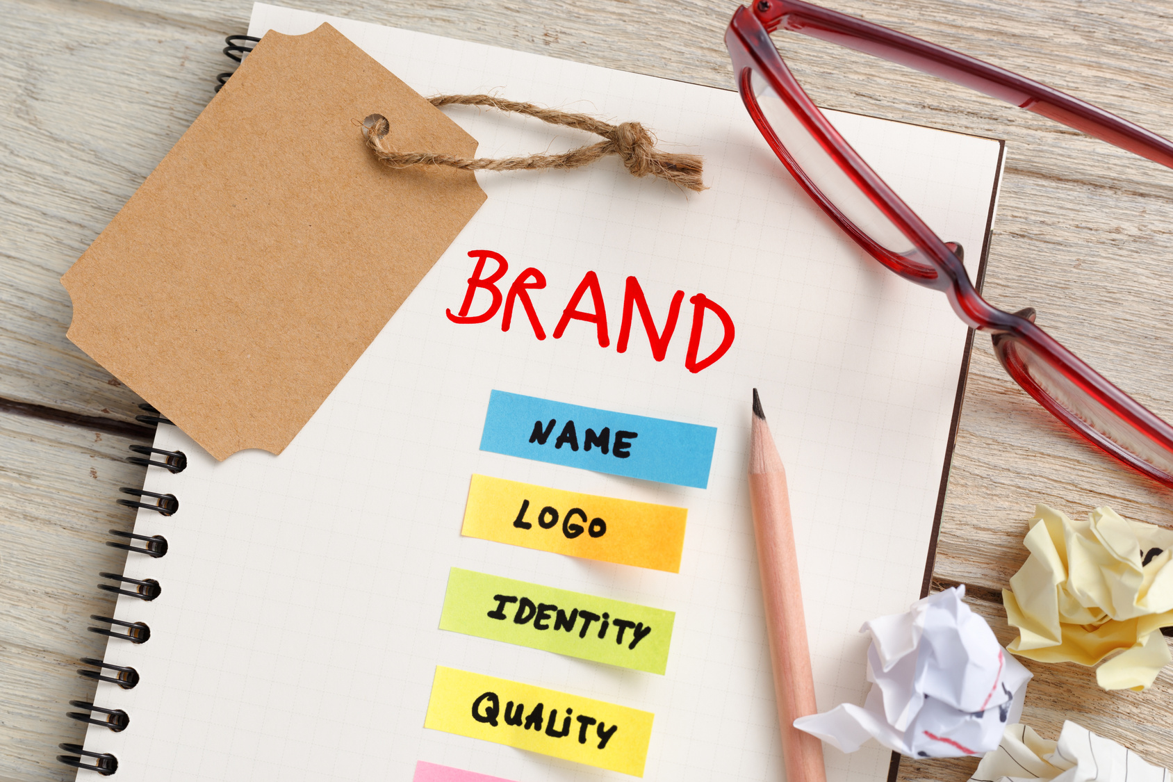
Designing a Fishing Logo to Reel in Charters
Posted on September 18, 2017 by Logo Design Tips and Tricks
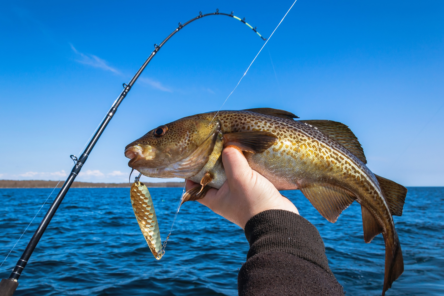
Charter fishing is a sport that’s fun for participants and lucrative for professionals.
This industry has approximately 50 million licensed fishers, who generate a whopping $48 billion in revenue. Anyone looking to get a slice of this pie needs to make their business stand apart from the competition.
To attract this crowd, charter companies need to create an amazing fishing logo while building a brand.
This guide teaches all about designing a logo with pizazz, in order to generate some revenue and succeed for years.
Consider these tips when hunting down that amazing logo.
Make A Fishing Logo That Is Fun And Inviting
Companies often make the mistake of getting too serious when it comes to their brand.
People want to think about fun and excitement when booking a charter fishing trip, so make sure the logo reflects that. Skip the realism and have a logo designer create something that is fun and cartoony instead.
Don’t forget the smile!
Making the fishing logo smile can be the difference between looking too serious and creating an emotional response in customers. An emotional response is crucial, because it opens the door for ongoing business.
This is especially important for charter fishing companies that cater to the vacation crowd. Companies like Dos Hermanos Charters have thrived in vacation spots like Cabo San Lucas, by bridging that gap and forging a bond with their customers.
Create Some Subtlety In The Message Sent
Avoid being “on the nose” when it comes to creating a logo.
While there’s power in simplicity, it’s important to create double entendres with the fishing logo. Making logos that mean more than one thing plays a fun little psychological game with the viewer.
Think about it. The dance and flirtation are half the battle. By enticing the customer, they’ll be intrigued to find out more about the charter fishing company.
Most importantly, this type of logo will stand out from the rest, making it easier to draw in new revenue.
Work With A Company That Is Familiar With The Fishing Industry
While there are many talented graphic designers, the true results come by getting on the same page with a company that understands fishing.
When searching for a logo design company, ask if they’ve ever done logos for other fishing businesses. Not only does this ensure they understand the nuances of logo creation, but also the intricacies of the fishing business.
Shop around for prices on a brand new logo, to stick to a strict budget.
A fresh new logo can cost anywhere between $85 and more than $300. This price depends on the experience of the logo designer and the amount of work that goes into this particular idea.
The more digging you do, the better understanding you’ll have on how much you can expect to pay for your logo.
Using these three tips will help to find a great logo designer.
The logo is a critical marketing tool, so never cut corners.
Follow these tips and request a meeting with a logo designer today.
5 Iconic Baby Logos to Inspire Your Parenting Brand
Posted on September 15, 2017 by Logo Design Tips and Tricks

Nearly 4 million babies were born in 2014. That means a whole lot of new parents and a whole new market for advertising and marketing.
If your business has anything to do with parenting or young children, you already know the importance of important branding.
Let’s take a look at some of the most famous and inspiring baby logos to kick start your brand’s inspiration.
Five Unforgettably Iconic Baby Logos
Gerber
Arguably one of the most famous baby logos, Gerber is synonymous with all things related to baby food, baby nutrition, and overall baby health.
The logo here is simple and clean, in an inviting blue shade, with a picture-perfect image of an adorable open-mouthed child that’s now recognized all over the world.
What’s an even cooler fun fact about this brand? In 1928, Gerber ran an advertising campaign to find the right image.
Pampers
Diapers and pull-ups — any Proud Mummy knows they’re the necessary evil of parenting. However, this winning combination incorporates a cool, green logo with a clean and optimistic font. The cheery yellow flower shape softens the blow of cleaning up after baby messes.
Take note: simple, appealing colors sell. Happy images sell, too!
With this brand, in particular, the message is loud and clear — less is more.
Wet Ones
Wet wipes. Can you ever really have enough of these bad boys? Wet ones have become a household brand name, and we don’t believe it’s due to pure downright luck.
For one, the font color is a casual and inviting blue color (evoking a peaceful sense of calm). The font also has the appearance of “looking wet,” which simply reminds the consumer of what they’re purchasing.
Fisher-Price
Known for all things fun (toys, games, outside equipment), Fisher-Price is one of those baby logos that you could pick out anywhere.
Here’s why: it’s bright red (very noticeable), in a simple and clean font, and in a distinct baby shape which almost looks like curtains, which just inherently look inviting. If a picture can tell a thousand words, a shape may be able to tell us two thousand.
Parents love it. Kids love it. What’s not to love?
Baby Einstein
Maybe it’s the bright rainbow colors. Or maybe it’s the fun, childlike font. Maybe it’s the cute cartoon-like figure with glasses.
We think it’s a combination of all of the above that has made this education company famous across the country for its learning products.
If you’re feeling stuck, take note of their fun color palette and casual, youthful font. This appeals to both children and their parents. It’s a win-win for everyone.
Final Thoughts
Developing the right baby logo for your brand needs to incorporate the right colors, font, and shape. Take some time with your project! Play around with what works best. Ask others for feedback.
And, be sure to check out our comprehensive tutorial guide for step-by-step instructions and guidance for the logo of your dreams.
5 Tips for Designing an Unforgettable Marketing Logo
Posted on September 15, 2017 by Logo Design Tips and Tricks
The first step in creating brand recognition is to have an unforgettable logo.
But, you knew that. You’re a marketing professional!
The problem is knowing how to do that. What makes a memorable logo? Something one-of-a-kind that will make potential clients stop in their tracks.
To achieve that, you don’t have to hand over the reigns to a graphic designer. You can create that all on your own. Here are 5 tips for designing a marketing logo that makes an impact.
1. Let Your Logo Tell a Story
The famous Starbucks logo represents a character in the book, Moby Dick. You don’t have to go that far when it comes to telling a story. But, you should have some meaning behind your marketing logo.
Put some thought into it before you get started. What do you want your logo to say, symbolically?
It doesn’t have to be complicated.
For example, the “M” in the McDonald’s logo represents the golden arches. Many McDonald’s restaurants don’t have the arches anymore. But, keeping that “M” tells a story about the history of the company and reminds you of french fries.
2. Choose Active Over Passive
Want to have a logo of an object or living thing? Make sure your design is active, not passive.
Meaning, it should feel like it’s in motion. As if it’s doing something. Because as a business marketing agency, you are always moving forward.
Think about the original Taco Bell logo. It was just a bell in stillness.
Now, the bell is tilted to the side, as if it’s ringing. With just a simple change it went from passive to active. It tells the story that the dinner bell is ringing, and it’s time to eat.
3. It’s All About Balance and Symmetry
The human eye perceives things that are symmetrical as more appealing. When something looks appealing, it’s becomes more memorable. That’s true of a model’s face, and it’s true in logo design.
If you’re creating an abstract logo or a logo of typography, it should feel balanced. There shouldn’t be more happening on one side of the design than the other. It should all flow evenly.
4. Colors Should Grab Attention
Colors are an important part of brand recognition. If you want to be unforgettable, you should use colors that naturally catch the eye.
There’s lots of studies behind the psychology of color in marketing. Experts say that the color yellow is the most effective for grabbing attention.
5. The Design Should Be Completely Unique
It always helps to get inspiration from other logos that you like. But, be careful to keep your design unique.
What happens when your logo reminds a client of another brand’s design? Instead of making them think of your company, they’ll be thinking of someone else’s.
Does Your Marketing Logo Need a Boost?
You don’t need to wait on an expensive graphic artist to craft a killer logo. Take these tips and get to work right now.
With a free online logo maker, you’re in control. You don’t have to be an expert to make something memorable. Take a look at this tutorial and see how easy it can be.
What to Know About Having a Logo Engraved on a Trophy
Posted on September 15, 2017 by Logo Design Tips and Tricks

Is it time for company awards again? Are you sponsoring a big event in your area?
If the answer to either of these questions is, “yes”, you need to get a trophy with your company logo engraved on it.
Engraving a logo is your chance to add a personal, yet professional touch to any award. It expresses your pride to be a part of something bigger than your business and offers a great opportunity to build brand recognition in the community.
Plus, the recipient will likely put the trophy on display, which is further company exposure.
Before sending your logo engraving order in, there are a few things to be aware of. We have everything you need to know about the process below.
1. File Format and Resolution
Do not make the mistake of thinking you can use the high-res logo file you have saved for brochures and other prints.
The best way to send your logo to get engraved is in a vector file.
High-res files are actually small pixels combined to make an image. When scaled up or down, they tend to lose their sharpness.
Vector files, on the other hand, remain sharp and smooth no matter how big or small you manipulate an image. This is because they are made of connecting lines, points, and curves.
On your computer, vector files are categorized as AI or EPS.
However, you can sometimes submit files as a PDF. If you opt for PDF, double check the resolution of your logo.
Resolution standards can vary across engraving companies, but they tend to be much higher than files used for web design or traditional print. The average resolution is around 300 DPI.
It is also good practice to submit the highest form of resolution, no matter the company minimum.
2. Color
Once you understand the required file format, consider the color of your logo.
If your standard logo has any form of color, it has to go. The only thing an engraving machine will pick up is solid black lines.
This should be an easy fix, since it is not advised to have many colors in your logo anyway.
3. Proof
Just like your company logo went probably went through a series of proofs before the final edit, ask your engraving company for a proof of your trophy.
Is the logo as big as you thought it would be? Do you think it would look better on a different part of the trophy or plaque?
The answer to these questions will be clear once you see an example of the final trophy. The proof allows you to be hands-on when creating the finished product.
Making edits before any actual engraving has been done saves time and money in the long run.
To get an idea of some trophy options and proofs, click here.
Get Your Trophy Logo Engraved
Ordering a logo engraved for the first time can be tricky if you are not prepared.
Always keep a vector file handy for special situations, and a solid black and white file helps, too. Remember to ask for proofs, then sit back while you wait for the final product!
Have you recently had a logo engraved on a trophy or other surface? Tell us about your experience in the comments below!


