Making the Case for Wordless Plumbing Logos
Posted on August 30, 2017 by Logo Design Tips and Tricks
Do you own a plumbing company? Do you need inspiration to create a new logo or redesign your old one?
Whether your company is new or it’s been around for a while, a strong logo is crucial to building your brand. Plumbing logos vary in shape, color, and design, but the newest trend is a wordless logo.
Why should you consider a wordless logo for your plumbing company? Read on for more about wordless design and why it’s the perfect choice for plumbing logos.
Increased Recognition
MasterCard recently redesigned its brand, removing all words and taglines from its logo. The new logo features just the company’s iconic yellow and red circles.
How did consumers respond to the new logo design? A full 81% of those polled instantly recognized the logo – even without the word “MasterCard.”
What’s the lesson? First of all, there’s nothing “wrong” with including words in your logo. Many companies do so successfully.
However, if your logo isn’t recognizable without the words, you’re missing out on valuable marketing opportunities. Creating a logo consumers recognize without the words opens the door to stronger advertising.
Streamlined Branding
When it comes to logo design, simplicity is key.
Think about the world’s most powerful companies. What do their logos look like?
Apple uses – well, an apple. Nike uses its famous “swoosh” mark. McDonald’s uses a pair of golden arches.
None of these brands include words in their logo. Yet, anywhere you go, you instantly know if someone’s using an Apple computer or wearing Nike shoes.
And there’s no need to McDonald’s to translate its name. Everyone in the world recognizes those golden arches.
Those simple, streamlined logos have defined each company’s brand. A wordless design can do the same for plumbing logos.
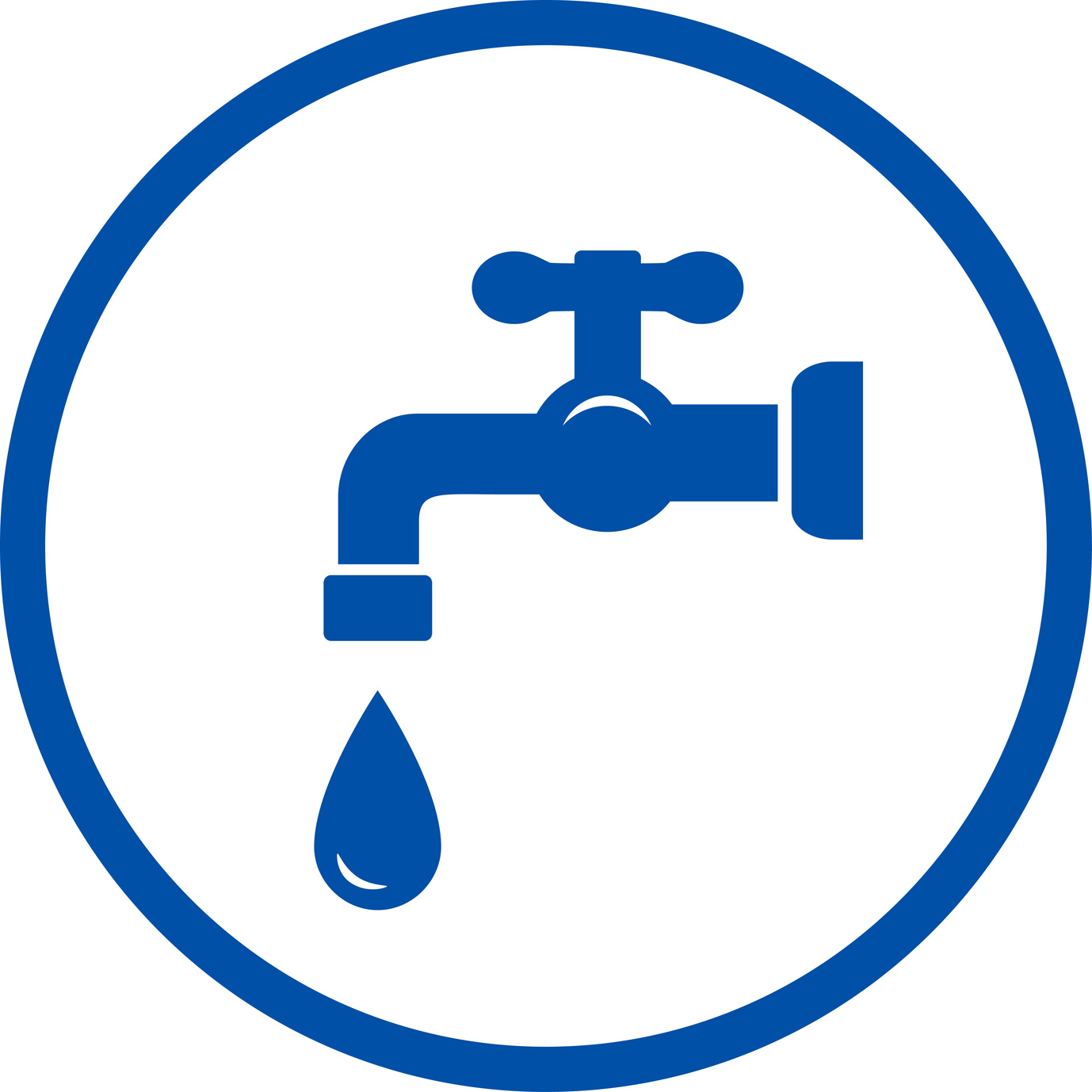
Tips for Plumbing Logos
To design a compelling plumbing logo – especially without words – what your company does should be obvious.
Common elements of plumbing logos include:
- Tools
- Pipes
- Water drops
- Faucets/taps
- A handyman
With one or more of these elements in your logo, customers won’t have to guess what service you offer. The design makes it clear you’re a plumber.
What color should your logo be? The decision is up to you, but many plumbers choose blue to convey the image of water. Blue is also associated with feelings of trustworthiness, sincerity, and integrity.
What better message could you send your future customers?
A mascot is another terrific component of a plumbing logo. You can convey a lot of information through a simple design featuring a handyman mascot.
For instance, you could portray him looking strong and capable or rushing to get a job done. No matter what action your mascot is doing, he should look friendly and inviting.
A terrific example is the cheerful mascot for Benjamin Franklin Plumbing. You can learn more about logo design by studying what successful companies like this one have already done.
Final Thoughts
Creating a compelling logo requires a lot of time and consideration.
With these handy tips, though, you’re on your way to making a powerful logo for your plumbing business.
Are you ready to get started? We invite you to use our free online logo maker to design your wordless plumbing logo.
5 Ways to Include Hidden Symbolism in Roofing Logos
Posted on August 30, 2017 by Logo Design Tips and Tricks
To succeed in the roofing and construction industry you want to be memorable for all the right reasons. A well-designed logo that embodies your business and sticks in customers’ minds is essential. A memorable logo is more likely to make people tell their friends about your business. It also encourages them to use your services again themselves.
Some of the most effective roofing logos use hidden symbolism to give their brand an extra boost in today’s competitive market.
But how do you include hidden symbolism to your roofing logo? Here are 5 ideas to get you started.
Secondary Imagery
Have you ever looked twice at a logo only to see something you didn’t the first time? That second glance would have picked up on the logo’s secondary imagery. Major brands like the Pittsburgh Zoo and PPG Aquarium and the Spartan Golf Club use this technique brilliantly.
Including secondary imagery in your logo lets you say many things about your brand at once. This gives your customers a more complete idea of who you are as a company. Incorporating it in a clever or subtle way also gives your logo the extra pop it needs to be more memorable.
Use Symbols
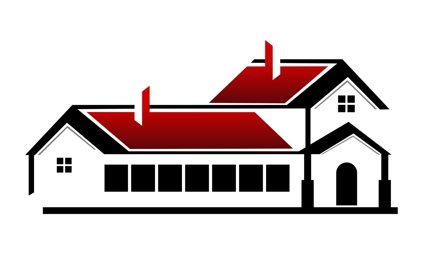
Symbols represent self-contained ideas and are understood more immediately and consistently than words. They’re also more universal – not requiring language or any related visual elements to lend meaning.
As a roofing company, symbols of a house, roof tiles, or windows are just a few that would suit your logo.
Negative Space
Negative space or white space is the space between the lettering and visual elements of your logo. Using white space to create symbols or secondary typographic imagery is a perfect way to incorporate a hidden meaning into roofing logos.
So, when you look at your logo, teach yourself to look at what’s not there. Clever use of negative space is one of the strongest tools at a logo designer’s disposal.
Clever Typography
Proper typography is an essential element of roofing logos, but it can also lend your design hidden symbolism if used cleverly. Consider the negative space between letters – can you use it to form a secondary image? Do any letters of your brand name resemble an appropriate symbol?
Letters that have an arched shape lend themselves to roof imagery, which would suit roofing logos well. For example, a company like Arlington Roofing Co could make use of the A and N in their brand name.
Create Depth With Color and Shading
Logos need to be able to work in greyscale or color, but by using different shades you can create hidden meaning in your roofing logo that’ll work in any format.
Roofing logos bring to mind imagery of buildings, construction, and arched roofs – by shading different areas of your typography or visual elements, you can create the effect of roof tiles or walls. The limit is really your imagination!
Start Designing Quality Roofing Logos With Our Free Tool
Creating a roofing logo that won’t fail is no easy task, but with a bit of creativity and our free tool, you’re ensuring your roofing company stands out from the crowd!
Tips for Creating a Memorable Legal Logo Design
Posted on August 30, 2017 by Logo Design Tips and Tricks

There are nearly 50,000 law firms in the United States alone.
This means that, if you’re in the legal profession, sometimes it’s easier to win a case than it is to beat out your competition for clients.
How can you set your firm apart without compromising your sense of professionalism?
Your legal logo is the perfect foundation for all of your future branding.
Not sure where to start when it comes to what your design should include? Well settle in, because court is now in session.
Use Recognizable Symbols
When you present your case to a court, there are a few key pieces of evidence that you have to present to your jury to ensure that they trust you and can follow your arguments.
The same goes with the specific symbols you include in your legal logo.
You need to feature images that people casually passing by on the street, or browsing online, can instantly recognize as connected to the legal profession.
For example, look at the logo of LedgerLaw. It prominently features the Scales of Justice, being held up by Lady Justice herself. It’s impossible to get confused about what this company does.
When designing your logo, think along similar lines: a gavel, a jury box, or even a judge addressing a courtroom are all excellent images to use.
Stand Out With Your Font And Color Choices
If you’re using symbols that people commonly associate with the legal profession, you’re doing a lot to boost your brand recognition.
But you still need to find a way to set yourself apart from the 20-30 other firms practicing in your area.
This is where color and font choice come into play.
When people seek out legal services, it’s generally not always for the most positive reasons. It’s likely that your potential clients feel stressed out, on edge and totally overwhelmed.
The colors you include in your logo can help them to relax, and communicate to them that you have the expertise to help them emerge victorious. Avoid colors like red, which can raise blood pressure levels in already tense future clients.
Instead, focus on blues, greens, and other softer pastel shades. This evokes a sense of calmness, yet also tells clients your laser-focused on their case.
Typography can also help you to communicate a message of strength while ensuring people don’t confuse your firm with your competitor’s. Work with a font designer to come up with a unique font that’s all your own.
In addition to using it for the text on your logo, also include this font on your website, social media handles, and even business cards.
Ready To Bring Your Legal Logo To Life?
Thanks to this post, you know what to include and what to avoid when you create your legal logo.
As with evidence, you’ll likely need to spend some serious time crafting the perfect design. Avoid the temptation to rush through the process. Instead, use our free online logo maker tool to help you create several possible options.
Then, have your team and even your social media followers vote on their favorite.
Still in need of a little inspiration? Want to take the next step when it comes to branding?
Check out our blog for invaluable advice on how to get the most out of your logo — no matter where you place it.
So, You’ve Created Your Personal Logo–Now What?
Posted on August 30, 2017 by Logo Design Tips and Tricks
Most people associate the concept of choosing a logo with companies and businesses. Brands like Nike, Apple, and Twitter are all immediately recognizable by their logos.
But the truth is that logos aren’t just for businesses. Many entrepreneurs are now creating a personal logo as a way to build their personal brand. This is especially important for small businesses, which often distinguish themselves from larger corporations by adding a more personal touch.
But keep in mind that it’s not enough to just make a personal logo and tack it on to your bio page. Instead, it’s important to take intentional steps to use your logo effectively.
Let’s take a look at what you should do next after you’ve created a personal logo.
Optimize the Design
Before you launch your logo, you want to make sure it’s communicating the message you want it to. Taking some extra time to make sure the logo is right is more important than rushing to launch it.
Feature Your Name
Your personal logo is a way to highlight yourself and build your own brand. To do this successfully, it’s important for the logo to refer to your name.
This doesn’t necessarily have to spell out your full name. You can use just a first or last name, or even just your initials. Or, if you have an online alias that you go by, you can use that.
Reveal Your Passion
You want customers to see your logo and immediately associate with both you and your business. For this reason, your logo’s design should communicate both your personality and your industry.
For instance, if you are a writer, you might want to feature a book or a writing implement in your logo. You can also use colors that communicate your purpose. Green is a good color to indicate a dedication to the environment or new beginnings.
Remember Your Audience
As much as your logo should be a reflection of yourself, remember that it should also be designed to appeal to your audience. As you create your logo, keep in mind what values your target market has, and what they expect to see in a logo.
For instance, if you have a higher-end clientele, you’ll probably want a logo that looks sleek and professional. By contrast, if you’re targeting a younger crowd, you’ll want to create a logo that is vibrant and engaging. Misjudging your audience’s expectations could lead you to create a logo that they find stuffy or unprofessional.
Get It Out There
Once you’ve created a logo that you love, it’s time to start using it. Having a strategy to put your logo to work will help you start establishing your personal brand.
Start a Blog
If you’re looking to grow your business and build your brand, learning how to start your own blog is a great idea. After all, estimates indicate that 23% of all time spent on the internet is spent reading blogs and browsing social media sites.
Featuring your personal logo prominently on your blog will help customers to start associating it with your brand. As your blog grows in popularity, your brand will as well.
Why a Blog?
In today’s digital marketing landscape, content is still king. This means that consumers want to interact with high-quality content that makes them feel informed about and connected to a particular product.
Also, when customers like content, they’re more likely to engage with it. Creating awesome blog material is a good way to get your customers to share your content on social media. This will help you expand your reach, and grow your brand even more.
Find Your Niche
Many new bloggers make the mistake of trying to cover too much territory with their blog. If your blog covers a wide range of topics, it can become hard for readers to follow. Instead, choose a narrow focus within a specific topic to focus your blogs on.
For instance, if you’re a real estate agent, don’t just blog about real estate–that’s a huge topic! By contrast, you could focus your blog on tips for first-time buyers in a certain geographic area. By choosing a focused topic like this, you can establish yourself as an authority that your readers will trust.
Build Backlinks
Once you get your blog up and running, you’re going to need backlinks. Backlinks are links from other high quality sites in your niche. These links tell Google and the other search engines that your site is important and help you rank better in the search engines.
To get backlinks, you can comment on other blogs, participate in forums, contact website owners to ask for links, write guest posts, etc. There are plenty of ways to get backlinks, so go out there and get creative!
Engage on Social Media
Blogging is just one form of media you should be making utilizing. One survey shows that 79% of adults who use the internet use some form of social media. For this reason, social media is a powerful tool for engaging with customers.
Make Your Logo Your Profile or Cover Photo
Your social media accounts are a great way to feature your logo prominently. You should consider using your personal logo as your photo for either your profile picture or your cover image. This will ensure that everyone you’re connected with on social media associates that logo with you.
Share Blog Content
Your social media accounts are a great way to distribute blog content. Your readers may not remember to check your blog every day, but they will remember to check social media every day. This way, you can encourage your followers to read your newest content.
Engage in Conversation
The keyword in social media is social. Consumers nowadays are resistant to sales pitches, or marketing approaches that seem too sales focused. Pushing your brand and your content too hard could backfire by turning people off.
Instead, share content that sparks conversations. End your blog posts with questions for your readers to answer. Host Twitter chats for customers to ask you about your products or services.
Taking these steps to add a personal touch will help make your brand more genuine. This way, when customers see your logo, they will immediately associate it with the good experiences they’ve had interacting with you.
Making a New Personal Logo
If you haven’t made a personal logo yet, it’s not too late to start!
If you want to make a new logo or update an existing one, check out our free online logo maker tool. This is a great way to let your creativity shine and build your brand.


