What You Need for a Professional Makeup Artist Logo
Posted on July 10, 2017 by Logo Design Tips and Tricks
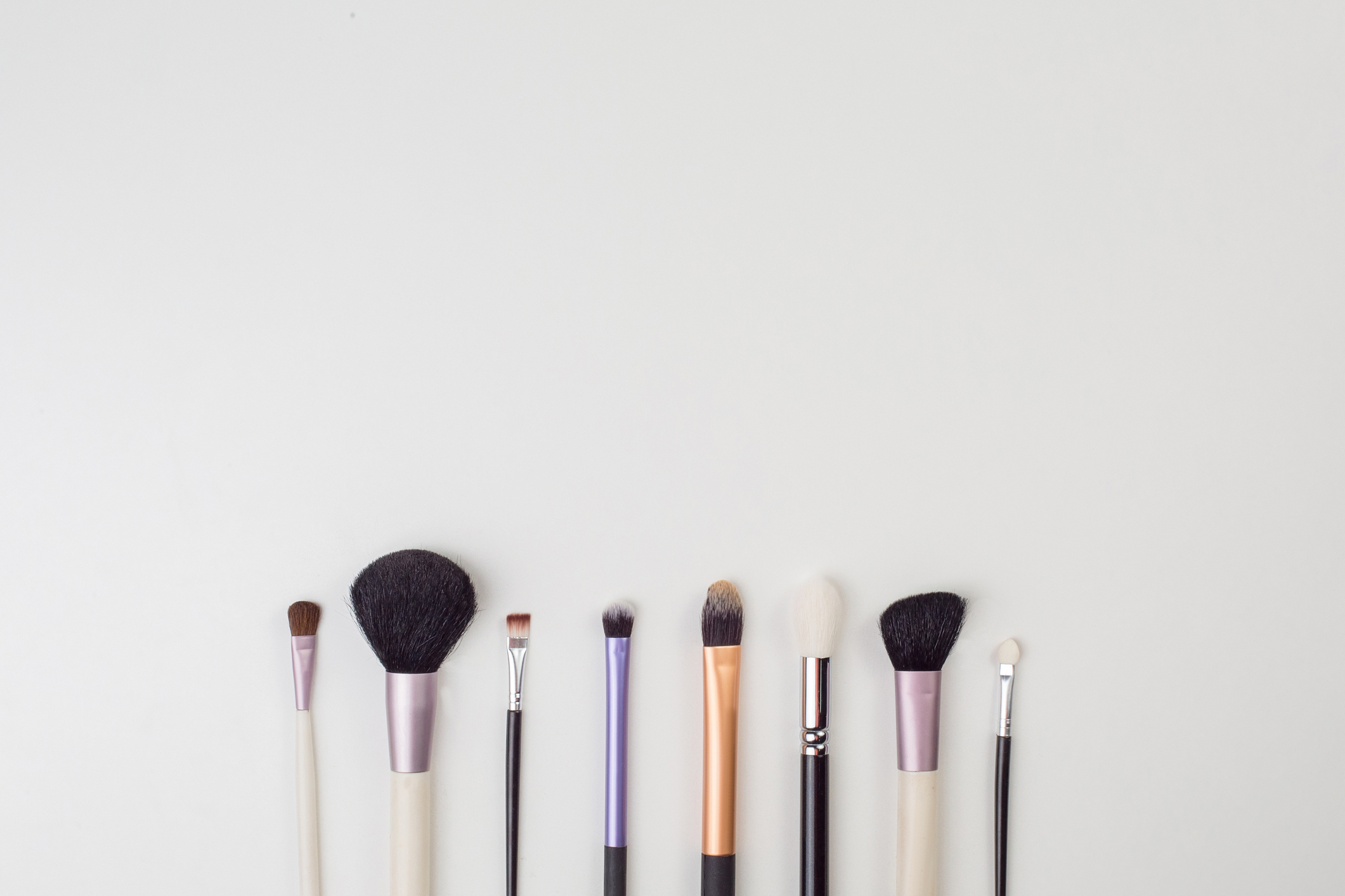
Creating a professional makeup artist logo will help your brand stand out from the competition. A logo plays a large part in building a brand’s reputation. it can also make your product more memorable.
Think of your favorite makeup company. Chances are, you can picture their logo! The fact is, by the age of eight 100% of children can match a logo to its product. A good logo helps get your product recognized and remembered.
Follow this guide and get a makeup artist logo that’s trendy and professional. Here’s exactly what you need to create an awesome logo for your makeup artist business.
How To Create the Perfect Makeup Artist Logo
These are the steps you’ll need to take to get the logo look for a successful makeup artist business.
Logo Generator
The first step in making your dream logo is to use an awesome program to generate your concept. It needs to be user-friendly and have a ton of great beauty logo designs that are both unique and beautiful.
Simple Design
Some of the most iconic brands have the simplest designs for logos. Think Apple or Nike. These brands are instantly recognizable, but also very basic and clean.
Keep this in mind as you design yours. It should be representative of your makeup artist business but also easy to identify.
Get inspired by your surroundings! As you design, think of your favorite logos and take in the products you work with.
You can even be inspired by themes! Holiday nails are especially popular. For inspiration, check out the stunning and festive designs at https://naileverything.com/pages/holiday-nail-art. They give new meaning to the famous nail art phrase, “ten tiny canvases!”
Color Choice
You want colors that compliment each other. Being in the makeup business, your makeup artist logo needs to be as beautiful as you make your clients.
Convey this to them by choosing a color palette that pops and instantly catches their attention. Your color choice in your logo is an easy way to show off your versatility and creativity!
Be Timeless
Your logo should represent your brand forever, ideally with only minor adjustments over time. A logo is more effective at creating brand awareness when its concept never ages.
Choose a design that’ll stand the test of time so you can get better life out of your logo.
Think Versatility
A great logo will be used on all your advertising mediums. Make sure your design will pop on your website, business cards, brochures, and more.
Wherever you choose to print your logo, it needs to look fantastic. Don’t forget to design a versatile logo that will work for all your makeup artist business needs.
Ready, Set, Lo-Go!
While your logo is certainly designed to intrigue potential customers and create brand awareness, the most important thing is that you love it!
Create your perfect makeup artist logo today using these steps:
- Use the best online logo generator
- Keep it simple
- Choose the right colors
- Be timeless
- Create a versatile design
Your beauty business is about aesthetics, so make sure you convey it from the beginning with a gorgeous logo. A powerful logo will set your makeup artist company apart as a memorable industry authority with great taste and an eye for detail.
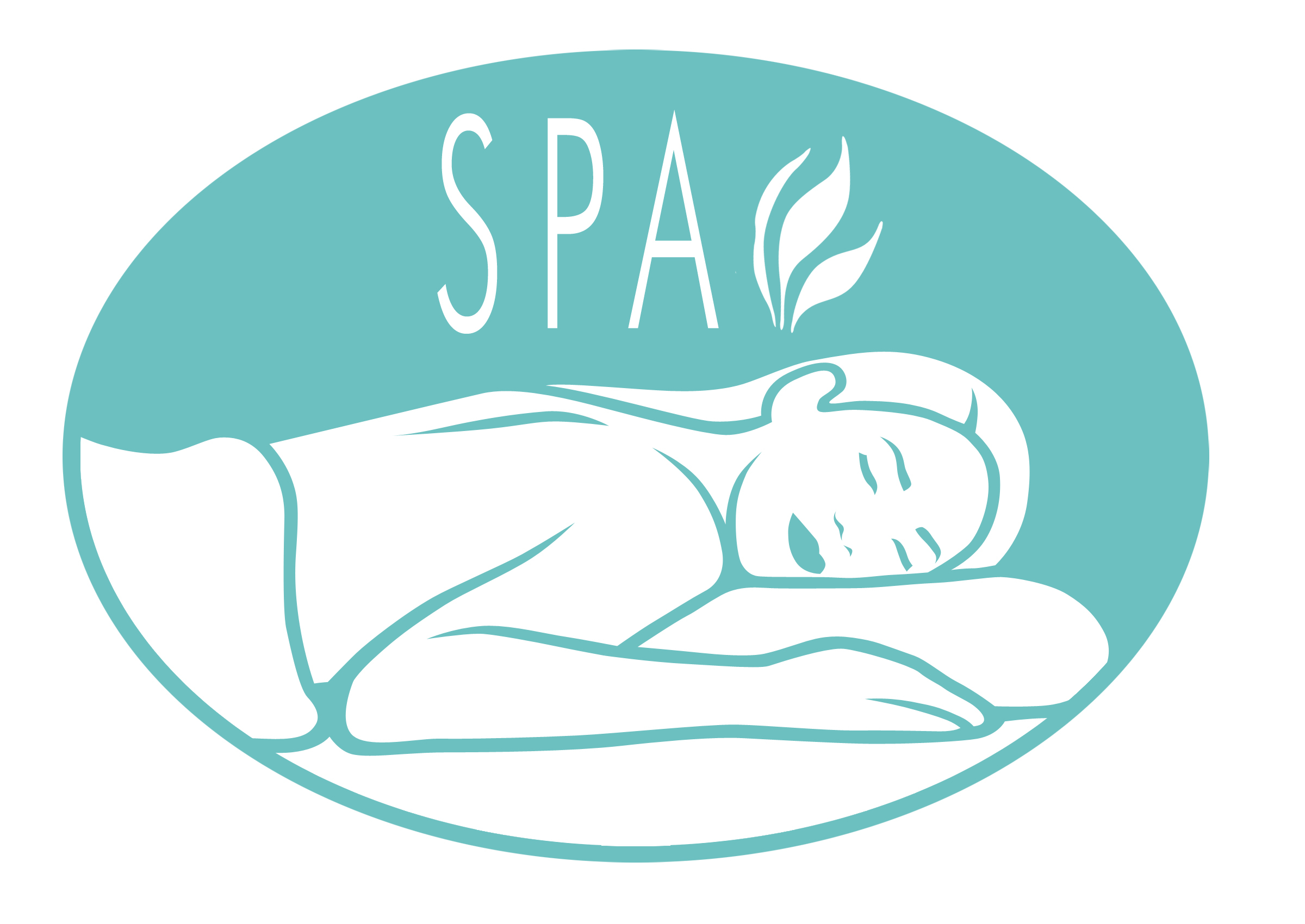
Creating a Calming Spa Logo With Positive Energy
Posted on July 10, 2017 by Logo Design Tips and Tricks
Are you looking to design a new spa logo?
Whether you’re re-branding or getting ready for your grand opening, your logo needs to do a lot in a small space. It needs to make your clients feel calm and relaxed.
Remember that your logo sets the tone for your business and helps you to attract the right clientele.
Read on to learn more about how to create the perfect spa logo, no matter which phase of business you’re currently in.
Make Your Branding Consistent
There are lots of different kinds of spa experiences. Your logo needs to make it clear to clients the kinds of services you provide. Are you an in-and-out spa, or are you aiming for a more luxury, high-end feel?
No matter the types of services you provide, your logo needs to work to communicate the overall feeling of your spa. Your logo is the core of your entire branding strategy. If you have a website and a social media presence, you need to ensure your logo is consistent with how you’ve presented yourself online.
You must also set yourself apart from your competition.
Most spa logos are clean, minimal, and unique.
Here are some things to consider when creating a calming logo that’s also unique.
Choosing The Right Spa Logo
When designing your logo, the key is to make sure that the tone of the logo matches the overall experience for customers.
Believe it or not, color plays a huge role here. After all, color evokes emotion.
Emotion is very important in spa environments. Spas are meant to help customers feel relax and rejuvenated.
Your logo needs to call to mind an oasis and an escape. In short, it has to create an alternate world. Choosing the right colors can help you to do that.
There are different meanings for different shades of color, and you’ll want the perfect combination.
While bright oranges and reds may get customers’ attention, they’re not going to set the soothing tone you’re looking for. Instead, go with blues and greens. Read on to learn more about the specifics of color.
Primary Colors in a Spa Logo
To get people perked up and active, primary colors are the way to go.
However, it may not be ideal for a spa.
You can choose softer tones of these colors if you want to create the same energy. For example, the color pink is soft and feminine. This could be a great choice to attract more women and cosmetic clients.
Light blues, yellows, and greens also evoke positive emotions and calmer vibes.
Cautionary Colors
The color yellow has many different purposes.
You can consider it a neutral and happy color that promotes a sense of healing. It also increases clients’ focus and attention. This can promote happiness and relaxation. To keep things neutral, stick with a softer shade of yellow. No neons, please.
Relaxing and Refreshing
The two most relaxing colors are blue and green.
After a calming massage, lighter shades of these colors can help clients feel refreshed. Blues are reminiscent of clear skies and calm waters.
You want to be sure that none of these colors reach a point of blandness or boredom. Play around with different hues to find the most vibrant one.
For example, look at the logo of SkinStyle Global. It uses two complimentary blue colors to show the outline of a woman’s face in total relaxation and bliss. It’s hard not to want to be in her position when viewing the logo.
Ready To Create Your Logo?
You can go in many different directions to design the right logo. Try making your own spa logo today! Your options are endless!
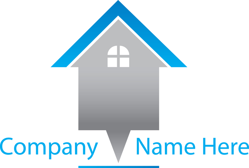
Cash for Homes Branding: Do You Need a New House Logo?
Posted on July 07, 2017 by Logo Design Tips and Tricks
A logo can make or break your business.
Even the shape of a logo can have a huge impact on how your customers view your brand.
If you’re a cash for homes business who wants to refresh your branding, then you need to perfect your house logo. We’ll take a look at some tips below on how to create a logo that cements your brand in the minds of your customers.
Make your logo clear
Your house logo should make your cash for homes business immediately obvious.
People make a huge number of snap conclusions about a company just from their logo and the colors they choose.
By refreshing your logo, you can create one that tells customers what you do without them even having to click! That’s huge in an age of short attention spans.
Using text can be a great way to reel customers in. If your logo spells out the nature of your cash for homes business, you’ll have an edge on competitors who don’t use the same technique.
Sites like Cash Offers Dallas show this in action. The combination of the stylized house in the logo along with the company’s name and text make it immediately clear what the business does.
Customers want to know what you do as quickly as possible. They shouldn’t have to dig through an “About Us” page to find out that you deal in real estate. Make sure your logo saves them the effort.
Use color psychology
Humans respond strongly to colors. This means that choosing the right color for your house logo is vital.
For a cash for housing company, you want to look at bright, optimistic colors. By doing this, you’re instilling hope in your customers. It makes you appear friendly and approachable.
Green is a good choice for cash for homes. Green is a very positive color, thanks to its usual associations with health and the environment. At the same time, you’re subtly planting the idea of money into your logo.
Blue is another good choice. It’s an optimistic color like green, but also suggests professionalism.
Consistency is key
Your logo’s design is only one part of your overall logo strategy.
When it comes to using your logo, you need to give a lot of thought to how to deploy it.
Keep your logo consistent across all promotional material. Online, that should include your website, emails, and social media accounts. Your logo design needs to read well at all different sizes as a result.
Can your logo be sized up and sized down without losing information?
Text is a useful tool. However, you’ll need to be careful about how it reads when downsized. A huge percentage of people now browse using mobile devices. This means that your logo will need to make your business clear even at these smaller sizes.
On social media, you’ll want to create matching header images for sites like Facebook and Twitter. This is a great chance to advertise your cash for homes business. You can use the banner space to highlight great deals or opportunities.
Create Your House Logo Today
Keep these tips in mind and you can make your house logo work for your business across a huge range of advertising platforms and bring customers flocking to you.
Be sure to follow our blog for more logo tips and tricks!
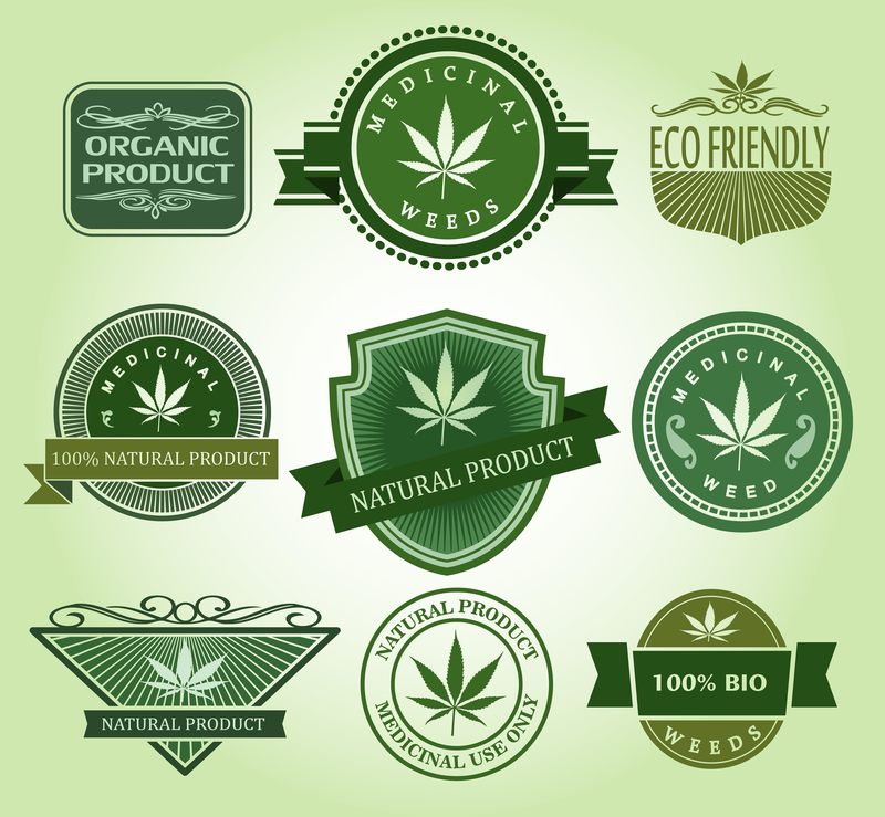
Should the Marijuana Industry Drop the Weed Leaf Logo?
Posted on July 07, 2017 by Logo Design Tips and Tricks
Eight U.S. states have legalized recreational and medicinal marijuana. Today, the legal marijuana market is worth over $7 billion. In short, it’s clear that the pot business isn’t one to take lightly.
The cannabis industry is growing. This means we’ll continue to see new brands of edibles, beauty products, raw marijuana, and more emerge as more and more states legalize it.
So, why do all marijuana logos look the same? Is the weed leaf logo tired, or should it continue to be used to identify pot-based products? Let’s look at the pros and cons.
Pro: Customers Know Exactly What It Is
Just like glasses for an eye doctor, a tooth for a dentist, or a fruit for fruit juice, when you see a weed leaf logo, you know exactly what it is.
The leaf symbol is unmistakable — you won’t find out your mom accidentally bought some thinking it was basil.
Brands like Pukka Budz have taken advantage of the leaf’s fame to brand their products. Its logo takes the traditional seven-pointed leaf and add a twist to make their brand recognizable as a marijuana producer.
However, there’s only so much you can do to make a pot leaf logo stand out. Plus, it has some negative connotations that you may want to avoid. That brings us to the Cons:
Con: Brands Don’t Stand Out
Your company logo is incredibly important from a branding standpoint. As much as you want it to reflect your product, it also needs to stand out from the competition.
If all of your rivals are using the pot leaf as a logo, then how will customers know what makes you different? One competition for new marijuana logos showed the breadth of creative logos that could come from different pot products.
The results speak for themselves. The sleek, minimalist designs for fictional pot brands were innovative. They were also easily distinguishable from each other. They also looked professional, which brings us to our second Con.
Con: The Weed Leaf Logo Has a Bad Rap
Over the years, in part from the media, weed, and its leaf logo, have become associated with tired old cliches: laziness, stupidity, and low-lives.
What we know now goes against these assumptions. Weed is prescribed by doctors, it’s legal in many states, and the taboo against its use is rapidly fading.
And a $7 million-dollar and growing industry is nothing to laugh about. But if the marijuana industry continues to use the weed leaf logo, it may dig itself into a hole. To move away from the cliches, it may need to move away from the leaf.
Some of the highest-valued brands in the world have logos that look nothing like their product–Apple, Starbucks, and Nike are just a few examples.
Creating a sleek design that identifies your product without using the weed logo is possible. It may be the direction in which the industry should go.
What do you think? Should the marijuana industry drop the weed leaf logo? Or, is it a classic look that should stay put?


