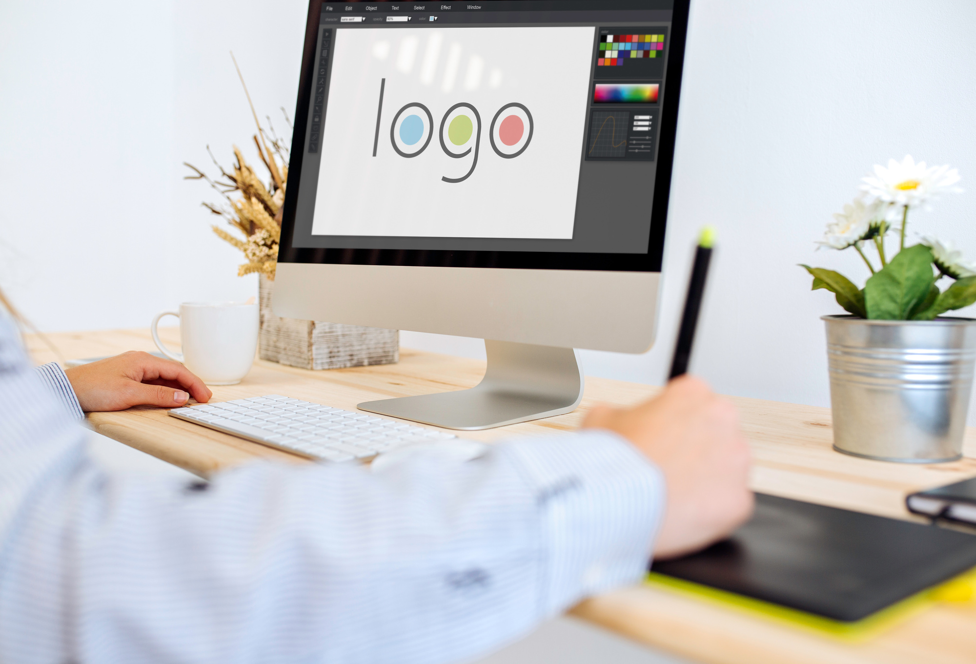
7 Hard & Fast Rules of Logo Making
Posted on July 05, 2018 by Logo Design Tips and Tricks
Branding is the best way to get your company noticed. It’s what you could call the summation of your marketing campaign, or even the face your company. What image you choose to project can make or break your business.
One of the biggest aspects of branding is your logo. Your chosen graphic becomes the figurehead for your company and makes your first impression.
Flashy logos project a different brand vision than subdued, text-only logos. It’s up to you what type of logo you want to project to consumers; just ensure it’s unique and representative of your vision.
However, despite the enormous variety in logo making, there are some hard and fast rules that good logos should follow. Deviate from the standard too much and you’ll send customers running in the opposite direction.
To help you get started we’re breaking down 7 rules for logo making that every business should follow. Let’s get started.
Logo Making 101
Logos are more important today than ever to represent your company. The explosion of the internet and web-enabled devices mean we’re becoming more and more visually oriented. U.S. adults spend over 10 hours per day looking at screens, and thus inevitably looking at logos.
Think tech companies for a second. Facebook, Twitter, Instagram, etc. You’re probably picturing either the website itself or its logo. They’re one excellent example of the capitalizing on screen-time with memorable logos.
So it all begs the question, what goes into a successful logo? What do you need to succeed? How do you create a logo as ubiquitous as Facebook’s or Twitter’s?
Well…
Hire a Professional
First and foremost, it’s best to consult a professional. This doesn’t mean you can’t have control over the creative process. In fact, it’s important that you do remain in control over most aspects of your logo.
However, complete control doesn’t mean shutting down suggestions from the people who design logos day in and day out. Professional logo designers know what works and what doesn’t.
Plus, they have the expertise in actually creating your logo. Chances are your staff doesn’t have an in-house graphics professional. Logo design programs like InDesign and Illustrator take years to learn, and even longer to master.
Unique to Your Brand
Though just because you need to find a professional doesn’t mean you can’t start brainstorming in the interim. As we touched on above, keeping your logo unique is priority number one when it comes to initial design.
Think of it this way. You want your logo to remind people about your company. If it’s too similar to another company’s logo, the entire premise is gone before it started.
If you’re selling cars you want people to think of your dealership when they see tour logo. Not your dealership and the one right down the road. You need to capture as much consumer attention as possible.
Balance
So how do you keep your logo unique? Balance makes a good starting point. By balance, we mean keeping the elements of your logo proportional to one another. You don’t want the text to overpower the graphics, and vice versa.
Likewise, you don’t want color to overtake your entire design. Too much color can actually distract from parts of the logo. If someone only sees florescent yellow they might miss the text-based branding.
Scaling
After balance you’ll want to take into account how your logo scales. By scaling, we’re referring to how it looks in small, medium, and large formats. It’s almost certain that you’ll use your logos across different mediums that require different logo sizes.
The key to creating something that scales well is two-fold. First, you need to ensure the logo elements scale. This means text that doesn’t become unreadable and graphics that still look reasonable, small or large.
Second, ensure the logo gets created in the vector file format. Vector graphics use mathematical designs to create your image, and also so don’t distort when scaled.
Typography Matters
We already mentioned text several times above. While we are talking about text (again) we’re focusing this time specifically on the font. The font you choose can make or break your overall design, including your scaling.
Always strike a balance between eye-catching and readable. You want to draw in consumers but also ensure your writing is legible no matter the logo’s size or the consumer’s distance from the logo.
Match Your Brand
You can have a unique, scaling, balanced, logo with high-quality typography but still find it’s worth nothing if the logo doesn’t match your brand. After all, your chosen design needs to represent your brand in the eyes of the consumer.
The way you choose to make this happen is entirely up to your creative team and the professional you’ve hired. Twitter’s logo reminds people they’re “tweeting” with a small bird.
Facebook’s logo consists of just a blue styled “F”. It’s less direct than Twitter, but still invokes the same universal thought, “Oh, that’s Facebook.” Google, on the other hand, takes the most direct approach. Their logo is simply “Google.”
The variance in some of the most prominent logos shows that despite your choice, it’s all about capturing your brand image. Google doesn’t need much of an image, while Twitter keeps it whimsical with their bird.
Keep it Simple
Finally, just keep it simple. People need to think about your company when they see or remember your logo. You want to stay memorable, but not as the brand that has that one cool logo.
Why? While it does sound great that you’re memorable, chances are nearly 100 percent (ok, they’re 100 percent) that your company doesn’t sell logos.
Choosing a Logo Maker
Choosing a professional logo maker means finding someone known for high-quality work who has the time, experience, and resources to make sure your logo fits your vision. Logo making is time-consuming; let a professional do the work while you focus on other parts of your business.
Top 6 Tips to Create an Awesome Vape Logo
Posted on June 26, 2018 by Logo Design Tips and Tricks
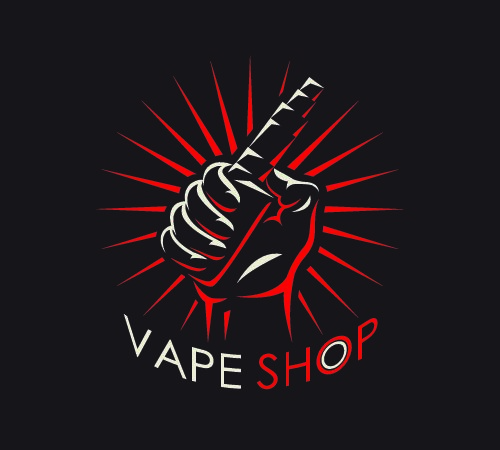
According to Yelp, there are at least 11,000 vape shops all around the US. While not all vape shops are created equal, the one way to tell them apart is their design and their logo. If you’re working on your vape logo, you need to take a few things into consideration.
Here are the 6 most important things to think about when you’re making your vape shop logo.
1. Know Your Niche
The first thing you need to assess when you’re designing a logo is who you’re designing it for. While every company wishes that their products and services appealed to absolutely everyone, it’s just not possible. There’s going to be a target market for your vape shop and you need to know who that is.
Start by doing the market research regarding who is in business near you. If you’ve got a brick and mortar shop, go visit all the shops near you before you announce the opening of your shop. If you’re already known competition, have some friends or colleagues go by and assess how the other stores are doing.
Get to know what kind of design style they’re relying on and get to know how much of the market they reflect. You don’t need to follow their lead but you should consider what they do reflective of the market at large.
Offer something new if you think there’s an untapped section of the market. If the professional vaper is catered to with the casual left behind, that could be your niche.
2. Pick A Texture
Textures reflect a lot about the kind of business you are. When you’re designing a logo, to give your logo some depth, consider what you want to reflect about your business.
Clean, metallic textures are very popular now. Because of the technology involved in vaping, it makes sense. People see vaping as the future and so people choose very metallic and modern looking logos.
However, if your vape shop is more about herbal or natural flavors and styles, you might want to go with an earthier texture. The texture of your logo can give your clients a view of the style of vape shop that you run and the kinds of products that you sell.
The texture of your logo could be a signifier that connects with your audience subconsciously and attracts them to you.
3. Corporate or Casual?
Now that you’ve figured out your target market, you need to think about what end of the spectrum they’re on. While some markets require you to have a more professional and corporate approach, some will be much more casual.
Even if you’re in a relatively relaxed college town, you might have to position yourself relative to what other businesses are around. Your vape logo needs to project the vibe you’re going for.
If a lot of new high-end restaurants have opened up near your vape shop, you’re going to need to take a more corporate or minimal approach. If your area is filled with independent record and bookshops, coffee houses, and pizza shops, you can be a lot more casual.
If you’re a high-end place for customers to refill their eliquid, you need to let customers know what you’re about from the moment they see you.
4. Colors Matter
When you’re projecting your image, the colors that you choose matter. Once you’ve decided on your target market, you need colors that connect with the lifestyle your typical client has.
If you’re trying to capture a more casual demographic, you could use more fun colors. Choose one strong color and a few muted tones to complement it. If you choose a really bright blue, you might want to pair it with grays, pastels, or other softer colors.
If you’re going for a more tech-influenced style, think about the kinds of colors used by companies like Apple. Whites, grays, soft pinks, and black are all possible contenders.
Limit your palette to about 2 colors and work within those strict parameters. Making your logo with too many colors could be distracting.
5. Use a Professional Design Program
When you’re ready to get your design into a digital program, you need to make sure you use a professional level program. While the free design programs that come with your computer might be a good place to start, they won’t give you the options you need.
You’re going to have to start design your logo with a real program, as much as you might enjoy good old MS Paint. With a professional design program, you also get the option to export your logo to a format that can ensure it always looks great.
Few things will make your audience doubt the quality of your company than a pixelated logo on a sign or on a banner. A professional design program gives you the option to export via a scalable vector format. No matter what size you stretch your logo, it will always look great.
6. Get Feedback
Once you’ve come up with an idea for your logo and exported your final version, give it to some friends and colleagues. Let them know that you want to hear some honest feedback about it. Take their feedback into serious consideration.
If it makes sense, average out their feedback. If you see their point, find ways you can accommodate their ideas without losing your original vision. While your friends and colleagues may not be your ideal audience, they can offer general tips from the perspective of consumers.
A Good Vape Logo is Memorable
Even if you don’t remember the name of a certain vape shop, a good vape logo can help you pick it out from the crowd. By sticking in your memory, a strong logo can impact your feelings about a brand. Look into the psychology of branding before you settle on any aspects of your vape shop’s design.
When it’s time to start thinking about fonts, check out our guide to picking the best font for a vape shop.
How to Use Blue in Your Logo to Convey Trust
Posted on June 23, 2018 by Logo Design Tips and Tricks
When designing or re-designing a business logo, one of the most important steps is choosing the colors.
Color can have a major impact on somebody’s emotional reaction to a brand. With the right knowledge, you can take advantage of color to benefit your company.
One of the most powerful colors is blue. This is because blue evokes feelings of trust.
In this article, we’ll show you why blue is the color of trust and how to use blue for your business.
Why is Blue Trustworthy?
Why does blue make things feel trustworthy?
Color is a favorite area of study for scientists and psychologists. Through a number of studies, they research how color affects our minds.
Despite the many studies, it’s hard to nail down a singular scientific reason our brains equates blue to trust. But we do know many correlations and associations most people have with blue.
Everybody Likes Blue
Blue is the most popular color around the world.
One study found that 42% of males and 30% of females would pick blue as their favorite color. Red and green are next on the list.
If you ask any random person what their favorite color is, they’ll probably say blue. If blue isn’t their favorite, it’s probably second or third. Very few people dislike blue, which makes it a very safe color for branding and marketing.
In simple terms, blue is a popular color.
Blue is Familiar
If you want to see blue, all you have to do is step outside and look up.
Between the blue hues of the sky above and the bluish tint of oceans and lakes, blue has some decent real estate.
Besides sky and water, blue pigment is rare in nature. Greens and browns are much more common. Its natural rarity hasn’t stopped humans from using blue in just about everything.
Walk down any given street and you’ll see blue all around you. Blue cars, blue clothing, blue mailboxes, blue signs, blue storefronts, blue packaging. This color is everywhere.
That familiarity with the color blue likely contributes to the trust factor. People are comfortable with the things they’re familiar with.
By using blue in your logo and marketing materials, you’re falling in line with a lot of other brands. This might seem counterintuitive, as you would think that making your brand stick out from the crowd would be more beneficial.
But, when it comes to being trustworthy, sticking out isn’t necessarily the best course of action.
Blue is Both Bold and Calm
Blue is unique in that it displays a vibrant boldness while also being calm and relaxing.
When you think of red, you think of power. You think of fire and heat and strength.
But you might also associate red with Darth Vader’s lightsaber or the Soviet Union or Hell. Red is powerful, but it’s often associated with evil or something sinister. Not exactly something to want for your brand.
Blue, however, shows power and confidence without the evil connotation. This is Luke Skywalker’s lightsaber, not Vader’s.
Despite being such a bold color, blue is also a calm, cool color.
Studies have shown that blue relaxes your mood, and even lowers your blood pressure. Darker blues are often recommended as bedroom wall colors to help you calm down before bed and sleep better.
Even the brightest shades of blue are easy on the eyes, compared with harsh warm colors like yellow and orange.
Blue is thus a versatile color. It’s strong and bold without being extreme. Regardless of which shade or tint you choose, you’re getting an effective, likable color that plays to many emotions, including trust.
Which Companies Use Blue?
Because of the reasons we’ve described above, blue is a very popular color to use on logos and other branding materials.
Many of the world’s largest and most recognizable corporations choose to use blue as their primary color. In many cases, the desire for the unconscious evocation of trust plays a significant role in the decision.
Banking and Finances
The financial sector is perhaps the industry which most desires and requires the trust of their clients. After all, they deal with people’s money, and often in large sums.
Banks, investment groups, and insurance companies love to incorporate blue into their color scheme to try and earn some of that color-derived trust. Here’s a collection of some of the largest financial companies that use blue in their branding:
- AIG
- Allianz
- Allstate
- American Express
- Bank of America
- Barclays
- BBVA Compass
- Capital One
- Chase
- Citi
- Goldman Sachs
- New York Life
- PayPal
- Visa
Technology
Tech companies also want to earn the trust of their customers.
Some of them, like phone and computer companies, often deal with sensitive personal information. For them to be successful, they need people to trust them to keep their data secure.
Here are some of the top technology companies with blue logos:
- AT&T
- Boeing
- Dell
- General Electric
- Hewlett-Packard
- IBM
- Intel
- Motorola
- Nokia
- Panasonic
- Samsung
- Siemens
Retail
Retail stores sell their customers products and take their money.
They need those customers to trust in the quality of their clothes, food, and other goods.
Here’s a few national retail corporations that feature blue:
- Bed Bath & Beyond
- Food Lion
- Gap
- Ikea
- Kroger
- Lowe’s
- Old Navy
- Sam’s Club
- Sears
- Wal-Mart
Automotive
When you buy and drive a car you’re entrusting your life to the sturdy manufacturing of the vehicle. If something fails, you could be looking at a deadly incident. It makes sense that auto companies desire trust, too.
These logos feature the color blue:
- BMW
- Ford
- General Motors
- Hyundai
- Mazda
- Saab
- Subaru
- Volkswagen
- Volvo
Social Media
Social networks also deal with sensitive personal information. And given some of the recent data issues with Facebook, these social media sites need all the extra trust they can get.
- Facebook
- Instagram
- Periscope
- Skype
- Twitter
News & Media
People rely on fair and impartial news outlets to get their information.
With all the talk of “fake news,” these media companies hope that some blue hues can give their readers and viewers some more reassurance:
- Business Insider
- CBS
- Forbes
- Fox
- Fox News
- ProPublica
- The Weather Channel
- USA Today
- U.S. News & World Report
How to Use Blue
It’s clear that blue is a great color to use on your logo and branding if you want to build trust with customers and clients.
So how can you incorporate blue into your marketing efforts?
Wordmark
Many of the companies listed above use a simple wordmark as a logo.
Choose a nice typeface, and make the letters blue. Straightforward, but effective.
Symbol
If you prefer to use a symbol or icon for your logo, blue is easy to use as well.
The various shapes and pictures within your symbol can utilize blue as a fill color. You can also use blue as a background color or as an outline.
Digital
Your branding goes beyond your logo.
If you want to use blue as a primary color, you need to use it across all mediums, including in the digital space.
Blue should be a central color on your website, as well as on your social media profiles. You can make menus, backgrounds, profile pictures, and banners blue.
Packaging
If you sell a product, your packaging should feature blue as well.
Boxes, containers, and wraps can all use blue. To save some money on printing, remember that the whole thing doesn’t need to be blue; products like water bottles have a clear plastic with a small branding wrap, with a colored bottle cap.
Office/Store Decor
We mentioned how blue is often a recommended wall color for bedrooms. You can also paint your store and office blue.
When somebody walks in, the blue environment will calm them down and give them a trusting feel.
Create Your Blue Logo
Want to use your new knowledge of how to use blue to create a great new logo for your organization?
Get started now by using our free digital Logo Maker.
Tips and Tricks for Effective Logo Flag Designs
Posted on June 18, 2018 by Logo Design Tips and Tricks
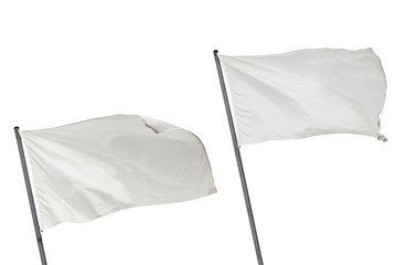
Does your company plan on using a flag? Flags are great promotional tools. There’s a reason why nations use flags. Flags are memorable and offer a great physical promotional tool.
Your company logo printed on a flag will attract new customers and will increase your brand awareness. But your efforts will pay off more when using effective flag design.
Do you need to learn a thing or two about flag designs? Creating an eye-catching flag is easy when you know the right tricks. Here are tips and tricks for effective flag design using your company logo.
Be Diverse
Anyone can relate to flags. Flags are created for social causes, for entertainment and for other industries.
Since you’re using a flag as a promotional tool, try and appeal to everyone. If you plan on using more than just your logo, go for an image or slogan that’s universal.
Niche flags will only attract a specific group. Unless your company specifically wants to attract a niche group, this can ruin your marketing.
For example, a USA flag with patriotic colors and an American-based message will only attract American customers.
If you work in the domestic American market, this shouldn’t be an issue. But international businesses may experience problems.
Always Keep It Simple
Images are worth a thousand words, and flags are no exception. So keep your flag design simple.
Most businesses only use their logo or slogan. Color schemes should be simple, such as solid colors or any color that compliments your business logo design. Make sure your logo font is easy to read.
You have a small space to work with. Lots of design and impact can clutter the flag.
Your Flag Shape Can Be Unique
Do you still want a catching flag design? Stand out with a unique flag shape.
There’s no reason to only use a square or a rectangle. Triangles, octagons, and arrows all make great flag shapes. You can also collaborate with a flag designer and create unique shapes.
Remember Distance and Movement
Flags are usually seen from a distance. What looks great up close may not look great from far away. Keep your flag simple with a large logo and solid background.
In addition, find the perfect spot for your flag. If your building is too large, display the flags on a windowsill or even on the ground.
Your flag will likely be displayed high and outside. The wind will cause it to move. Make sure your design looks catching while the flag is moving.
To best test your flag, place your flag in different areas to ensure your flag is convincing.
Now You Know Effective Flag Designs
It’s hard to stay relevant with physical promotional items, but flags never falter.
Unless you’re an expert at flag designs, choosing the best flag for your company can be difficult. As long as your logo is printed and you choose an effective background, you can ensure better brand visibility.
For more design tips, use different flag shapes, stay vague, and keep distance and movement in mind.
Do you need to create a company logo? Use our logo maker.


