Do You Have a Logo or a No-Go? A Beginner’s Guide to Creating a Logo People Will Remember
Posted on July 30, 2018 by Logo Design Tips and Tricks
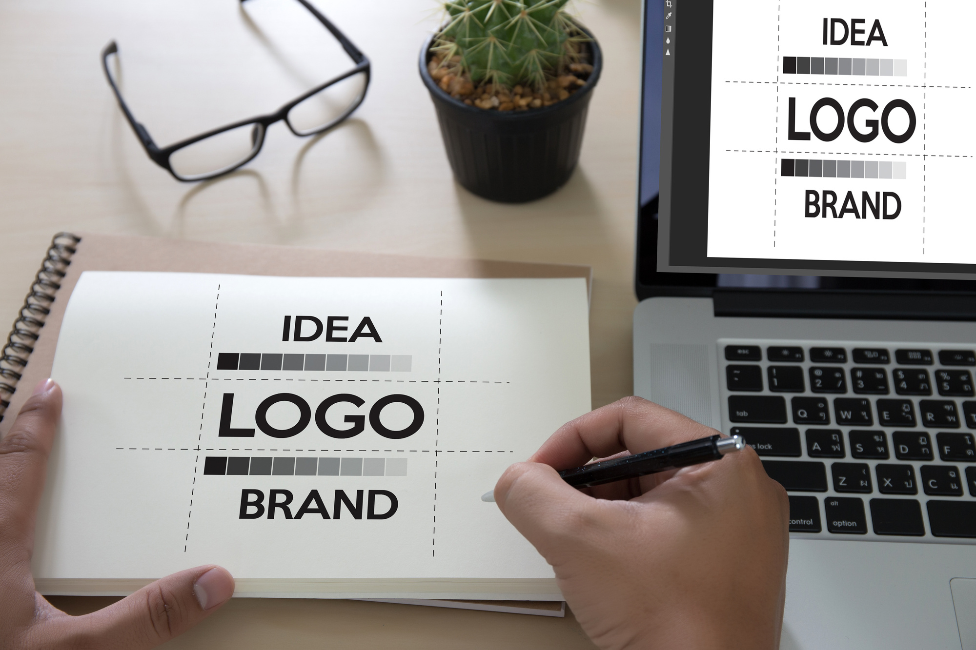
It’s possibly the most significant choice you will make for your new business, and it will impact the company into the foreseeable future.
You’re creating a logo.
It seems so simple, brainless even. After all, Coca-Cola got by with a fancy font and red letters. More thought goes into a logo than customers realize, and you’re about to find out just how much.
Do you want a logo that doesn’t stink? That’s unforgettable and inspiring?
We’ll walk you through the basic steps so that your company’s symbol doesn’t fall through the cracks.
Is It That Important?
No. It’s even more important than “that.”
Studies show 67% of 2 to 3-year-olds can successfully match logos with products. That leaps to 100% by the time those children reach 8 years of age.
Furthermore, logos have jumped off of ads and into consumers’ pockets and bags. Purchasers see them every day when they use a product or swipe through an app. This intimacy results in a higher sense of ownership and loyalty.
Research indicates this sense is so strong customers are willing to pay more for these products because they have touched them. If they see your logo and interact with it, they are more likely to buy from you.
Nowadays, encouraging those interactions is easier than ever. You can print logos on merchandise, business cards, and brochures. You can even use your logo on advertisements sent through the mail. Best of all, many companies offer printing services at an affordable price, as you can see on this website.
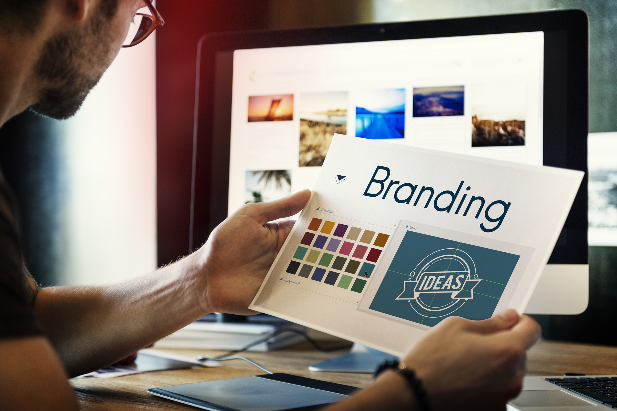
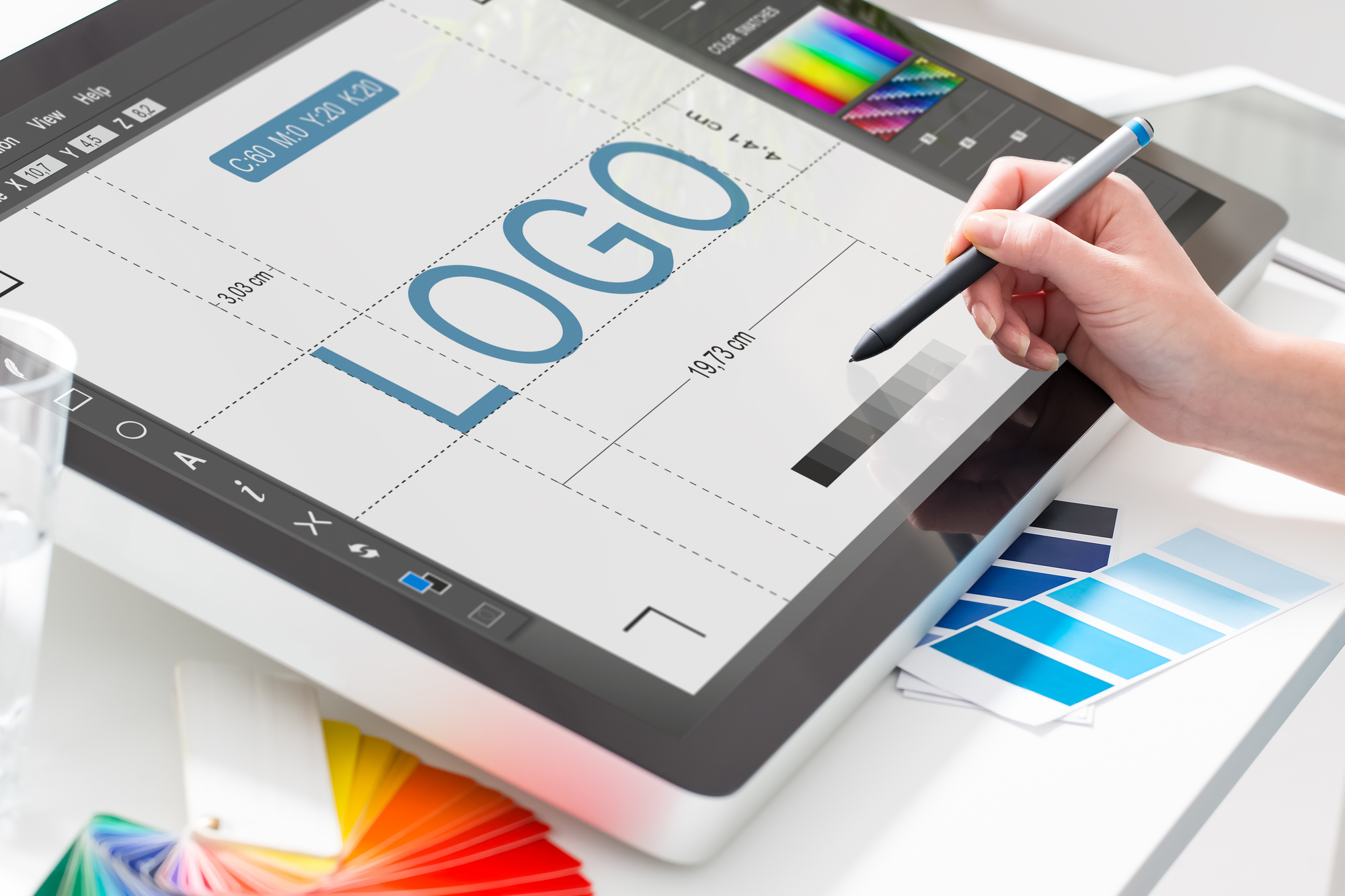
Creating a Logo
So how do you go about creating a logo that customers can interact with? There are a number of tricks, and we’ll share them all.
1. Know Your Company
Before you begin to imagine your logo, you must think long and hard about your company. Many entrepreneurs skip this step with devastating results.
A good logo holds hours of thought and research in its simple design. Empower your entire team to think about your logo.
Issie Lapowsky of Inc. writes, “The most iconic logos were conceptualized for millions of dollars employing teams of professional creative directors, art designers, and focus groups.” Then again, the Twitter logo was reportedly purchased from an artist for $6.
Either way, don’t assume that because you’re the head of a company or an executive you have a clear understanding of what your company offers the world. Assembling a team is an easy way to get diverse opinions and to test a logo for its overall success.
Ask yourself these questions:
- What is the company’s mission in my own words?
- In three or fewer words, what are its core values?
- How do I want people to feel when they think of the business?
- What products or services does it offer?
Write down your answers. They provide vital information you will use later on.
2. Research Competition
You’re still not quite ready to design. Now it’s time to research your competition.
What are other businesses using in their logos? Make a list or print them off on a single sheet.
Your goal is to make a logo that stands out, so try to rule out the images, shapes, fonts and color schemes you see consistently.
3. Decide on a Basic Image
Finally, it’s time to consider your image or words. Whatever you decide should pertain to your company and your customers.
Starbucks, for instance, has the drawing of a siren. What does this have to do with coffee?
Not much, but it has everything to do with the company’s core value and the emotion they want to invoke in customers: desire. It’s implying a commitment to give customers what they want. Just as sirens seduce sailors, your barista prepares your cup of coffee to your taste to seduce you.
Add a dash of creativity here:
- Two images wrapped into one
- One single, simple image
- The company name
- Include an image using letters or vice versa, as seen in the FedEx logo
The options are endless. One good piece of advice is to use a dynamic image, which implies movement.
Studies show dynamic images increase customer engagement. If these images connect with the business’s services or products, they boost consumer attitudes about the brand.
4. Select an Appropriate Shape
Shapes also say more than you might have bargained for.
Circular shapes convey a positive, emotional message that implies community or friendship. Squares and triangles suggest stability and efficiency.
Vertical and horizontal lines add even more emotion. Vertical lines give off feelings of masculinity, strength, and aggression while horizontal ones encourage feelings of calmness, community, and peace.
Also, consider the ease with which you can print or transfer a shape or transferred when deciding on one for your logo.
5. Consider Color Psychology
Color also plays into logos. Starbucks’s green connects to their commitment to sustainable coffee. McDonald’s yellow and red colors make viewers hungry.
The main deciding factor here is how you want consumers to feel. We’ve broken down some of the basic connotations of colors to make it easier:
- Red – intensity and passion
- Blue – depth and stability
- Yellow – energy and joy
- Green – nature
- Purple – luxury
- Orange – happiness
Color is so significant that 84.7% of customers cite it as the primary reason for a purchase. Use only one or two colors to avoid sensory overload, and make sure they relate to your company values.
Whatever main image you choose should function well in black and white, as well as in color to give the logo more marketing versatility.
6. Reflect on Typography
Font choice is as important as color should you use words in your logo.
There are two basic types of fonts: serif and sans-serif. Serif fonts are the ones with the fancy embellishments at the tips of letters. These are your Times New Roman and Century fonts.
Serif fonts evoke feelings of old-school belief systems, class and timelessness. They are professional and upstanding.
Sans-serif fonts don’t have those neat little embellishments. However, they are being used more and more in logos and marketing, as they appeal to the newer generations. These fonts emphasize youth, minimalism, out-of-the-box thinking and fashion.
Which fits your company?
7. Contemplate Symmetry and Size
You’ve gotten most of the tough stuff out of the way. Now, consider symmetry and size.
Too big and your logo risks making people run away. Too small and it appears weak. Find the size that’s just right.
The same rule applies to fonts and images. Emphasize certain parts of the logo by making them larger, but be leery.
Likewise, take a look at your symmetry. Humans like symmetry. People associate symmetry with beauty and perfection.
But it can create a cool, otherworldly sensation when used in a logo. This is the exact reason you’ll see the nose of Starbucks’s mermaid is longer on one side. Without it, she appeared frightening, so the designers changed it.
They may have been onto something. Recent studies confirm that asymmetry evokes subjective arousal and brand excitement.
8. Watch the Negative Space
Negative space is the area between images and fonts that consumes a logo if there is too much. If there is too little negative space, the logo appears cluttered.
Finding balance is integral in creating a successful logo.
Use negative space to create secondary images or to add a sense of balance to the logo. You can even use it to create shadows, to turn a “flat” image into a dynamic one or to give a 3-D feel to it.
This creates further engagement.
9. Keep It Simple and Timeless
Keep it simple. Simple is strong and timeless.
It’s also easy for your customers to remember.
This isn’t a rule, per se. First and foremost, logos should convey something about a company. If you want your company’s image to be one of nuance and intricacy, your logo should be, too.
10. Suggest a Story
Your logo should have a story behind it. Nike’s symbol isn’t just a “swish.” It’s a wing.
In fact, it’s a Greek goddess’s wing.
Whatever logo you settle on, it should tell a story. Sometimes, this implication is in the image’s simplicity or, like Starbucks’s mermaid, in curiosity about its connection to the company.
11. Create and Test
Once you’ve created several designs, go back through the checklist to see if your design holds up to all the characteristics mentioned here. If it does, it’s time to create it online.
Use our free online logo maker to test it out and play with the elements. Don’t restrict yourself and save several different designs.
Print them off and show them to your team. Ask for their first impressions and after-impressions. Discuss, re-evaluate and try again.
Eventually, you’ll decide on a logo everyone likes. But don’t stop there. Show it to random acquaintances who aren’t familiar with the company to get their opinions, too.
Strong Symbols
If you follow these 11 steps, you’ll find success in creating a logo that people will remember. Take your time, don’t be afraid to mess up and have fun with it.
If you’re ready to start, read over our article about logo grids before fashioning your first designs! Logo grids can save you tons of time and center your focus. Read all about them here.
Now it’s time to take a breath, pick up a pen or pencil and let your imagination roam.
How to Choose the Best Typeface for Your Wordmark Logo
Posted on July 30, 2018 by Logo Design Tips and Tricks
If we ask you “What’s in a word,” how would you answer?
Well, you can take a page out of Google’s book.
Nowadays, people don’t only use it to refer to the $132.1 billion-worth company. They also use it to refer to the action of “searching via Google” (like “Just Google it!”). Some even use it as an adjective (think “Google-worthy” topics).
Before its inception though, you wouldn’t find the word Google in the dictionary. That’s because the name came from a typo of the mathematical term “googol.”
From there, company’s wordmark logo became one of the most recognizable today.
This then brings us to the next question:
Wouldn’t it be awesome if your own brand logo can have the same impact on consumers?
How exactly can you come up with a powerful wordmark design though?
Keep reading to learn how to use the best typeface for your logo!
Know Thy Enemy’s Typeface
First things first: Find out what typeface your direct competition already uses.
The last thing you want, after all, is for anyone to mistake their typeface with your brand name. Also, your brand is one of a kind, so that means your logo should be too.
As such, take the time to do some background-checking on your competitors. Look at what they use for their typefaces. Steer clear from these and use another, or better yet, have one engineered (AKA custom typeface) for your business.
It’s also a good idea to keep yourself in the loop of the latest logo design trends. This way, you can figure out whether your ideas make the cut or if you should trim them from your final decision.
Shoot the Serif or the Sans-Serif?
What does Sony and The New York Times have in common?
A Serif typeface, that’s what!
FedEx and Microsoft, on the other hand, use Sans Serif typefaces.
With these examples, can you now distinguish the difference now between a Serif and a Sans Serif?
Simply put, Serifs have those fancy features on the ends of each stroke (think Times New Roman, Garamond, and Georgia). Sans Serifs (like Arial and Tahoma) don’t.
It’s for this reason that you’ll find Serifs used in normal body texts while Sans is for smaller texts (like web copy, for instance). But this is only one way to differentiate the two.
Since we’re talking about brand logos, when should you use which then?
It depends on the type of mood, emotions, and perceptions you want to instill in consumers.
Say, for instance, your brand’s offers have something to do with kids. In this case, a Sans may work in your favor, since their simplicity makes them easy to recognize. It’s simple, clean, and minimalistic, making it a good way to create a logo with a modernized look.
Legibility in All Sizes
Whether you go for a Serif or a Sans, you need to make sure your chosen wordmark font keeps its legibility in all instances.
No matter what the font size is. Regardless of what channel (print or digital) you put it in.
A critical consideration for this is the typeface’s weight. How thick (or thin) is it? Do you need to add a bit of texture to it or keep it solid?
You also need to make a case with your typeface’s case. How readable is it in all uppercase (and lowercase) letters? What does it look like with a combination of uppercase and lowercase?
The important thing is to experiment and try out all possible sizes and case combinations. This way, you can ensure consumers can read your logo – whether printed out or displayed on computer/laptop screens, tablets, or smartphones – without any problem.
The Right Color Can Make or Break Your Wordmark Logo
More than one billion people from all over the world know right away what they’re looking at when they see the six-letter Google. (Maybe apart from China, where it’s banned.)
Most, if not all, can even tell right away what colors make up the company’s logo. In other words, when they see the combination of blue, red, yellow, and green, Google’s most likely the first thing to pop into their mind.
This should already tell you that your logo’s color scheme tells a lot about your brand.
First, different colors set off different emotions. That includes consumer behaviors – buying decisions, in particular.
Red, for instance, stirs feelings of urgency. That’s why stores love them for discount or sales signs.
Blue, on the other hand, signals safety, security, and trustworthiness. You need only to think about companies like Bank of America, IBM, Paypal, Facebook, and Oreo among many others.
Black exudes sophistication (why, hello there, classy little black dress). It also represents authority and power, which is why you’ll find it in the logos of Mercedes-Benz, Nikon, Giorgio Armani, Gucci, etc.
All these said, you need to consider color scheme as important as the typeface when creating your word-only logo.
Reinforce Your Brand’s Uniqueness with a Character Feature in Its Logo
Vans most likely wouldn’t be as recognizable if it wasn’t for that line extending from the V in its logo. The same goes for the XX in Exxon Mobile. Or that lopsided E in Dell’s logo.
What we’re saying is that it’s possible to make typeface logos recognizable and recallable with only a single character feature. Of course, this doesn’t work for all brands, but it’s something that you should consider if you want to make your unique logo even more unique.
Wow Your Customers with Only A Single Look at Your Logo
Creating the best wordmark logo takes research and planning. But so long as you follow these tips, you’ll leave your customers exclaiming wow at first sight. In fact, your logo can make your brand a household name.
Want more tips and tricks that’ll help you get your logo imprinted in your customers’ minds? Then make sure you check our other blog posts out!
How to Create Symbolic Logos with Animals
Posted on July 26, 2018 by Logo Design Tips and Tricks

There is something undeniably attractive about good logos with animals. They resonate with us in a way unlike text-based designs or those using inanimate objects.
A few great examples are the World Wildlife Fund and Penguin Books.
With a glance, they evoke emotion. Whether it’s playfulness, compassion, or some other feeling, animals have a way of speaking volumes.
So how do you design a strong logo using these powerful, wordless messages?
Find out with our tips on how to create symbolic animal logos.
Tips on Creating Symbolic Logos with Animals
Creating a great animal logo takes a bit of planning and forethought. We walk you through the critical thinking that goes along with logo design to help you achieve the best results.
Decide What Animal Best Represents Your Business
Before you even begin sketching out designs, ask yourself:
- What do I want my brand to stand for?
- How do I want consumers to feel when they look at my logo?
- What animal represents my organization best?
You can’t just pick your favorite animal. For example, a snake wouldn’t be a good representation of a local home and garden store. Neither would a kitten pair well with a nearby shooting range.
Every animal has its own reputation which influences the kind of impression it makes on viewers.
Start with exploring animal symbolism. Many cultures have specific interpretations of various animals and what they represent. Even if you or your consumers don’t believe in these old symbols, their descriptions are useful.
Find lore relative to your demographic and research what emotions each type of animal evokes. Try to track down one that aligns with your brand and what you want it to represent.
- Are you clever and quick like a fox?
- Does your company find its success through owl-like intelligence?
- Do you reign over the industry like a lion?
Find an animal you can relate to your brand, then make sure you can explain why it fits. Once you have the right animal in mind, you can move on to the design phase.
Decide How to Use Your Brand Colors
If you haven’t already chosen your brand colors, the animal you choose may be an influencing factor. However, if your brand already has an established palette, don’t feel the need to change it to suit your animal’s natural design.
Keep your color scheme simple. Animals may showcase many colors, but simplicity is important when creating a logo. One to three colors is a good range to stay within.
Think not only about what colors pair well together but also what they mean. Like the animal you chose, colors have certain emotions they evoke. Use the wrong one and you may end up confusing your audience.
For example:
- Red evokes hunger, passion, or urgency
- Blue can be calming, serene, or sad
- Yellow is joyful, optimistic, and exciting
- Green represents life or growth
Couple these with your animal’s symbolism and you can reinforce its meaning. Don’t limit yourself to “natural colors”.
Remember, an animal logo doesn’t have to be realistic. You can get creative with your color scheme.
A great example of this is the Zebra from Fruit Stripe bubble gum, who was anything but black and white. Think outside the box. Capture emotion as well as attention.
Once you decide on your brand colors, you can start working on your animal logo design.
Choose a Style of Graphic that Represents Your Brand’s Personality
Whether you’re browsing stock or going with a custom design, the graphic style of your animal logo says a lot about your business. Make sure you think about impressions as you consider your options.
A cartoon style logo won’t match the cut and dry image of law firms or other white collar agencies. Likewise, a plain, realistic logo for a creative agency may fall flat in the eyes of your target client.
You can combine your animal logo with text or let it stand alone. Put together several different variations to explore your options. Once you have a selection you like, consider not just what you think but how your potential client base will react to each one.
Go with what your clients will respond to best, even if it’s not your favorite. After all, they are the individuals your logo is aiming to attract.
Make Sure Your Design Looks Good in All Formats
One of the biggest mistakes new logo designers make is not thinking about how the logo will be printed and used. As part of your brand’s face, it will be displayed in many ways, shapes, and forms:
- On your website
- In brochures
- On your business card
- In flyers and news clippings
- On vehicle wraps
- In Mailers
- Etc.
Because of this, you have to consider both scale and grayscale.
You know your logo looks good as-is, but what if its reduced to a 1″ x 1″ scale? Is it readable? Is it recognizable?
The same goes for enlarged designs. Designs can look surprisingly different based on how big or small its represented. Make sure your logo is flexible enough to suit all occasions.
Consider also how it looks without color. Sometimes you won’t be able to add your brand’s palette to your logo. There may be instances where grayscale is the only option.
In this case, you want to make sure your logo doesn’t lose its personality. Test it before you finalize your design by viewing it both in color and black and white. Make sure you don’t lose any of the detail or the impression you’re trying to convey.
Create an Awesome Animal Logo Without Photoshop
You don’t have to be a Photoshop genius to design quality logos with animals. In fact, all the tools you need are right here, online.
Get started on your free logo and discover how easy it is to create the perfect design for your brand. The steps to use our logo maker are so simple, anyone can do it.
Ready to get started? Open our logo maker now and let your creativity run loose.
How to Incorporate Negative Space Into Your Logo
Posted on July 22, 2018 by Logo Design Tips and Tricks
The popularity of reality-bending films give us some clues about people’s interests. Films such as The Matrix, Inception, and Doctor Strange present questions about what is known and what lies beneath.
We become engrossed in talking about concepts of what we see as well as what we don’t see.
When you face the challenge of catching in a potential customer’s mind you want to find a way to front-load and backdoor your message at the same time. You want something that catches the eye immediately.
However, adding in something that takes a minute to reveal itself provides added reinforcement.
For the front-loading, we’ve been coming up with shapes and objects to accomplish that for a while. We know logos have some profound impact on consumers.
For that backdoor into consciousness and lingering appeal, we need to go further into visual psychology with negative space logo concepts. How do you use them in your design? Read on for everything you will need to get started.
Negative Space Logo Design
Negative space design broaches into realms of mysticism. The principles of light and the functioning of the visual cortex play their part in how images are produced.
The interpretation and the fascination we have with them comes down to that gap left for transcendent ideas.
We get a charge out of that ah-ha moment when we notice something that was always there, but not readily apparent. Despite ourselves, we like to both learn and grasp hidden concepts.
So, you may be asking “What is negative space?” Let’s start with that and get you grounded so you can explore the limits of perception.
Go Negative
In a certain sense, negative space is the area between other images. Think of a photographic portrait. The foreground contains the person and the background is usually neutral to not steal focus.
Negative space is that gap between the two components of the image. When no background exist and it is flat, that whole area becomes negative space.
There’s some interesting psychology around what we do and do not see in an image. When negative space is present it can lead us to see something in the nothing between.
Consider the original work of Frank Miller’s Sin City. Instead of drawing in black ink on white paper, he inverted the image by drawing with white ink on black paper. It gives the work a remarkable finished emotional depth.
Which leaves us with the concern of how to create a negative space logo. Start by thinking outside and inside of your boxes.
Be Clever
Utilizing negative space when creating a logo requires you to think about both the seen and the unseen. Modern graphic design programs make this somewhat easier than the mind-bending feats of the past.
Consider how the layers in such a program can be placed on top of or underneath each other.
Get clever in placing an image within the shape of a letter o the gap of that letter. Shapes like R, P, and A offer a lot of room to tweak and create a secondary image.
Letters make for good places to manipulate negative space for two reasons. First is that using lettering in logos has a solid track record of efficacy. Second, humans recognize the basic shapes of letters and scan and identify them quickly.
This is part of the basis for how fonts work in the first place. A font takes the basic shapes of letters and changes them. They do so to invoke emotional responses or enhance readability at different sizes.
Different typography allows us to shape a message to be friendly, evoke a sense of unease, or build confidence.
Think Cookie Cutters
When trying to spot logo negative space opportunities, it is best to think about cookie cutters. The shape of the plastic or metal outline creates a negative image.
The space in between, the cookie, can be thought of as the positive space.
As you cut through the dough and pile up your positive shapes, you may notice that the area left sometimes resembles other shapes. This kind of overlapping provides another way to use negative space.
Another classic example is the yin-yang symbol. What exists on one side is seemingly taken out of the other.
A logo can benefit from similar mirroring and enhance its impact. The logo enhances a component by removing it from the positive space and representing it in the negative.
Lurk From the Shadows
Another trick in the box of how to use negative space is shadow enhancing. Much like Frank Miller did with Sin City, reversing the expectations and paint with the white to make the black disappear.
Shadows provide the most black and white way to see negative space. When you see a shadow in the world, you can get an idea of the shape casting the shadow because the shadow resembles, in part, the object.
Shadow puppets work by blocking light and creating an image. You may not have known you spent your childhood figuring out negative space, but there it is.
Creating a negative space logo with shadow effects creates a 3D illusion. It works the same way that drawing a 3D cube on paper does. We imagine what cast the shadow and we ‘see’ that object next to it.
The interplay of shadow and foreground also has a specific psychology to it. We tend to think of things in strict positive/negative of black/white as being serious or professional. It works much like the emotional attachment we have to colors.
Shadow doesn’t have to be only black and white. Two mixed colors can work just as well. The idea of shadow is to represent the quality of blocked or cast light.
Make It Yours
It can take a little bit of time to catch on to the interplay of elements in a negative space logo design. That same difficulty in creating the logo is part of what makes it effective in lingering with consumers.
Looking to get started in designing a logo now? Check out our tutorial to learn more about logo design step by step.


