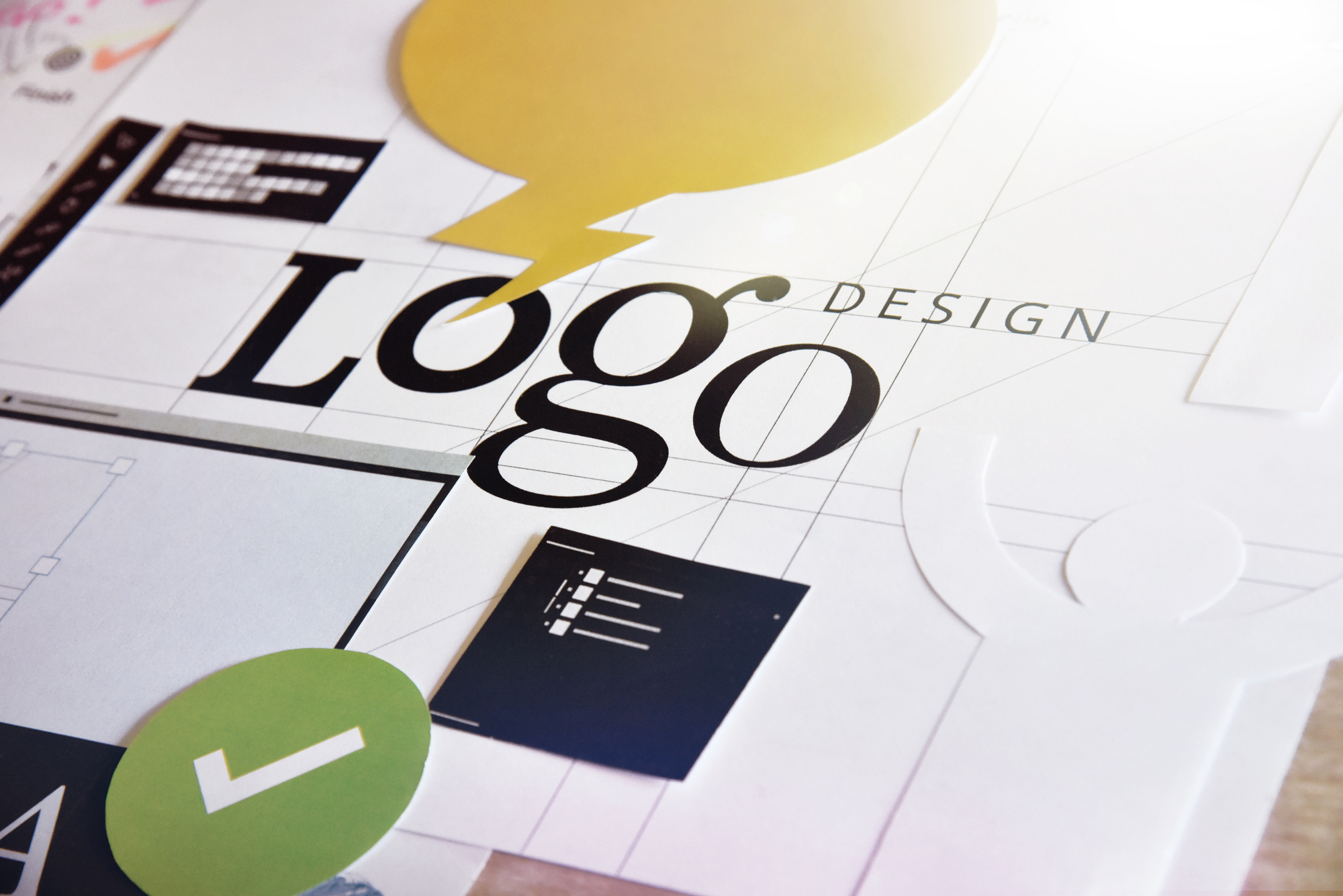
How to Design Your Own Logo for a Tshirt
Posted on March 15, 2018 by Logo Design Tips and Tricks

Did you know that you can design your own awesome tshirt logo?
Logo design is a great way to promote your brand. With a cool, unique tshirt logo, you can become a walking advertisement for your own business. To promote the brand even more, give shirts to your customers and employees.
If the logo becomes popular enough, you can even start selling the tshirts in an online store, creating a whole new revenue stream!
But first, you need to make the logo. Wondering how to get started? We’re here to help – in this guide, we’ll walk you through how to design your own tshirt logo. Keep reading for our top tshirt logo design tips.
1. Seek Inspiration
Before you can design the logo for your tshirts, you’ll need to get inspired. Logo design is an artistic, creative process, so tap into your inner artist before you get to work.
You can research online, exploring different company logos on sites like Yizzam. Figure out what designs appeal to you, then compare them to see what they all have in common. This will help you decide what kind of design is perfect for you.
You can also just keep an eye out for a great tshirt logo in your day to day life. People wear branded shirts all the time. Which ones catch your eye?
The logos that stick in your mind the most are the ones you should draw inspiration from. After a while, you’ll probably see that the different logos you like have many things in common.
2. Learn About Logos
It’s also a good idea to learn about the history and concept of logos. What makes an effective logo?
The best ones tend to be unique, visual, memorable, and not too complicated. Your logo also has to look good on a t-shirt. What will make people want to wear a logo on their clothing?
3. Follow a Process
The creative process can look different for everyone. However, if you’re not sure what steps to follow, it can be good to have a roadmap.
Consider a process that goes something like this:
- Research: look at what’s out there, and what your competitors are doing. Decide how you want your logo to fit in or stand out. Look at modern logo trends, and balance that with the need for a logo to be timeless (or get updated).
- Concept: sketch or design a few logos based on your ideas.
- Reflect: spend a few days away from the project and see how you feel about it. When you come back, the right direction to go will often be clear.
- Feedback: present the logo to a small focus group and get some feedback. Make changes accordingly until you come to a final draft.
4. Know Your Audience
While you’re researching and designing, you’ll need to keep your audience in mind. Who do you want to reach with this logo? Who do you want to wear your tshirts? Who do you want to notice them?
Your logo will communicate something, but different audiences often read messages in different ways. It’s a good idea to include your target audience members in the group you get feedback from. That way, you can tell if your logo is really conveying the message that you want it to.
5. Save Your Work
As you work to design your logo, you’ll probably work through a number of different sketches and design ideas along the way.
Make sure to save your work, rather than throwing away the sketches you decide not to go with. These can be helpful later if you decide to do a redesign based on feedback from your focus group. If you decide to make another logo later, your sketches can also be helpful.
6. Try a Mood Board
If you get stuck, get creative with a mood board or vision board.
Logos are all about tying different elements together: color, shape, text, and so on. With a mood board, you can experiment with different elements, and envision how they might work together in a tshirt logo.
7. Don’t Get Too Trendy
There will always be fads in logo design. However, you need to balance the desire for trendiness with the need for the logo to be evergreen.
Of course, if you intend to release a new tshirt design every few months, you may want to go with a trendy logo. But if you want this logo to last for years to come, choose a design that will remain relevant, rather than a trend that will soon be forgotten.
8. Change Your Design Medium
If you’re hitting a brick wall on ideas, you might just need to try designing with a different medium.
If you’ve been trying to come up with a design on a computer, try switching to pen and paper for a few days instead – or vice versa. Sometimes, this kind of change is all you’ll need to spark creativity and come up with the perfect design.
Don’t worry about your skill level here, either. Your paper-and-pen sketches don’t need to be great: this is just a way to spark ideas. You can always clean up the image with a computer later.
9. Consider Fonts
Words aren’t necessary for logos, but they’re a great way to create an attention-grabbing tshirt. If you decide to incorporate words into your logo, though, you’ll need to take font into consideration.
Different fonts work for different purposes. A sans-serif font looks more modern, while a serif font can look old-fashioned. Hard-to-read fonts aren’t ideal for tshirts, since the goal is to allow people to read the text quickly.
10. Consider Color
Will you be printing your logo on tshirts of a specific color? If so, that will affect the colors you should choose for your logo. A black logo becomes hard to see on a navy-blue shirt, for example.
Get Your Tshirt Logo Printed!
Once you’ve decided on the perfect logo design, getting the shirts printed is the only thing you have left to do.
This is the fun part – you can choose the perfect shirt colors and styles to display your logo.
However, creating the logo can be fun as well, when you use an online logo maker. Start designing your logo with our logo maker today!
A Logo Designer’s Guide to Logo Development
Posted on March 14, 2018 by Logo Design Tips and Tricks
Every business needs a logo. Sometimes a business is just starting out and building out their marketing collateral. Other times, the business is rebranding and looking for a fresh take.
No matter who your client is or how old the company, the logo development process is fairly consistent. There’s always some competitor research involved. There are brand-related questions you’ll ask every client.
That said, there are some tricks that speed the process along and leave your clients happier in the long run.
So let’s dig deep into some areas of logo development and see if we can help to streamline your process.
Start Logo Development with Competitor Research
Before you draw your first sketch, you must research your client’s competitors. It won’t matter how great your design is if it resembles an existing logo.
This isn’t just a question of avoiding confusion, though that matters. A new logo that resembles an existing, better-established logo just works as a marketing tool for another business. You don’t help your client by advertising for someone else.
There’s also a legal issue at play. Many businesses trademark their logo. Give your client a logo that looks like someone else’s and you create a potential legal problem.
No one will thank you for opening up that can of worms.
Of course, you can’t possibly research every logo in existence. There’s just too many of them. The best you can offer is a good faith effort at not recreating a competitor’s logo.
Make Sure You Understand Your Client’s Brand
You can’t design an effective logo if you don’t get what your client’s brand is about. That doesn’t mean you must read their mission statement, but it does warrant a conversation. Make sure you ask a few key questions, such as:
- What are your brand values?
- How do you communicate those values to customers?
- Do customers perceive your brand that way you intend?
The answers to those questions will inform almost all of your design choices. A company that aims for a light, cheery brand isn’t well-served by a heavy font or dark colors. A business with a reputation for cool professionalism is best served by capitalizing on that reputation.
Simplicity
There is no greater friend in logo development than simplicity. There are a few important reasons for that.
Remembering simple things is easier than remembering complex things. For example, almost everyone knows that 2 + 2 = 4. On the other hand, how many people remember the Quadratic Equation from their high school math classes?
It’s more complicated and that makes it harder to remember.
Think of any images you create as symbolic. You’re trying to evoke an idea, rather than paint a scene.
You can see a great example of simplicity at work in a logo over at The Marine Battery. The anchor image is incredibly simple, but it evokes the idea of the sea.
Play Around with Several Ideas
Another key element of good logo development is not getting hung up on your first idea. Coming first doesn’t make an idea good or even viable. On the whole, first ideas are either vague or overly ambitious.
The brain is pretty lazy when you get right down to it. If it can work less in reaching a goal, it will.
Say your new client is a self-employed bricklayer. Your brain probably jumped straight to a picture of a brick or brick wall.
What about a freelance writer? Your brain probably conjured an image of a keyboard or a pen.
The problem is that you almost certainly share most of the same cultural and social touchstones as your competitors. That means their brains also went straight to some variant of those images.
Think of your first few ideas as cobweb clearing exercises. They let you deal with the obvious and the derivative. Once you get through those, you can start the real creative work.
Color
There is always the temptation to avoid color in logo development, but don’t go there too fast. Color is a primary reason around 85% of customers choose a product.
Again, the goal here is simplicity. Limit your palette to a few colors. If the business already uses specific colors for it’s marketing collateral, most of the decision is made for you. Consistency in branding more or less requires you stick with those colors.
If the business is new or hasn’t settled on a color scheme, reference their answers about what their brand represents. Choose colors that dovetail with their intentions.
If all else fails, look at broader industry trends. Is there consistency in color choices? If so, start with those colors.
The client can always ask for different colors if they aren’t happy.
It Must Scale
You can’t predict where a client will use a logo these days. For now, it might just go on their business cards and letterhead. It could turn up almost anywhere down the road, such as:
- The client’s website
- Social media accounts
- Product packaging
- Billboards
- Television ads
- Brochures
That means the logo must scale and still look good. The less complicated the image is, the better it scales. So there’s another argument for simplicity.
The real trick here is making sure you give the client the logo image in a scalable file type, like Scalable Vector Graphics. That lets them use it at any size without any grainy pixelation.
Parting Thoughts
Good logo development is about striking a balance between conflicting forces.
You must balance creativity against the practical reality of existing logos. You must balance your own view of a brand against the company’s stated brand values.
You should strive for simplicity, even when your imagination takes you toward complexity. Developing multiple ideas is more difficult, but first ideas are often stale.
Using color requires some restraint because it’s easy to go overboard. Yet, it also helps drive sales when done well.
The one straightforward part is that you should always use a file format that lets the image scale. It simplifies your clients’ lives in the long run.
Looking for another way to streamline your logo development process? Instead of building logos from scratch on your own computer, try out our free logo maker.
5 Reasons Your AV Company Needs A Custom Logo
Posted on March 12, 2018 by Logo Design Tips and Tricks

Your AV company is in the business of communicating through images and sound, so why is your logo so generic?
There’s a reason why top global companies spend millions on logos. It only takes a few seconds to form a first impression of a logo and as little as five impressions to secure brand loyalty.
With only a few seconds to impress, what do you do? Ditch the stock logos and think like your favorite brands!
Let’s take a look at five more reasons to leverage logo customization.
Color Boosts Brand Recognition by 80%
Your AV company has to stand out in a sea of competition. But something as simple as color can increase recognition by as much as 80%.
Your logo plays a vital role in leveraging color in brand strategy, but you can’t just throw paint on a canvas and see what sticks. Color and mood are inextricably linked. Ask yourself, what do you want customers to feel about your brand?
As an AV company, consider the psychological impact of the following colors:
“Welcoming” light blue, as seen in logos from Walmart and Airbnb.
Purple conveys both calmness and creativity, which you can see from Yahoo! and Hallmark’s logo.
Red elicits a sense of urgency, which makes it perfect for CNN, CVS, and YouTube.
Yellow stimulates the mind and elicits a sense of optimism, as you can see in the famous Shell logo, Best Buy, and National Geographic.
The color white represents wholeness, completeness, and feelings of hope, as leveraged by Atema Partners, Adidas, Apple, and ABC.
Don’t miss an opportunity by treating your logo colors like an afterthought. Let’s dig in more into the true value of brand recognition.
Brand Recognition Starts Young
Going without a decent logo can have more consequences than you think. An ill-conceived logo can completely misrepresent your business. Just ask Pepsi and the 2012 Olympic Games.
But a compelling logo can help turn a new brand into a household name, like Apple, Nike, and The Walt Disney Company. And more recently, Twitter, Slack, Uber, and Netflix. And kids play a much bigger role than you ever would have thought.
Studies show that brand loyalty is established as early as six years old. In fact, more than 90% of children surveyed can correctly match brands to their logos. This means if kids absorb your logo at a young age they’re more likely to be customers as adults.
95% of Purchase Decisions Are Subconscious
Need another powerful reason for a custom logo? Consumers may have less power over their purchases than you think. This comes down to the power of the subconscious mind.
What does these mean for your logo? Everything.
Harvard Business school professor, Gerald Zaltman, found that 95% of purchase decisions are dictated by the subconscious mind. According to Zaltman, your senses help guide your subconscious mind, and there’s no better way to evoke positive emotion than with an effective logo.
An AV company, in particular, can look to Zaltman’s communication industry example. Aside from color and shape, Zaltman found that purchases are also linked to tactile experiences. That’s why the look of “finishing” and “sheen” are particularly effective in audiovisual logos.
You may not be able to control your customers’ subconscious mind, but leveraging the psychology of design does give you an advantage.
Logos Communicate Who You Are
Consumers hate mixed messages. Does your logo clearly represent what your AV company is really about? You need visual impact to clearly communicate your values and principles with little to no words.
That’s what an effective logo brings to the table. Through your logo, you can tell the world what kind of AV company you have. Do you want to appeal to high-end clientele or consumers who want discount AV services?
The best way to truly tell if your logo communicates with your target base is through focus groups, test audiences, user testing, and surveys. This will let you know whether you’re ready to launch or go back to the drawing board.
Logos Give Your AV Company Credibility
A poor quality logo screams ‘unprofessional’, but a complicated logo can be just as bad. So how can you stand out without taking a chance on logo design?
Truth is, a simple and clean logo design is often the most credible. Just look at Google, Apple, Nike, Microsoft, and Spotify. Four prolific companies with simple logos and colors.
What does this mean? Editing matters. Forget crazy gimmicks and make sure your logo is clear, professional, and relevant. This will help you establish your AV brand in the industry.
Here are a few more ways to establish credibility and trustworthiness in logo design:
- Pick a logo symbol that’s relevant to AV
- Keep it versatile
- Choose a modern font
- Use capital letters
- Use a strong shape like a triangle
Of course, this means quality matters. But don’t hire a logo designer just yet. Learn how to create and customize your own AV company logo with this quick and easy design guide.
Get Started
You know why you need a custom logo, now it’s time to give your AV company a design that matches its mission.
Time is of the essence in business, so start brainstorming your logo now to improve your company’s brand recognition, consumer perception, and credibility in the industry.
Make sure to bookmark these tips and tricks and check back often for the latest in AV logo design.
9 Unique Real Estate Logo Ideas
Posted on March 11, 2018 by Logo Design Tips and Tricks

With over 2 million real estate agents in the United States, the competition is fierce. It’s more important than ever to set yourself apart from every other real estate agent around.
Which is why branding is so important. Part of an effective branding strategy is having a logo so clients can easily recognize you.
But you need to make sure your logo is unique. Here are some great real estate logo ideas to help get you started.
1. Use Color
When you’re looking for real estate logo ideas, what colors you want to use should be the first thing you think about. Colors are extremely important as each color conveys a different meaning.
Don’t go overboard on using colors. Too much and it will be confusing to people. You want to choose one or two colors that represent your brand best.
Try not to use colors that are trendy. Your goal is to create a logo that has lasting power.
It’s also possible to make a huge splash just by using black and white images.
2. Think of Symbols Outside the Home
When people think of real estate logo ideas, most think of using a house or some type of a dwelling. Except, that’s not really very memorable.
Instead, try using a symbol that might stick in people’s minds a bit longer. Geometric shapes would work well for the real estate industry.
Another way is to use images from nature to still convey a homey feeling without using an actual home. You could also use symbols from within the home as well.
Get creative and use symbols that symbolize who you are as a brand.
3. Make it Timeless
Your goal for creating real estate logo ideas is to find something that will stand the test of time. While certain trending ideas are useful, you don’t want to have to come back two years later and create something new.
Rather, try to find a logo that can be tweaked if it needs to be updated. The Quaker Oats brand has been using a Quaker on their cereal for over a century.
When they finally did some updates, it actually took them years of careful crafting before they made the changes.
4. Stick With Your Name
There are two options for real estate log ideas when you use your name. You can use your initials and design a really great monogram logo.
It’s perfect for people who either have very long names or difficult names to pronounce. You can also get creative with the various types of fonts and sizes that are available.
You can choose to use the monogram and another symbol or just use the monogram itself.
You can also choose to use your full name. Again, there are a variety of font styles and sizes you can use.
The best part is that your name will never go out of fashion. If in the future, you do need to make some updated changes, a new font can give you a whole new updated look.
If you do decide to go with a monogram or use your full name, make sure you’re fully committed to using your name for the rest of your career. Meaning, if you get married and take the other person’s name, you’d have to change your logo and branding strategies.
5. Make Your Real Estate Logo Ideas Fun
Buying or selling property is stressful for owners and buyers. Which is why it’s a good idea to create real estate logo ideas that are fun.
If part of your brand is that you make finding a dream home a fun and inspiring experience, then use symbols or artwork that show off your fun side.
Nike uses a swirl for their logo. It has nothing to do with running or shoes. But it does leave a lasting impression on people.
6. Keep It Simple
Whatever you do, keep your real estate logo ideas simple. Do not overcomplicate it.
You’re trying to gain a positive first impression with people. You do not want to confuse clients.
Sometimes you’ll see a company doing an advertising campaign that’s so outside the box that it leaves the viewer confused. That doesn’t help boost sales.
Instead, be creative but keep it simple.
7. Use a Slogan
A great slogan is one avenue you can take for your real estate logo ideas. A slogan is memorable and will always be attached to you.
Take the slogan, “looking out for your next move.” It has two meanings and is memorable. When a client is looking at Boise ID homes for sale, they now know who to call first.
Don’t make the slogan too long or complicated. A simple sentence that’s memorable and witty is enough.
8. Most the Most Out of Negative Space
The information on your logo doesn’t need to take up the entire space. Instead, leave some room for negative space.
You can actually do a lot with negative space. Take the FedEx logo, for instance.
Their use of negative space is so ingenious that most people don’t even realize they’re seeing an arrow in the “Ex” part of FedEx. Hidden images are fun and creative.
It’s subtle, yet powerful.
Negative space also forces the eye to be drawn to whatever is there. You could create a very simple logo with so much negative space that people have no option but to see your logo.
9. Active Versus Passive
Real estate agents are extremely busy. You’re always on the go.
Your real estate logo ideas can incorporate your active lifestyle into your brand. A bird in flight can show that someone is on the move.
You could even use a photo of a home that looks like it’s in motion.
You might also consider using a passive type of logo. That would convey that once you sell a home, the resident is there forever.
Make Your Free Logo Now
Don’t wait to set yourself apart from your competition. Get started making a new logo for yourself now.
It’s easy to get started. Check our tutorial that shows you how to create your own logo.


