How to Add a Garage Door Logo to Your Website
Posted on August 14, 2017 by Logo Design Tips and Tricks
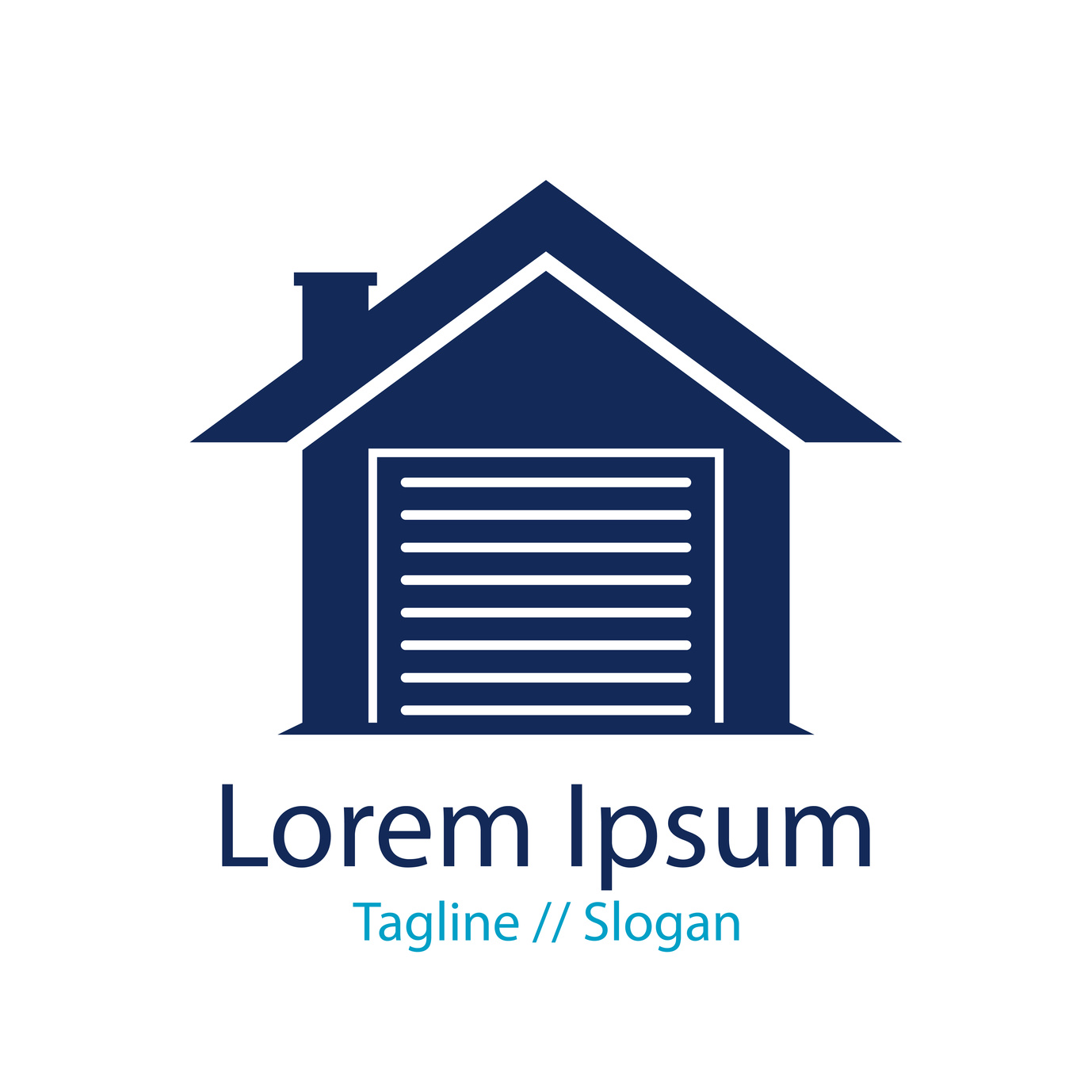
Adding a garage door logo to your website is essential. Your homepage is an advertisement and should be your most cost-effective one.
If you have a strong digital presence, people will remember you. This means they’re likely to do business with you when they need their garage door renovated.
But if people visit and don’t have an image to remember you by, you’ve wasted a huge opportunity.
Placing It Properly
Companies like A 1 Doors do a great job of placing their logos prominently.
The door company’s prominent placement of the logo in the header of their website, combined with the cubic depth of the logo itself, draws the eye without being distracting.
And while it may seem like obvious advice, logo placement can be one of the trickiest elements of logo design.
People need to associate your logo with your brand — without it becoming obnoxious. If you place an image in the background of your site, for instance, it will be an eyesore to your visitors.
Avoid anything that makes your content less readable, but also make sure the logo is somewhere web visitors will look.
Your best bet is placing it at the left side of your website’s header, right next to your company name. That way, people will visit your website and come to associate your brand with your logo.
This is vital to creating a strong brand identity.
Color And Your Garage Door Logo
Using the wrong color scheme for your logo hurts businesses ranging from liquor stores to law firms.
In the case of a garage door logo, remember what people are looking for out of your company.
Reflect that by combining lighter color tones (just enough for contrast,) with a gray color palette. This color is something people associate with construction. Concrete, asphalt, and even the metallic tools that do the work are all different shades of gray.
You’re limited in the number of colors you can use. But that doesn’t mean you shouldn’t care about contrast.
In fact, contrast is vital to making sure whatever logo you use “pops” off of the page. Make sure you make your logo stand out and reflect depth.
Making It the Right Size
Just like you need your logo to be the right color, you also want it to be the right size.
A logo that’s too big will be distracting and even comical. Design principles, particularly online, are shying away from the maximalism that defined the early internet.
This means that people just won’t take your website seriously with a giant logo. But if your logo is too small, people won’t see it.
The best way to get this one right is through trial and error. Try different versions of your garage door logo in your header until you find something that fits.
Try A Logo Maker
To get the perfect logo, accept the fact that you probably won’t get it right the first time.
It takes serious work. Drawing something on printer paper or making it in photoshop won’t cut it.
You need to use a logo maker. We offer one of the best for regular people who want a well-designed website and identity for their brand.
Try our tutorial so you learn the ropes. Then, register with us for more tips and tricks!
Clear the Air With These 6 Popular Purifier Logos
Posted on August 14, 2017 by Logo Design Tips and Tricks

Are you trying to design a new logo for your air purifier business?
Struggling to come up with ideas? Looking at what’s already out there can be a great source of logo inspiration.
Scroll down to see the six best air purifier logos that are out there right now.
The Best Existing Air Purifier Logos
Whirlpool
This company uses subtlety to make their logo effective.
A simple colored ring around bold, black lettering creates a mental image that fits the name perfectly. The angle of the ring makes it appear as though the text is in a whirlpool itself, without obscuring it.
Rabbit Air
The Rabbit Air logo combines the name of the brand with the function of the products they sell to create an image that truly represents what the brand is about.
The name is at the center of the logo, but it’s so much more than that. Around the font are wispy lines, representing the air flow you could have in your home with one of their products. Those lines come together to form the image of a rabbit, from long ears to a fluffy tail.
Lots of other famous logos use subliminal imagery in this way.
Honeywell
Honeywell is a household name, and part of the reason everyone is familiar with this company is down to their simple yet striking logo.
Bold, sans-serif text makes the Honeywell name clear and easy to read, and the choice of a bright red shade means you’ll spot it immediately.
You can browse air purifiers from Honeywell and other providers on the Unhumid site. Take a look and see what their logos look like.
Alen
This logo uses a light shade of blue to give the feeling of coolness and cleanliness that you want from an air purifier.
Wide, blocky capital letters paired with wavy lines are all this logo is made up of, but it works very well. Three horizontal wavy lines form the ‘e’ in ‘Alen’, integrating text with imagery.
Underneath that, you find the company’s slogan ‘pure air for life’. The font is clear and sufficiently spaced out, so even when the logo is small, you don’t need to squint to read it.
AllerAir
The logo for AllerAir uses a color scheme befitting of an air purifier company.
Green is used to show balance and equilibrium, while blue shows coolness and calm. This is a great use of color psychology to make people associate your logo with certain feelings.
Airmega
The Airmega logo uses two dotted circles inside of each other to create an image of air flow.
The text is soft and unintrusive, using a light gray color that doesn’t stand out too much. The lettering is mostly block capitals, aside from the ‘m’, which is rounder, shaped like an air wave. Its placement right in the center of the logo makes it perfectly symmetrical.
Design Your Own Logo
Now that you have some ideas, put them to work and design your very own logo.
Use our free logo maker to create a design that could give the ones above a run for their money.
You Won’t Object to These 5 Debt Attorney Logos
Posted on August 14, 2017 by Logo Design Tips and Tricks

Want to design a debt attorney logo that makes your firm stand out from the others?
Whether you’re helping clients to pay off a mountain of credit card debt, deal with multiple debts, or file for bankruptcy, you need to put forward an image they can trust.
And that image starts with your logo.
That’s why we’re sharing five impressive law firm logos to help you get inspired.
1. Simple Text Logo
Not sure which elements to include in an attorney logo?
The Lebedin Kofman LLP logo looks pretty simple at first glance. It shows the initials of the two main partners, with their full names on the right-hand side.
It’s simple but effective, and the white text stands out clearly on the blue background.
The bottom of the logo is where things get interesting. Text reads, ‘New York Debt Relief Attorney’. This makes the location and purpose of the company crystal clear, which is what clients need.
There’s no point in specializing in debt law if your logo doesn’t reflect your expertise. Extra text is the easiest way to include this essential info.
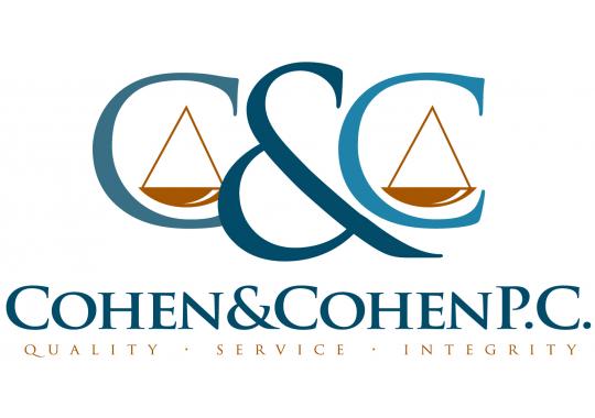
2. Logo Based on Values
The Cohen and Cohen P.C. logo doesn’t scream ‘debt attorney’ as clearly as the one above, but still uses a relevant design.
The letter ‘C’ is repeated twice in a traditional font, giving a sense of professionalism.
The scales pictured within each ‘C’ are a nice visual representation of the kind of help they offer – literally helping clients to ‘balance’ their debt.
At the bottom of the logo are three words: ‘Quality. Service. Integrity.’ They’re subtle enough not to look overbearing, yet still convey the values of the firm clearly.
Consider integrating your key values into your logo design.
3. Image Logo Based on Firm Name
The logo for Trident Debt Solutions is bold, modern, and clear.
The words ‘Trident Debt Solutions’ make up the bulk of the logo, using a simple font and capital letters for increased clarity.
To the left of the text is a stylized image of a trident, made of three squares arranged into a triangle. The combination of multiple shapes could represent teamwork and cooperation, while the complete image brings to mind resolution.
If your firm’s name translates well into an image, try a few different designs and see what kind of values they communicate.
Avoid anything that’s too busy. Clarity and simplicity are key.
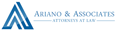
4. Logo Based on Geographic Location
The Ariano & Associates logo combines a modern image with a traditional font to get the best of both worlds.
A large letter ‘A’ is created using a single stroke, creating an impression of flow and connectedness.
The ‘A’ also resembles a mountain, reflecting the geographical location of the practice. This is a really smart move that will appeal to local clients.
5. Iconic Symbol Logo
The Lincoln Law logo makes clever use of an iconic image to create a sense of trust and integrity.
Sticking to a silhouette of Lincoln means that their logo doesn’t look too busy, but the message is still clear.
Using a traditional font for the company name enhances the overall appearance. It also speaks to the trustworthiness and integrity of the firm.
How to Design the Perfect Debt Attorney Logo
The best debt attorney logo will include some or all of the following:
- Clear communication of you values.
- An indication that you specialize in debt law, or a specific area, like non tax federal debt.
- Traditional elements to convey integrity.
- Modern elements to appear up-to-date.
- Memorable imagery.
Once you have a firm idea of what it is you’re trying to create, don’t be afraid to experiment!
Be sure to create a few different logos before you settle on your final design.
A Logo With a Purpose: The Mission of the New Hearing Aid Logo for OTC Aids
Posted on August 10, 2017 by Logo Design Tips and Tricks

Logos have been used for as long as advertising has been around. A logo says a lot about your company and the services you offer.
Your logo is your brand, it is what you want people to see and associate with quality.
However, what if a logo could be used not for a single company, but to bring together an entire industry?
That is exactly what the Consumer Technology Association (CTA) have done with their new hearing aid logo.
But why did they make such a decision? Read on to find out.
Giving a Logo a Larger Purpose
Within the hearing apparatus industry, there is a split between the products on the market. You have high-quality amplification enhancements that can help everybody with mild to moderate hearing impairment, and you have low cost ‘personal amplifiers’ which are also readily available.
The idea behind this standardizing logo is that when people see it, they know that the items they will be looking at are of a high quality. A standard that will help them with their troubles.
Only items that have been checked and match the Personal Sound Amplification Performance Criteria will be allowed to use the logo to represent their product.
Using a Logo to Protect Consumers Not Just to Sell
By introducing a logo aimed at increasing consumer awareness, the CTA has created something that not only aims to generate sales but more importantly to protect their consumers from buying products that may be of a less than stellar quality.
Consumers know that if they see this logo on a site, such as Hansaton, they can rest assured that they are getting a product that will assist them.
Living with a hearing impairment is not fun, and people deserve to have a banner which guides them towards quality.
A Hearing Aid Logo Aimed at Educating the Consumer on New Technology Options
Technology is improving the quality of our lives in every possible way. By creating a link between a product logo and a quality standard, people can also be assured that the latest levels of technology will be available to them
They may not take that particular enhancement aid, but it is all about being able to make an informed decision. It is about giving the consumer a sense of empowerment and control over the decisions they make regarding their own hearing.
Creating a Logo that Promotes Quality of Life Above Everything
At the end of the day, amplification enhancements are all about ensuring a better quality of life. If that can be achieved in some way through a good quality hearing aid logo, then that is all for the greater good.
Whether you have a moderate or a mild hearing impairment, you have the right to be protected, and that is exactly what the idea was behind creating this logo.
What are your thoughts on this standardization? Leave a comment below. We’d like to hear from you.


