5 Tips for Designing a Moving Company Logo
Posted on July 25, 2017 by Logo Design Tips and Tricks

Ah, the company logo.
It can be mystifying to try to encapsulate your brand and all of its meaning into a symbol or simple line of text.
Logo design can be especially tricky if your business is moving.
How can a simple logo showcase your 5-star service? Your 30-plus years in the business? Your skilled packing?
The good news is it can be done.
Join us as we walk you through the five most important tips to consider when designing your moving company logo.
1. Do Your Research
Most designers will tell you that your logo should stand out from competitors. It’s pretty obvious advice but the real question most moving company logo creators need to know is the how part.
How do you come up with a unique design that will speak to your target market?
It’s in the data or your data more specifically.
Do you have a website? Take a look at your analytics. This will give you an idea of what behaviors and habits your customers have.
Read up on your online reviews from past customers. Maybe they loved that you offered free estimates or thought you had a top-tier staff.
Data can be revealing and inspiring.
If you look beyond the numbers you can begin to understand what your customers see as your company’s winning attributes. Then your goal is to find a way to merge these within your logo design.
2. Simplicity Wins
Stop and think for a moment…
What do IBM, Apple, and Nike all have in common when it comes to their logos?
Simplicity in their design.
Take note, simplicity doesn’t mean boring. When designing your moving logo you can still give it some flair. This is where creativity and branding come in.
The logo for IBM is a great example of this. The letters IBM could be extremely boring but they’ve added a certain type with horizontal bars that give the logo a distinct brand attrubute.
How can you inject your brand’s personality into its’ logo?
3. Understand Brand Identity
As we mentioned before your moving company logo should connect with your target market while promoting who you are as a company.
Think of your logo as an introductory conversation to potential customers.
How do you know what to highlight about your brand?
Start by jotting down some quick adjectives that describe your company. Use these as a spring board to narrow down your brand’s personality.
4. Use Online Tools to Make Your Moving Company Logo
Want a professional looking moving company logo but don’t want to spend a ton? Online tools and resources are available that put you in control of your budget and business’s design.
These tools are perfect for modest-sized companies like Small Moving Inc., who want a longer lifespan to their logo and the ability to reproduce it without complications.
5. Use Design Variables to Make it Yours
While it might be next to impossible to create a completely original logo, moving company owners can certainly get close.
Think about the following design elements when creating your moving company logo:
- Custom Type
- Color
- Proportion and Symmetry
Again, finding the right balance between highlighting your business and meeting your customers’ specific needs is key when choosing each of these elements for your design.
If you’re ready to start making your company’s logo, check out our free logo maker. This tool offers an affordable way to design the perfect logo for your moving business.
How to Create Great Financial Logos Without Breaking the Bank
Posted on July 25, 2017 by Logo Design Tips and Tricks

Creating great financial logos without breaking the bank doesn’t have to be cause for a headache.
A great logo is one that best represents your financial planning service.
Having a great logo is essential even for a small business. Below, we’ll walk you through a designer’s process of creating a great logo that works for your business needs.
How to Create Great Financial Logos
Creating great financial logos can be the simple result of a tried-and-true design process.
Think, brainstorm, and plan
The first step in creating a great logo is to brainstorm.
What ideas or icons do you want to be represented in your design?
What do you want customers to feel or think when they look at your design?
What message are you trying to convey to consumers?
Potential customers could base their first impression of you on your logo, so all of these are important questions you must ask before beginning the design process of your logo.
During this process, browse other creative logo designs for inspiration.
Put your ideas and thoughts together
This is the fun part of the design process.
Get creative! Begin trying out all kinds of different designs. Release your inner artist and don’t be afraid to try new things.
Try a logo creator for extra help creating your financial logos.
Combine unexpected elements and try turning your paper (or design) upside down.
What objects, images, or ideas come to mind when you look at your design?
What can be changed in order to get closer to the message you brainstormed above?
As you begin creating the early stages of what will become your future logo, make sure to ask yourself plenty of questions and incorporate your answers into your designs.
Make it more interesting
Creating better logos consists of taking a good or okay design and making it even better.
Think of ways you can change the logo to get people to ask questions about you or your financial planning services.
Add layers to the design.
Don’t be afraid of pushing your logo to be more abstract.
It can be difficult to conceive of the best way to represent a safe harbor 401k visually, but with the help of a great designer, the task is not impossible.
Revising the design again and again may be tiresome, but the end result–a killer logo–is worth it both for your business’s reputation and your own peace of mind.
Plus, when you have financial logos you’re proud of, you’ll want to show them off–generating more leads and starting up more conversations than ever before!
Ask for outside input
At the end of the day, no matter how much you like (or dislike) your logo design, you are not your target audience.
Ask for the opinion of friends, family, customers, and strangers as part of the process of creating financial logos.
A great logo can be the difference between gaining a new customer or client, or having another prospect walk away uninterested…if it’s not clear yet, a great logo is an essential tool in your business arsenal!
Remember, you should love your design, but what outsiders think is what matters most–and if they say you have an attractive design, then that’s what you should prioritize.
Signs Your Communication Protocol Company Needs A New Logo
Posted on July 25, 2017 by Logo Design Tips and Tricks
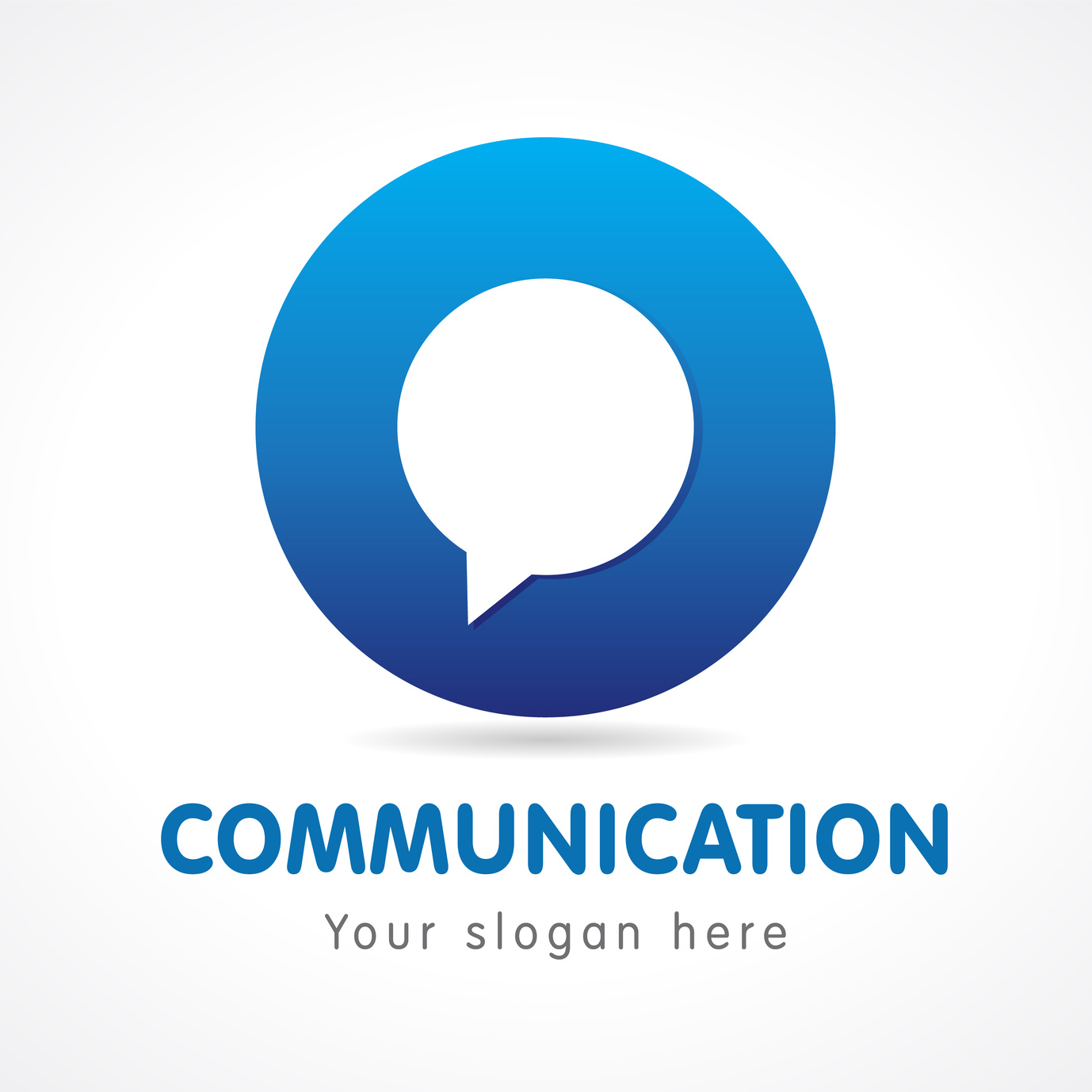
Corporate logos are a reflection of the brand. A potential client may forget your company’s name, but he will remember its logo. This visual element tells the story of your business and its values.
From the logo color to its shape and message, everything matters. The right colors can increase brand recognition by a whopping 80 percent.
For instance, many iconic brands use the color blue in their logos. Over 42 percent of customers say that this is their favorite color. Thus, it makes sense to incorporate it in logo design.
When you’re running a communication protocol company, it’s crucial to update your logo. Clients expect you to be up-to-date to the latest trends in tech. An outdated logo can affect sales and brand image.
Just like everything else, logos aren’t forever. Even the best designs may lose their appeal. A new logo can liven up your brand and increase your reach.
Here are some warning signs your communication protocol company needs a new logo:
It Doesn’t Look Professional
Many start-ups have their logos designed by students or freelancers with limited experience. This might work in the first few months, but it can affect your image later.
A logo is the first thing people when checking out your website or marketing materials. Thus, it needs to look professional. Depending on your budget, you can either create a new logo yourself or hire an expert.
Your Logo Is Outdated
If your logo is over 10 years old, it’s time for a change! It may have looked fantastic in newspaper ads, but this doesn’t mean it looks well on websites and social media.
A good logo should keep up with the modern technology. It should also tell customers about your products, such as Modbus and other communication protocols.
Don’t worry – it’s no need to change everything!
Just add a splash of color, an eye-catching message, or a cool font. For inspiration, check out iconic brand logos, such as Goodyear and Volvo.
Track their evolution and see how they’ve changed over the years.
For instance, Mastercard had six logos up to this date. The first version was released in 1886. Their current logo follows the latest trends, featuring a minimalist design.
You’re Offering New Products
Communication protocol companies are constantly launching new products and services. This industry is fast-changing with new technology. Thus, it makes sense to update your logo accordingly.
If you’re launching new products, your logo should reflect these changes.
Use the existing design as a starting point. Use different fonts, add new graphics, or remove unnecessary elements.
Incorporate symbols that reflect your products.
Let’s say you’re offering communication protocols for lighting control. Your logo could include the image of a light bulb or a thunder bolt plus the brand’s name.
Why Create a New Logo?
You may wonder if it’s really worth creating a new logo.
According to marketing experts, corporate logos have a major impact on company performance. They can also positively impact customer commitment and make your business stand out.
Logos are more than just a symbol of your brand. They play a functional role in promoting your business and generating sales.
A good logo can give you a competitive edge and convey your message to the target audience.
So, are you ready to update your logo? Do some brainstorming, write down your ideas, and experiment with different designs!
5 Steps to Create a Camera-Ready Video Production Logo
Posted on July 25, 2017 by Logo Design Tips and Tricks

To say that logos are important is an understatement.
Logos are the primary means for consumers to recognize your brand, and they are what sets your video production company apart from the rest.
They also form the first impression of your brand. Just the shape alone has a powerful impact on how consumers will view your company.
Creating an image that could make or break your video production company may sound daunting, but there are principles that you can follow for success. Read on to learn how to create an unstoppable video production logo.
Keep Your Video Production Logo Simple
Make your logo simple and easy to read, with no complicated fonts and minimal punctuation. The logo for National Audio Visual is a good example: with a simple, easy-to-read font and a focus on the name of the company, the logo leaves little to explain.
Your production company likely isn’t popular enough to merit the strong brand recognition of Nike or Apple, so the title of your company should be incorporated into the logo.
And while we’re on Nike and Apple: these logos are sleek, simple, and timeless. When you’re creating your video production logo, keep these principles in mind.
Focus on Color and Composition
The color of your logo can say a lot about your brand. Don’t neglect the symbolism behind colors: take a look at what type of emotional response each color evokes and go from there.
Similarly, your font selection is crucial. You can choose a font that looks playful or professional, classic or modern, cutesy or serious. Play with different fonts and decide what best represents your brand.
Don’t neglect other design principles like white space, balance, and shape. A well-designed video production logo will balance white space and come in an easy-to-digest shape, like a circle or rectangle.
Also, remember that your logo should be versatile. You should be able to shrink it down, isolate one main component, eliminate color, and eliminate descriptive words, and it will still stand alone.
Be Creative
You don’t have to stick with film reels or cameras: your production company is unique, and your logo should be, too.
Symbols for video production can be helpful for your clients to identify what you do, but they’re not essential, and what’s worse, they can easily devolve into cliche.
If you think another image better represents your brand, use it. You can always specify that it is a “video production company” underneath the logo.
If your company’s name includes an animal, a concept, or a color, for example, it should be incorporated, but you can do this creatively. Play with the letters in your title as well as the words to come up with something that will make you stand apart from the competition.
Be True to Your Brand
What does your brand stand for? What type of consumer are you trying to attract? Your video production logo should tie back into your production company’s mission, and its unique purpose.
Brainstorm ideas about what your company values the most, and what type of message you are trying to send with your logo. What is your target audience? Would they like to see a cute and playful logo or a more professional one?
What does your video production logo look like? Could it use an upgrade? Start creating your new logo today with our online logo maker.


