5 Marshmallow Logo Ideas for Your Camping Business
Posted on January 26, 2018 by Logo Design Tips and Tricks

Do you want to add a marshmallow logo to your camping company?
It’s a clever play on the image of sitting around the campfire while camping, and it can evoke many memories for people.
The camping industry continues to grow with over 3 million new families starting to camp each year since 2014.
That’s a lot of new opportunity to grow your business and reach new audiences. You want to make the right first impression, and it’s important to have a logo that will do just that.
If you’re looking to use a marshmallow in your camping logo, keep reading for five marshmallow logo ideas.
What Does Your Brand Stand For?
There’s a lot of thought that goes into a logo. It’s an important part of your marketing message. It’s so important, large companies have been known to spend millions of dollars just to design a logo.
You may not have that kind of budget, but you can take a similar approach to logo design.
The purpose of the logo is to create an emotional response that connects the buyer to your camping business. You need to get a good idea as to how you want people to think about your business.
The main thing that you want to focus on is who you are designing the logo for. In other words, who is your target audience?
Let’s say you target luxury campers. The fonts, colors, and images are going to need to be modern and sleek to make the connection with that audience.
If you target families, you’ll want to have something that’s more fun and child-like.
You also need to understand what your company stands for. Is your business environmentally friendly? Is it a fun company?
This is important to know because certain colors and fonts have common emotional responses. You want to match the logo with the emotional response you want to create.
What to Think About When Designing a Camping Logo
When you’re designing a logo, you want to make sure you get elements just right.
Whether you’re a camping business or an office equipment company, the core of what makes a good logo is the same.
- Color
- Text
- Message
- Symbols
Each element conveys a message. They work in unison to create one message for your business.
Now that you know what it takes to create a logo that aligns with your business, it’s time to give your logo a personality.
Check out these five ideas for a marshmallow logo.
1. Happy Marshmallow
Camping makes people happy.
The reasons why are varied, but a recent study showed that being disconnected from technology and being out in nature contributes to a better sense of wellbeing.
Add to that the bonds forged with people they’re camping with that create memories that last a lifetime.
How can you create those emotions with your marshmallow logo?
Try making a happy marshmallow. One example is to create an abstract marshmallow and put a big happy face on it.
2. Burning Marshmallow
Not everyone responds to campfires the same way, but many people love the smell and sight of a campfire because it evokes great memories.
There’s something about sitting around a campfire that people love. It’s time to bond, connect and roast marshmallows.
Men also tend to have a primal response to fire. It provided our ancestors with warmth and safety when they were hunter-gatherers.
If your camping business targets men or hunters, consider using a marshmallow roasting over a fire to evoke that primal response.
3. Glamping Marshmallow
Luxury camping has taken off in the last few years. That’s because more and more people are deciding to go on a staycation rather than travel to other countries.
For people that are on staycation and don’t want to ‘rough it’ luxury camping is a great option. It’s become a camping trend all over the world, from California to Italy.
Don’t take our word for it, check out these camping options in Europe on Campsited.
So, how can you incorporate a marshmallow into your camping logo?
If you have an Airstream camping site, you can have a marshmallow that looks like a person just outside of the Airstream.
Another way is to have a marshmallow lounging in a hammock. That can show that your campground is a place to relax, unwind and have fun.
4. Smores, Please!!
You could evoke the homey goodness of a gooey marshmallow s’more dripping throughout your logo.
If you’re targeting parents or older campers who have grown up camping, this can be a great option for a marshmallow logo.
The older people get, the more nostalgic they get.
A logo with a gooey s’more can make people think about the fun they’ve had camping before. If it’s done right, you can have a logo that makes the connection between the wonderful childhood memories of camping and your business.
5. Marshmallow Family
Is your camping business targeted towards families? Then you’re going to want to show that in your logo.
Many families go camping together as a way to connect, recharge and have quality time together.
How can you show that your camping business works with families?
You can get as creative as you like. You can have a marshmallow family around a campfire with a tent in the background.
You can also use your business name and have an outline of a family in the logo.
If you want to get a little cheeky, you could have a marshmallow family just like the popular stickers you see on minivans. That shows that you have a sense of humor and you like to poke fun at popular culture.
Build Your Own Marshmallow Logo
There’s more to creating a camping logo than throwing a marshmallow in front of a fire.
You have to think about your business, your brand, and your target audience. That will make sure your logo looks sharp, is consistent with your business, and you have something that people will positively respond to.
Now that you know how to build a brand and what goes into creating a logo, it’s time to get to it.
Creating your own marshmallow logo can be as easy as roasting s’mores. Just use OnlineLogoMaker. The logo maker has images and templates that you can customize.
You can have your logo done in as little as 10 minutes.
Take this brief tutorial and create your logo today.
5 Gambling Logo Mistakes You’re Making
Posted on January 15, 2018 by Logo Design Tips and Tricks

It’s time to design a new gambling logo. You might have some ideas in mind, but you may not be sure how to bring them all together.
Every day, we see about 5,000 logos. You want yours to be remembered for the right reasons, not because you made some critical mistakes along the way.
How do you make yours stand out from the thousands of logos and be remembered for the right reasons?
You start by knowing what mistakes you need to avoid when designing your logo. Read on for the top 5 mistakes you need to avoid to make your gambling logo stand out from the crowd.
What a Logo Is, and What It Isn’t
How important is a logo for your business? A logo is often the first impression you get of a business. It’s what people see first on a brochure, website or business card.
It then takes someone 10 seconds to form a first impression of your business by looking at your logo.
How can you create a unique gambling logo? Let’s start by going over what a logo is and isn’t.
A logo is:
- A visual representation of your brand
- Carefully researched and thought out
A logo is not:
- Just a couple of cool images put together
- To be taken lightly
- Your brand
What’s the difference between a logo and a brand? A brand is what your company stands for. It’s the values, name, customer service, company culture and everything that your business embodies.
Your logo is all of that wrapped up in a neat image that creates an emotional connection between your customers and your brand.
Mistake #1: No Planning or Research into the Logo
Plenty of gambling businesses create logos by slapping a few images together with the company name and think it looks cool, so they go to print it.
What they don’t realize is that just because it looks cool, the message of what the company is about isn’t there.
While a logo may look good to you, it may not connect with your customers, your employees, or anyone else. That’s why it’s necessary to plan your logo out before considering colors and fonts.
You’ll need to consider your target market, competition, and the first thing you want people to know about your business.
Also, ask yourself the following questions:
- What makes your company stand out from your competition?
- What are your company’s strengths?
- How do your customers think about your company? Is there anything you’d like to change?
- How do you talk about your business to someone for the first time?
By answering these questions, you’ll have the attributes of your company and the core of what you want your logo to say about your company.
Mistake #2: Your Logo Is an Instructional Drawing
If you’re creating a gambling logo, does it have to have someone standing at a slot machine for people to know what your company does?
Absolutely not.
You want your logo to be simple and memorable. You don’t have to be completely obvious when designing it.
For example, a logo for a boot company doesn’t have to have a boot in it, and a logo for a gambling business doesn’t have to have a stack of chips, or a slot machine or obvious imagery.
The logo isn’t there to tell people what you do. That’s why you have your website. It’s there to tell them about who your company is.
If your company targets men, then you should use colors like brown or blue in your logo to make that psychological connection.
Take a look at this blog post about understanding the tote at Betting Gods. First of all, their name is awesome. If you’re a bettor, odds are you’ve prayed the betting gods before.
Secondly, take a look at the logo. It’s colorful, creative and plays in its name. You know what the company does, and it’s a company that has a sense of humor.
Mistake #3: Logo Isn’t Scaled for Different Uses
Another common mistake you see is that the logo is designed with only one use in mind, usually for a website.
Always consider the different uses of your logo. Will it be used on t-shirts, brochures, letterhead, and your website?
These are vastly different uses and you want to be sure that your logo looks good in every instance.
Not taking this into consideration can result in having a logo that’s pixelated and looks poor.
That’s not the first impression you want to make.
Be sure to test your logo out in different environments before you settle on a final design.
Mistake #4: Your Gambling Logo Looks like Other Logos
There’s a difference between inspiration and copying someone’s logo outright.
You can find inspiration in different logos and adopt a typeface or a color, as long as it’s not trademarked.
However, if you copy someone’s logo outright, you’ll only confuse people. That also won’t reflect well on your company. You’ll look lazy or you’re trying to piggyback on someone else’s success.
Mistake #5: Your Logo Is Busy
Yes, there is a lot you want to convey in a logo. That does not give you license to pack as much information into your logo as possible.
Remember to keep it simple.
A major mistake people make when designing a logo is that they use too many fonts, and colors. They also try to do too much with it by having too many images.
Your best bet is to stick to one or two typefaces and a single image. You can decide to just have your name as the logo and use a single typeface like Betting Gods.
Make Your Gambling Logo Stand Out
Are you ready to design your gambling logo? After you’ve done your research and you have a few sketches to work with, you can start designing your logo.
OnlineLogoMaker.com is here to make your design process easy, even if you don’t have a design degree. There are countless templates, images, and fonts for you to design a high-quality logo without much hassle.
You can save your image and download it using a free or premium account.
Start designing your logo today.
How to Create the Perfect Logo for Your Plastic Surgery Clinic
Posted on January 12, 2018 by Logo Design Tips and Tricks

Have you noticed a serious dip in the number of patients you’ve seen in the past year at your plastic surgery clinic?
When you speak to people at local events, do you often find that they’ve never heard of your business, or that they’ve already started working with another surgeon?
Or perhaps you’re starting your own clinic, and want to know how to make your mark in a new city.
Whatever the case, creating the perfect logo is an essential part of your branding strategy. But what does it take to dream up an effective, engaging, and creative one?
In this post, we’ll tell you everything you need to know about whipping up the perfect logo for your plastic surgery clinic. We’ll cover typography, how to choose the central image, and much more.
Avoid Looking Overdone
You’ve seen what can happen when someone takes things a little too far when it comes to plastic surgery.
You don’t want the logo of your plastic surgery clinic to look overdone, either. As with surgery itself, a few minor, natural touches are usually best.
Initially, you might think that to set your design apart from your competition, you need to think big. You may want to choose several different colors, create a detailed central image, and use a loopy, over-the-top font.
That’ll get their attention, right?
It certainly will. But like the socialite that just couldn’t say no to one more injectable, it will cause heads to turn for all the wrong reasons.
Stick to a maximum of two colors when it comes to your logo design.
Keep your font clean and simple, much like a traditional doctor’s office would. This helps you to communicate a sense of professionalism, and it will also make it much easier for you to resize your logo to fit on social media profiles, business cards, and in print ads.
This brings us to our next point…
Image Is Everything
As the owner of a plastic surgery clinic, you know all too well that, like it or not, looks matter.
The same goes for your logo.
It can be tough to select a central image that communicates exactly what you do, but doesn’t overwhelm or seriously lack creativity.
So, how can you make the right choice when it comes to your central image? As we’ve mentioned before, subtly is as important in logo design as it is in the results you give your patients.
For a little inspiration, take a look at the logo at the top of the Atlanta Face and Body facelift page. Dr. Whitaker has turned the ampersand (AKA the “&” symbol) into a smooth, elegant, and long-lined young woman. She’s even added two arms to help the retouched ampersand to strike a “look at me” pose!
In addition to the creative element, what especially works here is the sense of discretion in the design. You know that many of your patients work hard to keep people from figuring out they’ve had a few nips and tucks along the way.
This logo design could just as easily be for a relaxing day spa as it might be for a plastic surgery clinic.
Focus on the Font
Another way you can create a logo for your plastic surgery clinic that builds brand recognition?
By choosing the right font.
Of course, it goes without saying that readability is incredibly important here. However, it’s far from the only thing that matters.
These days, typography is just as important — if not more so — than the images and colors you choose to include in your logo.
It helps you to communicate the central message of your brand, but it also helps you to reach out to your niche market. For example, is your plastic surgery especially beloved for its mommy makeovers? If so, choose an easy-to-read, clear font that’s perfect for people who are constantly on-the-go.
Or maybe the bulk of your clientele are the well-heeled residents of your city, the names that always pop up in the “social events” section of your local paper. If so, you might want to choose a scripted, elegant font that calls to mind an invitation to a fancy dinner party.
Looking for a way to really take your typography over the top?
In today’s world, it’s very popular for businesses within all types of industries to have a bespoke, customized font created just for them. Not only is it a wonderful way to connect with local artists (and maybe drop off a few of your business cards in the process.)
It will also help to set your practice apart from your competitors, who are still using one of the most overused fonts of all time.
Have a Logo Consultation
Before anyone goes under the knife, you always meet with them for a consultation. In it, you discuss what they want to have done, manage their expectations, and identify any potential problems they might run into along the way.
You should do the same when it comes to your logo design.
While it might be easier to settle on the first design you create, we urge you to think bigger and better. Meet with your team, or even poll your followers on social media and decide between several designs.
If you don’t want to hire a professional to design your central image, you can even make it a contest, with the winner of the best design getting a cash prize or a discount for one of your best treatments.
Create the Perfect Logo for Your Plastic Surgery Clinic
Remember, when you’re creating the logo for your plastic surgery clinic, you need to keep it subtle, keep it readable, and keep it on brand.
Now that you’re ready to give your current logo a bit of a facelift, or to create a new design from scratch, where can you go to flex your design muscles?
Spend some time on our website and blog to access hundreds of articles that will help you to fine-tune your design and learn how to use your logo to market your clinic.
Then, when you’re ready, use our free online logo maker tool to create several different design options.
In the new year, give your logo — and your branding strategy — the makeover it needs.
The Importance of Standout Shoe Brand Logos
Posted on January 11, 2018 by Logo Design Tips and Tricks
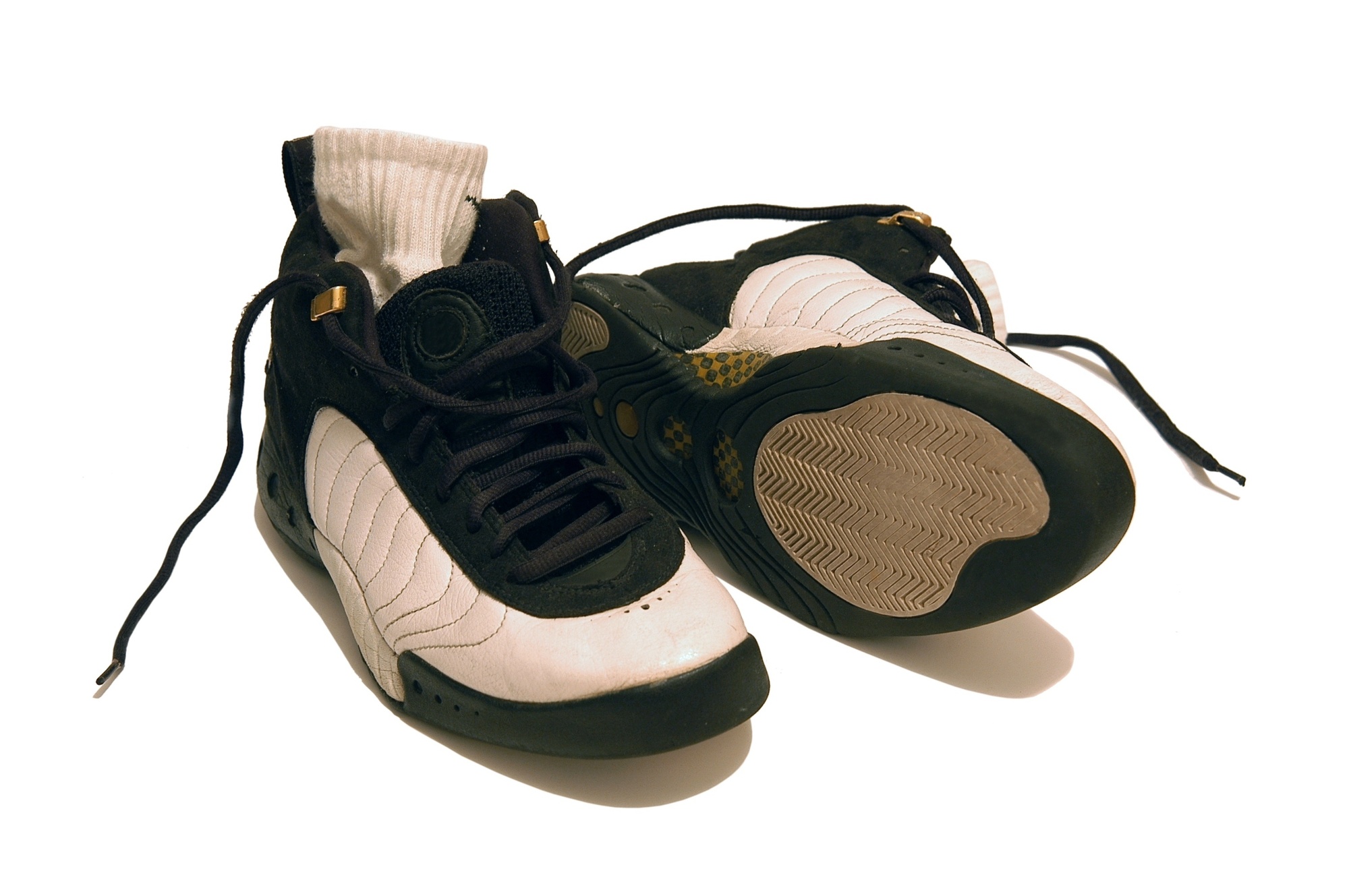
You’ve spent years dreaming about creating the perfect shoe brand.
You’ve been obsessed with sneakers for as long as you can remember, and you’re totally willing to wait hours in line for the latest offering from your favorite brand to drop.
You’ve invested the money, drawn up some killer designs, and you’ve even found the perfect retail location.
With all of that work, the last thing in the world you want is for your shoe brand to end up like Bella Hadid’s epic fail of a sneaker interview.
To avoid all that embarrassment, start by thinking about your shoe brand logos. But why exactly does your logo matter, and how can you design it?
Read on to find out.
Shoe Brand Logos Specify Your Niche
While it might be tempting to market your shoes to as broad of an audience as possible, it’s not exactly a secret that today’s shoe game is more competitive than ever.
Especially thanks to the rise of street style, both men and women are paying more attention to what they put on their feet. Yes, you’ll have a larger target market. However, that target market still needs to be within a specific niche if you want to be successful.
One of the best ways to connect with that specific market?
Through the designs, colors, and even typographical style of your shoe brand logos.
For example, take a look at the logo of British-based brand Rachel Simpson bridal shoes. Their logo is a minimalist, loopy handwriting script — the kind that you might see on a wedding or bridal shower invitation. Their logo is feminine, elegant, and timeless — just like every bride wants to be on her wedding day.
In contrast, take a look at the logo of the iconic skateboarding shoe brand, Vans.
Their signature extended “V” reminds buyers of the perfect shape of a half-pipe and the long lines, often banisters or walls, that skaters love to ride down. Additionally, the squiggly line logo often seen on many of their best-selling shoes calls to mind the precarious nature of skateboarding on rough terrain.
Both of these brands make it entirely clear the kinds of shoes they offer — strappy heeled sandals and durable, street-smart sneakers — thanks to their logos.
Logos Build Brand Recognition
You’re a young brand — which means that if you want to succeed, you’ll need to get serious about your branding strategy right out of the gate.
Your logo is one of the best, not to mention the most effective, ways to do just that.
Your logo is the first step in your overall branding strategy. If you don’t have that, then it will be incredibly difficult for your target market to recognize your shoes when they see them on the street or on their favorite fashion blogger on social media.
Your shoe brand logos will also help you to build a more consistent presence both online and in person. Make sure you put your logo on all your social media accounts and even put your logo in the same place on the actual design of your shoe.
Try unexpected logo placement to help you stand out, like the sole or even the laces of your shoes! As an added bonus, this will also lend a cleaner feel to the tags and pictures that your clients upload of your shoes on their social media accounts.
They Give Your Shoes A Luxury Feel
Unless you’ve been living under a rock, then you know that the past few seasons in fashion have been all about logos and graphic tees.
Logos are a quick way to take your brand from no-name to the one that everyone’s talking about — and has to have. Logos help other people to draw conclusions about a person’s style, income level, interests, and even lend an air of exclusivity.
You already want your customers to feel like they’re ahead of the game when it comes to style.
A logo makes them feel like they have the shoe that everyone else wishes they could wear. It’s as much of a fashion statement as the color of a shoe and the height of its heel.
Don’t be afraid, especially at the start of your marketing efforts, to put your logo anywhere and everywhere you can. Again, this is a great way to be consistent with your overall branding.
If you’re more street style focused, then tag street signs in your neighborhood with bumper stickers featuring your logo. Elegant, glam shoes more your niche? If so, print your logo on the side of a tote bag, and use them in lieu of more traditional shopping bags.
Ready To Start Designing The Best Shoe Brand Logos?
So, is your shoe brand more street-style, more prom-friendly, or does it cater to businessmen and women who need to look sharp in the office?
No matter what you have to offer, or what your dream client looks like, you need to make sure that your shoe’s logo makes a connection with your target market as soon as possible.
Feeling inspired and ready to design thanks to this post?
Let us help you take your logo design out of your head and onto your shoes.
Use our free online logo maker tool to dream up several possible designs. Once you’ve settled on the perfect one, start building up hype around your shoe brand by releasing an Instagram or social media post relating to that logo every day.
Reveal a hint about your choice, like font or color, every day, until you, at last, reveal the logo in all its glory.
For more epic logo tips and tricks you can use in 2018, check out our website to ensure that your logo is as fresh as your kicks.


