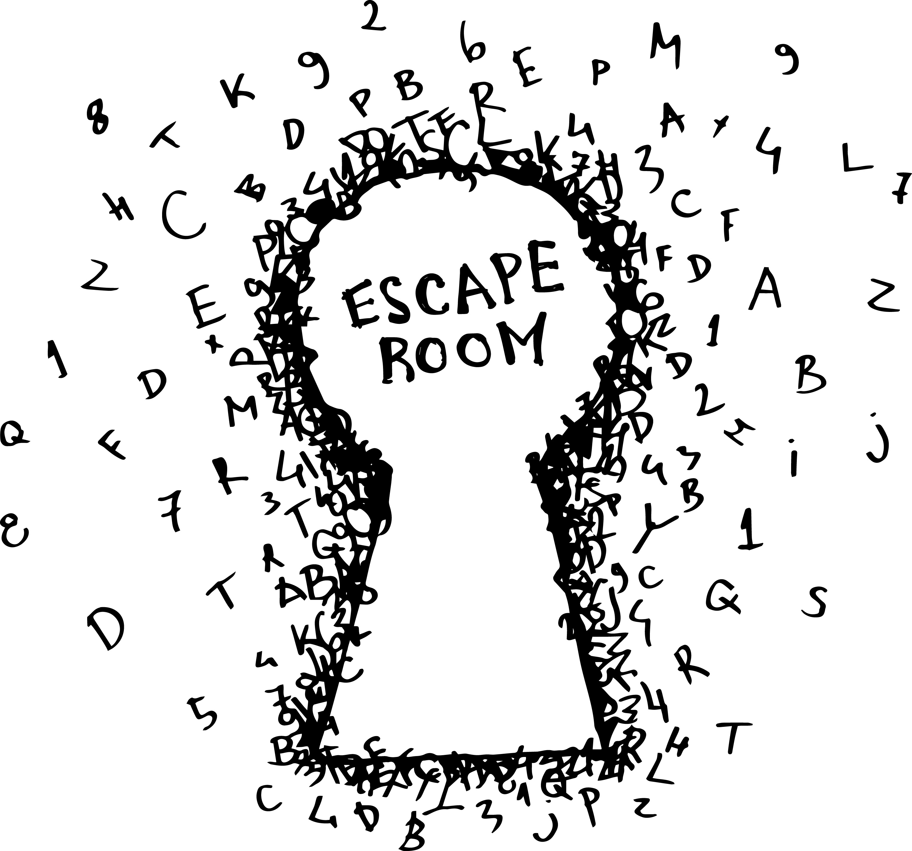
6 Tips for Designing an Escape Room Logo
Posted on November 08, 2017 by Logo Design Tips and Tricks

The popularity of escape rooms is exploding nationwide.
Escape rooms combine the rush of adrenaline from a ticking clock with the patience and brain power of finding clues and solving puzzles. It’s great fun for families, friends, and even groups of co-workers.
As interest in escape rooms grow, more of these adventure companies are popping up across the US.
For entrepreneurs and business owners looking to capitalize on the craze, one of the first marketing tasks for escape rooms is designing a great logo.
So how do you make a memorable escape room logo? Read on for 6 design tips.
Match Your Industry
To start designing your escape room logo, you first need to consider your industry.
Your logo should tell people things about your company. Ideally, people should be able to figure out your logo is for an escape room without needing to see the words “Escape Room” directly included.
Trying to match your logo to your industry should give you a good base to build on.
It might be helpful to scan your environment for inspiration. Take a look at logos used by other escape room companies.
Odds are you’ll discover certain trends and design motifs that span throughout your industry.
These trends can manifest in a number of forms:
Logo Types
Logos generally break down into three different types:
- Wordmarks
- Icons
- Combination
Wordmarks are stylized versions of the written-out company name. The most well-known wordmark is Google.
Icons are pictures or symbols used to represent a company. Apple, McDonald’s, and Target are among the many large corporations that use icons.
Combination marks combine an icon with a wordmark. Walmart and Taco Bell are great examples.
Depending on your industry, a type of logo may be more common. For example, law firms typically have a wordmark or combination mark due to the importance of the names of the lawyers.
Escape rooms are a relatively new and niche type of business. A logo or a wordmark might not say enough on their own, so a combination mark like the one used at http://www.goescapeartist.com might be a good choice.
Typography
The typography used in logos and signage depends significantly on your industry.
Different industries tend to have a certain outward vibe and ideal perception.
Law firms, government organizations, and other suit-and-tie businesses usually use a classic serif font to present a sense of formality and professionalism.
Sports teams, car companies, and tattoo parlors may prefer to use bolder, sharper fonts to show aggressiveness.
Organizations involving children or animals might have more happy, whimsical lettering.
Escape rooms are for people seeking thrills and adventure. An appropriate typeface might be something bold and sans-serif, and perhaps in all-caps.
Symbols
Symbols or objects related to an industry may appear in logos.
Rela estate companies usually include a house or building in their logo. Law firms may use a gavel or scales to represent the legal system.
For an escape room, symbols such as a lock, a key, or a door may be appropriate symbols to include in a logo.
Match Your Personality
Once you build a logo foundation around your industry, you can start to add your own twists to make it fit the personality of your individual escape room.
What is the theme of your escape room?
Some escape rooms involve aliens, or pirates, or cowboys. Some are based on American history. Some are for adults, and others are for children.
If there’s a special theme to your escape room, try to represent that in your logo.
Another way to personalize your logo is to represent your location. Escape rooms in Florida or California may use palm trees, the sun, and water in their logos. A room in Colorado might use mountains or snowboarders in their designs.
Use Colors Effectively
Part of personalizing your logo relies upon your use of color.
While not an exact science, the psychology of color is a popular area of study for marketers and psychologists.
Red portrays excitement. Blue evokes feelings of trust. Green indicates health and freshness.
Color is more about what looks cool on a design. It’s about what subconscious emotions you want to tap into.
Take some time to research color and find out how you can most effectively use it.
Stand the Test of Time
A logo should be timeless.
Ideally, your logo today should work as your logo in 40 years.
It’s not smart to constantly change or update your escape room logo every few years. A lack of continuity is like pulling up the roots of a young tree — it will never grow.
And if your brand is lucky enough to become popular, changing your logo could lead to a major backlash from your fans.
Avoid the need to change your logo frequently by staying away from “trendy” design ideas that will only be in style for a limited amount of time.
Put in the time and effort to create a high-quality timeless logo the first time. It will save you from more pain down the road.
Scalability and Versatility
You will use your logo in many ways. Keep that in mind when designing it.
Here’s just a small list of ways you might use your logo:
- Websites and social media
- Printed documents
- Store signage
- Billboards
- Small trinkets like pens and buttons
- Clothing (including screen printing and sewn patches)
Design your logo to be scalable, both to small and massive sizes.
A highly detailed logo may look great in some situations, but the detail will be lost or muddied on small scales.
Your escape room logo should be versatile and usable for any purpose without losing any of its elements.
Back it Up
A logo’s purpose is to make your company recognizable. It represents who you are and what you do.
The key word there is “represents.” A logo isn’t actually who you are and what you do.
Your escape room logo could be the most aesthetically pleasing and iconic logo in the country. But that would mean nothing if your company was poorly run or had bad service.
A logo is your most powerful marketing tool, but it isn’t the only piece to your puzzle. Make sure that your logo is representing a great company.
Create Your Escape Room Logo
Armed with this knowledge, it’s time to start designing your escape room logo.
Online Logo Maker gives you great design tips plus the digital tools to create your own logo for free. Start building your brand today!
5 Reasons Your Cybersecurity Logo Matters
Posted on November 08, 2017 by Logo Design Tips and Tricks

With around 4,000 hack attempts on businesses per day, it’s no coincidence that new cybersecurity companies are started every day. That means that it’s important to stand out.
One of the best ways to do just that is to create a cybersecurity logo. The right logo can open up many new paths to success for your company.
Here are five reasons it’s important to have one.
1. Bring in New Customers
A cybersecurity logo can help give your company brand recognition.
That’s a buzzword that gets tossed around a lot. The truth is that it means a wide range of things.
As important as any other part of brand recognition is the way it can help recruit customers. A logo, if it’s effective, is the first part of your company that someone will see. They’ll see it before they talk to you or any other employee, drawing them in when they might not have known about you otherwise.
They’ll even see it before they know what it means. That’s when they’ll turn to a friend.
2. Keep the Old Ones Coming Back
Think about the most iconic brands out there today. They all share one thing in common: they’re an integral part of the company they represent.
When people make decisions between companies that offer the same service, they often end up choosing what they already know. With a cybersecurity logo, it’s easier for them to spot something they already know: your company.
Now let’s take a quick look at this with the glass half empty.
3. A Cybersecurity Logo is a Necessity
The consequences of not having a logo are real. Consumers are very interested in cybersecurity nowadays.
That means you have quite a lot of competition. Let’s return to that moment when someone is looking for a cybersecurity company to get a job done for them.
If they don’t see your logo (because you don’t have one), they’ll likely go with another choice. It’s the stick, not the carrot, of logos.
But the carrot is real.
4. But It’s Also an Opportunity to Develop Your Brand
Let’s say that you want to advertise your merchant processing business. If you simply post “Learn More” by itself on Facebook, you’re less likely to grab someone’s interest in your payment processing tools or other security measures.
But throw a logo in there, and people will start to associate that logo with whatever you do. The logo allows consumers to track everything your company does, from social media to online advertising and everything in between.
It’s a bit like a GPS in that way.
5. A Logo Means Your Own Security
Now let’s think about your own company’s security.
You seem to have that whole cybersecurity thing down pat. That’s now what this is about.
Fraudsters are out there who wouldn’t mind using your name to trick somebody out of their cash. Your logo acts like a signature.
If someone forges it, it’s a worse crime. That means your logo acts as a deterrent to crime.
Make a Logo Today
The proper logo for your company can make a world of difference in your company’s dealings.
Looking to get started on yours? Reach out to someone on our team and you’ll be well on your way.
Good luck!
What Your Pest Control Logo Says About Your Business
Posted on November 07, 2017 by Logo Design Tips and Tricks

What if changing one small thing could double your business?
Most pest control businesses focus on marketing the services they offer, ensuring a high interest from visitors to their site. However, a bad pest control logo can keep many people from going to the site at all.
Your logo is the face of your marketing strategy. What your logo says about your business makes all the difference in the minds of the customers.
Why Use a Pest Control Logo?
Some businesses may feel a logo unnecessary. However, it’s the first thing potential customers see.
A logo is your first impression, a chance to gain the interest of a new customer. The challenge is doing so in a way that also reinforces your brand identity.
Brand Identity
A good pest control service should work every day to establish their brand identity. It helps you stand out from everyone else in town. A solid brand identity is also the key to generating word-of-mouth buzz.
Your logo conveys that identity. Having a bad logo or worse, no logo at all, will confuse customers and cause you to lose out on their business.
Text and Image
Logo design possibilities are endless. The ideal logo for your business combines an attractive image with your business name. You might include a short phrase or slogan.
Combining text and image helps it stick in the mind of your audience, making it easier to remember you. Draw their eye to a dynamic image, then seal the deal with a catchy phrase.
The more dynamic and engaging your logo, the better business you’ll receive. That’s one of the ways that Go Forth established themselves as the best pest control service near Winston-Salem NC.
The Importance of Color
Certain colors are associated with certain emotions. The color red, for example, is associated with excitement and boldness. Blue is associated with tranquility and strength.
Incorporating colors like these in your pest control logo can help bring out those emotions in your customers.
The right colors in your logo will foster belief in your quality and authority in your customers.
What Colors Should I Choose?
Many pest control logos use colors like green, black, or yellow. Each color matches a positive trait of your business.
Green is associated with both peace and freshness. Your customers want to remove pests from their home to restore it. Therefore, green reinforces your ability to make their home peaceful again.
Black is associated with both tradition and authority. Making it part of your logo signifies your experience in pest control. It also makes your business seem more established.
Yellow is associated with confidence and optimism. A bright color, it helps your logo get noticed. Using yellow in your logo shows how much you believe in your own abilities.
Font Matters
Lots of pest control services overlook the importance of font choice. Along with the image, your logo’s font is the first thing customers see. Choosing the right font makes your business look confident and strong.
Many businesses prefer a sans serif typeface in a pest control logo, such as Helvetica or Impact. This type of font looks more modern and serious than serif or script-like typefaces.
The right font ensures your business name will be seen from far away. It should look clean, be easy to read, and be ideal for both large advertisements and your company website.
Images and Symbolism
You may notice that many pest control logos do not have any symbols. Instead, they opt to use only the name of their business and some attractive colors. However, having a symbol can spice up your logo.
The visual symbol doesn’t have to rely on text, meaning it can appeal to people who don’t speak English. It also lets you market yourself in creative ways, such as using the symbol as an icon for a smartphone app.
Ultimately, the goal of any good logo is to get you noticed. Images remain one of the easiest ways to get your customers’ attention.
Telling Your Story
Modern consumers like to feel connected with their favorite businesses. A good pest control logo tells your story to new customers. Knowing your story helps customers get to know your business, and they’ll show their appreciation with their wallets.
A good symbol explains who you are and what you do. The best symbols are basic and straightforward, like the camera that serves as a symbol for Instagram.
Famous figures can make great symbols too. Incorporating celebrities into your logo makes your business seem modern and culturally relevant.
What to Avoid?
A good pest control logo shouldn’t be an obvious sales pitch. It should be memorable and distinct. Research your competition and make sure your logo looks different from theirs.
Don’t place the logo in the middle of your text or your headlines. It’s distracting and prevents customers from understanding your business. Place your logo in the corner or other areas that draw the eye and enhance the text.
Make sure that your logo isn’t too big. Good logos draw attention to your business, but bulky ones distract it away. A medium-sized logo is more inviting and more accessible to your readers.
The Bottom Line
Creating a great logo is one of the most important things you can do to attract new customers. It is also a vitally important way of building your brand identity within your community.
However, it can be difficult to create a new logo on your own. Unless you are a graphic designer, it can be very difficult to figure out where to start when making a logo.
Fortunately, you do not have to create this logo on your own. Online Logo Maker provides an amazing online app that helps you quickly create a great logo. The company has helped millions of clients and can help you design a logo in as little as five minutes.
Don’t settle for being the second best pest control service in your area. Use the Online Logo Maker today and see how a great logo can completely transform your business.
3 Tips For The Perfect Medical Logo Design
Posted on November 01, 2017 by Logo Design Tips and Tricks

Whether you’ve recently decided to open a new medical practice or you’re in the process of rebranding your old one, your medical logo design should be the first thing you think about.
After all, your logo serves as the foundation for all your future branding decisions.
In short, it’s incredibly important.
Not sure where to start? Need a little help understanding what design elements help you connect to more patients?
Read on to learn how to create the most effective — and most interesting — design.
1. Communicate Your Niche
One of the most important functions of your medical logo design? To communicate your specific niche to potential patients.
For example, if you’re a cardiology practice, your logo design should include a heart, or perhaps a more creative print-out of a heart rate monitor.
If you’re an OB/GYN, then your logo could include a pregnant woman’s belly, with the name of your practice written on the stomach. If you provide vasectomy services, then your logo could show a man shaking hands with a doctor.
Remember, your logo has less than two-tenths of a single second to make an impression on potential patients.
Remember the three C’s: your logo should be creative, clear, and communicative.
2. Keep It Legible
One of the biggest mistakes we see people make when it comes to logo design? Picking detailed images and fancy fonts.
While these might read wonderfully on larger billboards or as a banner on your website, they won’t work as well in smaller spaces. The last thing you want is for your logo to end up looking like a bunch of blobs and random squiggles.
When you’re first creating your design, choose an image and text that will look just as good on your social media avatar as it will in a print advertisement.
Try testing out resizing options before you finalize your design, and ask others to read the text in a variety of sizes to be certain.
3. Don’t Overload on Trends
We know that your medical practice is up-to-date on all the latest health developments and treatment plans.
But the last thing you want is to design a medical logo that is so trend-centric that you’ll end up having to redesign it by next season.
It’s up to you to strike a balance between classic and modern.
For example, you might choose to include a common and recognizable medical symbol, like a first aid cross, in your design. That’s the classic element. To keep it modern without having it look overly trendy, we love the idea of having that first aid cross drawn by hand.
Another way to merge trendy and classic design options?
By having your own unique font, also known as typography, created specifically for your medical practice. This will help you stand out from the crowd, maintain brand consistency and increase consumer recognition.
Ready to Create Your Medical Logo Design?
Thanks to this post, we hope you now have a clearer vision for your practice’s logo design.
When you’re ready to start creating, be sure to use our free online logomaker tool. That way, you can create several different options, and even poll your employees and patients to determine the favorite.
Looking for more advice about logo creation and branding in general? Then be sure to check out our blog for more invaluable tips.


